AI Logo Design Examples and Workflow for Better Concepts
AI can generate logo ideas fast, but speed doesn’t automatically mean quality. Most “bad AI logos” fail for the same reasons, messy shapes, inconsistent style, too much detail, and no real concept behind the mark. The solution is a clear process. This guide teaches AI logo design as a workflow, not a lottery. Brief → prompt → generate → select → refine → present.
If you’re a designer, freelancer, or agency, this approach helps you create better concepts faster while keeping the final output professional and client-ready.
AI Logo Design Starts with a Concept Brief, Not a Prompt
Before you open any tool, write a one-minute brief. This makes your AI logo design outputs more consistent and easier to direct.
The 1-minute logo brief
- Brand name:
- Industry:
- Audience:
- Brand traits (pick 3): modern / friendly / premium / bold / playful / classic
- Logo type: wordmark / icon / monogram / badge / mascot
- Visual keywords (pick 3): geometric / minimal / organic / vintage / tech / hand-drawn
- Avoid list: what the client hates (overly cute, gradients, complex icons)
This brief becomes your “prompt anchor” so your AI logo design stays on brand.
AI Logo Design Workflow Overview (The Repeatable System)
Here’s the full workflow you’ll run for every project:
- Define the concept direction (2-3 directions max)
- Generate a batch (20-40 variations)
- Select 3-5 best candidates
- Refine into clean vectors
- Build a logo set (primary, secondary, icon)
- Present with context (why this works, where it fits)
This keeps AI logo design fast and professional without cutting corners.
AI Logo Design Prompt Template You Can Reuse
Use this as your baseline prompt “skeleton,” then swap the bracket parts.
Baseline prompt (icon mark):
“AI logo design concept for (brand niche), (logo type), (style keywords), minimal vector look, clean geometry, strong negative space, 1-2 colors, no gradients, no shadows, simple silhouette, scalable, centered, no text.”
Baseline prompt (wordmark):
“AI logo design wordmark for (brand name), (brand traits), clean typography, premium spacing, modern letterforms, minimal, black and white, no icon, balanced kerning.”
The key is constraints. Constraints create cleaner how to design a logo with AI outputs.
6 Concept Examples You Can Copy for AI Logo Design
Below are concept “recipes” with prompts and what to refine. Use them as starting directions for different client types.
1. Minimal tech startup (geometric icon)
Concept: abstract mark based on initial letter + negative space
Prompt:
“AI logo design concept for a tech startup, abstract geometric icon based on letter (X), strong negative space, minimal vector, one-color, no gradients, no shadows, icon-ready.”
Refine: simplify to 2-3 shapes, unify angles, ensure it works at 24px.
2. Boutique service brand (premium wordmark)
Concept: typography-led mark with subtle signature detail
Prompt:
“AI logo design wordmark for (Brand Name), premium, calm, modern serif or refined sans, generous spacing, minimal, black and white, no icon.”
Refine: kerning, optical alignment, create stacked version, add subtle ligature if needed.
3. Coffee shop or roaster (badge + icon)
Concept: badge system that prints well on cups and labels
Prompt:
“AI logo design badge for coffee brand, circle emblem, minimal line icon (bean/leaf/mountain), bold outline, one-color, vintage-modern, no texture, no gradients.”
Refine: reduce detail lines, widen spacing, ensure stamp-friendly one-color version.

Image Source: ChatGPT
4. Kids or friendly brand (simple mascot line)
Concept: simple line mascot that scales as an icon
Prompt:
“AI logo design simple line mascot of a (animal), bold outline, consistent stroke, minimal details, friendly expression, vector look, one-color, no shading.”
Refine: simplify face details, keep silhouette strong, create icon-only mark.
5. Finance or security product (trust mark)
Concept: shield/lock abstract with clean geometry
Prompt:
“AI logo design for finance/security app, minimal shield icon, geometric, strong symmetry, one-color, modern, trustworthy, no gradients, no shadows.”
Refine: avoid cliché lock shapes, ensure uniqueness through negative space and proportions.
6. Creative studio (monogram system)
Concept: monogram that becomes a flexible brand asset
Prompt:
“AI logo design monogram of initials (AB), minimal vector, interlocking letters, strong negative space, symmetrical, one-color, premium.”
Refine: rebuild as vector, correct spacing, create pattern tiles and social avatar.
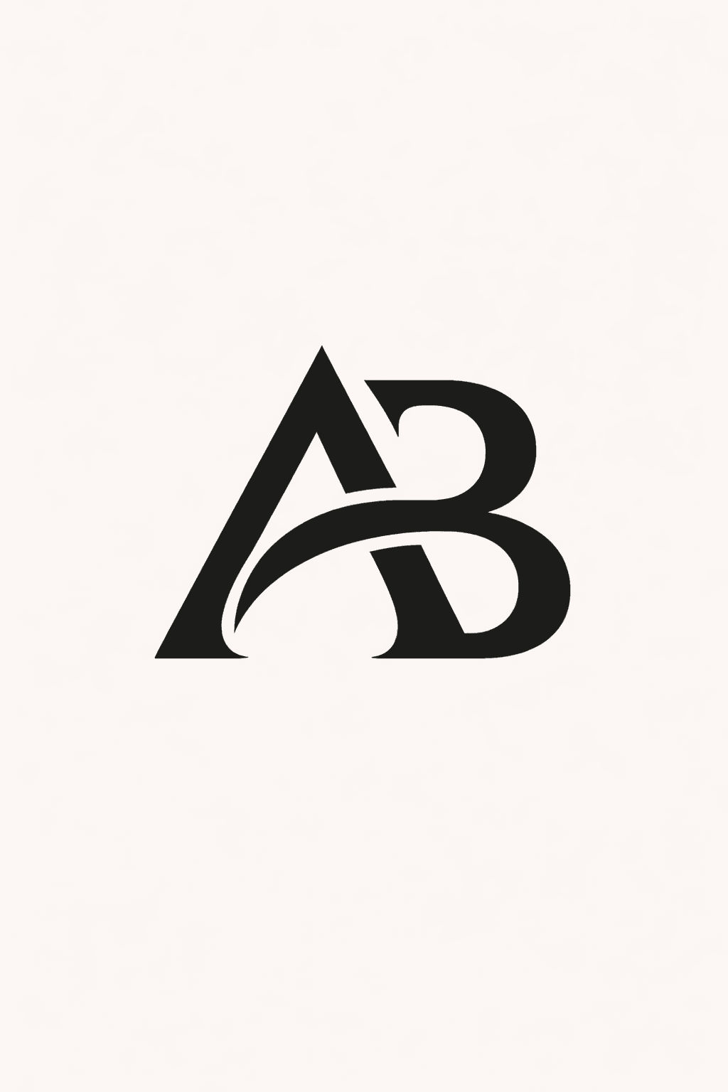
Image Source: ChatGPT
These examples help you guide AI logo prompts toward concepts that can actually become final marks.
Also Read: AI Prompts for Startup Logo: The Ultimate Prompt Library
AI Logo Design Batch Method – How to Generate Better Options Faster
Most designers generate 5 images and stop. Better results come from controlled volume.
The “20-40 variations” rule
For each direction, generate 10-15 options. Do 2-3 directions. That’s your batch.
Change one variable at a time
Keep 80% stable:
- style keywords
- simplicity constraints
- color count
- logo type
Change only one:
- icon concept (leaf → mountain)
- geometry (rounded → sharp)
- badge shape (circle → shield)
This keeps your AI logo design results consistent and easier to select from.
AI Logo Design Selection Criteria (Pick Winners Like a Pro)
When choosing the 3-5 finalists, use real logo tests.
The 5 quick tests
- Silhouette test: does it read as a shape in one second?
- Small-size test: does it work at 32px?
- One-color test: does it still work without color?
- Memorability test: can you draw it from memory?
- Uniqueness test: does it avoid obvious clichés in the niche?
If it fails multiple tests, it’s not a final direction. Strong AI logo design is mostly selection discipline.
AI Logo Design Refinement – How to Turn AI Output Into Real Vector Logos
This step is where designers win. AI gives you concepts. You make the logo real.
Refinement checklist
- rebuild the mark using clean shapes
- unify stroke weights (if line-based)
- remove tiny details that won’t print
- correct symmetry and optical balance
- define clear spacing rules around the mark
- create a wordmark pairing if needed
A good habit: treat AI output as a sketch reference. Your final AI logo design should be a new, clean vector build.
AI Logo Design for Typography Pairing to Cleaner Identities
Even icon-first logos often need a wordmark lockup.
Simple pairing rules
- use one neutral sans for modern brands
- use refined serif + neutral sans for premium/editorial
- avoid pairing two “loud” fonts together
- keep font weights consistent with the mark (thin icon + thin type often fails)
Typography is where “concept” becomes “brand.” That’s why it’s part of every AI logo design workflow.
Also Read: AI Sports Logo Prompts That Look Bold and Competitive
AI Logo Design for Logo Sets – Make it Feel Like a Complete Identity
Clients trust systems, not single files.
Your basic deliverable set
- primary lockup (icon + wordmark)
- secondary lockup (stacked or horizontal)
- icon-only mark
- black/white versions
- safe space and minimum size notes (simple)
This step turns AI logo design into a professional deliverable.
AI Logo Design Presentation – Show The Idea, Not The Tool
Clients don’t care how you made it. They care why it works.
Presentation structure
- Brand goal and traits (1 slide)
- Direction A / B / C with 1-line rationale
- Logo in black and white
- Size test (favicon, app icon, social avatar)
- Mockups (website header, packaging, card)
- Next steps (choose direction, refine, finalize)
A strong presentation makes AI logo design feel intentional and strategic.
AI Logo Design Mistakes that Create Generic Results
Avoid these, and your work improves immediately.
- prompts without constraints (“make me a cool logo”)
- asking for 3-4 styles at once
- relying on gradients, shadows, 3D effects
- using text inside generated logos (often messy)
- not rebuilding as vector
- skipping one-color and small-size testing
Good AI logo design is mostly about controlling variables and refining professionally.
AI Logo Design Mini Workflow You Can Run in 60 Minutes
If you need a fast concept sprint:
- 10 min: write the brief + 2 directions
- 15 min: generate 20-30 options
- 10 min: select top 5
- 15 min: rebuild 1-2 as clean vectors (rough)
- 10 min: mockup and present 2 directions
This keeps AI logo design efficient while still delivering quality.
Also Read: Cafe Logo Design Ideas for Luxury Coffee and Roaster Brands
Conclusion
The best AI logo design results come from a designer-led workflow. Start with a clear brief, generate controlled batches, select with real logo tests, then rebuild clean vectors and present as a system. AI speeds up ideation, but your judgment and refinement create the final quality.

For high-quality fonts to boost your income, check out DM Letter Studio. Our professional fonts are perfect for branding, marketing, and content creation. So, don’t miss this opportunity.