
Creative Bakery Logo Design Ideas That Look Professional
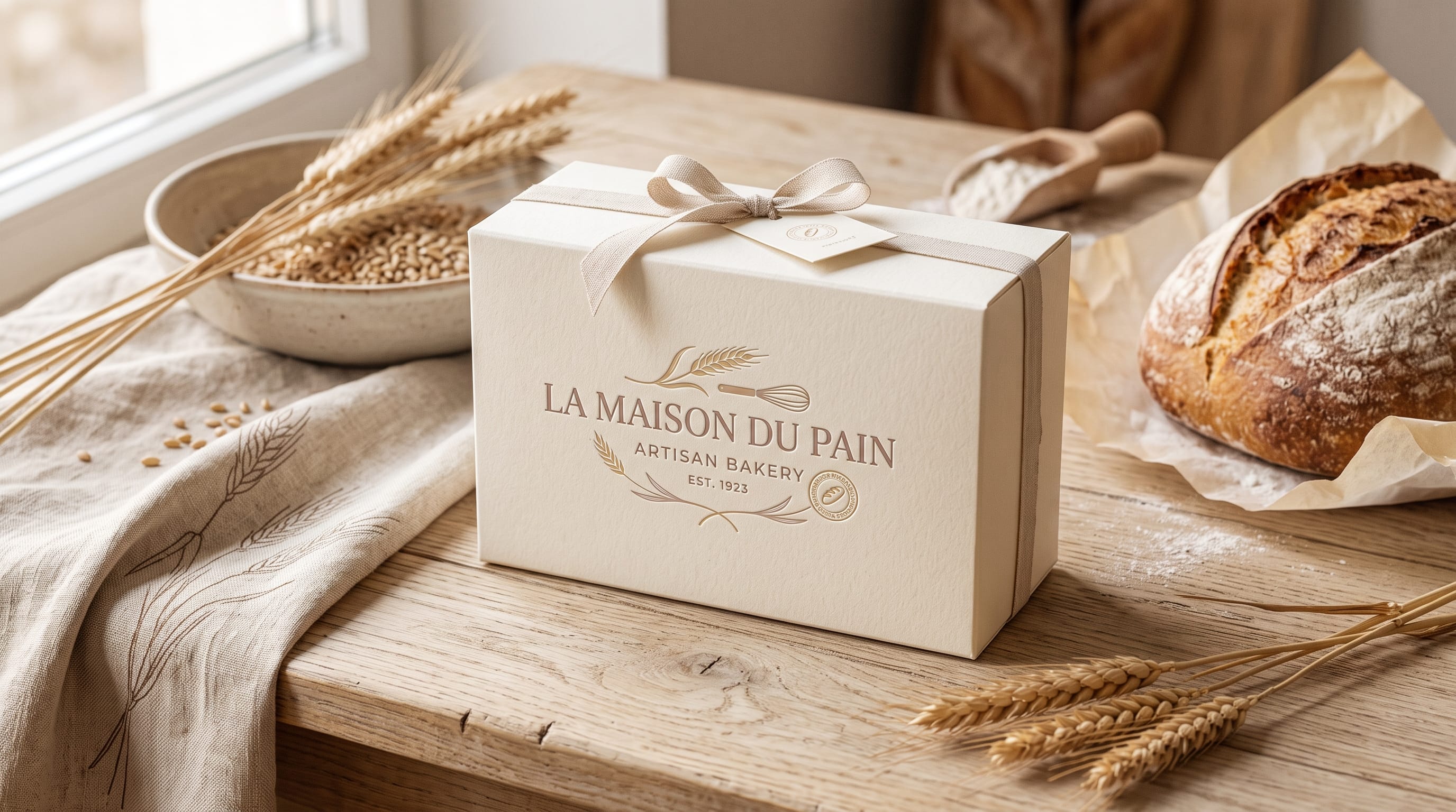
Bakery logo design plays an important role in shaping how customers first experience a bakery brand. Before people taste the bread, pastries, cakes, or cookies, they may already form an impression from the logo on a storefront, box, menu, social media profile, or product label.
A professional bakery logo should communicate more than the fact that the business sells baked goods. It can suggest whether the bakery feels artisanal, luxurious, playful, traditional, rustic, modern, family-friendly, or premium.
The most successful bakery identities usually combine a clear concept with carefully chosen typography, colors, symbols, and layout. A home bakery selling decorated cakes may need a different visual personality from a European-style sourdough shop or modern pastry cafe.
This guide explores practical bakery logo design ideas for different styles of bakery businesses, along with recommendations for creating a logo that remains memorable, flexible, and professional across both digital and printed applications.
What Makes a Professional Bakery Logo Design?
A bakery logo does not need to contain every possible baking symbol.
In fact, simple designs are often easier to recognize.
A strong logo should ideally be:
- Easy to identify
- Easy to read
- Memorable
- Relevant to the target customer
- Flexible across different sizes
- Suitable for packaging
- Distinctive from competitors
Professional bakery logo design also needs to work in more than one environment.
Test the logo on:
- Bakery boxes
- Paper bags
- Stickers
- Menus
- Storefront signs
- Social media avatars
- Websites
- Aprons
- Business cards
If the logo only works as a large illustration, it may become difficult to use on small labels or profile images.
1. Minimalist Bakery Logo Design
Minimalist bakery branding is ideal for businesses that want a clean, contemporary appearance.
A minimalist logo might use:
- Simple wordmark
- Small wheat icon
- Single bread illustration
- Neutral colors
- Generous spacing
Instead of using several baking symbols together, choose one recognizable element.
For example:
MORNING FLOUR
could be set in refined typography with a small wheat line below it.
Minimalist bakery logo design works particularly well for:
- Artisan bakeries
- Modern cafes
- Premium bread brands
- Sourdough businesses
- Boutique pastry shops
The simplicity can also make packaging look more expensive.
2. Handwritten Bakery Logo Ideas
Handwritten typography can make a bakery feel personal and welcoming.
This direction is especially suitable for:
- Home bakeries
- Cookie businesses
- Cake makers
- Local pastry shops
- Handmade products
A handwritten logo can suggest that the products are created personally rather than mass-produced.
Try combining:
Handwritten bakery name
with:
Small clean sans serif tagline
For example:
Sweet Morning
HANDMADE BAKERY
The contrast keeps the identity warm while preserving professional readability.
3. Elegant Bakery Logo Design
Premium patisseries and cake studios may need a more refined visual identity.
Elegant bakery logo design can use:
- Refined script typography
- Classic serif fonts
- Thin-line illustrations
- Monograms
- Muted color palettes
Suitable colors include:
- Black
- Ivory
- Champagne
- Dusty rose
- Deep burgundy
- Soft gold
Avoid adding too many decorative elements.
An elegant wordmark with carefully spaced typography may be enough to create a premium identity.
4. Vintage Bakery Logo Design
Vintage branding works well for bakeries that want a sense of history, tradition, or craftsmanship.
Possible elements include:
- Retro scripts
- Badge layouts
- Decorative borders
- Wheat illustrations
- Establishment dates
- Traditional serif lettering
A badge could contain:
HARRISON BAKERY
FRESH BREAD
EST. 1986
Vintage bakery logos can work especially well on:
- Kraft paper bags
- Bread wrappers
- Store signs
- Aprons
- Stickers
Use vintage influences selectively so the identity feels nostalgic rather than outdated.
5. Rustic Bakery Logo Ideas
Rustic branding can communicate natural ingredients and traditional production.
This style is suitable for:
- Sourdough bakeries
- Farm bakeries
- Organic bread brands
- Country cafes
Useful visual elements include:
- Wheat
- Grain
- Bread loaves
- Wooden textures
- Hand-drawn illustrations
- Earthy colors
Try palettes such as:
- Brown + cream
- Forest green + beige
- Terracotta + ivory
- Charcoal + kraft brown
Rustic bakery logo design works best when the logo remains simple enough for packaging stamps and labels.
6. Cute Bakery Logo Design
Cute branding can work especially well for cupcakes, cookies, desserts, and home-based bakeries.
Possible ideas include:
- Smiling cupcakes
- Small hearts
- Cherry illustrations
- Rounded typography
- Pastel palettes
- Simple mascots
Colors might include:
- Soft pink
- Peach
- Cream
- Mint
- Lavender
Avoid making every element cute at the same time.
A playful font plus a simple icon can be enough.
Too many cartoon decorations may make the business feel less professional.
7. Modern Bakery Logo Ideas
Modern bakery branding can combine simplicity with bold typography.
Try:
- Large sans serif wordmark
- Lowercase typography
- Geometric icon
- Monochrome palette
- Bold accent color
For example:
crumb
could appear in lowercase black typography with a small orange circular icon.
Modern bakery logo design works particularly well for urban cafes, delivery-first businesses, modern bread shops, and contemporary pastry brands.
8. Bakery Logo Design With Wheat Symbols
Wheat is one of the most recognizable bakery symbols.
It communicates:
- Grain
- Bread
- Natural ingredients
- Tradition
- Craftsmanship
However, wheat icons are also common.
To create something more distinctive, try:
- Using one simplified wheat stem
- Integrating wheat into a letter
- Creating a wheat monogram
- Combining wheat with negative space
Avoid copying generic stock-logo compositions used by many bakeries.
Also Read: Cafe Logo Design Ideas for Luxury Coffee and Roaster Brands
9. Bread-Based Bakery Logo Ideas
A bread illustration immediately communicates the product.
Possible forms include:
- Sourdough loaf
- Baguette
- Croissant
- Bread slice
- Pretzel
Keep the illustration simple.
A detailed realistic loaf may become difficult to recognize on a small packaging sticker.
Line art or simplified silhouettes are often more flexible.
10. Croissant Logo Design
Croissants can create a sophisticated European bakery identity.
They work particularly well for:
- French-style bakeries
- Cafes
- Patisseries
- Breakfast brands
A croissant shape can also create an interesting visual symbol because of its curved silhouette.
Try combining a small croissant illustration with an elegant serif wordmark.
Use warm colors such as beige, caramel, cream, and deep brown.
11. Cake Shop Logo Design
Cake businesses often need a slightly different identity from bread-focused bakeries.
A cake brand may emphasize:
- Celebration
- Customization
- Elegance
- Creativity
Logo symbols can include:
- Cake silhouettes
- Cake stands
- Small candles
- Icing swirls
- Flowers
For premium wedding cake businesses, avoid overly literal illustrations.
Elegant typography with a subtle monogram may communicate more sophistication.
12. Cupcake Bakery Logo Ideas
Cupcake shops can use more playful branding.
Try:
- Rounded lettering
- Pastel palettes
- Simplified cupcake icons
- Swirls
- Sprinkles
The challenge is avoiding generic designs.
Rather than using a detailed cupcake drawing, consider turning the cupcake shape into an abstract symbol.
This can make the bakery logo design more recognizable.
13. Monogram Bakery Logo Design
Monograms can make a bakery feel established and professional.
For example:
- B for Bellamy Bakery
- M for Maison Bread
- SC for Sweet Crumb
Monograms are particularly useful for:
- Stickers
- Box seals
- Social avatars
- Wax seals
- Packaging stamps
- Aprons
Use the complete bakery name as the primary logo and the monogram as a secondary mark.
This gives the identity more flexibility.
14. Bakery Logo With Rolling Pin Illustration
Rolling pins create a handmade, traditional bakery feeling.
They are suitable for:
- Home bakers
- Cookie businesses
- Baking classes
- Custom cake businesses
A rolling pin can be placed:
- Above the name
- Under the logo
- Behind the wordmark
- Inside a badge
Keep the illustration simple.
Detailed handles and textures are usually unnecessary in small logo applications.
15. Bakery Logo With Oven or Shop Symbol
A small storefront or oven icon can make a bakery feel warm and local.
This works well for businesses positioned around community and neighborhood identity.
For example:
A small bakery storefront icon above:
THE DAILY LOAF
can create a welcoming feeling.
Use this approach if the physical bakery experience is an important part of the brand.
16. Bakery Mascot Logo Design
Mascots can make bakeries more memorable.
Possible characters include:
- Baker
- Bread loaf
- Croissant
- Bear
- Cat
- Chef character
Mascot-based bakery logo design works especially well for:
- Family bakeries
- Kids’ products
- Cookies
- Casual cafes
- Social-media-focused businesses
Create a simplified secondary logo for situations where the full mascot illustration becomes too detailed.
17. Typography-Only Bakery Logo Design
Not every bakery needs an icon.
A typography-only wordmark can look extremely professional.
This approach works well when the bakery name itself is distinctive.
For example:
FLOUR & FORM
could use:
- Elegant serif lettering
- Wide spacing
- Small supporting tagline
Typography-only logos are easy to use on packaging and websites.
The challenge is choosing a font with enough personality to make the name memorable.
Also Read: Vintage Restaurant Logo Design for Better Branding Results
18. Bakery Badge Logo Ideas
Badge logos combine several elements inside one container.
Common shapes include:
- Circle
- Oval
- Shield
- Rectangle
A badge may contain:
- Bakery name
- Establishment year
- Location
- Small wheat symbol
- Tagline
For example:
NORTH STREET BAKERY
HANDMADE DAILY
EST. 2022
Badge designs are ideal for packaging stamps, stickers, merchandise, and signage.
19. Organic Bakery Logo Design
Organic bakery brands can use natural colors and simple botanical imagery.
Consider:
- Wheat
- Leaves
- Grain
- Sun
- Natural textures
Suitable palettes include:
- Sage + cream
- Olive + beige
- Brown + warm white
- Forest green + sand
Avoid using too many generic “eco” symbols.
The brand can communicate natural values through color, packaging, materials, and messaging rather than relying solely on a leaf icon.
20. Luxury Bakery Logo Design
Luxury bakeries and patisseries can use understated branding.
Try:
- Elegant serif type
- Delicate script
- Monograms
- Black and ivory
- Burgundy and cream
- Deep green and gold
Premium bakery logo design usually benefits from simplicity.
One well-designed wordmark can feel more luxurious than a complicated illustration.
Best Bakery Logo Color Palettes
Color strongly influences bakery branding.
Warm Artisan Palette
- Chocolate brown
- Cream
- Caramel
Modern Bakery Palette
- Black
- White
- Terracotta
Cute Bakery Palette
- Blush pink
- Cream
- Soft peach
Natural Bakery Palette
- Sage green
- Beige
- Dark brown
Luxury Bakery Palette
- Burgundy
- Ivory
- Champagne
Choose colors that match both the product and the intended audience.
Font Suggestions for Bakery Logo Design
Typography can dramatically change how a bakery identity feels. DM Letter Studio currently offers a large Script & Handwriting collection alongside display, retro, and monogram styles, giving bakery owners several directions for warm, elegant, vintage, playful, or premium branding.
Elegant and Premium Bakery Fonts
For patisseries, wedding cakes, luxury desserts, or boutique bakery identities, consider:
Pair elegant typography with:
- Ivory
- Champagne
- Burgundy
- Black
- Muted gold
Use the script primarily for the bakery name and a simpler typeface for supporting information.
Warm and Personal Bakery Fonts
For home bakeries, handmade cookies, local cafes, and friendly cake businesses, try:
These handwritten styles can make a bakery identity feel more personal and handcrafted.
Playful Bakery Fonts
For cupcakes, kids’ baking brands, dessert shops, or colorful social-media businesses, consider:
These fonts can support cheerful bakery graphics without forcing you to use complicated mascots or illustrations.
Use playful fonts with short names and simple layouts to preserve readability.
Vintage and Heritage Bakery Fonts
For traditional bakeries, retro cafes, old-fashioned bread shops, and nostalgic packaging, consider:
For bakery branding, keep these fonts focused on headlines or short wordmarks rather than body copy.
Bold Bakery Logo Fonts
If the bakery needs a stronger identity for storefronts, food trucks, packaging, or merchandise, try:
This direction can work especially well for:
- Bagel shops
- Bread brands
- Donut shops
- Street-food bakeries
- Bakery merchandise
Monogram Fonts for Bakery Branding
A bakery monogram can become an excellent secondary identity element.
DM Letter Studio’s current monogram collection includes options such as:
The current DM Letter Studio monogram collection contains hundreds of options, including crest, serif, botanical, and decorative approaches.
Aurielle Monogram can be particularly suitable for elegant bakery branding because it combines refined serif forms with subtle botanical details and is designed for upscale branding, packaging, and monogram identities.
Veloura Crest Monogram offers a more traditional crest-inspired style that can suit premium patisseries, heritage bakeries, personalized packaging, and elegant product labels.
How to Pair Fonts in a Bakery Logo Design
Avoid combining two highly decorative fonts.
A practical formula is:
- Primary: Script or display font
- Secondary: Clean serif or sans serif
For example:
Elegant Script
+
Small uppercase supporting text
or:
Bold vintage display
+
Simple sans serif
The decorative font creates personality while the supporting type preserves readability.
How to Test a Bakery Logo Before Launch
Before finalizing the design, create mockups.
Test your logo on:
- Bakery box
- Coffee cup
- Paper bag
- Store sign
- Instagram avatar
- Menu
- Sticker
Then reduce it to a small size.
If important details disappear, simplify the design.
Also test it in black and white.
A professional bakery logo design should remain recognizable even without the original colors.
Common Bakery Logo Design Mistakes
1. Using Too Many Baking Icons
You do not need bread, wheat, rolling pins, cupcakes, and chef hats in one logo.
2. Choosing an Unreadable Script
Decorative fonts should still allow customers to understand the bakery name.
3. Copying Popular Bakery Logos
Familiar visual cues are useful, but the identity should still feel distinctive.
4. Using Too Many Colors
A small palette is easier to reproduce consistently.
5. Making the Logo Too Detailed
Small packaging applications require simple shapes.
6. Ignoring the Target Customer
A children’s cupcake logo may not suit a premium French patisserie.
7. Forgetting Typography Licensing
Before using any commercial font in a bakery logo, packaging, website, or merchandise, verify that the license covers the intended use.
Bakery Logo Design Checklist
Before launching the identity, ask:
- Is the bakery name easy to read?
- Does the style fit the target customer?
- Is the logo distinctive?
- Does it work on a storefront?
- Can it fit on a small sticker?
- Does it work in black and white?
- Is the color palette consistent?
- Does the typography match the brand personality?
- Is the icon simple enough?
- Can the logo work on packaging?
- Is there a secondary logo or monogram?
- Have font licenses been checked?
Also Read: How to Create a Fashion Logo Design That Stands Out
Final Thoughts on Creative Bakery Logo Design
A professional bakery logo design should communicate the personality of the business before customers taste the first product.
Begin by deciding what the bakery should feel like.
A sourdough shop might use rustic typography, earthy colors, and a simple wheat symbol. A modern cafe could choose a clean wordmark with bold typography. A home cake business might benefit from warm handwritten lettering, while a luxury patisserie may need refined script, elegant serif typography, or a monogram.
Keep the logo simple enough to remain recognizable across packaging, menus, websites, storefronts, social media, and merchandise.
Typography deserves particular attention. Current DM Letter Studio options can support very different bakery personalities, from playful and handcrafted to vintage and premium.
The strongest bakery logo design does not necessarily use the most illustrations or decorative effects. It uses a few carefully selected visual elements that work together consistently.
When typography, color, imagery, packaging, and brand personality all communicate the same message, even a simple bakery logo can become a memorable symbol that customers immediately associate with quality, warmth, and delicious products.