
Beautiful Branding Design Examples for Designers and Creatives
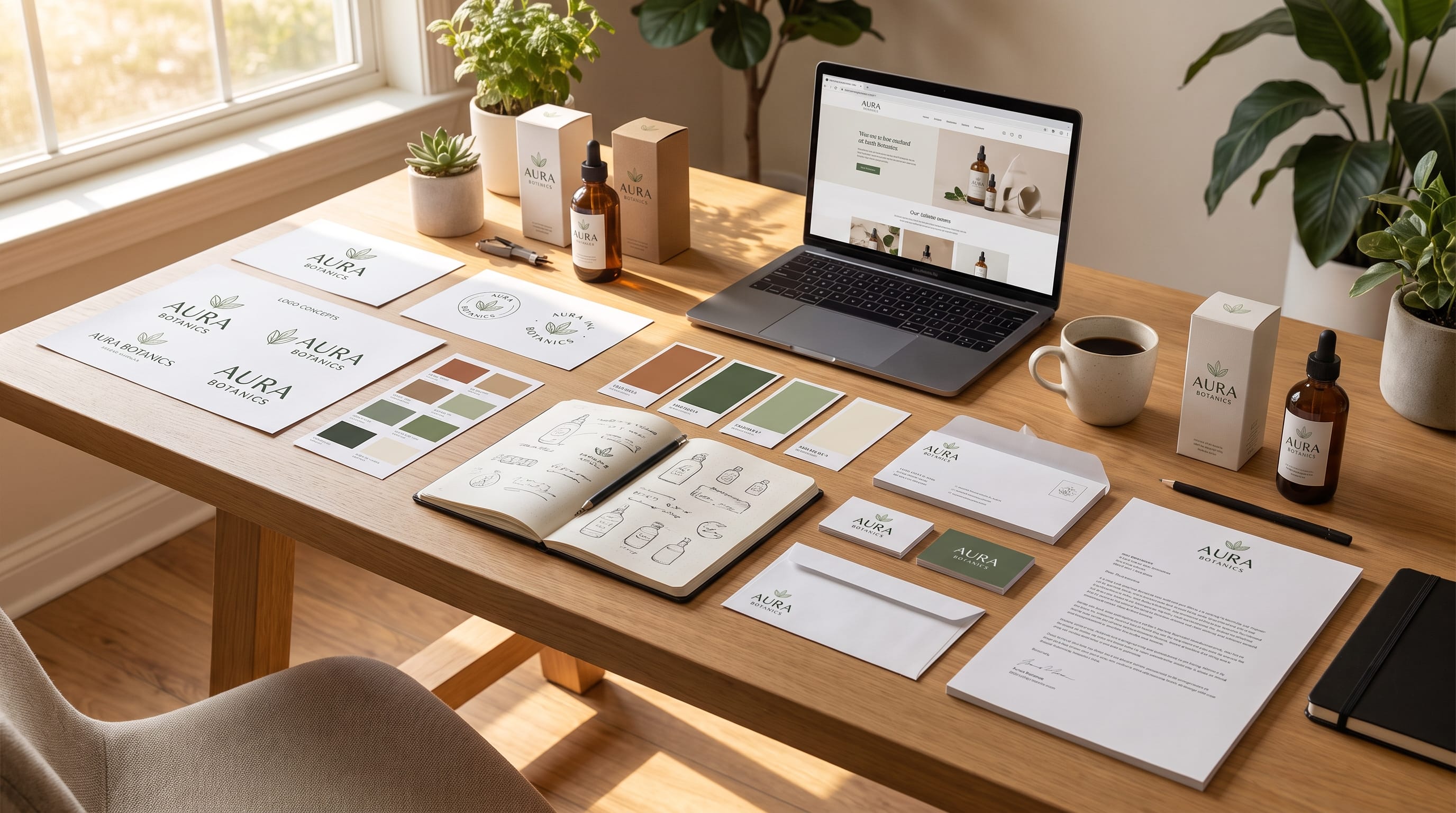
Great branding design examples can help designers understand how different visual elements work together to create a recognizable identity. A strong brand is rarely built from a logo alone. Typography, color, imagery, packaging, layout, patterns, icons, and digital applications all contribute to how people recognize and remember a business.
For designers and creatives, studying branding work is valuable because it reveals how visual systems are applied in real situations.
A logo may look beautiful on its own, but the more important question is how well it works on packaging, websites, social media, signage, stationery, and other touchpoints.
The goal of collecting inspiration should not be to copy another identity. Instead, study the decisions behind successful branding design examples and use those principles to develop something original.
Below are practical directions and examples that can help inspire your next branding project.
1. Minimal Branding Design Examples
Minimal branding often relies on restraint.
Instead of using many visual elements, the designer focuses on a few strong components.
A minimal identity might include:
- Simple wordmark
- Neutral color palette
- Clear typography
- Generous white space
- Limited graphic elements
- Strong photography
Imagine a modern skincare company using an elegant black wordmark on warm ivory packaging.
The labels contain only the product name, key information, and a subtle line or symbol.
Nothing feels unnecessary.
Minimal branding design examples work especially well for:
- Beauty brands
- Fashion
- Architecture
- Interior design
- Wellness
- Premium services
The important lesson is that minimalism still needs personality.
Removing elements is not enough. The remaining typography, spacing, and materials need to feel intentional.
2. Bold Branding Design Examples Using Color
Color can become one of the strongest parts of a brand identity.
A bold brand might use a vibrant primary color across:
- Packaging
- Website sections
- Social graphics
- Business cards
- Advertising
- Signage
For example, imagine a creative beverage company using bright orange as its dominant color with dark navy typography and cream backgrounds.
Even when the logo is not visible, customers may begin recognizing the color combination.
Bold color-based branding works well for brands that want to communicate:
- Energy
- Creativity
- Youthfulness
- Confidence
- Fun
- Innovation
When reviewing colorful branding design examples, notice whether the palette is controlled.
Strong identities usually define:
- Primary color: used most often
- Secondary color: supports the system
- Accent color: adds contrast
- Neutral colors: balance everything
This prevents colorful branding from becoming visually chaotic.
3. Typography-Focused Branding Design Examples
Typography can be the main personality of a brand.
Some identities use distinctive lettering instead of relying heavily on symbols or illustration.
For example, a luxury perfume company might use a sophisticated serif wordmark paired with a simple sans serif for supporting information.
A streetwear brand could use condensed display typography with bold oversized lettering across apparel, packaging, and digital campaigns.
Typography-focused branding design examples show how fonts can communicate:
- Luxury
- Tradition
- Modernity
- Playfulness
- Confidence
- Craftsmanship
- Technology
The strongest systems usually assign specific roles to each typeface.
For example:
- Display font: logo and headlines
- Supporting font: body copy and information
- Accent font: occasional decorative use
Consistency makes the typography feel intentional rather than random.
4. Logo System Branding Design Examples
A professional identity often includes several logo variations rather than one fixed logo.
A complete system may contain:
- Primary logo
- Secondary logo
- Horizontal version
- Stacked version
- Monogram
- Symbol
- Small icon
Imagine a coffee brand.
The full logo might appear on packaging and signage.
A simplified monogram could appear on social profiles.
A small symbol might be stamped onto cups or used as a favicon.
Good branding design examples demonstrate how these logo versions remain connected even when their layouts change.
This flexibility is particularly important for brands that appear across many digital and physical formats.
5. Packaging Branding Design Examples
Packaging gives designers an opportunity to combine several identity elements in one place.
A package may include:
- Logo
- Typography
- Color
- Patterns
- Illustration
- Photography
- Materials
- Product information
Consider a handmade soap brand.
It might use:
- Kraft paper
- Botanical illustrations
- Soft green typography
- Natural textures
- Simple ingredient labels
Now compare that with a premium soap brand using:
- Rigid cream boxes
- Elegant serif typography
- Black accents
- Subtle foil details
- Minimal decoration
Both products may serve the same basic purpose, but their branding creates completely different perceptions.
Packaging branding design examples are especially valuable because they show how visual identity influences product positioning.
6. Editorial Branding Design Examples
Editorial design can make a brand feel refined and sophisticated.
This style often uses:
- Large serif typography
- Structured grids
- Strong photography
- Generous margins
- Small uppercase details
- Clear hierarchy
Editorial branding works particularly well for:
- Fashion
- Interior design
- Architecture
- Magazines
- Creative studios
- Luxury products
A furniture brand, for example, might present products using large interior photography and magazine-style typography instead of a typical commercial catalog layout.
These branding design examples show how layout itself can become part of brand personality.
7. Playful Branding Design Examples
Not every brand needs to feel serious.
Playful identities can use:
- Bright colors
- Rounded fonts
- Friendly illustrations
- Organic shapes
- Mascots
- Stickers
- Flexible layouts
This direction works well for:
- Food
- Snacks
- Children’s products
- Pet brands
- Creative tools
- Entertainment
Imagine a children’s snack company using cheerful character illustrations and bold primary colors across boxes, bags, and social content.
The design feels energetic but still follows consistent rules.
Strong playful branding design examples show that fun does not mean random.
The colors, illustration style, typography, and shapes still need to belong to one system.
Also Read: Brand System Components for Better Cross-Team Collaboration
8. Luxury Branding Design Examples
Luxury branding often communicates value through restraint rather than excessive decoration.
Common elements include:
- Elegant typography
- Controlled color palettes
- High-quality photography
- Premium materials
- Subtle finishes
- Large amounts of space
Imagine a jewelry company using black and ivory packaging with small gold details and close-up photography.
The logo may appear relatively small.
The sense of luxury comes from proportion, materials, photography, and consistency.
Luxury branding design examples remind designers that adding more visual details does not automatically make something feel premium.
Often the opposite is true.
9. Natural and Organic Branding Design Examples
Natural brands often use design elements inspired by materials, landscapes, plants, and handmade processes.
Common directions include:
- Earth tones
- Botanical illustrations
- Natural photography
- Organic shapes
- Kraft materials
- Textured paper
- Handwritten accents
A botanical skincare brand might use muted olive green, cream packaging, hand-drawn plant illustrations, and natural-light photography.
A sustainable food company might combine recycled cardboard with simple typography and minimal printing.
These branding design examples communicate natural positioning through the entire system rather than relying only on green colors or leaf symbols.
10. Branding Design Examples Using Illustration
Illustration can give a brand a unique visual voice.
This can be especially valuable for businesses that want to avoid generic stock photography.
Illustrated branding works well for:
- Cafes
- Food brands
- Children’s products
- Creative studios
- Lifestyle brands
- Handmade businesses
Imagine a bakery using hand-drawn illustrations of bread, pastries, wheat, and baking tools.
The same visual language could appear on:
- Packaging
- Menus
- Bags
- Website sections
- Social media
- Stickers
When studying illustration-based branding design examples, look for consistency in:
- Line style
- Color
- Texture
- Detail
- Shape
- Character
A recognizable illustration system can become just as memorable as a logo.
11. Photography-Led Branding Design Examples
Photography can shape the emotional character of a brand.
For example, one fashion company might use:
- Direct flash
- Bold poses
- Saturated color
- Urban backgrounds
Another might use:
- Soft natural light
- Neutral colors
- Relaxed models
- Minimal environments
Even if both sell similar products, the brands feel completely different.
Photography-led branding should define:
- Lighting
- Cropping
- Backgrounds
- Color treatment
- Composition
- Subject direction
Strong branding design examples use photography consistently across campaigns, websites, and social content.
12. Social Media Branding Examples
Social media requires a visual identity that can remain recognizable while supporting different content types.
Instead of using one rigid template, create a small system.
For example:
Educational Posts
Use clear typography and structured layouts.
Product Posts
Use strong photography.
Quotes
Use simple typography and generous spacing.
Promotions
Use stronger brand colors and calls to action.
These formats can all share the same:
- Fonts
- Palette
- Logo position
- Illustration style
- Image treatment
This creates consistency without making every post look identical.
13. Branding Design Examples Using Patterns
Brand patterns are useful secondary assets.
They can be created using:
- Symbols
- Letters
- Geometric shapes
- Illustrations
- Botanical elements
- Product icons
For example, a coffee brand could build a repeating pattern from coffee beans, cups, leaves, and simplified logo shapes.
The pattern might appear on:
- Tissue paper
- Bags
- Boxes
- Social backgrounds
- Website sections
- Merchandise
Patterns help extend a visual identity beyond the main logo.
14. Icon Systems for Brand Identity
Icons are often overlooked when building a brand.
However, they may appear throughout:
- Websites
- Apps
- Packaging
- Presentations
- Information graphics
If every icon uses a different style, the identity can feel inconsistent.
Choose one direction, such as:
- Thin line
- Bold filled
- Rounded
- Geometric
- Hand-drawn
Keep the stroke weight, corner style, and level of detail consistent.
The best branding design examples often show attention to small details like these.
Also Read: Brand Voice and Typography Examples for Better Visual Branding
15. Branding Design Examples Across Multiple Touchpoints
A brand becomes more convincing when it works consistently in different environments.
Imagine developing an identity for a restaurant.
The brand may need to appear on:
- Signage
- Menus
- Packaging
- Uniforms
- Website
- Social media
- Delivery bags
- Loyalty cards
These applications should not all look identical.
However, they should share enough visual characteristics to feel connected.
This is why professional branding design examples are often presented through mockups showing the identity in several real-world situations.
16. Create Strong Color Systems
Color palettes should have structure.
A practical branding system could include:
- Primary: deep green
- Secondary: warm cream
- Accent: terracotta
- Neutral: charcoal
You can also define where each color should appear.
For example:
- Green for main brand areas
- Cream for backgrounds
- Terracotta for highlights
- Charcoal for body text
This makes it easier for designers to create new materials without reinventing the visual direction every time.
17. Build a Clear Typography Hierarchy
Typography should be designed as a system.
Consider:
Logo Typography
Supports the main brand personality.
Display Typography
Used for campaign headlines or major titles.
Body Typography
Prioritizes readability.
Small Text
Used for labels, captions, and interface details.
You may only need one or two font families.
What matters is how consistently they are used.
When you review branding design examples, study the hierarchy rather than focusing only on the logo font.
18. Use Branding Design Examples to Build a Mood Board
Before starting a branding project, collect references that help define the intended direction.
A mood board might include:
- Logos
- Packaging
- Fonts
- Photography
- Architecture
- Materials
- Color palettes
- Websites
- Illustrations
Then look for repeated qualities.
Ask whether the references feel:
- Warm
- Minimal
- Bold
- Playful
- Premium
- Natural
- Technical
This helps transform random inspiration into a clearer visual direction.
The best mood boards communicate emotion and personality rather than simply collecting attractive images.
19. Turn Inspiration Into an Original Identity
Studying branding design examples should lead to original decisions.
Instead of copying one reference, identify what makes it appealing.
Maybe you like:
- The color contrast
- Editorial typography
- Large photography
- Minimal packaging
- Flexible logo system
Then reinterpret those principles in a new way.
You might combine the spacing from one reference, the photography mood from another, and an entirely original logo direction.
This creates a stronger result than reproducing another designer’s style.
20. Create Brand Guidelines
Once the visual identity is complete, document it.
A simple brand guide may include:
- Logo versions
- Logo clear space
- Color palette
- Font system
- Photography style
- Illustration direction
- Icon system
- Patterns
- Social templates
- Examples of incorrect use
Guidelines help maintain consistency as more people begin working with the brand.
They are especially important when a business grows across multiple channels.
Common Branding Design Mistakes
Even visually attractive branding can become weak if the system is inconsistent.
Avoid these common problems.
Designing Only a Logo
A brand needs more than one asset.
Using Too Many Fonts
Limit the typography system.
Adding Too Many Colors
A focused palette is easier to recognize.
Copying Trends Too Closely
Trends can inspire a project, but they should not define the entire identity.
Ignoring Real Applications
Always test the brand on practical touchpoints.
Inconsistent Photography
Image style should support the same personality as the rest of the brand.
Also Read: Branding for Ecommerce: How to Build a Memorable Online Store
Final Thoughts on Beautiful Branding Design Examples
The most useful branding design examples show how several design elements work together to form a recognizable system.
A logo may introduce the identity, but typography gives it voice. Color builds emotional recognition. Photography establishes atmosphere. Packaging creates a physical experience, while social media, patterns, icons, and digital layouts help the brand remain consistent across many different touchpoints.
For designers and creatives, studying branding design examples is most valuable when you focus on the decisions behind the visuals.
Ask why the typography works. Study how the color system is repeated. Notice how the logo changes between applications. Look at how photography, spacing, patterns, and materials reinforce the same personality.
Then apply those principles to your own work.
Beautiful branding is not simply about creating attractive assets. It is about building a visual language that remains recognizable, flexible, and consistent wherever the audience encounters it.

For high-quality fonts to boost your income, check out DM Letter Studio. Our professional fonts are perfect for branding, marketing, and content creation. So, don’t miss this opportunity.