
Beautiful Green Logo Design Ideas for Eco-Friendly Branding
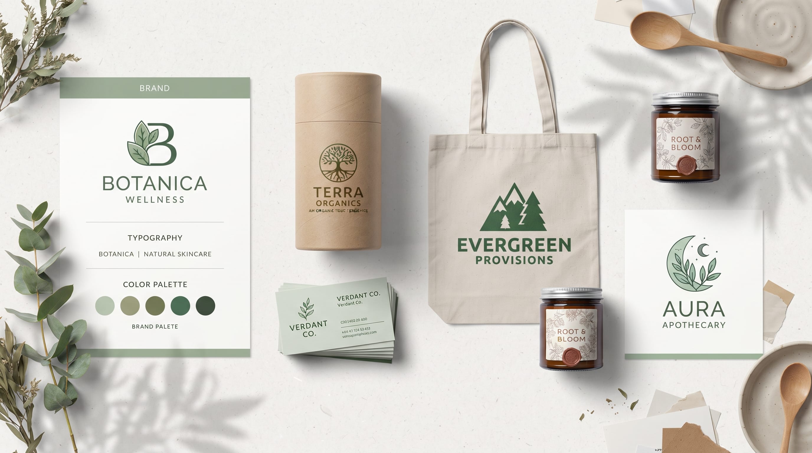
A thoughtful green logo design can help a brand communicate nature, growth, freshness, wellness, and environmental awareness before customers read a single word. Green is especially popular among sustainable businesses, organic products, wellness companies, botanical brands, agriculture, natural skincare, and businesses that want their visual identity to feel calm and connected to the natural world.
However, simply making a logo green does not automatically make a brand look sustainable.
The specific shade, typography, symbol, composition, and supporting colors all influence how customers interpret the identity. Sage green may feel calm and modern, forest green can create a more established personality, while emerald can feel sophisticated and premium.
The following green logo design ideas explore different ways to use this versatile color while creating branding that feels distinctive rather than predictable.
Why Green Logo Design Works for Eco-Friendly Brands
Green has a strong visual connection with plants, forests, gardens, agriculture, and healthy environments.
Because of those associations, green logo design is commonly used by brands related to:
- Sustainability
- Organic products
- Gardening
- Agriculture
- Wellness
- Natural skincare
- Renewable energy
- Healthy food
- Eco-conscious home products
- Outdoor businesses
Still, color should support a genuine brand strategy.
If sustainability is part of your positioning, the rest of the business should reinforce that promise through materials, sourcing, packaging, operations, or transparent communication where relevant.
A green logo is a visual cue, not proof of environmental responsibility.
1. Sage Green Logo Design for Calm Modern Branding
Sage is one of the easiest green shades to use for contemporary branding.
It feels softer than traditional forest green and less energetic than lime.
Sage works particularly well for:
- Wellness brands
- Skincare
- Home decor
- Natural beauty
- Lifestyle businesses
- Sustainable fashion
Try combining sage with:
- Warm white
- Cream
- Beige
- Charcoal
- Terracotta
A sage green logo design can use a simple wordmark with generous spacing and understated typography.
For example, a natural skincare company could use sage lettering on a warm ivory background with a very small botanical symbol.
The result feels natural without relying heavily on leaves or obvious environmental imagery.
2. Forest Green Logo Design for Strong Natural Brands
Forest green creates a deeper and more established visual personality.
It can communicate:
- Nature
- Strength
- Stability
- Heritage
- Quality
This makes it useful for:
- Outdoor companies
- Sustainable products
- Hotels
- Organic food
- Botanical brands
- Furniture
- Premium wellness
Forest green works beautifully with cream, beige, muted gold, brown, or pale sage.
A serif wordmark in dark green can create an elegant identity, while bold sans serif typography can make the same color feel more modern.
This demonstrates why green logo design depends on more than color alone.
3. Olive Green for Earthy Eco-Friendly Branding
Olive green has more warmth than many other greens.
Its slightly muted appearance creates an earthy and organic feeling.
Consider olive for:
- Handmade goods
- Sustainable clothing
- Organic food
- Gardening brands
- Natural interiors
- Eco-friendly packaging
Pair olive with:
Olive + sand for a natural minimalist direction.
Or try:
Olive + terracotta for a warmer Mediterranean-inspired identity.
Olive is especially effective when the brand wants to appear natural without looking overly bright or clinical.
4. Emerald Green Logo Design for Premium Brands
Green does not always have to look rustic or earthy.
Emerald can create a much more luxurious direction.
A deep emerald green logo design works well for:
- Premium wellness
- Sustainable luxury products
- Jewelry
- Botanical skincare
- Hotels
- High-end organic food
Pair emerald with:
- Ivory
- Black
- Gold
- Soft beige
For example, emerald typography with restrained gold accents can create a premium identity while retaining a connection to nature.
Keep the layout clean.
Too many decorative elements can weaken the sophisticated character.
5. Mint Green for Fresh and Friendly Brands
Mint creates a lighter, fresher personality.
It can work particularly well for:
- Clean beauty
- Healthy drinks
- Dental brands
- Wellness products
- Children’s eco products
- Modern food brands
Mint works nicely with:
- White
- Navy
- Peach
- Pale yellow
- Charcoal
Because mint is relatively light, check contrast carefully.
A mint logo on white may become difficult to read at small sizes.
Dark typography or a stronger supporting color can improve clarity.
6. Minimalist Green Logo Design Ideas
Minimalism can be especially effective for natural brands because it reinforces ideas of simplicity and reduced excess.
A minimalist green logo design might use:
- Simple wordmark
- One botanical symbol
- Geometric icon
- Monogram
- Limited colors
- Generous spacing
Avoid adding leaves, trees, circles, water droplets, and recycling symbols all at once.
One strong concept is usually more memorable.
For example, an organic tea company might use a simple monogram where one letter subtly forms a leaf.
The natural reference exists without dominating the identity.
Also Read: How to Create a Monogram Logo Design That Feels Luxurious
7. Botanical Green Logo Design
Botanical imagery is an obvious fit for green branding, but it can still feel distinctive when handled carefully.
Possible elements include:
- Leaves
- Flowers
- Herbs
- Branches
- Seeds
- Vines
- Plant silhouettes
Instead of choosing a generic leaf, use a plant that connects directly to the product.
A rosemary skincare company might incorporate a simplified rosemary branch.
A tea brand could reference the actual plant used in its blends.
Specific botanical details make a green logo design feel more connected to the brand story.
8. Leaf Logo Ideas for Sustainable Brands
Leaves are among the most common symbols used in eco-conscious branding.
Because they are so familiar, designers need to find ways to make them less generic.
Try integrating a leaf into:
- A letter
- Negative space
- A monogram
- A circular mark
- A geometric symbol
For example, the counter of a letter could subtly become a small leaf.
Or two leaves could form an abstract initial.
Keep the mark simple enough to remain recognizable at favicon or social-profile size.
9. Tree-Inspired Green Logo Design
Trees communicate growth, roots, stability, and connection with nature.
Tree symbols can work well for:
- Environmental organizations
- Forestry businesses
- Landscaping
- Gardening
- Sustainable construction
- Wellness
- Community brands
Avoid overly detailed tree illustrations if the logo needs to work at small sizes.
Instead, simplify the trunk, branches, and canopy into a recognizable silhouette or geometric form.
A more abstract tree symbol can also prevent the identity from feeling predictable.
10. Green Monogram Logo Ideas
Monograms provide another way to create natural branding without depending on conventional eco symbols.
Start with the business initials.
Then introduce a subtle botanical element such as:
- Leaf
- Branch
- Vine
- Flower
- Seed
A refined serif monogram in forest green can create a premium identity.
A clean sans serif monogram in sage may feel more modern.
Monogram-based green logo design is particularly suitable for businesses that need an elegant logo for packaging, labels, stationery, or social media.
11. Green Logo Design With Negative Space
Negative space can make simple logos more memorable.
Imagine:
- A leaf hidden inside a letter
- A tree formed between two shapes
- A sprout appearing inside a circle
- A landscape created between initials
The natural symbol does not need to be obvious immediately.
A subtle visual discovery can make the logo more interesting.
Keep the concept understandable when reproduced in one color, because complicated negative-space ideas can disappear at small sizes.
12. Green and Beige Logo Color Combination
Green and beige are among the most versatile combinations for eco-friendly visual identities.
The palette feels:
- Natural
- Calm
- Warm
- Contemporary
Possible combinations include:
- Forest green + warm cream
- Sage + sand
- Olive + beige
This pairing works beautifully for:
- Sustainable packaging
- Organic skincare
- Interior brands
- Wellness
- Natural food
A green wordmark on cream is also easier on the eyes than highly saturated green against pure white.
13. Green and Brown for Earthy Branding
Brown brings an additional connection to soil, wood, and natural materials.
Try:
- Olive + walnut
- Forest green + chocolate brown
- Sage + warm tan
This direction can work for:
- Coffee brands
- Gardening
- Furniture
- Outdoor products
- Organic food
- Handmade products
Use one color as the primary visual anchor.
Giving dark green and dark brown equal dominance can sometimes reduce contrast.
Also Read: Best Technology Logo Design Ideas for SaaS and Startup Brands
14. Green and Gold for Premium Eco Branding
Sustainable branding does not need to look handmade or rustic.
Green and gold can create a more premium approach.
Try:
Emerald + muted gold
or:
Forest green + antique gold
This palette works especially well with elegant serif typography and minimal packaging.
Potential applications include:
- Luxury skincare
- Botanical fragrances
- Premium tea
- Hospitality
- Wellness
The green logo design should still function without metallic gold because digital screens and basic printing may reproduce the accent differently.
15. Green and White for Clean Modern Branding
Green and white create a simple, fresh identity.
This works well for:
- Healthcare
- Wellness
- Organic products
- Clean technology
- Food
- Agriculture
Use a darker green when the logo appears on white to maintain contrast.
For example:
Deep forest green + white
will usually remain clearer than very pale mint on white.
You can introduce light green as a secondary brand color elsewhere.
16. Typography for Green Logo Design
Typography has a major influence on how a green identity feels.
Serif Fonts
Can communicate:
- Heritage
- Premium quality
- Organic elegance
- Craftsmanship
Suitable for botanical skincare, premium food, hospitality, or sustainable fashion.
Sans Serif Fonts
Can communicate:
- Simplicity
- Technology
- Modernity
- Cleanliness
Useful for sustainable startups, renewable energy, modern wellness, and eco-friendly services.
Handwritten Fonts
Can create:
- Artisan personality
- Handmade character
- Warmth
Use decorative handwriting carefully.
A heavily scripted logo combined with botanical illustrations can become too ornamental.
Balance expressive typography with simple supporting design.
17. Green Logo Design for Sustainable Packaging
A logo should be tested on the actual materials where customers will see it.
For eco-conscious packaging, this might include:
- Kraft boxes
- Paper labels
- Recycled cardboard
- Glass bottles
- Fabric bags
- Minimal wrappers
Dark green often reproduces beautifully on natural kraft materials.
Sage or olive can work well against cream paper.
Test the logo in both color and black-and-white applications.
A sustainable packaging system should not depend on expensive finishes for the identity to remain recognizable.
18. Green Logo Ideas for Wellness Brands
Wellness brands can approach green in several ways.
For a calm brand:
Sage + cream + minimal typography
For a botanical brand:
Olive + botanical line art
For a premium wellness company:
Emerald + ivory + elegant serif
For a modern wellness startup:
Deep green + white + geometric sans serif
The best choice depends on the personality rather than the industry alone.
This flexibility is one reason green logo design remains so useful.
Avoid Common Green Logo Design Mistakes
Green branding can quickly become generic if designers rely on the same visual symbols.
Using a Generic Leaf Automatically
Ask whether another natural reference could better represent the brand.
Using Too Many Shades of Green
Create a controlled palette.
Assuming Green Equals Sustainable
Visual identity should reflect genuine business practices rather than make unsupported environmental claims.
Ignoring Contrast
Pale green can disappear on light backgrounds.
Using Too Many Natural Symbols
One strong botanical element is usually enough.
Following Trends Too Closely
Sage may be popular, but the shade still needs to fit the brand.
Test Your Green Logo Across Brand Applications
Before finalizing a logo, test it on:
- Website header
- Mobile screen
- Social avatar
- Business card
- Product label
- Packaging
- Signage
- Merchandise
- One-color print
Also test the logo in:
- Full color
- Black
- White
- Grayscale
A strong green logo design should remain recognizable even when its main color is unavailable.
This ensures the underlying typography and symbol are strong enough to stand independently.
How to Choose the Right Green Shade
Ask how the brand should feel.
Calm and Soft
Choose sage.
Natural and Earthy
Choose olive.
Established and Trustworthy
Choose forest green.
Premium and Sophisticated
Choose emerald.
Fresh and Youthful
Choose mint.
Then test the chosen shade with typography, photography, packaging, and supporting colors.
Do not select a green in isolation.
The complete system determines how customers perceive it.
Also Read: How to Create a Lettermark Logo Design That Looks Professional
Final Thoughts on Beautiful Green Logo Design
A successful green logo design can communicate nature, growth, freshness, wellness, or sustainability while still giving a brand its own recognizable personality.
The key is choosing the right kind of green.
Sage creates a calmer contemporary feeling. Olive feels earthy and organic. Forest green can communicate stability, while emerald offers a more luxurious direction. Mint creates freshness and approachability.
From there, combine the color with typography and symbols that match the brand’s positioning.
A minimalist monogram may be more appropriate for a premium sustainable business, while botanical illustration could work beautifully for an organic skincare or herbal product company.
Most importantly, avoid treating green as proof of sustainability.
A strong visual identity should communicate the brand honestly and work alongside real product, packaging, sourcing, and business decisions.
When color, typography, symbolism, and application all reinforce the same idea, green logo design becomes more than a familiar environmental cue. It becomes a distinctive and flexible foundation for memorable eco-friendly branding.

For high-quality fonts to boost your income, check out DM Letter Studio. Our professional fonts are perfect for branding, marketing, and content creation. So, don’t miss this opportunity.