
Best Logo Color Combinations for Strong and Memorable Branding
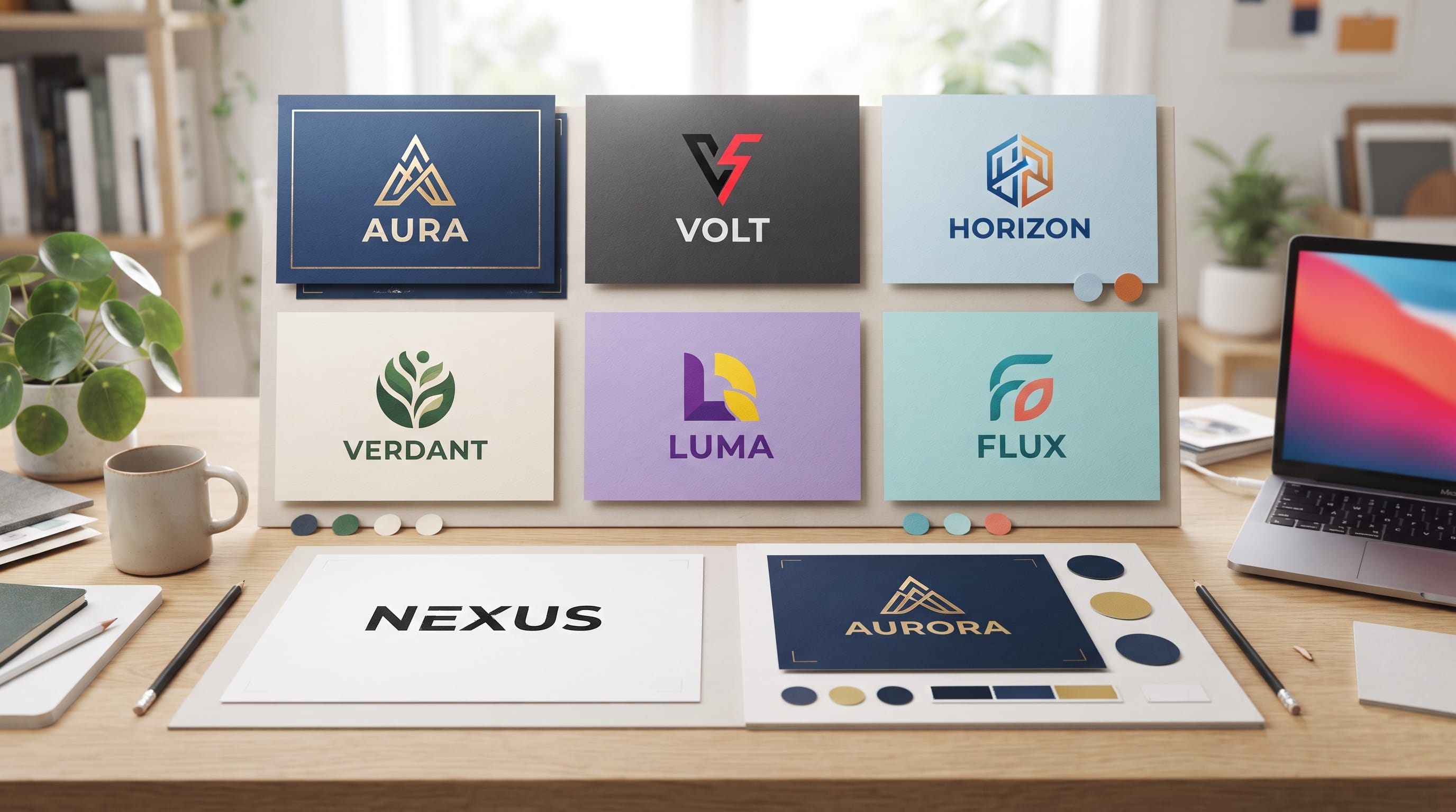
Choosing the right logo color combinations can completely change how people perceive a brand. A logo may use a strong symbol and beautiful typography, but the colors often create the first emotional impression. Blue can feel dependable, green can suggest nature or wellness, while orange can bring energy and warmth. When two or more colors work together, they can give a logo even more personality and make the brand easier to recognize.
However, choosing colors should not be based only on personal preference.
The strongest palettes reflect the brand’s personality, audience, industry, and positioning. They also need enough contrast to stay readable across websites, packaging, social media, signs, and printed materials.
Below are practical logo color combinations that designers can explore when building distinctive visual identities.
Why Logo Color Combinations Matter
Color is one of the most recognizable parts of a visual identity.
Customers may notice a familiar color palette before they read the company name.
Strong logo color combinations can help communicate qualities such as:
- Trust
- Energy
- Luxury
- Creativity
- Sustainability
- Friendliness
- Professionalism
- Innovation
Color can also help separate a brand from competitors.
For example, if nearly every company in an industry uses dark blue, a carefully designed green, orange, or purple identity may create stronger differentiation.
The goal is not to choose unusual colors simply to be different. The palette still needs to make sense for the audience and brand personality.
1. Blue and Orange Logo Color Combinations
Blue and orange create strong visual contrast because one feels cool while the other feels warm.
Blue commonly communicates:
- Trust
- Stability
- Technology
- Professionalism
Orange can communicate:
- Energy
- Creativity
- Friendliness
- Action
Together, they create balanced logo color combinations suitable for businesses that want to feel dependable without becoming too conservative.
This pairing can work well for:
- Technology brands
- Marketing agencies
- Sports companies
- Digital services
- Software businesses
Try using dark navy as the dominant color and orange as a smaller accent.
This usually feels more sophisticated than giving both colors equal visual weight.
2. Black and Gold for Luxury Branding
Black and gold are classic choices for premium positioning.
Black creates strength and sophistication, while gold adds a sense of exclusivity and quality.
This combination can work for:
- Luxury fashion
- Jewelry
- Premium restaurants
- Beauty products
- Hotels
- High-end services
However, designers should use gold carefully.
Too much metallic styling can make the identity feel decorative rather than refined.
A simple black wordmark with a small gold symbol or detail can often create a stronger result.
For digital applications where real metallic gold cannot be reproduced, use a warm gold or muted ochre tone.
3. Green and Beige Logo Color Combinations
Green and beige create a soft, natural identity.
This palette is particularly useful for brands connected with:
- Sustainability
- Organic products
- Wellness
- Home decor
- Skincare
- Gardening
- Food
Instead of using bright green, try:
- Sage
- Olive
- Forest green
- Moss
Pair the green with:
- Cream
- Sand
- Warm beige
- Off-white
These logo color combinations feel calmer and more sophisticated than bright green paired with pure white.
For premium natural brands, dark forest green with warm cream can work especially well.
4. Red and Navy for Strong Professional Brands
Red and navy create an energetic but trustworthy combination.
Navy brings stability while red adds confidence and urgency.
This pairing is often useful for:
- Consulting
- Sports
- Education
- Financial services
- Professional organizations
- Transportation
Use navy as the main color if the brand should feel more established.
Use red more prominently when energy and action are important.
Be careful with extremely bright red and dark blue together because the result can feel overly aggressive.
Muted red or burgundy can create a more refined identity.
5. Purple and Pink for Creative Brands
Purple and pink can create expressive and imaginative branding.
Purple is often associated with:
- Creativity
- Imagination
- Premium positioning
- Individuality
Pink can introduce:
- Warmth
- Playfulness
- Energy
- Softness
These logo color combinations can work beautifully for:
- Creative studios
- Beauty brands
- Lifestyle businesses
- Digital products
- Entertainment
- Fashion
Instead of defaulting to bright purple and hot pink, explore more sophisticated combinations.
For example:
Deep plum + dusty rose
or:
Lavender + coral pink
Small changes in saturation can completely change the personality.
6. Black and White Logo Color Combinations
Black and white remain among the most flexible logo palettes.
They work well when the identity relies heavily on:
- Typography
- Shape
- Composition
- Photography
Black-and-white logos can feel:
- Minimal
- Modern
- Editorial
- Premium
- Timeless
This pairing works particularly well for:
- Fashion
- Architecture
- Photography
- Creative studios
- Luxury services
A black-and-white logo is also extremely practical.
It can reproduce easily on documents, packaging, stamps, embroidery, and other applications where full color may not be available.
Even when a logo has a larger brand palette, always test whether it still works in one color.
7. Teal and Coral for Fresh Modern Branding
Teal and coral create a fresh balance between cool and warm tones.
Teal can communicate:
- Calm
- Modernity
- Reliability
- Freshness
Coral adds:
- Energy
- Warmth
- Approachability
This combination can work for:
- Travel
- Wellness
- Hospitality
- Creative agencies
- Lifestyle products
It feels more distinctive than standard blue and orange while keeping a similar warm-versus-cool contrast.
Use muted versions if you want the brand to feel more sophisticated.
Also Read: Best Sports Logo Design Ideas for a Powerful Team Identity
8. Brown and Cream for Warm Natural Brands
Brown and cream can create branding that feels grounded, warm, and handcrafted.
These logo color combinations work especially well for:
- Coffee
- Bakeries
- Handmade products
- Furniture
- Natural skincare
- Restaurants
- Artisan brands
Possible combinations include:
- Espresso brown + cream
- Caramel + ivory
- Walnut + beige
Brown has become increasingly useful for brands that want something natural without relying on green.
It pairs especially well with serif typography and tactile packaging materials.
9. Blue and Green for Trust and Sustainability
Blue and green combine two qualities that many businesses want to communicate.
Blue suggests trust and professionalism.
Green can suggest growth, health, and nature.
Together, they work well for:
- Health technology
- Environmental businesses
- Finance
- Education
- Renewable energy
- Wellness
Avoid choosing two colors with almost identical brightness.
For stronger contrast, try:
Navy + fresh green
or:
Deep teal + sage
Good contrast helps each color maintain its own role in the identity.
10. Yellow and Black Logo Color Combinations
Yellow and black create immediate visual impact.
Yellow communicates energy and optimism, while black provides enough contrast to keep the result strong and readable.
This pairing can work well for:
- Creative businesses
- Construction
- Sports
- Technology
- Youth brands
- Entertainment
Because yellow is highly noticeable, it can work effectively as an accent.
For example:
Black logo + yellow background
can create a stronger visual identity than trying to make every logo element yellow.
This is one of the strongest logo color combinations when visibility is important.
11. Burgundy and Cream for Elegant Branding
Burgundy feels richer and more mature than bright red.
When combined with cream, it creates an elegant and warm identity.
This combination is suitable for:
- Restaurants
- Wine-inspired hospitality brands
- Fashion
- Beauty
- Premium packaging
- Interior design
Burgundy can also pair nicely with muted gold accents.
Keep the overall palette restrained to preserve sophistication.
12. Forest Green and Gold Logo Color Combinations
Forest green and gold create a luxurious natural direction.
Green connects the identity with nature, while gold introduces premium character.
This pairing can suit:
- Organic luxury products
- Botanical skincare
- Hotels
- Wellness
- Premium food
- Interior brands
A dark green background with subtle gold lettering can feel particularly strong on packaging.
However, test the logo without metallic effects as well.
The core identity should remain recognizable even when only flat colors are available.
13. Navy and Cream for Timeless Brands
Navy and cream create a softer alternative to black and white.
This combination often feels:
- Professional
- Calm
- Established
- Editorial
- Sophisticated
It is especially effective for:
- Consulting firms
- Interior studios
- Fashion
- Hospitality
- Professional services
Cream reduces the harsh contrast of pure white while still giving dark navy enough separation.
These logo color combinations are useful when a brand needs to feel trustworthy without looking overly corporate.
14. Orange and Cream for Friendly Branding
Orange paired with cream creates warm, optimistic branding.
This works well for:
- Cafes
- Food brands
- Creative businesses
- Lifestyle products
- Children’s brands
- Local shops
A slightly muted orange can create a retro-inspired identity.
For example:
Burnt orange + warm cream
can work beautifully with vintage typography and handmade illustration.
Bright orange creates a much more energetic and contemporary feeling.
15. Monochromatic Logo Color Combinations
Not every logo needs contrasting colors.
A monochromatic palette uses variations of one main hue.
For example:
Dark blue + medium blue + pale blue
or:
Forest green + sage + light mint
This creates a cohesive identity and can be especially useful for modern brands.
Monochromatic palettes work well when:
- The logo has several parts
- The broader branding needs many shades
- You want consistency without visual complexity
The main challenge is contrast.
Make sure adjacent shades remain different enough to distinguish.
Also Read: Wordmark Logo Design Examples and Tips for Better Branding
16. Pastel Logo Color Combinations
Pastels create gentle and approachable branding.
Examples include:
- Blush + sage
- Lavender + cream
- Pale blue + peach
- Mint + soft yellow
These combinations can work well for:
- Baby products
- Wellness
- Beauty
- Lifestyle businesses
- Cafes
- Creative brands
Avoid using too many pale colors without a darker supporting tone.
Adding charcoal, navy, or deep green for typography can improve readability.
17. Bold Logo Color Combinations for Creative Brands
Creative companies can often explore more expressive palettes.
Examples include:
- Cobalt blue + bright orange
- Electric purple + lime
- Hot pink + deep red
- Turquoise + yellow
Bold logo color combinations work best when the rest of the identity is controlled.
If the color palette is highly energetic, typography and layout can remain relatively simple.
This prevents the visual system from becoming overwhelming.
18. How to Choose Logo Color Combinations by Industry
Color should support the message of the business.
Technology
Consider:
- Blue + orange
- Navy + green
- Purple + blue
Natural and Sustainable Brands
Consider:
- Green + beige
- Forest green + cream
- Brown + sage
Luxury
Consider:
- Black + gold
- Burgundy + cream
- Forest green + gold
Creative Businesses
Consider:
- Purple + pink
- Teal + coral
- Yellow + black
Food and Hospitality
Consider:
- Orange + cream
- Brown + beige
- Burgundy + cream
Industry conventions can provide a useful starting point, but they do not need to become strict rules.
19. Use Color Psychology Carefully
Color psychology can help guide design decisions, but it should not be treated as a universal formula.
Red does not always mean excitement.
Blue does not automatically create trust.
Meaning depends on:
- Shade
- Saturation
- Context
- Culture
- Typography
- Industry
- Supporting imagery
For example, pastel blue may feel peaceful, while electric blue can feel energetic and digital.
When choosing logo color combinations, evaluate the whole brand rather than relying on one simplified color meaning.
20. Test Logo Color Combinations in Real Applications
A palette that looks attractive on an artboard may behave differently in actual branding.
Test the logo on:
- Website headers
- Social media profiles
- Packaging
- Business cards
- Signage
- Merchandise
- Mobile screens
- Black-and-white printing
Also test both light and dark backgrounds.
A strong identity should remain recognizable across different formats.
Keep Contrast and Readability in Mind
Colors should never make the logo difficult to understand.
Be careful with combinations such as:
- Yellow on white
- Light gray on cream
- Pale pink on white
- Similar shades of blue
- Dark red on dark brown
If two colors have similar brightness, the logo may lose clarity.
Create enough contrast between important elements.
This becomes especially important for small logos and digital applications.
Build a Flexible Brand Color System
The logo does not need to use every brand color.
In fact, a strong brand may have:
- Primary logo colors: two colors
- Supporting palette: three or four additional shades
For example:
- Logo: forest green + cream
- Supporting colors: sage, sand, terracotta, charcoal
This gives designers more flexibility for social media, packaging, websites, and advertising while keeping the logo simple.
Common Logo Color Combination Mistakes
Avoid these common problems.
Using Too Many Colors
Two main colors are often enough.
Following Trends Without Considering the Brand
A fashionable palette may not fit the company long term.
Ignoring Contrast
Beautiful colors still need to remain readable.
Choosing Colors Only by Personal Preference
Brand colors should support audience and positioning.
Forgetting One-Color Applications
Always create a version that works without the full palette.
Making Every Color Equally Dominant
Give each color a role.
A primary color creates recognition while accents provide emphasis.
Also Read: Best Business Logo Ideas for Small Businesses in 2026
Final Thoughts on the Best Logo Color Combinations
The best logo color combinations are not simply the most attractive palettes. They are combinations that communicate the right personality, remain easy to recognize, and work consistently across real brand applications.
Blue and orange can balance professionalism with energy. Black and gold can create premium positioning. Green and beige can communicate a softer natural personality, while purple and pink can support creative and expressive brands.
Start by defining how the brand should feel.
Then choose one dominant color and one supporting color that reinforce that personality.
Test the palette in multiple environments, including small digital icons, large signage, packaging, social media, and monochrome applications.
Most importantly, build a system rather than choosing colors individually.
When typography, logo shape, imagery, and logo color combinations support the same message, the identity becomes more coherent, memorable, and useful across every customer touchpoint.

For high-quality fonts to boost your income, check out DM Letter Studio. Our professional fonts are perfect for branding, marketing, and content creation. So, don’t miss this opportunity.