
Branding Design Tutorial for Building a Strong Visual Identity
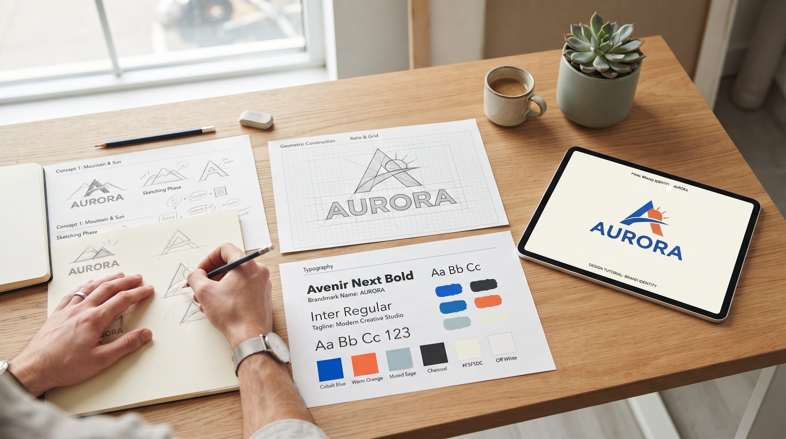
A practical branding design tutorial should teach more than how to create a logo. A strong visual identity connects strategy, typography, color, imagery, composition, and brand applications into one recognizable system. When these elements work together, customers can recognize the brand across websites, packaging, social media, presentations, advertising, and physical products.
Good branding starts before opening design software.
Designers first need to understand the business, audience, competitors, personality, and goals. Without that foundation, it is easy to create attractive visuals that do not communicate the right message.
This branding design tutorial walks through the process from early research to final brand guidelines. It is designed for brand designers who want a repeatable workflow for real client projects.
Why a Branding Design Tutorial Should Start With Strategy
Visual identity is only one part of branding.
Before developing colors or logos, understand what the brand needs to communicate.
Start by answering questions such as:
- What does the business offer?
- Who is the target audience?
- What problem does it solve?
- How should customers feel about it?
- What makes it different from competitors?
- Where will the identity appear?
For example, a premium skincare company and a playful children’s snack brand require very different visual systems.
Both could use excellent typography and beautiful colors, but those choices need to reflect different audiences and personalities.
A useful branding design tutorial therefore begins with clarity rather than decoration.
1. Research the Brand and Market
Research provides context for creative decisions.
Review the client’s:
- Products
- Services
- Customers
- Competitors
- Current visual identity
- Marketing materials
Look at competitor branding too.
You are not studying competitors to copy them.
Instead, identify patterns.
For example, if every competitor uses blue and geometric sans serif typography, your client may need a different direction to become more recognizable.
Identify Brand Personality
Choose several words that describe the intended personality.
For example:
Modern, confident, accessible
or:
Elegant, natural, calm
These words become useful filters later.
When choosing a color or typeface, ask whether it supports those characteristics.
2. Define the Creative Direction
The next stage in this branding design tutorial is translating research into a visual direction.
Avoid jumping immediately into logo design.
First define what the identity should feel like.
You might create two or three possible directions.
For example:
Minimal and Premium
Neutral colors, sophisticated typography, generous whitespace.
Bold and Contemporary
Strong typography, vivid color, geometric shapes.
Natural and Handcrafted
Earthy colors, organic imagery, tactile materials.
Presenting different directions can help clients make decisions before you spend time developing detailed visual assets.
3. Create a Brand Mood Board
A mood board turns abstract personality words into visible references.
Include elements such as:
- Typography
- Photography
- Colors
- Materials
- Shapes
- Layouts
- Illustration
Do not fill the board with random attractive images.
Every reference should support the desired direction.
For a premium natural skincare brand, your mood board might include:
- Warm stone textures
- Cream packaging
- Botanical photography
- Refined serif typography
- Muted green accents
A good mood board becomes a visual filter for the rest of the project.
4. Sketch Logo Concepts
Now the branding design tutorial moves into logo development.
Start with simple sketches rather than polished digital artwork.
Explore:
- Wordmarks
- Monograms
- Symbols
- Combination marks
- Emblems
Sketching encourages speed.
You can explore twenty rough ideas more quickly than polishing one digital concept.
Focus on Strong Concepts
A logo does not need a complicated hidden story.
It needs to be:
- Recognizable
- Appropriate
- Flexible
- Clear
Avoid forcing multiple ideas into one symbol.
One strong concept usually creates a more memorable result.
5. Build the Logo Digitally
After identifying promising sketches, recreate the strongest concepts as vector artwork.
Check:
- Proportions
- Alignment
- Spacing
- Curves
- Stroke consistency
Start in black and white.
If a logo only works because of beautiful colors or gradients, the underlying form may not be strong enough.
Once the structure works, test color.
Create Logo Variations
A complete identity may need:
Primary Logo
The main version.
Secondary Logo
Useful for alternative layouts.
Icon or Monogram
For smaller applications.
Black Version
For simple reproduction.
White Version
For dark backgrounds.
This flexibility is essential for real-world branding.
Also Read: YouTube Video Editing Tutorial for Beginners and New Creators
6. Choose a Brand Color Palette
Color influences recognition and personality.
The next stage of a strong branding design tutorial is creating a controlled palette.
A typical system may include:
Primary Color
The most recognizable brand color.
Secondary Colors
Support the main identity.
Accent Color
Highlights important details.
Neutrals
Used for backgrounds, typography, and supporting layouts.
For example:
Deep blue + warm orange + cream + charcoal could create a confident contemporary identity.
Avoid adding colors simply because they look attractive.
Each color should have a role.
7. Create a Typography System
Typography should work beyond the logo.
A brand may need type for:
- Website headings
- Body copy
- Packaging
- Social graphics
- Presentations
A practical typography system might include:
- Display Typeface: major headlines
- Body Typeface: paragraphs
- Supporting Style: captions and labels
You do not always need three different fonts.
One versatile family with several weights may be enough.
Test Typography in Real Content
Do not evaluate fonts using only the alphabet.
Create realistic examples:
- Homepage headline
- Product description
- Instagram graphic
- Packaging label
This reveals whether the type system actually works.
8. Develop Supporting Graphic Elements
A logo alone rarely creates a complete identity.
Supporting graphics help extend the visual system.
Consider:
- Patterns
- Icons
- Shapes
- Lines
- Frames
- Illustrations
For example, a geometric logo might inspire a repeated pattern.
A curved symbol could influence image frames or section dividers.
This makes the identity feel connected without repeating the logo everywhere.
9. Define Photography and Imagery
The visual language should also define how photographs or illustrations are used.
Consider:
- Lighting
- Background
- Cropping
- Composition
- Subject style
- Color treatment
For example, a wellness brand might use soft natural light and warm neutral backgrounds.
A technology company could use clean architecture, structured compositions, and cooler tones.
Consistency in imagery can make a brand recognizable even when the logo is absent.
10. Apply the Branding Design to Real Materials
This stage of the branding design tutorial tests whether the system actually works.
Apply the identity to relevant touchpoints.
Depending on the business, these may include:
- Business cards
- Packaging
- Website
- Social posts
- Signage
- Merchandise
- Presentation slides
Do not create mockups only because they look impressive.
Choose applications the client will actually use.
A restaurant might need menus and takeaway packaging.
A software company may need website screens and presentation templates.
11. Test the Brand Across Different Sizes
Strong identity systems need flexibility.
Test the logo at:
- Large signage size
- Website header size
- Social avatar size
- Small packaging size
Fine details that look beautiful on a large screen may disappear when reduced.
Typography also needs testing.
A decorative typeface that works for large headlines may become difficult to read on a small label.
Testing reveals these weaknesses before final delivery.
Also Read: Mobile Photography Tutorial for Creators Who Want Better Photos
12. Build Brand Consistency
Consistency does not mean every design should look identical.
It means different materials should feel related.
Repeat recognizable elements such as:
- Color
- Typography
- Grid
- Photography
- Shapes
- Spacing
For example, Instagram graphics can vary in layout while still sharing the same type hierarchy and color palette.
A good branding design tutorial teaches designers to create rules flexible enough for different situations.
13. Design Brand Guidelines
Brand guidelines explain how the visual identity should be used.
A basic guide may include:
Logo
Show primary and secondary versions.
Clear Space
Define how much empty space should surround the logo.
Minimum Size
Explain how small the logo can appear.
Colors
Include relevant color values.
Typography
Define typefaces and hierarchy.
Imagery
Explain photography or illustration direction.
Applications
Show examples of the system in use.
Guidelines help clients maintain consistency after the designer finishes the project.
14. Prepare Professional Brand Files
File preparation is an important part of the branding design tutorial process.
Organize final assets clearly.
For example:
01_Logos
02_Colors
03_Font_Info
04_Brand_Guidelines
05_Social
06_Print
Logo exports may include:
- SVG
- PNG
- JPG
Provide versions appropriate for both light and dark backgrounds.
Clear organization makes the identity easier for clients and future designers to use.
Common Branding Design Mistakes
Several problems can weaken an otherwise promising identity.
Designing the Logo Too Early
Complete enough research first.
Using Too Many Colors
A smaller palette usually creates stronger recognition.
Using Too Many Fonts
Keep typography controlled.
Copying Trends
Trends can provide inspiration, but the identity needs its own personality.
Ignoring Real Applications
A logo needs to work outside the presentation mockup.
Creating Inconsistent Imagery
Photography should feel connected to the visual system.
Making Guidelines Too Complicated
Rules should help people use the identity, not make it impossible to work with.
A Simple Branding Design Tutorial Workflow
Here is the full process in one sequence:
- Research the business.
- Understand the audience.
- Analyze competitors.
- Define personality.
- Build creative directions.
- Create a mood board.
- Sketch logo concepts.
- Refine the logo.
- Build the color palette.
- Create the typography system.
- Develop supporting graphics.
- Define imagery.
- Apply the identity.
- Test different sizes.
- Create brand guidelines.
- Prepare final files.
Following this branding design tutorial creates a structured workflow while still leaving room for creativity.
How to Improve Your Branding Design Process
The best way to improve is to practice complete identity projects rather than creating isolated logos.
Choose a fictional business and develop:
- Strategy
- Mood board
- Logo
- Colors
- Typography
- Packaging
- Website concept
- Guidelines
This helps you understand how every part of an identity affects the others.
Also study existing brands.
Instead of only asking whether you like the design, ask:
- Why does the typography work?
- Why was this color selected?
- How does the logo adapt?
- What makes the identity recognizable?
This type of analysis develops stronger design judgment.
Also Read: Packaging Design Tutorial: Create Professional Packaging
Final Thoughts on Branding Design Tutorial
A strong visual identity is not created by designing a logo and adding several matching colors.
It requires a system.
This branding design tutorial starts with research because the visual direction needs to support a real business, audience, and positioning.
Mood boards help translate strategy into visual language. Logo exploration creates a recognizable core, while color, typography, imagery, and supporting graphics expand the identity into something flexible.
The final applications reveal whether the system actually works.
Brand guidelines then help protect that consistency as more people begin using the assets.
Most importantly, do not design each element separately.
The logo, typography, colors, imagery, layout, and applications should feel like parts of one visual language.
When research, strategy, creativity, and consistency work together, a branding design tutorial becomes more than a sequence of design steps. It becomes a repeatable process for building visual identities that are distinctive, practical, professional, and ready to grow with the brand.

For high-quality fonts to boost your income, check out DM Letter Studio. Our professional fonts are perfect for branding, marketing, and content creation. So, don’t miss this opportunity.