
How to Use Brutalist Design in Modern Branding
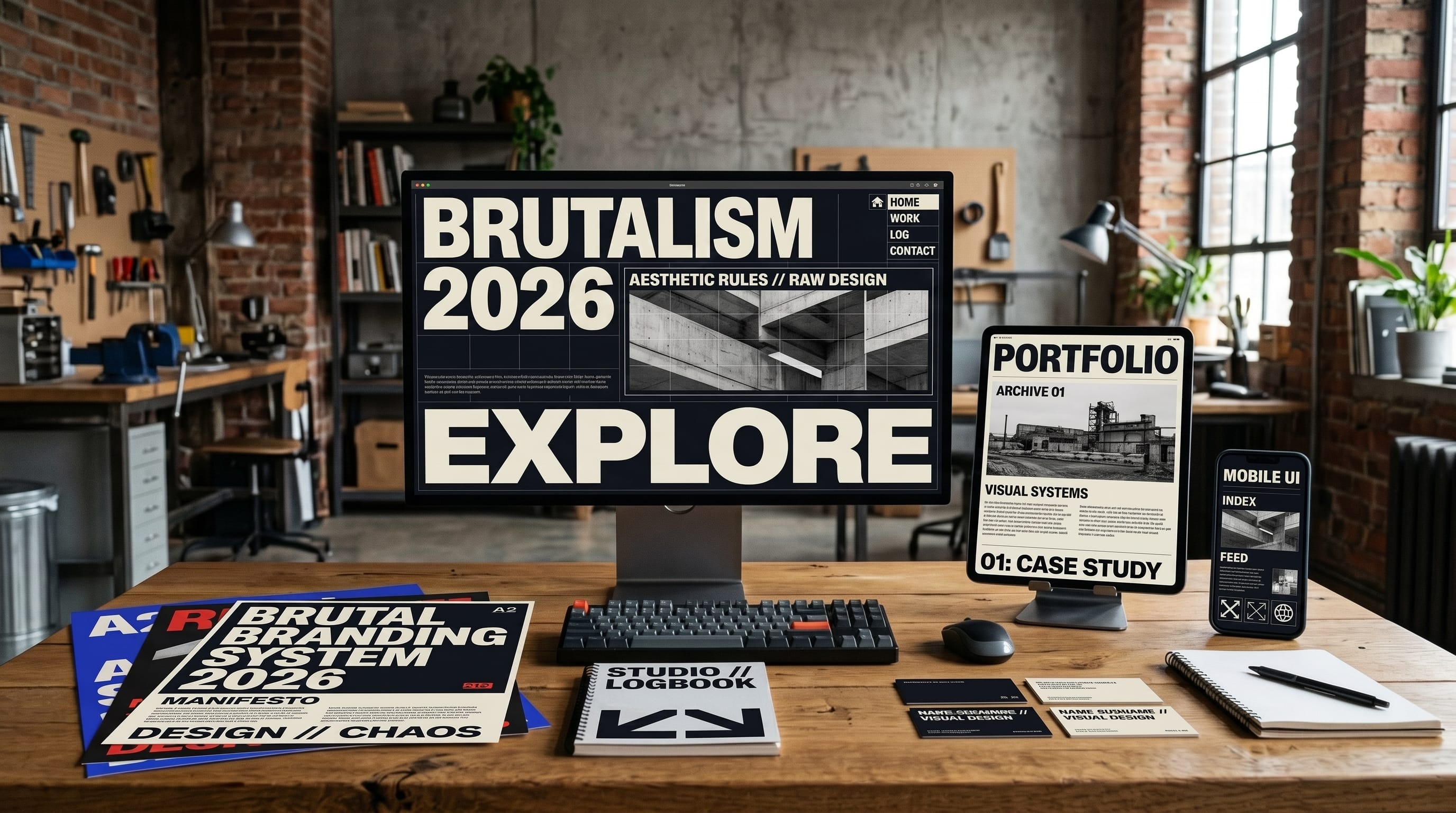
Brutalist design can give modern brands a bold, unconventional identity that immediately stands apart from polished minimalist competitors. Instead of hiding structure behind perfect grids, soft gradients, and decorative effects, brutalist-inspired branding often celebrates raw typography, visible borders, unexpected layouts, strong contrast, and deliberately direct communication.
The style takes inspiration from architectural Brutalism and later digital interpretations that favored function, honesty, and exposed structure. In graphic design and branding, however, Brutalism is not about copying concrete buildings. It is more about rejecting unnecessary polish and allowing typography, layout, imagery, and information to feel direct and unapologetic.
For designers, the challenge is using brutalist design intentionally. A chaotic layout is not automatically brutalist, just as an ugly website is not automatically experimental. Successful branding still needs hierarchy, recognition, accessibility, and a clear relationship with its audience.
This guide explains how designers can bring Brutalism into logos, typography, websites, packaging, social media, and complete brand identities while keeping the result useful and professional.
What Is Brutalist Design in Branding?
Brutalist branding usually favors direct visual communication over decorative refinement.
Common characteristics include:
- Oversized typography
- Strong black-and-white contrast
- Visible grids and borders
- Minimal visual effects
- Raw photography
- Unusual alignment
- Large blocks of color
- Repetitive typography
- Sharp hierarchy
- Functional navigation
- Intentionally imperfect layouts
Traditional branding often tries to make every element feel polished and harmonious.
Brutalist design may intentionally introduce tension.
A heading can feel dramatically oversized. A photograph may be cropped unexpectedly. Navigation might remain visibly structured rather than blending smoothly into the background.
The result can feel raw, energetic, independent, and memorable.
Why Brutalist Design Works for Modern Brands
Modern visual culture is filled with smooth interfaces, rounded cards, neutral sans serif typography, soft shadows, and carefully balanced compositions.
These approaches can be effective, but similarity creates an opportunity.
A brand that suddenly uses enormous black lettering, exposed borders, direct photography, and unconventional spacing can immediately attract attention.
Brutalist branding can communicate qualities such as:
- Confidence
- Independence
- Creativity
- Rebellion
- Transparency
- Experimentation
- Cultural awareness
- Youthfulness
This makes the style especially relevant for:
- Creative studios
- Fashion labels
- Music brands
- Cultural organizations
- Art projects
- Technology startups
- Independent publishers
- Experimental products
However, brutalist design should support the personality of the brand rather than simply follow a trend.
Start Brutalist Design With a Clear Brand Strategy
Before designing anything, define what the brand should communicate.
Ask:
- Who is the audience?
- What makes the business different?
- Should it feel rebellious or professional?
- Is the brand playful or serious?
- How experimental can the identity become?
- Which platforms matter most?
A luxury financial consultancy may have little reason to use chaotic brutalist visuals.
An independent fashion label targeting young creative customers may benefit considerably more.
Understanding the personality first prevents the style from becoming decoration without meaning.
Use Oversized Typography in Brutalist Branding
Typography is often the most important element in brutalist design.
Headlines can become enormous graphic objects.
For example:
- NEW
- IDEAS
- ONLY
could occupy nearly the entire page.
Designers can experiment with:
- Very large text
- Tight spacing
- Uppercase lettering
- Heavy weights
- Condensed fonts
- Monospaced type
- Repeated words
The typography itself becomes visual imagery.
You do not necessarily need illustrations or elaborate background graphics when the words already provide strong visual impact.
Create Strong Brutalist Typography Hierarchy
Oversized typography still needs hierarchy.
Consider a structure such as:
- Headline: 120 px bold display type
- Subheading: 32 px medium type
- Information: 16 px sans serif
- Metadata: 12 px monospace
The differences should be obvious.
Avoid making every element loud.
If everything is oversized, viewers lose a clear entry point.
Professional brutalist design usually controls visual aggression rather than applying it everywhere.
Mix Serif, Sans Serif, and Monospace Fonts
Brutalist branding can benefit from intentionally contrasting typography.
One useful system is:
- Primary: Heavy sans serif
- Secondary: Editorial serif
- Utility: Monospace
The heavy sans serif delivers impact.
The serif creates unexpected cultural or editorial contrast.
The monospace style can communicate technical information, labels, dates, or navigation.
Limit the total number of fonts to avoid unnecessary visual confusion.
The goal is contrast with structure.
Use Black and White as a Brutalist Design Foundation
Black and white create one of the strongest starting points for brutalist design.
The combination offers:
- Maximum contrast
- Strong typography
- Easy hierarchy
- Flexible photography
- Clear structural elements
A simple system might use:
- Background: White
- Headline: Black
- Border: Black
- Accent: Electric green
Or:
- Background: Black
- Text: White
- Accent: Red
Adding one strong accent color can create more personality without weakening the raw visual direction.
Add One Aggressive Accent Color
Brutalist branding often works well with direct, saturated colors.
Consider:
- Electric blue
- Signal red
- Acid green
- Bright yellow
- Hot pink
- Orange
Use the accent strategically for:
- Buttons
- Important text
- Labels
- Background sections
- Navigation states
- Calls to action
Avoid introducing several unrelated bright colors unless the brand deliberately uses a multi-color system.
One dominant accent usually feels more controlled.
Use Visible Borders and Graphic Lines
Many polished interfaces attempt to make their underlying grid invisible.
Brutalist layouts often do the opposite.
Designers can expose structure through:
- Thick borders
- Thin black rules
- Boxed sections
- Visible columns
- Underlines
- Dividers
For example, a website homepage might consist of large rectangular sections separated by one-pixel black lines.
This makes the interface feel structured and direct.
Visible borders are especially effective in:
- Websites
- Posters
- Menus
- Editorial layouts
- Product cards
They can become a recognizable element of the overall brutalist design system.
Also Read: Best Graphic Design Ideas for Social Media Content in 2026
Use Asymmetrical Brutalist Layouts
Traditional branding frequently relies on perfectly centered or evenly balanced compositions.
Brutalist layouts can introduce asymmetry.
Try:
- Placing headlines close to an edge
- Moving images off center
- Leaving unexpectedly large empty areas
- Creating uneven columns
- Allowing text to cross grid boundaries
However, asymmetry should still feel deliberate.
Randomly placing objects around a canvas usually creates disorder rather than meaningful tension.
A hidden grid can still control the layout even when the final composition appears unconventional.
Use Raw Photography in Brutalist Branding
Highly retouched commercial photography may clash with a raw brutalist identity.
Instead, consider imagery that feels more direct.
Examples include:
- Direct-flash photography
- Documentary images
- Black-and-white portraits
- Grainy photography
- Unusual crops
- Product images without elaborate staging
- Behind-the-scenes photography
The goal is not necessarily poor image quality.
The goal is authenticity and visual immediacy.
Photography can contrast strongly with clean typography and geometric borders.
Experiment With Unusual Image Cropping
Conventional branding tends to display important subjects completely.
Brutalist design can be more aggressive.
- A portrait might show only half the face.
- A product could extend beyond the frame.
- A photograph might occupy one narrow vertical strip.
These unusual crops create tension and movement.
Always make sure the essential information remains understandable.
Experimentation should strengthen communication rather than hide the subject completely.
Use Repetition as a Graphic Tool
Repeated typography is particularly effective in brutalist graphics.
For example:
SALE SALE SALE SALE SALE
or:
NEW
NEW
NEW
NEW
Repetition can create:
- Rhythm
- Texture
- Movement
- Visual emphasis
Designers can vary size, orientation, or placement while keeping the same word.
This technique works well for:
- Posters
- Fashion campaigns
- Social graphics
- Website hero sections
- Event promotions
Use repetition selectively so important content remains visible.
Brutalist Design for Logo Systems
Not every brutalist brand needs a strange or distorted logo.
In fact, a simple wordmark can work extremely well.
The surrounding identity can provide the experimental personality.
A logo system might include:
Primary Wordmark
Simple bold typography.
Compact Mark
Initials inside a rectangular border.
Utility Version
Plain text treatment for small applications.
This allows the brand to remain recognizable even when the surrounding brutalist design changes dramatically.
Brutalist Design for Website Branding
Web design is one of the most recognizable applications of modern Brutalism.
A brutalist-inspired website may use:
- Large HTML-style typography
- Exposed borders
- Minimal animation
- Default-like buttons
- Strong text links
- Unusual grids
- High-contrast backgrounds
The website may feel deliberately functional rather than polished.
However, usability still matters.
Navigation should remain clear.
Buttons should look clickable.
Text should remain readable.
Mobile layouts should function correctly.
Effective brutalist design challenges visual conventions without frustrating users unnecessarily.
Keep Brutalist Websites Accessible
Experimental design does not excuse poor accessibility.
Maintain:
- Strong text contrast
- Readable font sizes
- Clear link states
- Keyboard navigation
- Descriptive labels
- Appropriate heading structure
- Comfortable line lengths
Avoid tiny text simply because it looks editorial.
Do not use unpredictable interactions when a conventional control would communicate more clearly.
A bold visual identity becomes stronger when users can actually interact with it.
Brutalist Design for Packaging
Packaging offers another strong opportunity for Brutalism.
Instead of complex illustration, try:
- Huge product names
- Visible information
- Black-and-white labels
- Industrial typography
- Unusual text placement
- Strong color blocks
Imagine a coffee package with:
COFFEE
taking up half the front panel.
Below it:
ETHIOPIA
NATURAL PROCESS
250 G
The result can feel straightforward and confident.
Raw brutalist design can work particularly well for food, beverages, cosmetics, fashion, and creative products.
Brutalist Branding for Fashion
Fashion brands can use Brutalism to create an editorial or underground identity.
Potential elements include:
- Oversized type
- Unusual photography
- Model imagery with direct flash
- Monochrome layouts
- Repeated logos
- Industrial labels
- Extreme cropping
Social posts can resemble experimental posters rather than conventional advertisements.
Keep enough consistency in typography and color so the campaign remains identifiable as one brand.
Also Read: Best Retro Graphic Design Ideas for Modern Creatives
Brutalist Design for Social Media
A brutalist identity should translate easily into social formats.
Useful templates include:
Announcement
Huge headline + small metadata.
Product Launch
Full-frame photograph + oversized product name.
Quote
Massive typography with no illustration.
Carousel
Visible grid and numbered information.
Event Graphic
Bold typography + strong border system.
Repeated structural elements make different posts feel connected.
Use Brutalist Design With Minimalism
Brutalism and minimalism can overlap.
Both can reduce decoration.
The difference is personality.
Minimalism may aim for calmness, elegance, and refinement.
Brutalism often feels more confrontational, raw, and structural.
A minimalist brutalist identity might use:
- Black and white
- One font
- Huge headlines
- Large negative space
- Visible borders
Very few elements are required.
The impact comes from scale and contrast.
Combine Brutalist Design With Editorial Style
Editorial design is an excellent partner for Brutalism.
Use:
- Large serif typography
- Small captions
- Page numbers
- Columns
- Strong images
- Unexpected whitespace
- Repeated metadata
This combination can create sophisticated experimental branding for:
- Fashion
- Architecture
- Art
- Photography
- Creative studios
- Magazines
Editorial structure prevents the brutalist elements from becoming completely chaotic.
Create Brutalist Templates for Brand Consistency
Even experimental brands benefit from templates.
A useful template system might define:
- Headline position
- Border thickness
- Accent color
- Type scale
- Logo position
- Image treatment
- Metadata style
For example:
- Template A: Text-only campaign
- Template B: 50% image + 50% typography
- Template C: Full-image poster with bordered caption
- Template D: Numbered information card
Every composition can feel different while sharing recognizable visual rules.
When Brutalist Design Should Be Simplified
Not every customer interaction needs maximum visual experimentation.
Use stronger Brutalism for:
- Campaigns
- Posters
- Landing pages
- Social graphics
- Event design
Use simpler layouts for:
- Checkout
- Forms
- Legal pages
- Customer support
- Long articles
- Account dashboards
Function should determine the intensity of the visual approach.
A brand can feel brutalist while still offering comfortable experiences when customers need to complete important tasks.
Common Brutalist Design Mistakes
1. Making Everything Intentionally Ugly
Brutalism is not an excuse for careless design.
2. Ignoring Hierarchy
Large typography still needs clear priorities.
3. Using Too Many Fonts
Contrast becomes confusion when every text block uses a different style.
4. Randomizing Every Layout
A brand still needs recognizable rules.
5. Ignoring Mobile Design
Experimental desktop layouts need careful adaptation for smaller screens.
6. Sacrificing Accessibility
Readable and usable interfaces remain essential.
7. Copying Other Brutalist Websites
Create a visual system connected to the brand instead of reproducing popular examples.
8. Overusing Distortion
Not every letter needs to be warped, stretched, or rotated.
How to Balance Brutalist Design and Professional Branding
One useful approach is the 70/30 principle.
Keep roughly 70% of the system predictable:
- Logo
- Core typography
- Basic colors
- Navigation
- Information hierarchy
Use the remaining 30% for experimentation:
- Extreme headline scale
- Unexpected crops
- Raw photography
- Asymmetry
- Bold accent colors
This balance allows a brand to remain functional while still feeling unconventional.
The exact ratio can change according to the audience.
Brutalist Design Checklist for Brand Designers
Before finalizing a brutalist identity, ask:
- Does the style match the audience?
- Is typography readable?
- Is there a clear hierarchy?
- Are colors accessible?
- Is the logo recognizable?
- Are layouts intentionally structured?
- Does photography match the visual direction?
- Are borders and graphic elements consistent?
- Does the identity work on mobile?
- Can the system adapt to social media?
- Does packaging remain functional?
- Are templates available for repeated content?
- Is the design bold without becoming confusing?
If the brand fails several of these tests, simplify the system.
Also Read: Best Graphic Design Templates for Faster Creative Work
Final Thoughts on Brutalist Design in Modern Branding
Brutalist design gives modern brands an opportunity to reject predictable visual conventions and build identities that feel direct, experimental, and memorable.
The strongest examples are not randomly chaotic. They use deliberate typography, visible structure, bold contrast, raw imagery, unusual spacing, and controlled asymmetry to create a distinctive personality.
Start with a clear strategy. Decide whether Brutalism genuinely matches the audience and positioning of the business.
Then build a visual system around oversized typography, limited colors, strong borders, expressive photography, and reusable layouts.
Use the most experimental brutalist design techniques in places where attention matters, such as posters, campaign pages, packaging, social media, and launches. Keep important functional experiences such as checkout pages, forms, and navigation easier to understand.
Most importantly, remember that Brutalism does not require abandoning professional design principles.
Hierarchy still matters. Accessibility still matters. Brand consistency still matters.
When these fundamentals remain strong, brutalist design can create a modern identity that feels intentionally raw rather than unfinished, unconventional rather than confusing, and bold enough to stand apart in a visually crowded market.

For high-quality fonts to boost your income, check out DM Letter Studio. Our professional fonts are perfect for branding, marketing, and content creation. So, don’t miss this opportunity.