
Common Packaging Design Mistakes and How to Avoid Them
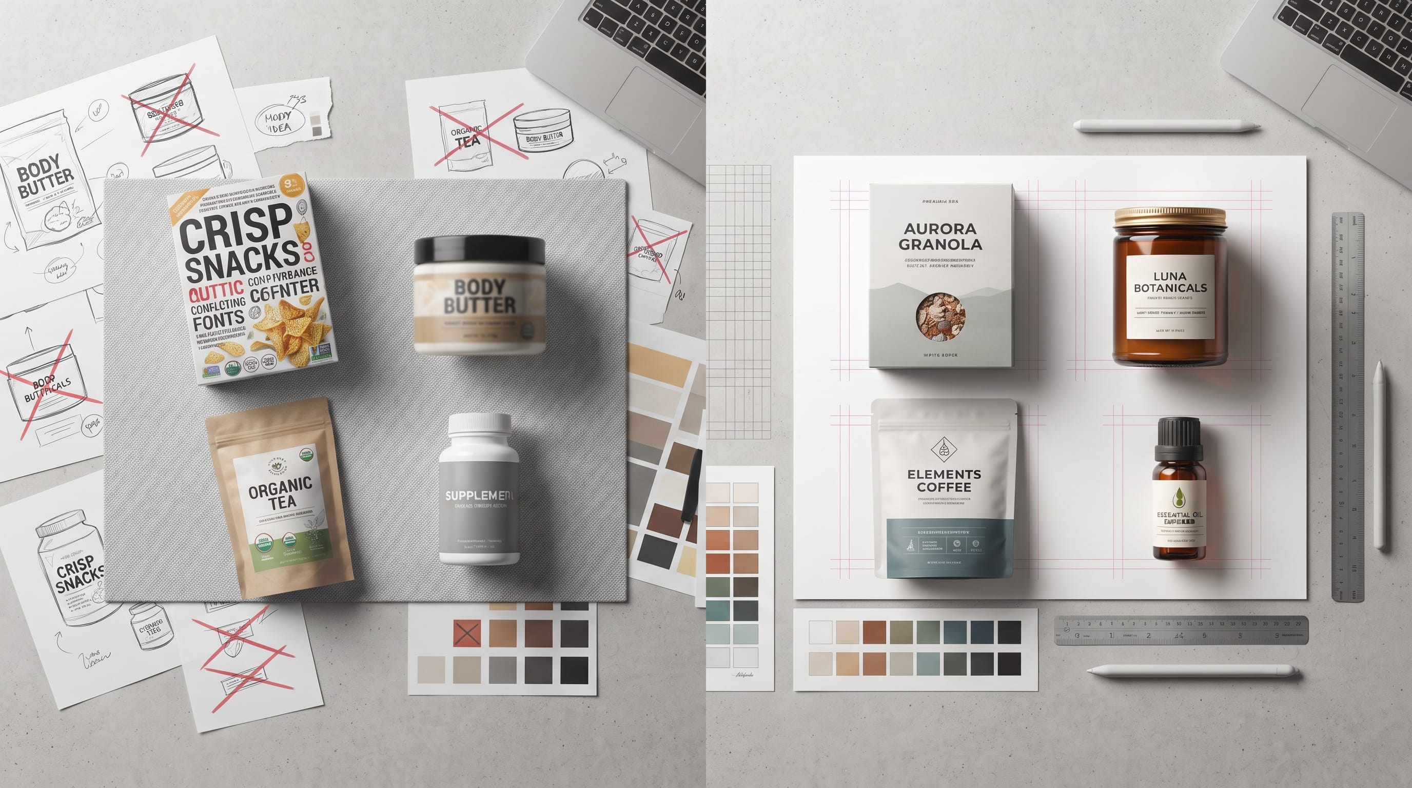
Common packaging design mistakes can turn an otherwise strong product into something that feels confusing, difficult to read, or less professional than its competitors. Packaging has to do several jobs at once. It needs to protect the product, communicate important information, support the brand identity, attract attention, and work correctly when printed and assembled.
That combination makes packaging more complicated than designing a simple poster or social media graphic.
A design can look beautiful on a computer screen but fail once it is wrapped around a bottle, folded into a box, printed on textured paper, or viewed from several feet away on a retail shelf.
For designers, understanding the most common packaging design mistakes can prevent expensive revisions and help create packaging that works both visually and practically.
Below are the problems worth checking before a design goes into production.
1. Packaging Design Mistakes With Weak Visual Hierarchy
One of the most common problems is giving every piece of information the same level of importance.
A package may contain:
- Brand name
- Product name
- Flavor
- Quantity
- Ingredients
- Benefits
- Certification marks
- Instructions
- Promotional messages
If everything is large, bold, and colorful, customers may not know where to look first.
A stronger hierarchy might guide the eye through:
- Brand
- Product name
- Main feature or flavor
- Supporting details
Secondary information can move to the side or back.
Good packaging should allow someone to identify the product quickly.
When reviewing packaging design mistakes, ask whether the most important message is visible within a few seconds.
2. Using Too Many Fonts
Typography can give packaging personality, but too many typefaces often make the design feel inconsistent.
A package rarely needs four or five different fonts.
A simpler system might use:
- Primary font: brand or product name
- Supporting font: ingredients, descriptions, and technical information
An optional third font can be used sparingly for short accents.
Using too many decorative fonts creates several problems:
- Poor readability
- Weak hierarchy
- Inconsistent branding
- Visual clutter
One of the easiest packaging design mistakes to fix is simply reducing the number of typefaces.
Choose fonts with clear roles and use weight, size, and spacing to create variation instead.
3. Choosing Fonts That Are Hard to Read
A beautiful script or decorative display font may work perfectly for a logo but become difficult to read in smaller product information.
Avoid using highly decorative fonts for:
- Ingredients
- Instructions
- Net weight
- Warnings
- Contact information
- Nutrition details
These areas need clarity.
Decorative typography works best for short elements such as:
- Brand names
- Collection names
- Flavor names
- Short headlines
Test printed text at actual size.
A font that looks readable at 300% zoom may become nearly impossible to read on a small label.
4. Packaging Design Mistakes With Poor Color Contrast
Color combinations may look attractive while still making text difficult to read.
Common examples include:
- Light yellow on white
- Pale pink on cream
- Gray on beige
- Dark red on brown
- Light green on white
Always test contrast between text and background.
If important product information disappears into the design, change either the color, weight, or background treatment.
This becomes even more important for small packaging.
Strong contrast also helps products perform better in ecommerce thumbnails and shelf environments.
5. Ignoring the Actual Packaging Shape
Designers sometimes create flat artwork without considering what happens when the package is assembled.
A label may wrap around a bottle.
A box may have folds, flaps, corners, and seams.
Important text can accidentally disappear around an edge.
This is one of the more expensive packaging design mistakes because it may not become obvious until a physical sample is produced.
Always consider:
- Front panel
- Side panels
- Back panel
- Top
- Bottom
- Seams
- Folds
- Closures
Use mockups or prototypes to see the design in three dimensions.
6. Ignoring Dielines
The dieline is the technical template that shows where packaging will be cut, folded, or glued.
Designers need to understand:
- Cut lines
- Fold lines
- Glue areas
- Bleed
- Safe zones
Do not treat the dieline as decoration.
Artwork placed too close to a cut line may disappear.
Text crossing a fold may become difficult to read.
A logo inside a glue area may never be visible.
Always keep important elements inside the safe area defined by the printer or packaging supplier.
7. Forgetting Bleed
Bleed allows artwork to extend beyond the final cut line.
Without bleed, small white edges may appear after trimming.
This is one of the most common technical packaging design mistakes, especially among beginners.
Background colors, patterns, and photos that reach the edge should extend beyond the cut line according to the printer’s specification.
Do not assume every printer uses the same amount of bleed.
Always confirm the required measurement before preparing the final file.
8. Using Low-Resolution Images
Low-resolution images may look acceptable on screen but become blurry or pixelated in print.
Use high-quality source files for:
- Product photography
- Illustrations
- Textures
- Backgrounds
- Logos
Vector graphics are generally preferable for logos and simple icons because they can scale cleanly.
If raster images are required, prepare them at appropriate print resolution and final output size.
Avoid enlarging small web images for large packaging panels.
Also Read: Packaging Typography Design Guide for Better Results
9. Designing Only in RGB
Screens generally use RGB color, while many print processes use CMYK or other specialized systems.
A bright color on screen may print differently.
Electric blues, greens, and highly saturated colors can be especially difficult to reproduce exactly in standard printing.
Before production:
- Confirm the printer’s required color mode
- Request color specifications
- Check spot colors if necessary
- Review proofs
Color differences are another reason physical testing matters.
10. Packaging Design Mistakes With Too Much Information
Brands sometimes try to place every selling point on the front panel.
The result becomes crowded.
A package does not need to explain the entire company story immediately.
Decide what information customers need at each stage.
Front Panel
Focus on:
- Brand
- Product
- Main variant
- Primary benefit
- Quantity
Side or Back
Place:
- Ingredients
- Instructions
- Longer descriptions
- Company details
- Additional claims
Good design uses space strategically.
Removing unnecessary content can often improve packaging more than adding new graphics.
11. Making the Product Name Too Small
Customers should be able to identify the product quickly.
If the brand logo dominates the entire package while the actual product name appears in tiny text, confusion can result.
This is especially problematic when one brand sells many products.
For example, a skincare company may sell:
- Cleanser
- Serum
- Moisturizer
- Toner
The product category needs to be clear.
Brand recognition matters, but so does usability.
12. Poor Flavor or Variant Differentiation
Brands with multiple flavors or versions need a clear identification system.
For example:
- Strawberry
- Chocolate
- Vanilla
- Mint
- Orange
If every package looks nearly identical, customers may accidentally choose the wrong product.
Use a consistent system involving:
- Color
- Illustration
- Label
- Flavor name
- Pattern
The overall branding should remain unified while each variation is easy to distinguish.
This is one of the packaging design mistakes that becomes more serious as a product range grows.
13. Inconsistent Branding Across Products
Every package in a product family should feel related.
Consistency can come from:
- Logo placement
- Typography
- Color structure
- Layout
- Illustration style
- Photography
- Label size
- Icon system
Do not redesign the entire brand every time a new product is released.
Create a flexible system instead.
A strong family look makes products easier to recognize together on shelves and ecommerce pages.
14. Copying Competitors Too Closely
Looking at competitors is useful, but copying their visual language can make your brand disappear.
If every organic skincare product uses:
- Sage green
- Leaf illustration
- Serif logo
- Beige packaging
your brand may need another way to stand out.
Study competitors to understand category expectations.
Then identify where your brand can look different without becoming confusing.
Good packaging should feel appropriate for the category but still have its own personality.
15. Overusing Trends
Trendy design can make packaging look current, but trends change quickly.
Avoid building the entire identity around one fashionable style.
For example:
- Extreme gradients
- Oversized bubble lettering
- Y2K graphics
- Certain pastel combinations
can look fresh now but may feel dated later.
Use trends selectively.
The core identity should remain strong even after the trend loses popularity.
16. Packaging Design Mistakes With Bad Material Choices
Packaging design is not only about graphics.
Materials affect how the product feels.
A luxury product printed on very thin, inexpensive stock may create the wrong impression.
Likewise, excessive premium material may not suit an affordable everyday product.
Consider:
- Paper thickness
- Texture
- Finish
- Durability
- Sustainability
- Product protection
- Shipping
The material should support the brand positioning and practical needs.
Also Read: Complete Packaging Dieline Tutorial for Print and Production
17. Ignoring Shelf Appeal
Packaging often competes with many products at once.
A design that looks beautiful when viewed alone may disappear on a crowded shelf.
Test the package beside competing products.
Ask:
- Does the brand name stand out?
- Is the product category obvious?
- Is the main color distinctive?
- Can customers read important information from a short distance?
Shelf impact does not require loud colors.
Strong hierarchy and simple shapes can also create visibility.
18. Ignoring Ecommerce Thumbnails
Many products are now discovered online before customers ever see them in person.
A package may appear very small on:
- Ecommerce listings
- Social media
- Ads
- Marketplace search results
Make sure the brand and product are still recognizable at thumbnail size.
Small decorative details may disappear.
Strong typography, clear contrast, and recognizable color systems become especially important online.
19. Making Claims Too Prominent Without Verification
Packaging often includes marketing claims such as:
- Natural
- Sustainable
- Organic
- Eco-friendly
- Clinically tested
- Recyclable
These terms can carry regulatory or legal implications depending on the product and market.
Designers should not invent claims simply because they look attractive on packaging.
Always confirm that the business can support the statement.
This is one of the packaging design mistakes that can become more serious than a visual problem.
20. Forgetting Required Product Information
Different products and markets may require specific information.
This can include:
- Ingredients
- Weight
- Manufacturer
- Warnings
- Usage instructions
- Nutrition information
- Batch codes
- Barcodes
Designers should understand what information must be included before finalizing the layout.
Leaving required content until the last moment often causes crowded revisions.
Plan space early.
21. Using Barcodes Incorrectly
Barcodes need enough clear space and contrast to scan properly.
Do not:
- Stretch them
- Place them on folds
- Cover them with patterns
- Use very low contrast
- Make them extremely small
Confirm technical requirements with the printer or barcode provider.
A visually attractive barcode area is useless if it cannot be scanned.
22. Ignoring Sustainability in Packaging Decisions
Sustainability is increasingly relevant for many brands, but good intentions need practical decisions.
Consider:
- Excessive layers
- Oversized boxes
- Difficult-to-recycle materials
- Unnecessary plastic
- Mixed materials
Reducing packaging can also reduce:
- Cost
- Weight
- Storage space
- Shipping volume
However, the package still needs to protect the product properly.
Sustainable decisions should balance environmental goals with functionality.
23. Not Creating a Physical Prototype
A prototype can reveal problems that digital mockups hide.
Print a simple test at actual size.
Fold it.
Wrap it around the product.
Hold it.
Place it beside competing packaging.
Check:
- Text size
- Alignment
- Seams
- Fold placement
- Color
- Hierarchy
This step can prevent many packaging design mistakes before professional printing begins.
Even a basic paper prototype is useful.
24. Skipping the Printer Proof
Before approving large production quantities, review a proof whenever possible.
Check:
- Color
- Alignment
- Text
- Cutting
- Material
- Finish
- Barcode
- Logo placement
Compare the proof with your approved artwork.
A small error multiplied across thousands of packages becomes expensive.
Do not rush final approval.
Packaging Design Checklist Before Printing
Use this quick checklist before sending files to production.
Typography
- Fonts are readable
- Hierarchy is clear
- No unnecessary typefaces
- Small text remains legible
Color
- Contrast is strong
- Print color mode is correct
- Important colors are tested
Dieline
- Artwork uses the correct template
- Important text stays inside safe areas
- Folds and seams are considered
Print Setup
- Bleed is included
- Images are high resolution
- Fonts are embedded or outlined where required
- File format matches printer specifications
Branding
- Logo is consistent
- Product variants are easy to identify
- Visual system matches other products
Product Information
- Required details are included
- Barcode placement is correct
- Claims are verified
Physical Testing
- Prototype has been reviewed
- Final proof has been checked
Also Read: How to Choose the Best Packaging Design Software
Final Thoughts on Common Packaging Design Mistakes
Most packaging design mistakes happen when designers focus only on how the artwork looks on screen.
Successful packaging has to work as a physical object, a communication tool, and a recognizable part of the brand.
Strong hierarchy helps customers understand the product. Good typography keeps information readable. Proper dielines, bleed, resolution, and color setup prevent production problems. Consistent branding helps a product family feel connected, while careful material choices support both function and positioning.
Before sending packaging to print, slow down and review every detail.
Check the design at actual size. Test it on the real package shape. Make sure the product name is clear, variants are easy to distinguish, and important information is readable.
Then review the technical file with the same attention.
Avoiding common packaging design mistakes can save money, reduce production delays, and help the final product look much closer to the design you originally intended.

For high-quality fonts to boost your income, check out DM Letter Studio. Our professional fonts are perfect for branding, marketing, and content creation. So, don’t miss this opportunity.