
Creative Chocolate Packaging Design Ideas for Better Branding
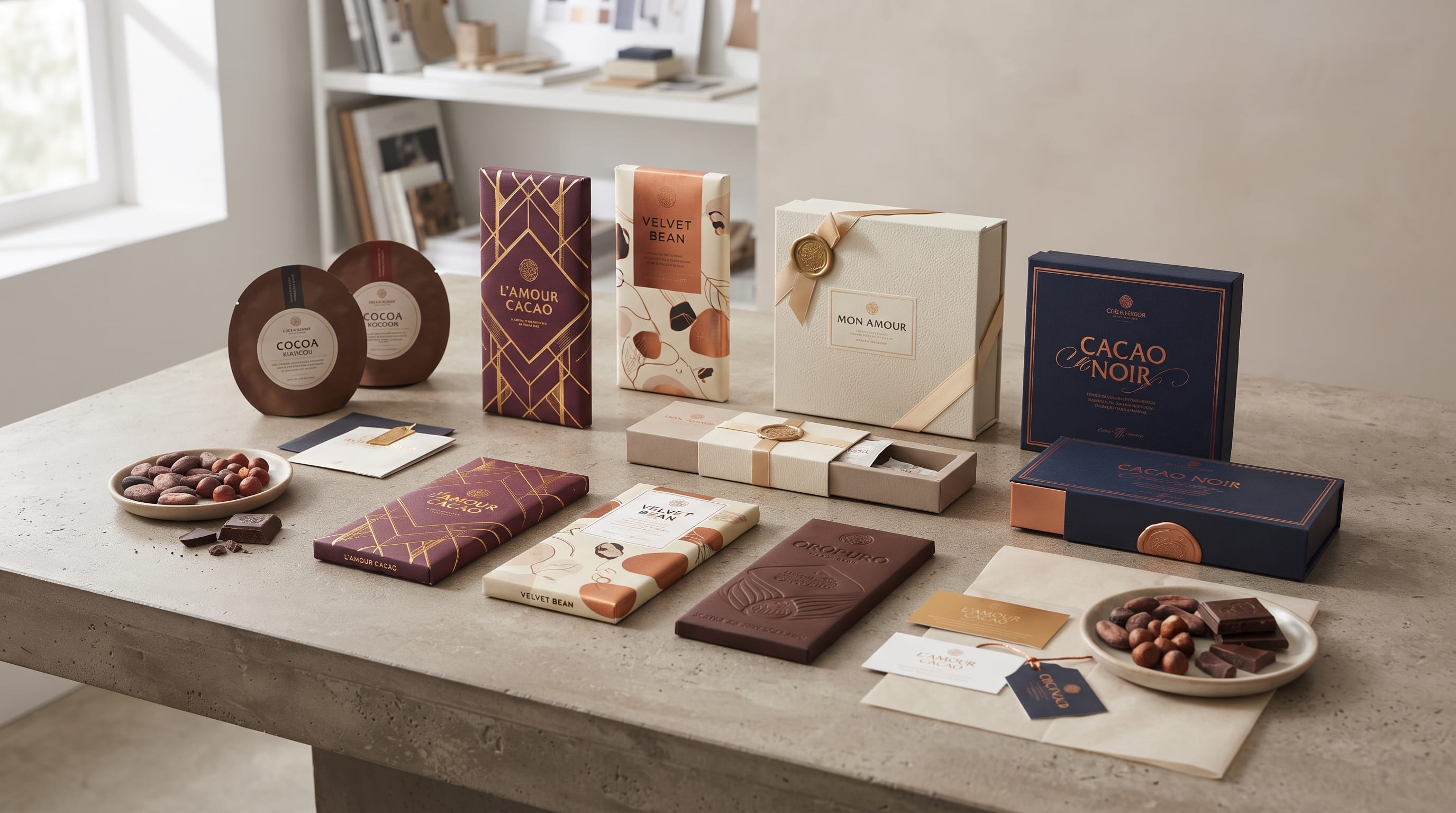
Creative chocolate packaging design can turn an ordinary chocolate bar into something customers want to pick up before they even know how it tastes. Packaging communicates flavor, quality, personality, price positioning, and brand story within seconds. For confectionery businesses, that makes the wrapper or box much more than simple protection. It becomes one of the strongest visual tools for attracting attention and building recognition.
Chocolate also gives designers enormous creative freedom.
A handmade dark chocolate brand might use textured paper and earthy typography, while a luxury chocolatier could choose rigid boxes, elegant lettering, and metallic details. A playful candy company may use bright colors and illustrated characters instead.
The most effective chocolate packaging design begins with a clear brand position and then uses typography, color, materials, imagery, and structure to support it consistently.
Here are creative directions to inspire stronger chocolate branding.
1. Minimal Chocolate Packaging Design
Minimal packaging can make chocolate feel sophisticated and modern.
Instead of filling the wrapper with patterns and promotional text, use only the most important information:
- Brand name
- Chocolate type
- Cocoa percentage
- Flavor
- Weight
- One distinctive visual element
For example, a premium 70% dark chocolate bar could use a warm ivory wrapper, dark brown typography, and one small gold accent.
Generous empty space helps the product feel more refined.
Minimal chocolate packaging design works particularly well for:
- Bean-to-bar chocolate
- Premium dark chocolate
- Organic confectionery
- Boutique brands
- Modern gift products
The key is visual hierarchy. If the design has fewer elements, each one needs to be carefully positioned.
2. Luxury Chocolate Packaging Design Ideas
Luxury chocolate needs packaging that supports its price and experience.
Possible materials and finishes include:
- Rigid boxes
- Embossing
- Foil details
- Soft-touch paper
- Textured card
- Inner trays
- Decorative sleeves
A luxury palette might combine:
- Deep brown + warm gold
- Black + ivory
- Burgundy + cream
- Forest green + muted gold
Typography can become one of the strongest signals of premium positioning.
For this type of chocolate packaging design, avoid making every element decorative. One elegant wordmark, high-quality paper, and subtle metallic detail can often feel more expensive than a heavily ornamented package.
3. Artisan Chocolate Packaging for Handmade Brands
Handmade chocolate often benefits from packaging that feels personal.
Consider:
- Kraft paper
- Textured labels
- Hand-drawn graphics
- Small-batch numbering
- Ingredient illustrations
- Stamp-style details
A wrapper does not need to look imperfect to communicate craftsmanship. It simply needs elements that feel more human and less industrial.
For example, a small cacao producer could use cream textured paper, hand-drawn cacao pods, dark brown lettering, and a simple label explaining where the beans were sourced.
Artisan chocolate packaging design is especially effective when the brand has a real story around sourcing, production, recipes, or craftsmanship.
4. Use Cocoa-Inspired Color Palettes
Brown is an obvious choice for chocolate packaging, but there are many ways to use it.
Explore shades such as:
- Espresso
- Cocoa
- Caramel
- Mocha
- Milk chocolate
- Warm beige
Then add one contrasting accent.
For example:
- Dark cocoa + cream for classic elegance.
- Chocolate brown + orange for a warm energetic brand.
- Espresso + pink for a more modern confectionery identity.
- Brown + sage for natural or organic positioning.
Good chocolate packaging design does not need to use brown everywhere. The product itself already provides that association, so designers can also explore unexpected palettes.
5. Color-Code Different Chocolate Flavors
If your brand sells several varieties, color can help customers recognize them quickly.
For example:
- Dark chocolate: charcoal
- Milk chocolate: warm beige
- Raspberry: deep pink
- Orange: burnt orange
- Mint: muted green
- Hazelnut: caramel
- Sea salt: blue-gray
Keep the layout, logo, and typography consistent while changing one primary accent color.
This creates a clear product family.
When all flavors appear together on a shelf or ecommerce page, customers can immediately see that they belong to the same brand.
This is one of the most practical chocolate packaging design systems for growing confectionery companies.
6. Botanical Chocolate Packaging Ideas
Chocolate flavors often include ingredients that can become beautiful visual elements.
Consider illustrations of:
- Cacao pods
- Vanilla flowers
- Mint
- Orange
- Coffee beans
- Hazelnuts
- Raspberries
- Almonds
- Sea salt
Botanical illustration works especially well for artisan and premium chocolate.
Instead of showing every ingredient, choose one hero ingredient.
For example, an orange dark chocolate wrapper could use a detailed orange branch illustration with dark chocolate typography.
The visual immediately explains the flavor while creating a more distinctive package.
Also Read: How to Create Coffee Packaging Design That Looks Professional
7. Illustration-Led Chocolate Packaging Design
Illustration can give confectionery packaging a personality that photography may not provide.
Possible directions include:
- Hand-drawn
- Vintage engraving
- Flat vector
- Watercolor
- Collage
- Geometric
- Character illustration
A playful chocolate brand aimed at younger customers could use bright character illustrations.
An artisan brand might use rough ink drawings of cacao farming or ingredients.
A luxury company could use fine-line botanical illustrations.
Whatever style you choose, keep it consistent across the product line.
Illustration should become part of the brand language rather than decoration added to individual products.
8. Vintage Chocolate Packaging Inspiration
Chocolate has a long history, which makes vintage-inspired design feel natural for the category.
A vintage direction might include:
- Decorative borders
- Cream paper
- Dark burgundy
- Antique gold
- Engraving-style imagery
- Traditional serif typography
- Badge compositions
This works especially well for brands that want to communicate:
- Heritage
- Craftsmanship
- Tradition
- Established quality
However, vintage chocolate packaging design should still remain easy to read.
Avoid filling the front panel with so many ornaments that the brand and product name disappear.
Use vintage references selectively.
9. Modern Geometric Chocolate Packaging
For a more contemporary direction, use simple geometric graphics.
Shapes can represent:
- Ingredients
- Flavor strength
- Cocoa origin
- Product category
For example, a chocolate collection might use different abstract patterns for each cocoa percentage.
70% chocolate could use a dense dark pattern, while 45% milk chocolate uses softer and lighter shapes.
This creates a visual system without relying on traditional chocolate imagery.
Geometric packaging works particularly well for modern lifestyle brands and design-conscious customers.
10. Typography-First Chocolate Packaging Design
Sometimes typography can become the main graphic.
A large product name such as:
DARK 72%
or:
SEA SALT
can dominate the wrapper.
This approach works well when the font has enough personality to carry the design.
Keep supporting information smaller and simpler.
Typography-first chocolate packaging design is especially effective for:
- Modern brands
- Premium bars
- Limited collections
- Boutique confectionery
- Gift products
A strong typographic system also makes it easy to introduce new flavors later.
Font Suggestions for Chocolate Packaging From DM Letter Studio
Typography should match the personality of the chocolate brand, not simply look attractive on its own.
Here are verified DM Letter Studio directions that fit different confectionery styles.
Omarta + Melvick for Premium Chocolate Packaging
For a polished premium direction, consider:
DM Letter Studio recommends this pairing for premium packaging because it combines an expressive signature style with a cleaner supporting font.
For chocolate branding, use:
This could work nicely for:
- Premium truffles
- Luxury chocolate boxes
- Boutique chocolate bars
- Gift collections
Keep the expressive font limited to the most important name or headline so smaller packaging information remains easy to read.
Chalk Field + New Austin for Artisan Chocolate
For handmade and small-batch confectionery, consider:
DM Letter Studio specifically positions this pairing for artisan products and handmade goods.
Chalk Field has a structured slab serif character, while New Austin brings a more expressive handwritten brush personality.
Use this combination for:
- Bean-to-bar chocolate
- Farmers market products
- Handmade confectionery
- Small-batch chocolate
- Rustic packaging
For example:
- Chocolate Name: Chalk Field
- Small Accent Phrase: New Austin
This can create warmth without making the package feel unprofessional.
Apple Crush + Honey Beezy for Friendly Confectionery
For a cheerful chocolate brand, consider:
DM Letter Studio recommends this combination for food, bakery, and friendly product packaging.
It can work particularly well for:
- Chocolate treats
- Family-oriented confectionery
- Children’s chocolate
- Bakery chocolate products
- Fun seasonal products
Use brighter packaging colors and simple illustration to support the playful typography.
Puffy Love + Dear Shine for Chocolate Gift Packaging
Gift chocolate can have a more emotional and playful personality.
Consider:
This pairing works especially well for:
- Valentine’s chocolate
- Birthday gift boxes
- Seasonal collections
- Romantic confectionery
- Limited-edition packaging
Use the expressive lettering for short phrases or collection names rather than long ingredient lists.
A gift package might feature a large romantic phrase in Puffy Love with smaller supporting typography in Dear Shine.
11. Chocolate Bar Wrapper Design
Chocolate bars give designers a long rectangular canvas.
Important front-panel information might include:
- Brand
- Chocolate type
- Cocoa percentage
- Main flavor
- Net weight
Keep detailed ingredients and legal information on the back.
The front should communicate the product quickly.
A strong wrapper can use:
- Top: logo
- Center: large flavor name
- Bottom: cocoa percentage and product details
Avoid giving every piece of text the same size.
Hierarchy makes the package easier to scan.
Also Read: Tea Packaging Design Examples That Inspire Better Branding
12. Chocolate Gift Box Design
Gift boxes need to create an experience before they are opened.
Consider:
- Magnetic closures
- Sleeves
- Patterned interiors
- Custom inserts
- Individual wrappers
- Printed messages
You can also use the inside of the box for storytelling.
For example, include:
- Chocolate origins
- Flavor notes
- Brand story
- Pairing suggestions
Good gift chocolate packaging design makes opening the package feel intentional rather than simply functional.
13. Sustainable Chocolate Packaging
Sustainability can become part of the packaging strategy.
Possible approaches include:
- Recyclable paper
- Reduced plastic
- Minimal layers
- Recycled card
- Smaller packages
- Clearly identified materials
However, avoid making environmental claims that are not supported by actual materials or business practices.
Good sustainable packaging can still feel premium.
A simple textured paper wrapper with beautiful typography may create more impact than a complicated multi-layer package.
14. Use Texture to Create Premium Shelf Appeal
Texture gives customers another reason to interact with a package.
Consider:
- Uncoated paper
- Embossed logos
- Rough kraft
- Soft-touch finishes
- Letterpress
- Subtle foil
Texture is particularly effective for chocolate because gifting and sensory experience already play an important role in the category.
Even a relatively simple chocolate packaging design can feel more valuable when the paper and printing choices are carefully considered.
15. Create Packaging for Online Shopping Too
Chocolate is increasingly discovered through ecommerce and social media.
That means packaging needs to work in photography as well as on physical shelves.
Ask:
- Is the brand name visible in a thumbnail?
- Can customers identify the flavor quickly?
- Do different varieties look distinct?
- Does the package photograph well?
- Is the color palette recognizable?
Strong contrast and clear typography become especially important online.
A beautifully detailed package may lose its impact if none of the details are visible at small digital sizes.
Common Chocolate Packaging Design Mistakes
Avoid several common problems.
Too Much Information on the Front
Move secondary information elsewhere.
Weak Product Hierarchy
Customers should quickly see the brand, type, and flavor.
Too Many Fonts
Two coordinated fonts are usually enough.
Generic Chocolate Imagery
A photograph of melting chocolate is not always necessary.
Poor Flavor Differentiation
Create a clear system for product varieties.
Decorative Fonts for Ingredients
Long supporting information needs readability.
Forgetting the Actual Packaging Material
Design should be tested on the real substrate, not only on a digital mockup.
Build a Consistent Chocolate Packaging System
A growing chocolate brand needs a repeatable system.
Define:
- Logo placement
- Typography
- Cocoa percentage position
- Flavor hierarchy
- Color coding
- Illustration style
- Wrapper dimensions
- Packaging materials
Then apply those rules to each product.
For example, one collection might include:
Dark Chocolate 72%
Milk Chocolate 45%
Dark Chocolate Orange
Sea Salt Caramel
The individual packages can feel different while remaining clearly connected.
Also Read: Modern Food Label Design That Inspires Better Packaging
Final Thoughts on Creative Chocolate Packaging Design
Strong chocolate packaging design combines appetite appeal with clear branding.
A luxury chocolatier may rely on elegant typography, restrained color, and premium materials. An artisan producer might use textured paper and handcrafted lettering. A playful confectionery brand can use brighter colors, illustrations, and friendlier typography.
For verified DM Letter Studio fonts choices, can add personality to gift-focused collections.
Whatever direction you choose, create a system rather than designing every package independently.
Use consistent typography, color logic, layout, materials, and imagery across the collection.
The best chocolate packaging design should make customers recognize the brand quickly, understand the product easily, and feel that the visual experience matches the quality and personality of the chocolate inside.