
Best Esports Fonts for Competitive Gaming Branding
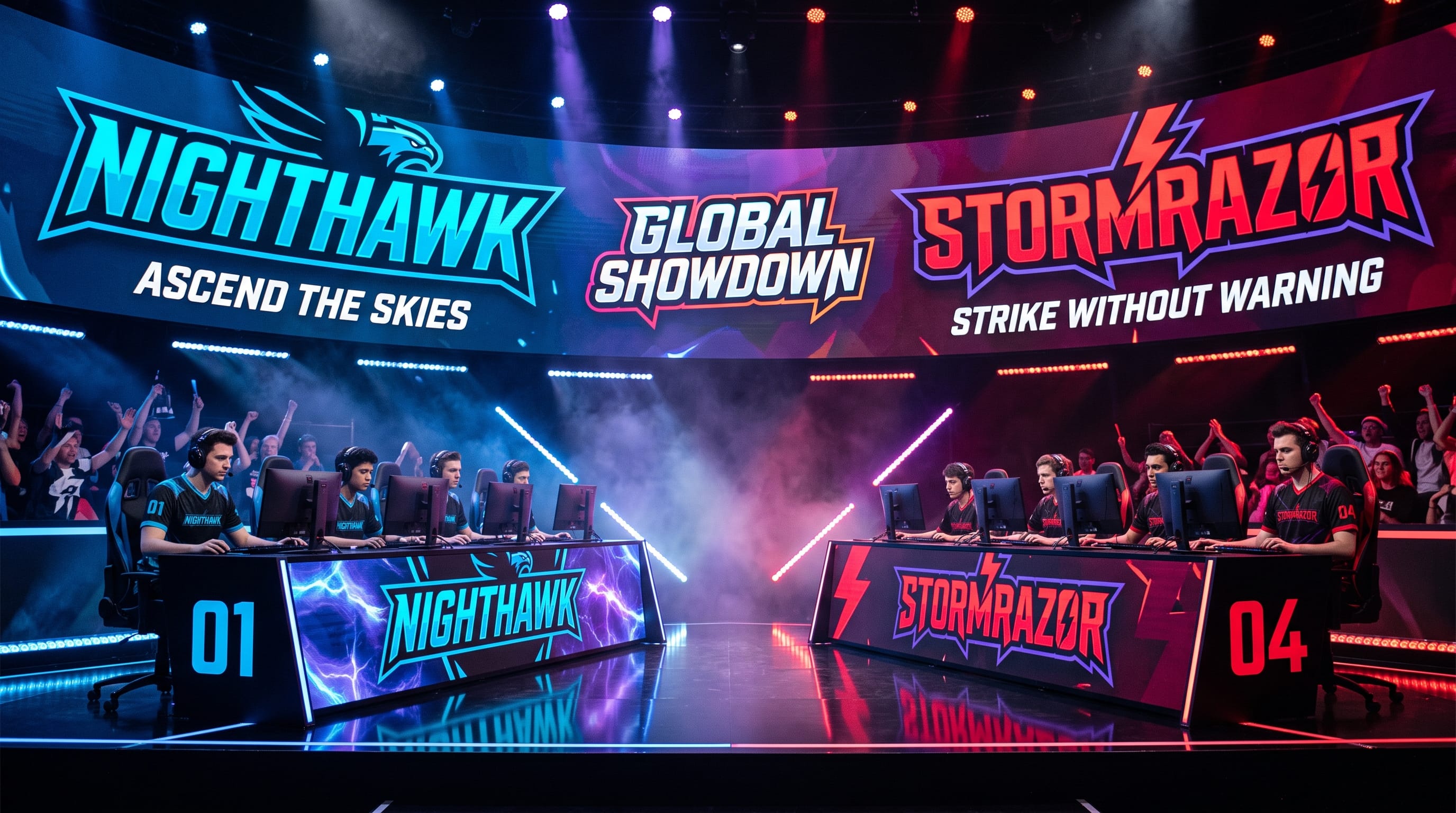
Esports fonts play a major role in creating competitive gaming brands that feel powerful, recognizable, and professional. From team logos and Twitch overlays to tournament posters, jerseys, YouTube thumbnails, and merchandise, typography helps define how a gaming identity looks before viewers even learn anything about the team behind it.
The strongest competitive gaming typography usually combines impact with readability. A dramatic futuristic typeface may look impressive on a poster, but it becomes less useful if viewers cannot quickly read the team name on a small streaming thumbnail or mobile screen.
That is why choosing esports fonts requires more than finding the most aggressive-looking typeface. Designers need to consider the personality of the gaming brand, the types of games involved, the platforms where the identity will appear, and whether the font can remain recognizable across logos, apparel, videos, and digital interfaces.
This guide explains how to select and use esports typography effectively, along with font recommendations from the current DM Letter Studio catalog for competitive gaming branding.
Why Esports Fonts Matter for Gaming Brands
Gaming is highly visual.
Teams and creators compete not only through gameplay but also for attention across:
A strong visual identity helps audiences recognize a team immediately.
Typography influences whether a gaming brand feels:
- Competitive
- Futuristic
- Aggressive
- Tactical
- Professional
- Retro
- Playful
- Premium
Well-chosen esports fonts also help establish consistency.
If the same typography appears across team jerseys, profile banners, videos, event posters, and social graphics, the brand becomes easier to recognize over time.
What Makes the Best Esports Fonts?
Gaming fonts need more than visual personality.
The best choices usually combine several characteristics.
Strong Silhouettes
Distinctive letter shapes can make team names easier to recognize.
High Readability
The name should remain readable on:
- Mobile screens
- Video thumbnails
- Jerseys
- Overlays
- Social avatars
Bold Weight
Heavy typography usually works well in competitive environments because it remains visible over complex backgrounds.
Flexible Shapes
The font should be adaptable to:
- Horizontal logos
- Stacked logos
- Badges
- Posters
- Merchandise
Personality
The best esports fonts communicate something about the team.
A tactical shooter team may need very different typography from a casual gaming community or retro arcade channel.
Choose Esports Fonts Based on Gaming Personality
Before selecting a font, define the personality of the brand.
Ask:
- Is the team aggressive or friendly?
- Does it compete professionally?
- Is the brand futuristic?
- Is it influenced by traditional sports?
- Does it focus on retro gaming?
- Is the audience young and casual?
- Should the identity feel premium?
Your answers will make the typography decision easier.
Bold Esports Fonts for Competitive Teams
Competitive gaming organizations often benefit from bold display typography.
Strong block letters communicate:
- Confidence
- Strength
- Stability
- Competition
- Team identity
This direction works particularly well for:
- FPS teams
- Battle royale teams
- MOBA organizations
- Competitive leagues
- Collegiate esports
Large block lettering can also translate easily to apparel and merchandise.
Use it for the main team name and pair it with a simpler typeface for secondary information.
Futuristic Esports Typography
Futuristic fonts are another common gaming direction.
They may use:
- Angular shapes
- Extended letterforms
- Sharp cuts
- Geometric construction
- Technology-inspired details
These esports fonts work well for teams associated with:
- Sci-fi games
- Cyberpunk visuals
- Technology
- Competitive shooters
- Racing
- Digital entertainment
However, avoid using overly experimental typography for every line of text.
Use the futuristic font primarily for:
- Team name
- Campaign headline
- Tournament title
Supporting text should remain easier to read.
Varsity Esports Fonts for Team Branding
Traditional sports typography can work extremely well for esports.
Varsity lettering already communicates:
- Teams
- Competition
- Jerseys
- Clubs
- Championships
Using collegiate-inspired esports fonts can make an organization feel more established and athletic.
This direction works especially well for:
- University esports
- Gaming clubs
- Tournament teams
- Gaming camps
- Merchandise
- Community organizations
Varsity fonts also reproduce effectively on hoodies, jerseys, hats, and stickers.
Stacked Esports Fonts for Gaming Logos
Stacked lettering is useful when horizontal space is limited.
It can create:
- Compact logos
- Vertical badges
- Stream graphics
- Poster titles
- Merchandise designs
A stacked wordmark can also make a short gaming name appear more powerful.
For example:
NOVA
can become a tall vertical typographic block rather than a simple horizontal word.
Stacked esports fonts are particularly useful for:
- YouTube thumbnails
- Twitch banners
- Team badges
- Apparel graphics
- Tournament posters
Esports Fonts for Gaming Logos
A team logo must remain recognizable across many sizes.
When choosing typography for a gaming logo, test it in several formats.
Large Format
Does the font still look strong on posters and banners?
Small Format
Can you read it inside a profile avatar or thumbnail?
Black and White
Does the logo still work without effects?
Embroidery or Print
Can the letters reproduce clearly on merchandise?
A great esports logo should not depend entirely on gradients, glowing effects, or complex textures.
The typography itself should provide enough character.
Also Read: AI Sports Logo Prompts That Look Bold and Competitive
Esports Fonts for Twitch Branding
Streaming graphics need immediate readability.
Twitch branding may include:
- Stream starting screens
- Intermission screens
- Webcam frames
- Alerts
- Panels
- Offline screens
Use esports fonts for the most important text, such as:
- Gamer name
- Stream title
- Major section headings
Use cleaner fonts for:
- Schedules
- Rules
- Social links
- Descriptions
Too much decorative gaming typography can make a streaming layout difficult to navigate.
Esports Fonts for YouTube Gaming Thumbnails
Gaming thumbnails compete for attention at very small sizes.
Typography should therefore be:
- Bold
- Short
- Highly contrasted
- Easy to recognize
Useful thumbnail text might include:
- FINAL BOSS
- RANKED
- WORLD RECORD
- NEW UPDATE
- GAME OVER
Avoid long sentences.
One to four words usually provide more visual impact.
Bold esports fonts work particularly well when combined with strong imagery and simple outlines.
Gaming Fonts for Team Jerseys
Typography on esports jerseys needs to work physically, not only digitally.
Consider:
- Player names
- Team names
- Numbers
- Sponsor logos
Avoid letterforms with extremely thin lines or complicated interior details.
Strong varsity, block, or condensed fonts are usually easier to print and embroider.
Jersey typography should also remain recognizable from a distance.
Esports Typography for Tournament Posters
Tournament posters allow more expressive typography.
Designers can experiment with:
- Oversized lettering
- Angled compositions
- Glowing effects
- Outlines
- Layering
- Perspective
- Repeated text
- Stacked type
Use one dominant esports font for the event title.
Then create hierarchy with simpler supporting typography for:
- Dates
- Teams
- Locations
- Prize information
- Registration details
Strong hierarchy keeps the poster exciting without making it chaotic.
Esports Fonts for Merchandise
Typography-driven gaming merchandise can be extremely effective.
Potential products include:
- T-shirts
- Hoodies
- Caps
- Mouse pads
- Posters
- Stickers
- Jerseys
Fonts with strong silhouettes are often better for merchandise than highly detailed styles.
Before production, test the design at realistic print sizes.
A font that looks impressive at 2000 pixels may lose detail when printed on a small chest logo.
Pair Esports Fonts With Simple Supporting Type
A common mistake in gaming design is using multiple aggressive fonts together.
Instead, try:
- Primary: bold esports display font
- Secondary: simple sans serif
- Body: neutral readable typeface
The primary font creates personality.
The supporting typography communicates information.
This structure makes the overall identity look more professional.
Use Color to Strengthen Esports Fonts
Gaming brands frequently use high-contrast color systems.
Popular combinations include:
- Black + electric blue
- Charcoal + neon green
- Purple + cyan
- Black + red
- Navy + white
- Black + orange
- White + magenta
The typeface does not need to contain complicated effects if the color already creates strong contrast.
For many professional teams, one strong accent color is enough.
Add Outlines and Shadows Carefully
Outlines can improve visibility over complex backgrounds.
They are especially useful for:
- Thumbnails
- Posters
- Jerseys
- Stream graphics
Try:
White lettering + black outline
or:
Dark lettering + bright outline
Shadows can also create depth.
However, avoid stacking several effects together.
Too much glow, beveling, shadow, and outlining can make typography feel outdated or difficult to read.
Also Read: 20+ Typography Logo Ideas That Look Premium and Simple
Font Suggestions for Esports Branding
DM Letter Studio currently offers several bold varsity and stacked fonts that fit naturally into competitive gaming branding. These recommendations are especially useful for team identities, gaming clubs, tournament graphics, merchandise, stream graphics, and thumbnails.
1. Blockton Varsity for Professional Esports Teams
Blockton Varsity is one of the strongest DM Letter Studio choices for competitive gaming branding.
It uses thick, balanced block letterforms with a confident collegiate personality. DM Letter Studio describes it as suitable for team branding, apparel, posters, logos, packaging, signage, and sports-focused merchandise.
For esports, use it for:
- Team wordmarks
- Gaming jerseys
- Tournament posters
- Team merchandise
- Social graphics
- Streaming headers
Its clean geometry is particularly useful when you need a strong gaming identity without relying on overly futuristic visual effects.
2. Echoline Varsity for Sharp Competitive Branding
Echoline Varsity offers a sharper personality.
It combines strong varsity letterforms with clean geometry and more angular edges. DM Letter Studio positions it for team logos, sportswear, event posters, and bold branding.
This makes it suitable for:
- FPS teams
- Competitive clans
- Tournament branding
- Gaming merchandise
- Esports logos
Its all-caps structure can give short team names strong visual impact.
3. Scholar Stacked for Gaming Thumbnails
Scholar Stacked is particularly interesting for gaming graphics because its vertical stacked structure creates a powerful typographic footprint.
DM Letter Studio specifically notes uses including athletic branding, posters, apparel, and YouTube gaming thumbnails.
Use it for:
- YouTube thumbnails
- Tournament posters
- Gamer merchandise
- Stream graphics
- Vertical logo compositions
Stacked typography can help a gaming title remain large even when horizontal space is limited.
4. Plump Varsity for Friendly Gaming Communities
Not every gaming brand needs to look aggressive.
Plump Varsity combines classic collegiate lettering with rounded, bubble-like forms.
DM Letter Studio specifically mentions gamer squads among its suitable applications, along with shirts, hoodies, stickers, banners, water bottles, and social graphics.
It works well for:
- Gaming communities
- Casual esports teams
- Student gaming clubs
- Streamer groups
- Youth gaming events
- Friendly competitive brands
Use it when you want team energy without an intimidating aesthetic.
5. Campus Groove for Creator Gaming Brands
Campus Groove blends varsity structure with softer rounded forms.
DM Letter Studio describes it as suitable for game-day posts, clubs, teams, thumbnails, and creator brands that want a modern school-inspired energy.
This makes Campus Groove useful for:
- Gaming creators
- Campus esports
- Stream branding
- YouTube thumbnails
- Community tournaments
- Merch
Its rounded construction can also work well when your esports identity needs to feel more accessible.
6. Condense College for Compact Esports Logos
Long gaming team names can become difficult to fit into logos.
Condense College addresses this with a compact, bold collegiate structure. DM Letter Studio positions it for team logos, banners, sports branding, and merchandise.
This makes it particularly useful for:
- Longer team names
- Narrow logo areas
- Jersey typography
- Tournament banners
- Mobile graphics
Condensed esports fonts let designers maintain boldness while using less horizontal space.
7. Scholar Varsity for Traditional Competitive Identity
Scholar Varsity delivers a more classic athletic personality.
Its block forms and all-caps structure reference letterman jackets, jerseys, and old-school sports signage.
It can work especially well for:
- University esports teams
- Gaming leagues
- Tournament organizations
- Collegiate gaming
- Team apparel
Use modern colors and clean supporting typography to prevent the identity from becoming too traditionally academic.
8. Scholar Varsity Stacked for High-Impact Logos
For designs requiring an even stronger vertical composition, Scholar Varsity Stacked offers a double-layer stacked structure.
DM Letter Studio describes it as suitable for tight typographic logos, merchandise, banners, posters, and social or video thumbnail applications.
This makes it useful for:
- Compact esports badges
- Gaming thumbnails
- Tournament graphics
- Apparel
- Stream graphics
Its stacked structure can become the visual centerpiece of an identity.
How to Build an Esports Typography System
Do not choose only one font and assume the branding work is finished.
Create a complete typography system.
For example:
Primary Typeface
Use a bold esports display font for:
- Logo
- Team name
- Major headlines
Secondary Typeface
Use a simpler font for:
- Player names
- Social graphics
- Menus
- Statistics
Body Typeface
Choose a highly readable font for:
- Website copy
- Articles
- Long descriptions
This gives the gaming brand both personality and usability.
Create Different Esports Font Treatments
One typeface can create several logo variations.
For example:
Primary Wordmark
Full team name.
Abbreviated Wordmark
Team initials.
Stacked Version
Useful for square graphics.
Badge Version
Typography inside a geometric container.
Merchandise Version
Simplified lettering without effects.
Building variations ensures your esports fonts work across every platform.
Avoid Overdesigning Esports Typography
Gaming branding often becomes cluttered because designers feel everything needs to look futuristic.
Common unnecessary additions include:
- Excessive bevels
- Multiple outlines
- Heavy glows
- Lightning effects
- Metallic textures
- Extreme distortion
A strong typeface should work without these effects.
Start in black and white.
If the typography looks powerful before adding effects, you have a stronger foundation.
Keep Esports Fonts Readable on Mobile
Gaming audiences spend significant time on mobile platforms.
Test typography at:
- Profile avatar size
- Thumbnail size
- Social-post size
- Mobile website width
Very condensed or detailed esports fonts can become difficult to recognize when reduced.
Always prioritize the team name over decorative complexity.
Common Esports Font Mistakes
1. Using Too Many Gaming Fonts
One main display font is usually enough.
2. Ignoring Readability
Aggressive shapes should not make the team name impossible to identify.
3. Adding Too Many Effects
Strong typography does not need five different visual effects.
4. Ignoring Merchandise
A logo should still reproduce on clothing.
5. Copying Famous Esports Identities
Take inspiration from competitive gaming culture without creating an identity that feels derivative.
6. Using Body Text in Display Fonts
Keep decorative fonts for short headlines.
7. Forgetting Font Licensing
Commercial esports branding, merchandise, broadcasting, apps, or game development may require different license permissions.
Esports Fonts Checklist
Before finalizing the typography, check whether it:
- Matches the team personality
- Looks strong in the logo
- Remains readable at small sizes
- Works on Twitch graphics
- Works on YouTube thumbnails
- Reproduces on jerseys
- Looks good without visual effects
- Supports stacked layouts
- Has a strong silhouette
- Pairs well with simpler typography
- Works in black and white
- Fits the commercial license required
Also Read: How to Create an Emblem Logo Design That Stands Out
Final Thoughts on the Best Esports Fonts
The best esports fonts help competitive gaming brands feel recognizable, confident, and consistent across every touchpoint.
Bold block typography works particularly well for teams that want a strong competitive identity. Varsity fonts can connect esports with traditional athletic branding, while stacked and condensed styles are useful when space is limited.
DM Letter Studio fonts provide several directions for gaming logos, thumbnails, apparel, tournaments, and team graphics.
A professional esports identity should not depend entirely on glowing effects or futuristic decoration. Start with typography that has a strong silhouette and remains readable in black and white.
Then build a consistent system around it with team colors, secondary typography, logos, player-name treatments, social templates, stream graphics, and merchandise.
When strong esports fonts are combined with clear hierarchy and consistent visual branding, a gaming team can create an identity that feels competitive both inside and outside the game.