
Logo Variation Tips for New Businesses and Digital Products
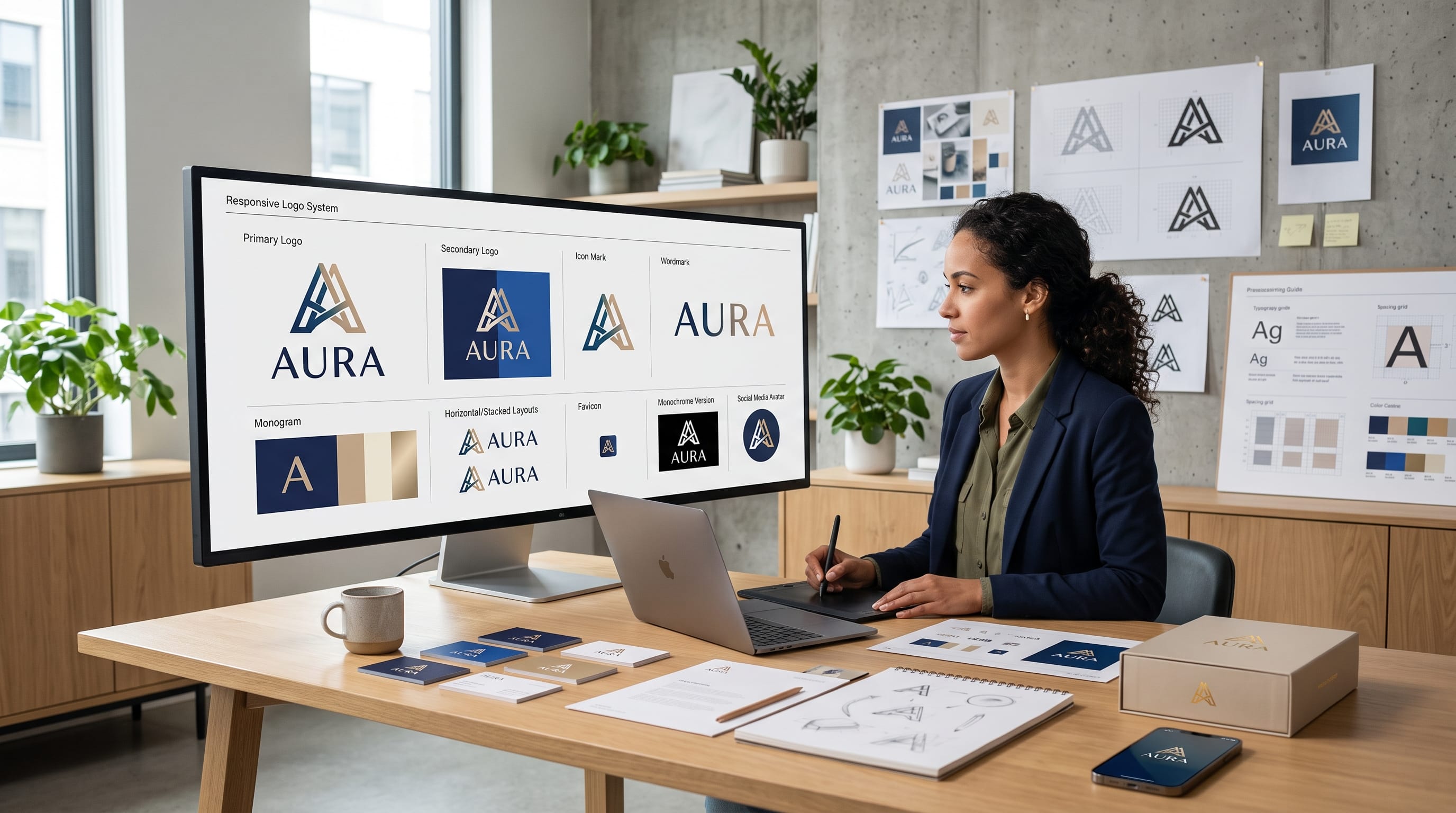
Logo variation tips can help new businesses create flexible visual identities that remain recognizable across websites, mobile applications, social media, packaging, advertising, and printed materials. A single logo design is rarely enough to support every platform and screen size.
A horizontal logo may look professional in a website header but become unreadable inside a social media profile image. A detailed emblem may work on packaging but lose clarity when reduced to a browser favicon. Digital products also need simplified icons that remain visible on mobile screens, dashboards, and application menus.
For this reason, designers should build a complete logo system instead of delivering only one static file. A logo system includes multiple coordinated versions of the same identity, each created for a specific purpose.
These logo variation tips explain how founders and designers can create primary logos, secondary arrangements, icons, wordmarks, monograms, responsive formats, and color alternatives without weakening brand consistency.
Why Logo Variation Tips Matter for New Businesses
A logo is used in more places than many founders expect. It may appear on a website, invoice, application icon, social post, presentation, email signature, product label, advertisement, or storefront sign.
Each format creates different limitations.
A website header offers enough horizontal space for a full wordmark. A mobile application icon is square and very small. A product label may require a vertical arrangement, while a social media banner may need a wide layout.
Without prepared variations, people may stretch, crop, recolor, or rearrange the original logo incorrectly.
A structured logo system helps a business:
- Maintain visual consistency
- Improve readability
- Adapt to different screen sizes
- Avoid distorted logo placement
- Create professional marketing materials
- Support future business growth
- Simplify content production
- Protect brand recognition
The best logo variation tips are not about creating unrelated designs. Every version should clearly belong to the same brand.
Understand the Difference Between Logo Variations
Logo variations are approved versions of the same visual identity.
They may change:
- Orientation
- Scale
- Color
- Level of detail
- Symbol placement
- Included text
- Background treatment
They should not change the core concept, typography, proportions, or personality without a clear reason.
A complete system usually includes:
- Primary logo
- Secondary logo
- Brand mark
- Wordmark
- Monogram
- Responsive logo
- One-color version
- Reversed version
- App icon or favicon
Not every business needs all nine formats, but most brands require more than one.
1. Create a Strong Primary Logo
The primary logo is the main representation of the brand. It should appear in the most important and spacious placements.
It may include:
- Business name
- Symbol
- Tagline
- Established date
- Supporting descriptor
For a new business, the primary logo often appears on:
- Website headers
- Presentations
- Business cards
- Packaging
- Storefront signs
- Official documents
A primary logo should communicate the complete identity, but it should not become overloaded.
Avoid adding too many decorative details, slogans, dates, borders, and symbols. Every added element makes the design harder to scale.
One of the most useful logo variation tips is to design the primary version first, then simplify it for smaller formats.
2. Design a Secondary Logo
A secondary logo rearranges the same elements into a different shape.
For example, the primary logo may use a horizontal arrangement with the symbol beside the name. The secondary version could place the symbol above the name to create a vertical composition.
Secondary logos work well for:
- Square advertisements
- Product labels
- Social graphics
- Packaging
- Posters
- Website footers
The typography, symbol, and proportions should remain consistent with the primary version.
Do not create an entirely new logo concept. The secondary arrangement should feel like a flexible extension of the main identity.
Horizontal and Stacked Variations
The two most common arrangements are:
Horizontal logo:
The symbol and business name appear side by side.
Stacked logo:
The symbol appears above or below the name.
Horizontal logos suit navigation bars and wide banners. Stacked logos fit square or vertical spaces.
Preparing both versions prevents designers from forcing a wide logo into an unsuitable area.
3. Develop a Standalone Brand Mark
A brand mark is the visual symbol without the full business name.
It may be:
- Abstract icon
- Illustrated symbol
- Geometric shape
- Character
- Initial
- Monogram
- Product-inspired graphic
The brand mark is useful after customers become familiar with the full logo.
Common placements include:
- Social profile images
- Application menus
- Product stamps
- Packaging seals
- Watermarks
- Merchandise
- Browser favicons
A standalone symbol should remain recognizable without the wordmark.
If the icon becomes confusing when separated from the name, it may need simplification or stronger visual distinction.
4. Prepare a Wordmark Logo
A wordmark uses the business name as the main visual identity.
Well-designed wordmarks may include:
- Custom letterforms
- Modified typography
- Unique spacing
- Special ligatures
- Subtle letter replacements
- Distinctive capitalization
A wordmark is especially useful when the business name is short and memorable.
Digital products often benefit from a clean wordmark because it works well in website headers, application login screens, and presentations.
When developing wordmarks, test them at small sizes. Thin strokes, complex ligatures, and tight spacing may disappear on mobile screens.
Good logo variation tips always consider readability before decorative style.
5. Create a Monogram Variation
A monogram combines one or more initials into a compact symbol.
For example, a company named North Valley Studio might use the initials NVS or a combined NV mark.
Monograms work well for:
- Fashion labels
- Creative studios
- Consultants
- Luxury brands
- Personal brands
- Hospitality businesses
- Digital applications
They are useful when the full business name is too long for small spaces.
A strong monogram should:
- Remain readable
- Avoid unnecessary complexity
- Work in one color
- Scale clearly
- Reflect the primary typography
- Avoid looking like an unrelated symbol
Decorative frames, crests, wreaths, or geometric borders can support a monogram, but they should not overpower the letters.
6. Build Responsive Logo Variations
Responsive logos change their level of detail depending on available space.
A full responsive system may include:
- Complete logo with tagline
- Logo without tagline
- Shortened wordmark
- Symbol with initials
- Standalone icon
The smallest version should contain only the most recognizable element.
This approach is particularly important for digital products because logos appear across desktop, tablet, and mobile interfaces.
For example:
Large desktop header: Full logo with business name and tagline
Tablet navigation: Symbol and business name
Mobile header: Symbol only
Browser tab: Simplified icon
Responsive logo variation tips help the identity remain readable without simply shrinking every element.
7. Design a Favicon
A favicon is the small icon displayed in a browser tab, bookmark, or search result.
Because the space is extremely limited, detailed logos usually do not work.
A favicon may use:
- One initial
- Simplified monogram
- Basic symbol
- Distinctive geometric shape
Avoid small words or intricate illustrations. They will become unclear at tiny sizes.
Test the favicon against light and dark browser interfaces. It should remain recognizable at common sizes such as 16, 32, and 48 pixels.
A favicon may be small, but it supports brand recognition throughout the browsing experience.
Also Read: Logo Color Trends 2026: The Best Palettes to Try
8. Prepare an Application Icon
A digital product may need an application icon for smartphones, tablets, desktop software, or online dashboards.
An app icon should be more carefully developed than a basic crop of the original logo.
Consider:
- Square format
- Rounded-corner display
- Small-screen visibility
- Strong contrast
- Simple shapes
- Minimal text
- Platform requirements
Application icons often use the brand mark or monogram rather than the full wordmark.
Do not place the full business name inside the icon. It will usually become unreadable.
Test the design among other application icons to ensure it remains visually distinctive.
9. Create Social Media Logo Variations
Social media platforms use different image shapes and display sizes.
A complete logo package should prepare versions for:
- Profile images
- Cover banners
- Story graphics
- Video watermarks
- Post templates
- Highlight covers
Profile pictures are usually circular or square. A horizontal wordmark may be cropped or reduced too much.
Use the brand mark, monogram, or simplified icon for profile images. Reserve the full logo for cover graphics and branded posts.
These logo variation tips reduce the risk of inconsistent cropping across different platforms.
10. Create One-Color Logo Versions
A full-color logo may not always be suitable.
One-color variations are needed for:
- Stamps
- Embroidery
- Engraving
- Screen printing
- Invoices
- Documents
- Product labels
- Watermarks
Prepare solid black and solid white versions.
The logo should remain recognizable without gradients, shadows, texture, or multiple colors.
If important parts disappear in one color, the original design may rely too heavily on effects.
A strong logo system should work in both full color and monochrome.
11. Prepare a Reversed Logo
A reversed logo is designed for dark backgrounds.
It often uses white or light-colored typography and symbols.
Do not simply invert every color automatically. Some colors may lose contrast or look visually unbalanced.
Create an approved reversed version with:
- Correct text color
- Adjusted symbol color
- Tested contrast
- Preserved brand recognition
Include examples of acceptable backgrounds in the brand guidelines.
For instance, a white logo may be approved on navy, black, dark green, or dark photography with sufficient contrast.
12. Create Grayscale Logo Variations
Grayscale versions are useful for black-and-white printing, documents, newspaper advertising, and restricted production methods.
Convert the logo carefully rather than depending only on automatic grayscale settings.
Two different brand colors may become nearly identical gray tones. This can cause shapes to blend together.
Adjust the shades so that important elements remain separated.
Grayscale testing is also a useful way to evaluate visual hierarchy. If the logo loses clarity without color, its structure may need improvement.
13. Protect Clear Space Around Every Variation
Clear space is the minimum empty area surrounding the logo.
It prevents text, images, buttons, and other elements from crowding the identity.
A common approach is to define clear space using:
- Height of one letter
- Width of the symbol
- A specific part of the monogram
- A fixed proportional measurement
The same clear-space principle should apply to primary, secondary, and icon variations.
Show this rule visually in the brand guidelines. Written descriptions alone may be misunderstood.
Proper spacing makes even a simple logo feel more professional.
14. Define Minimum Logo Sizes
Every variation needs a minimum approved size.
Below that size, thin lines, small text, and decorative details may disappear.
Set minimum sizes for:
- Websites
- Mobile interfaces
- Social media
- Favicons
- Application icons
For example, a full logo with a tagline may only be approved above a certain width. Below that point, the version without the tagline should be used.
One of the most important logo variation tips is to switch versions instead of shrinking the full logo beyond readability.
15. Keep Typography Consistent
The typography should remain consistent across the entire logo system.
Do not use one font in the primary logo and a completely different style in the secondary variation.
Maintain:
- Typeface
- Letter spacing
- Capitalization
- Weight
- Custom modifications
- Word spacing
A monogram may require custom letter adjustments, but it should still relate to the main wordmark.
Typography is often one of the most recognizable parts of a brand. Inconsistent lettering can make variations feel disconnected.
Also Read: 20+ Typography Logo Ideas That Look Premium and Simple
16. Preserve the Original Proportions
Logo files should never be stretched horizontally or vertically.
Distortion affects:
- Letter shapes
- Symbol balance
- Spacing
- Brand consistency
- Professional appearance
Provide files with locked proportions and clear instructions.
Designers and team members should resize logos from the corners rather than changing width and height independently.
Include incorrect examples in the brand guidelines, such as:
- Do not stretch
- Do not rotate
- Do not crop
- Do not rearrange elements
- Do not change spacing
These restrictions help protect the visual identity.
17. Avoid Creating Too Many Logo Variations
A flexible system is useful, but too many variations can create confusion.
New businesses usually need a focused set of approved formats rather than dozens of options.
A practical starter package might include:
- Primary horizontal logo
- Secondary stacked logo
- Standalone brand mark
- Monogram or icon
- Black version
- White version
- Favicon
- App icon, when relevant
Each version should have a clear purpose.
Do not create a new variation for every marketing design. The layout should adapt around the approved logo system.
18. Test Logo Variations in Realistic Mockups
Logo designs should be tested in real situations before final delivery.
Useful mockups include:
- Website header
- Mobile app screen
- Social media profile
- Product packaging
- Business card
- Email signature
- Store sign
- Invoice
- Presentation cover
- Merchandise
Mockups reveal problems that may not be obvious on a blank design canvas.
For example, a thin wordmark may disappear on a photograph. A detailed monogram may become unclear when embroidered. A square icon may look unbalanced among other application icons.
These tests help designers refine the system before launch.
19. Prepare the Correct File Formats
A professional logo package should include both vector and raster formats.
Vector Files
Vector formats can be enlarged without losing quality.
Useful formats include:
- SVG
- EPS
- AI, when applicable
Use vector files for printing, signage, packaging, and professional editing.
Raster Files
Raster files are pixel-based.
Useful formats include:
- PNG
- JPG
- WebP
PNG is useful for transparent backgrounds. JPG works for simple previews and documents. WebP can support optimized website use.
Export each variation with clear filenames.
For example:
- brand-primary-horizontal.svg
- brand-secondary-stacked.png
- brand-icon-black.svg
- brand-logo-white.png
- brand-favicon.png
Organized files make the system easier to use.
20. Document Logo Variation Rules
Every business should have basic logo guidelines.
The document does not need to be extremely long, but it should explain:
- Available logo variations
- When to use each version
- Approved colors
- Clear-space requirements
- Minimum sizes
- Background rules
- Incorrect uses
- File-format recommendations
Digital product teams may also need guidance for:
- Navigation bars
- Loading screens
- App icons
- Login pages
- Dark mode
- Mobile interfaces
Clear documentation ensures that employees, developers, designers, and marketing partners use the identity consistently.
Logo Variation Tips for New Businesses
New businesses often have limited budgets, but they should still prepare essential variations.
Prioritize:
- Primary logo
- Secondary logo
- Brand mark
- Black version
- White version
- Social profile icon
- Favicon
Additional variations can be developed when the business expands into packaging, applications, retail locations, or merchandise.
Founders should avoid purchasing a single decorative logo file without considering practical use. A logo may look beautiful in a presentation but fail on websites, mobile screens, and small printed materials.
A flexible system provides greater long-term value.
Logo Variation Tips for Digital Products
Digital products create specific design challenges.
Logos may appear inside:
- Application headers
- Side menus
- Login screens
- Loading screens
- Browser tabs
- Mobile notifications
- App stores
- Dashboard interfaces
Avoid using large detailed logos inside functional areas. A compact icon or simplified wordmark may be more appropriate.
The identity should support the product experience rather than dominate it.
Design for Light and Dark Modes
Many digital platforms offer light and dark interfaces.
Prepare logo versions for both.
Test:
- Contrast
- Brand colors
- Thin strokes
- Transparency
- Background separation
A dark-colored symbol may disappear in dark mode. A white logo may be too bright on a light interface.
Provide approved versions instead of allowing developers to recolor the logo independently.
Optimize for Fast Loading
Large image files can slow down digital products.
Use SVG for scalable logos when supported. Optimize PNG files and avoid unnecessarily large dimensions.
The logo should remain visually sharp without increasing page weight.
Common Logo Variation Mistakes
1. Creating Unrelated Versions
Every variation should use the same visual language. Different fonts, symbols, and colors create confusion.
2. Shrinking the Full Logo Too Far
Use a simplified icon instead of reducing detailed text until it becomes unreadable.
3. Using the Wrong Version
A horizontal logo should not be forced into a narrow square area.
4. Recoloring Without Guidelines
Random color changes weaken recognition and may create contrast problems.
5. Forgetting One-Color Testing
A logo that depends entirely on gradients or effects may fail in print and production.
6. Ignoring Digital Requirements
Favicons, app icons, dark mode, and responsive headers should be considered early.
7. Delivering Disorganized Files
Unclear filenames make it difficult for clients and teams to choose the correct version.
8. Omitting Usage Guidelines
Without instructions, even a well-designed system can be used inconsistently.
Also Read: Monogram Logos That Look Luxury for Wedding
Final Thoughts on Logo Variation Tips
The most useful logo variation tips focus on flexibility, readability, and consistency. A new business or digital product should not depend on one logo file for every situation.
Start with a strong primary logo, then create a secondary arrangement, brand mark, wordmark, monogram, and simplified responsive versions where necessary. Prepare black, white, grayscale, and dark-background alternatives.
Digital products should also include favicons, app icons, and approved versions for light and dark interfaces. Every format should be tested at realistic sizes and inside actual layouts.
A well-planned logo system allows the brand to adapt without losing its identity. By following these logo variation tips, designers and founders can create visual assets that work confidently across websites, applications, social media, packaging, documents, and future marketing campaigns.

For high-quality fonts to boost your income, check out DM Letter Studio. Our professional fonts are perfect for branding, marketing, and content creation. So, don’t miss this opportunity.