
How to Create a Maximalist Graphic Design Style
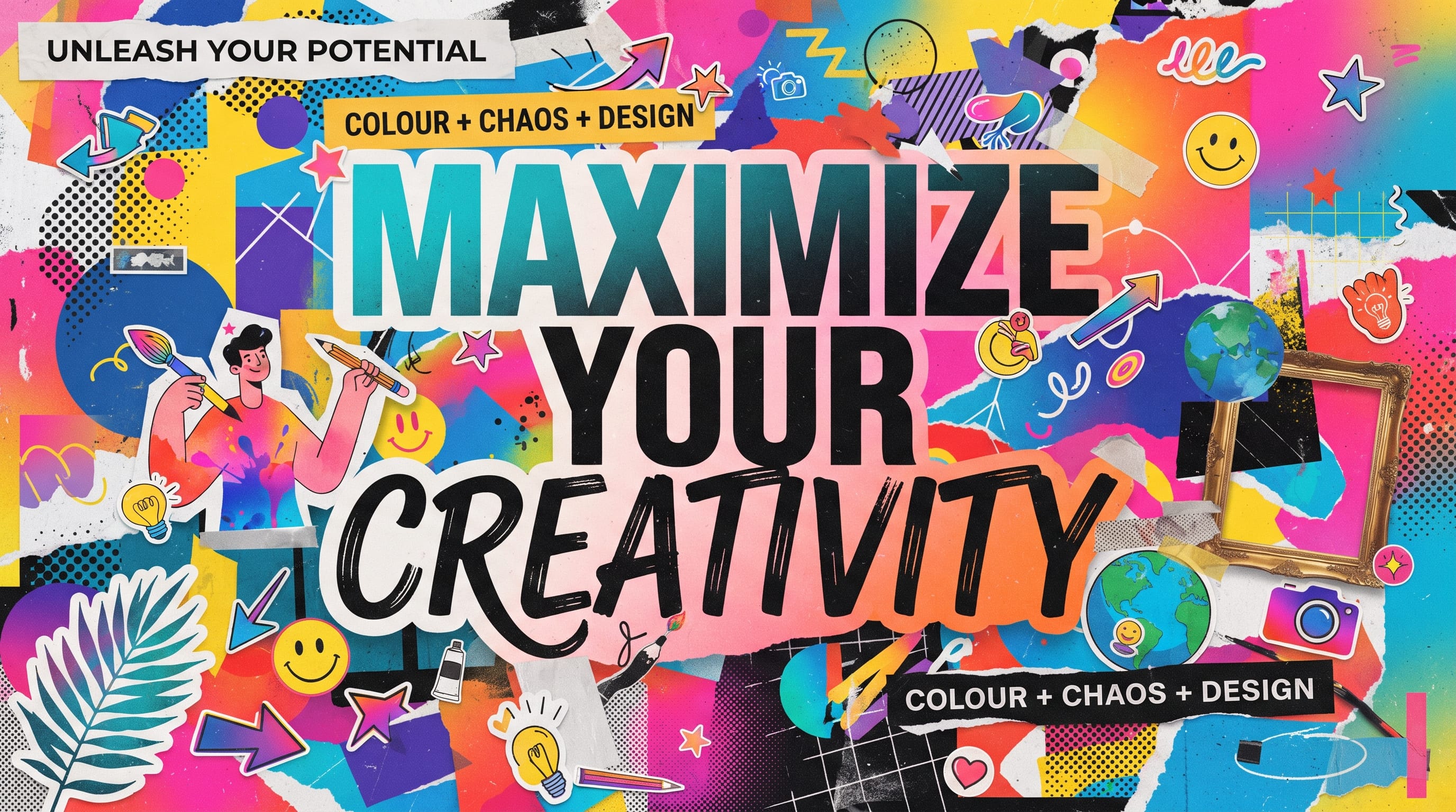
A maximalist graphic design style celebrates abundance, contrast, personality, and visual energy. Instead of relying on minimal layouts, restrained palettes, and large areas of empty space, maximalist design uses layered typography, bold colors, overlapping images, decorative details, patterns, textures, and unexpected combinations to create expressive visual experiences.
However, maximalism is not simply about adding more.
Strong maximalist design still needs:
- Hierarchy
- Rhythm
- Contrast
- Balance
- Intentional composition
Without those fundamentals, a design can quickly become cluttered rather than exciting.
The goal is controlled excess.
Designers and content creators can use maximalism for posters, branding, album covers, packaging, editorial layouts, social media campaigns, and other projects that benefit from a strong visual personality.
This guide explains how to create a maximalist graphic design style while keeping the final result readable, expressive, and professional.
What Is a Maximalist Graphic Design Style?
Maximalism is often described as the visual opposite of minimalism.
Minimalist design may use:
- Limited colors
- Simple typography
- Large white space
- Few decorative elements
Maximalist design may use:
- Many colors
- Large typography
- Layered images
- Patterns
- Decorative shapes
- Textures
- Dense compositions
However, the difference is not simply the number of elements.
A successful maximalist graphic design style still creates a clear visual system.
The viewer should know:
- What to notice first
- Where to look next
- Which elements belong together
The design may feel busy, but it should not feel random.
Start Maximalist Graphic Design With One Strong Concept
Before adding layers, decide what the design is about.
A strong concept can prevent the layout from becoming directionless.
For example:
Music Festival Poster
Concept: chaotic summer energy
Fashion Campaign
Concept: digital glamour
Beauty Brand
Concept: playful luxury
Editorial Spread
Concept: cultural overload
Once the concept is clear, every visual element can support it.
Ask:
- Does this color help the concept?
- Does this texture help?
- Does this extra image add meaning?
If not, remove it.
Maximalism still requires editing.
Build a Bold Color Palette
Color is often one of the strongest features of a maximalist graphic design style.
Instead of using one accent, try several expressive colors.
Possible combinations include:
Retro Energy
- Orange
- Mustard
- Pink
- Brown
- Cream
Digital Maximalism
- Electric blue
- Hot pink
- Acid green
- Black
Playful Editorial
- Red
- Yellow
- Cobalt
- Lavender
Luxury Maximalism
- Burgundy
- Emerald
- Gold
- Black
- Cream
Avoid choosing many unrelated colors at equal intensity.
A stronger palette has hierarchy.
For example:
- 60% dark purple
- 20% orange
- 15% pink
- 5% neon green
This creates structure even when the palette is bold.
Use One Dominant Color
One useful way to control maximalist color is to choose a dominant tone.
Then add secondary colors around it.
For example:
A poster could use deep blue as the foundation.
Then introduce:
- Orange typography
- Pink shapes
- Yellow accents
The design still feels colorful, but the main color holds everything together.
This is an important technique for keeping maximalist compositions visually coherent.
Create Strong Maximalist Typography
Typography is central to maximalist design.
You can experiment with:
- Oversized headlines
- Condensed fonts
- Wide fonts
- Italics
- Outlined text
- Curved text
- Stacked words
- Repeated lettering
Typography can become an image rather than simply carrying information.
For example:
CREATE LOUDER
could fill the entire poster.
Then supporting information can sit inside or around the large letterforms.
This creates immediate visual impact.
Mix Typefaces Carefully
A maximalist graphic design style can use more typefaces than minimalist design, but combinations should still feel intentional.
Serif + Sans Serif + Script
Best for editorial maximalism, fashion posters, magazine-inspired layouts, and expressive branding.
Example font suggestions:
- Anya Slab – strong serif/slab foundation for headlines
- Novaline – cleaner supporting typography
- Gold Sherry – expressive script accent
Condensed + Wide
This combination creates strong scale and width contrast, which works well for music posters, event graphics, streetwear, and experimental layouts.
Example font suggestions:
- Varsity Condense – narrow, impactful typography
- Plump Varsity – wide and heavy contrast
Bold Display + Monospace
For experimental digital maximalism, start with a dramatic display face and contrast it with something cleaner and more technical.
Example font suggestions:
Avoid using five unrelated decorative fonts without a reason.
A useful rule is:
Choose one dominant display font.
Then use one or two supporting fonts.
This keeps the composition expressive without destroying readability.
Use Size Contrast Aggressively
Maximalism benefits from dramatic scale.
Try:
- Extremely large headline
- Tiny caption
- Medium supporting line
For example:
MAXIMAL
could occupy 70% of the layout.
Then:
Graphic Design Exhibition
appears much smaller beneath it.
The scale difference creates energy and hierarchy.
If every element is large, nothing feels important.
Layer Typography
Text does not always need to sit cleanly above images.
You can:
- Place text behind a subject
- Overlap letters with photographs
- Put text inside shapes
- Repeat words in the background
- Crop oversized letters
This creates depth.
However, keep important information readable.
Event dates, prices, URLs, and calls to action should not disappear inside decorative layers.
Use Collage for Maximalist Graphic Design
Collage is one of the strongest techniques for creating a maximalist look.
Combine:
- Photography
- Illustration
- Paper texture
- Shapes
- Hand-drawn elements
- Typography
For example:
A fashion poster could include:
- Model portrait
- Torn paper edges
- Handwritten notes
- Geometric shapes
- Large type
The key is creating relationships between the elements.
Do not place random images everywhere.
Use repeated colors, shapes, or alignment to unify the collage.
Mix Photography and Illustration
Photography provides realism.
Illustration adds personality.
Together, they can create stronger maximalist compositions.
Try:
- Photograph + hand-drawn flowers
- Portrait + geometric shapes
- Product image + cartoon elements
- Architecture + abstract lines
This works particularly well for:
- Editorial design
- Fashion
- Music
- Youth brands
- Social campaigns
Make sure the illustration style fits the photographic mood.
Use Overlapping Images
Overlap creates visual density.
You can layer:
- Portraits
- Product photos
- Cutout objects
- Textures
For example:
- Place one portrait partially behind another.
- Add typography crossing both images.
- Then introduce a small decorative graphic in the foreground.
This creates depth and movement.
But keep one clear focal point.
Also Read: 50 Social Media Graphic Design Ideas for Better Visual Content
Add Patterns
Patterns can make a maximalist graphic design style feel richer.
Use:
- Checkerboards
- Stripes
- Dots
- Waves
- Florals
- Geometric motifs
Patterns can appear as:
- Backgrounds
- Small panels
- Borders
- Decorative shapes
Do not use every pattern at full strength.
One pattern might dominate while another appears more subtly.
This creates hierarchy.
Add Texture
Texture can prevent digital maximalism from feeling too flat.
Useful textures include:
- Paper grain
- Noise
- Photocopy effects
- Brush marks
- Fabric
- Ink
- Halftone
Texture works especially well in:
- Posters
- Album covers
- Editorial layouts
- Retro branding
Use texture selectively.
If every object has heavy grain, the design may lose contrast.
Create Visual Rhythm
Even a dense layout needs rhythm.
Repeat visual elements such as:
- Colors
- Shapes
- Type sizes
- Angles
- Motifs
For example:
Three red circles placed across a composition can create repetition.
Repeated italic type can create directional movement.
Rhythm helps the eye move through the layout instead of getting stuck.
Use Repetition Intentionally
Repetition is especially powerful in maximalism.
Try repeating:
- One word
- One icon
- One face
- One color
- One geometric shape
For example, repeat the word:
MOVE MOVE MOVE MOVE
in the background.
Then place the main headline above it.
This creates energy while maintaining visual connection.
Break the Grid Carefully
Maximalist design does not have to follow strict alignment.
Elements can:
- Tilt
- Overlap
- Move outside margins
- Break columns
However, grid-breaking works best when a grid exists underneath.
Build structure first.
Then break selected rules intentionally.
If everything ignores alignment, the composition can become chaotic.
Use Asymmetrical Composition
Asymmetry can make maximalist layouts feel more active.
Place:
- Large image on one side
- Smaller text block on another
- Decorative shapes around the edges
Avoid balancing everything perfectly.
Tension can make the design more memorable.
However, check whether the overall visual weight still feels controlled.
Keep One Clear Focal Point
This is one of the most important rules of maximalist graphic design style.
Even if the layout contains many elements, one thing should dominate.
Possible focal points:
- Face
- Product
- Headline
- Logo
- Illustration
Ask, what should viewers see first?
If the answer is unclear, simplify competing elements.
Maximalism is not about making everything equally important.
Use Contrast to Control Complexity
Contrast creates order.
Use contrast between:
- Large and small
- Dark and light
- Simple and detailed
- Thick and thin
- Smooth and textured
For example:
- A detailed collage background can support one large, simple headline.
- Or a minimal background area can hold a dense decorative cluster.
Contrast prevents the whole composition from becoming visually flat.
Use Decorative Borders and Frames
Maximalist designs often use strong framing devices.
Try:
- Thick borders
- Ornamental corners
- Repeated lines
- Illustrated frames
- Geometric edges
Frames work well in:
- Posters
- Packaging
- Editorial covers
A border can help contain a dense design.
It gives the eye a clear boundary.
Use Maximalist Graphic Design in Posters
Posters are ideal for maximalism because they allow large-scale typography and expressive composition.
A maximalist poster might include:
- Large headline
- Layered images
- Bright color
- Texture
- Small informational text
For example:
Music Poster
Large condensed title
Photocopy portrait
Neon shapes
Repeated date text
Grain texture
The result can feel energetic without sacrificing the event details.
Use Maximalist Style in Branding
Maximalist branding works well for businesses that want a strong personality.
Examples include:
- Fashion
- Music
- Beauty
- Restaurants
- Creative studios
- Youth brands
A maximalist identity might use:
- Bold logo
- Bright palette
- Patterns
- Illustrations
- Expressive type
The challenge is consistency.
Create clear rules so the brand does not look completely different on every application.
Also Read: Minimalist Graphic Design Inspiration for Modern Brands
Build a Maximalist Brand System
Define which elements are always present.
For example:
Core Elements
- One display font
- Three main colors
- Checkerboard pattern
- Hand-drawn icons
Flexible Elements
- Photography
- Collage
- Decorative shapes
This creates enough structure for the identity to remain recognizable.
The system can still feel expressive without becoming random.
Use Maximalist Design for Social Media
Maximalism can work particularly well on social platforms because bold content can attract attention quickly.
Use:
- Large text
- Strong color
- Layered images
- Repeating shapes
However, design for mobile viewing.
Small text may disappear.
Keep the main message large enough to understand quickly.
Create templates so the content remains consistent across posts.
Create Maximalist Carousels
Instagram and LinkedIn carousels can use maximalism effectively.
For example:
Slide 1
Large headline
Slide 2
Collage + short text
Slide 3
Bold statistic
Slide 4
Pattern + image
Slide 5
CTA
Repeat colors and typography across all slides.
This creates variety while maintaining a connected visual system.
Use Maximalist Design in Editorial Projects
Magazine spreads and editorial graphics are another strong fit.
Use:
- Oversized headlines
- Layered images
- Pull quotes
- Decorative text
- Unexpected grids
The design can feel expressive while still supporting long-form content.
Keep body text readable.
Do not apply experimental styling to every paragraph.
Decorative typography should support the editorial structure, not interfere with it.
Use Maximalist Design in Packaging
Packaging can use maximalism to create strong shelf impact.
Possible elements include:
- Bold illustrations
- Large type
- Repeating patterns
- Multiple colors
This works particularly well for:
- Snacks
- Beverages
- Beauty
- Lifestyle products
However, packaging still needs hierarchy.
Customers should quickly identify:
- Brand
- Product
- Variant
Do not let decoration hide essential information.
Maximalist Graphic Design Examples by Style
Maximalism can take many forms.
Retro Maximalism
Use:
- Wavy typography
- Orange
- Mustard
- Brown
- Repeating curves
Digital Maximalism
Use:
- Neon color
- Chrome
- Gradients
- Distorted type
- 3D forms
Editorial Maximalism
Use:
- Large serif typography
- Photography
- Strong grid-breaking
- Pull quotes
Playful Maximalism
Use:
- Cartoon icons
- Bright color
- Hand lettering
- Shapes
Luxury Maximalism
Use:
- Deep jewel tones
- Decorative serif
- Metallic details
- Rich pattern
Each direction uses abundance differently.
How to Prevent Maximalist Design From Looking Messy
Maximalism becomes clutter when everything competes.
Use these controls:
Limit the Palette
Use many colors if needed, but define a system.
Limit the Fonts
Keep one dominant display font and supporting type.
Repeat Elements
Create visual unity.
Maintain Hierarchy
One main element should lead.
Edit Aggressively
Remove anything that does not contribute.
This is the difference between intentional maximalism and uncontrolled decoration.
Use White Space Strategically
Maximalism does not mean eliminating all empty space.
Small areas of negative space can make dense sections feel stronger.
For example:
- Place a very detailed collage on the left.
- Keep the right side relatively simple with the headline.
The contrast makes both areas more effective.
White space can be part of maximalism when used intentionally.
Design From Big Shapes to Small Details
A practical workflow is to build the composition in layers.
Layer 1
Large image or shape
Layer 2
Headline
Layer 3
Supporting typography
Layer 4
Patterns
Layer 5
Textures
Layer 6
Small decorative details
This prevents the design from becoming overly detailed too early.
Always establish the main composition first.
Test the Design at Different Sizes
A maximalist layout may look good when large but become confusing when small.
Test:
- Poster size
- Social feed
- Mobile
- Thumbnail
Ask:
- Is the main message visible?
- Does the focal point remain clear?
- Are supporting details readable?
If not, create simplified versions.
Common Maximalist Graphic Design Style Mistakes
Adding Elements Without Purpose
Every addition should support the concept.
Using Too Many Fonts
Create a controlled type system.
Making Everything Bright
Use color hierarchy.
Ignoring the Focal Point
Choose one dominant element.
Mixing Too Many Styles
Keep the visual language connected.
Using Too Many Textures
Let some surfaces remain clean.
Forgetting Readability
Important information still matters.
Ignoring Alignment
Even experimental layouts need structure.
Copying Trends Too Closely
Develop a distinctive interpretation.
Refusing to Remove Anything
Editing is essential.
Maximalist Graphic Design Style Checklist
Before finalizing the design, ask:
- Is the concept clear?
- Is there one strong focal point?
- Does the color palette feel intentional?
- Is typography expressive but readable?
- Are images connected visually?
- Are patterns repeated strategically?
- Does texture add value?
- Is there enough contrast?
- Does the composition have rhythm?
- Are decorative details consistent?
- Does the layout feel dense rather than chaotic?
- Is important text readable?
- Does the design work at smaller sizes?
- Have unnecessary elements been removed?
- Does the final result feel distinctive?
If the design feels confusing, reduce one or two competing elements and review it again.
Also Read: Different Graphic Design Styles and What Makes Each One Unique
Final Thoughts on Maximalist Graphic Design Style
A strong maximalist graphic design style is not about placing as many elements as possible into one composition.
It is about creating controlled visual abundance.
Bold color, layered typography, collage, photography, illustration, texture, patterns, and decorative details can all work together when they follow a clear concept.
Start with one strong idea.
Then create hierarchy.
Choose a dominant color or image, establish the main typography, and build supporting layers around it.
Use repetition and rhythm to connect elements.
Break grids intentionally rather than randomly.
Most importantly, keep editing.
Even maximalist design benefits from removing anything that does not support the message.
The goal is to create visual energy without losing communication.
When color, typography, imagery, texture, and composition work together, a maximalist graphic design style can feel expressive, memorable, emotional, and highly distinctive.
For designers and content creators, maximalism offers an opportunity to move beyond safe layouts and explore a more confident visual language.
Use more.
But make every element matter.