
Modern Minimalist Packaging Ideas for Better Branding
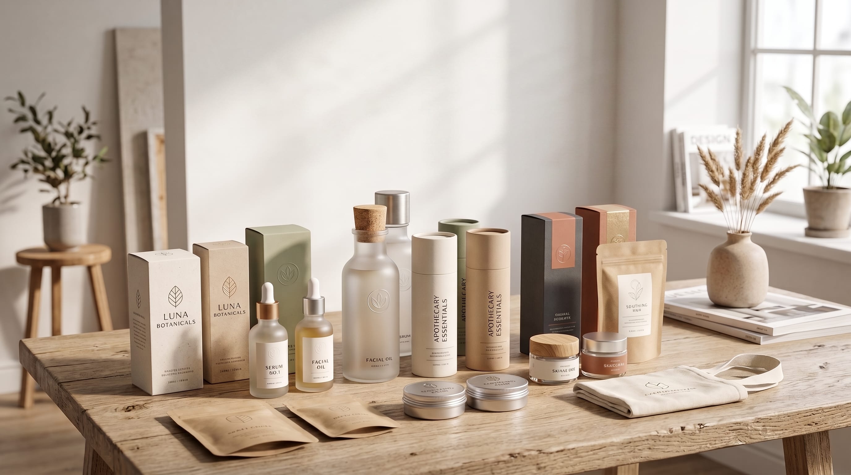
Modern minimalist packaging ideas help brands communicate value with fewer visual elements, clearer information, and more intentional design choices. Instead of covering every surface with colors, claims, illustrations, and decorative details, minimalist packaging focuses attention on the elements that matter most.
A minimalist package may use a limited color palette, simple typography, generous spacing, clean product information, and one memorable visual feature. This approach can make a product feel modern, professional, premium, and easier to recognize.
However, minimalist packaging is not simply empty packaging. Removing too much information or personality can make the design feel unfinished, generic, or difficult to understand. The goal is to simplify the message while preserving brand distinction and practical usability.
The strongest modern minimalist packaging ideas combine visual restraint with thoughtful materials, consistent typography, clear hierarchy, and a recognizable brand system. This guide explores practical approaches for beauty, food, wellness, fashion, home, technology, and ecommerce packaging.
Why Modern Minimalist Packaging Ideas Work
Customers often see many competing products at the same time. Busy shelves, crowded online marketplaces, and fast-scrolling social feeds can make visually complicated packaging difficult to process.
Minimalist packaging can create contrast by presenting information more clearly.
It may help a brand:
- Communicate the product quickly
- Improve shelf recognition
- Create a premium impression
- Strengthen typography
- Reduce visual clutter
- Support consistent product ranges
- Improve product photography
- Make important information easier to find
- Adapt designs across multiple package sizes
The best modern minimalist packaging ideas do not remove information randomly. They organize it according to importance.
A customer should be able to identify the brand, product, key benefit, and variation without studying the package for too long.
Start With a Clear Packaging Strategy
Before designing the layout, define what the packaging needs to communicate.
Consider:
- Brand name
- Product name
- Product category
- Primary benefit
- Size or quantity
- Flavor, scent, or variation
- Required legal information
- Instructions
- Sustainability claims
- Contact details
Separate essential front-facing information from details that can appear on the side or back panel.
For example, a skincare bottle may need the brand name, product type, key ingredient, and volume on the front. Directions, warnings, and the complete ingredient list can appear elsewhere.
This creates a cleaner hierarchy without removing necessary information.
1. Use Generous White Space
White space is one of the most recognizable elements in minimalist packaging. It refers to the empty space surrounding text, logos, images, and other design elements.
White space does not always need to be white. It may use cream, beige, pale gray, soft green, black, or another solid brand color.
Generous spacing can:
- Improve readability
- Make a logo feel more important
- Create a premium appearance
- Separate information groups
- Help small details stand out
- Reduce visual tension
Avoid filling empty areas simply because they appear unused. Space can be an active part of the composition.
One of the most useful modern minimalist packaging ideas is to reduce the number of elements while increasing the space around the remaining ones.
2. Build a Strong Typographic Hierarchy
Typography often becomes the main visual feature in minimalist packaging.
A clear hierarchy may include:
- Brand name
- Product name
- Product category
- Key benefit
- Variant or flavor
- Size and supporting details
Use differences in size, weight, capitalization, spacing, and position to show importance.
For example:
- Large brand name
- Medium product title
- Small category description
- Tiny supporting information
Avoid using too many font families. One or two coordinated typefaces are usually enough.
A clean sans serif can communicate modernity, while an elegant serif may create a premium or editorial appearance. A custom wordmark can add personality without requiring extra graphics.
3. Create a Typography-Only Package
Typography-only packaging removes most illustrations and photography, allowing the wording and layout to define the identity.
This style works well for:
- Skincare
- Fragrance
- Coffee
- Tea
- Supplements
- Fashion accessories
- Creative products
- Premium food
A typography-only design may use:
- Oversized product names
- Bold vertical text
- Small technical labels
- Structured grids
- Custom lettering
- Repeated words
- Strong alignment
The package still needs visual distinction. Typography should not look like information placed on a blank box without design consideration.
Experiment with scale, spacing, alignment, and controlled contrast.
4. Choose a Limited Color Palette
Many modern minimalist packaging ideas use two to four colors.
A practical palette may include:
- One primary brand color
- One neutral background
- One text color
- One accent color
For example:
- Warm white background
- Charcoal typography
- Sage green brand accent
- Muted gold detail
A limited palette improves consistency and makes production easier. It may also reduce printing complexity, depending on the material and process.
Avoid choosing neutral colors only because they appear minimalist. The palette should still reflect the product category and brand personality.
A children’s product might use brighter colors, while a luxury fragrance may rely on black, cream, and metallic accents.
5. Use One Bold Brand Color
Minimalist packaging does not need to be pale or quiet. A single strong color can create powerful recognition.
Examples include:
- Bright orange box with black typography
- Cobalt blue bottle with white lettering
- Deep burgundy label with cream text
- Neon green pouch with a simple black logo
- Red container with minimal white information
Using one dominant color can help a product stand out in retail displays and social media photography.
Keep the remaining layout restrained so the color remains the main visual statement.
This is one of the strongest modern minimalist packaging ideas for startups that want to build recognition without complex illustrations.
6. Apply Monochromatic Packaging
A monochromatic package uses several shades of one color.
For example, a green packaging system may include:
- Pale mint background
- Medium sage panels
- Deep forest green text
- Transparent green-tinted material
Monochromatic palettes can feel refined and highly coordinated.
They work well for:
- Natural products
- Skincare
- Tea
- Wellness
- Home products
- Fashion
- Organic food
Make sure the contrast remains strong enough for text, warnings, and product information.
Different shades should create hierarchy rather than blending together.
7. Use Small, Strategic Illustrations
Minimalist packaging can include illustrations when they are controlled and meaningful.
A small illustration may show:
- Main ingredient
- Product origin
- Flavor
- Plant source
- Product function
- Brand symbol
For example, a tea box may feature one simple leaf drawing. A honey label might use a small line illustration of a bee. A skincare bottle could use a minimal botanical icon.
Keep the illustration style consistent across the full product range.
Avoid adding decorative graphics that do not help customers understand or remember the product.
8. Explore Simple Geometric Shapes
Geometric elements can add structure and distinction without making packaging feel crowded.
Useful shapes include:
- Circles
- Rectangles
- Arches
- Lines
- Grids
- Squares
- Repeated dots
- Abstract blocks
A colored circle might identify a product flavor. A rectangular panel may organize important information. A line can separate the product name from technical details.
Geometric modern minimalist packaging ideas work especially well for technology, beauty, supplements, food, and contemporary lifestyle products.
Use consistent proportions and alignment throughout the range.
Also Read: Packaging Design Trends for Better Visual Impact and Sales
9. Create a Flexible Packaging Grid
A grid helps organize the package consistently across different products and sizes.
A basic system may define:
- Logo position
- Product-name area
- Variant marker
- Information block
- Image area
- Barcode zone
- Legal text placement
Once the grid is established, colors, names, or small illustrations can change while the overall brand remains recognizable.
This is useful for companies with many product variations.
For example, a coffee company may keep the same typographic structure while changing the accent color for each roast.
A flexible grid prevents each package from becoming a separate design project.
10. Use Color Coding for Product Variations
Color coding helps customers identify flavors, scents, ingredients, sizes, or product categories.
A minimalist range might use:
- Orange for citrus
- Green for herbal
- Blue for calming
- Pink for floral
- Brown for chocolate
- Purple for nighttime products
Keep the core logo, typography, and layout consistent. Only the approved variation color should change.
This creates a system that is easy to understand and visually satisfying when displayed together.
Avoid colors that are too similar, especially when customers need to distinguish products quickly.
11. Explore Transparent Packaging
Transparent materials allow the product itself to become part of the design.
This approach can work for:
- Food
- Beverages
- Cosmetics
- Stationery
- Home accessories
- Clothing
- Handmade products
A transparent package may use a small label, simple logo, or limited printed information.
The product must look attractive and consistent because it remains visible.
Consider how the package appears when:
- Full
- Partially used
- Displayed under store lighting
- Photographed
- Viewed from the back
Transparent modern minimalist packaging ideas can communicate honesty and product quality when executed carefully.
12. Use Natural and Uncoated Materials
Material choice can communicate minimalism before customers read any text.
Useful materials include:
- Kraft paper
- Uncoated cardboard
- Recycled board
- Glass
- Aluminum
- Cotton
- Molded fiber
- Natural paper labels
- Wood
Natural materials are especially appropriate for handmade, organic, sustainable, and lifestyle brands.
However, brands should avoid making environmental claims based only on visual appearance. Brown paper does not automatically make packaging sustainable.
The material should be selected according to product protection, transportation, recyclability, sourcing, and local waste systems.
13. Combine Minimalism With Sustainable Design
Sustainable packaging often benefits from minimal design because both approaches encourage reduced materials and unnecessary decoration.
Possible strategies include:
- Smaller packaging dimensions
- Fewer material layers
- Recyclable components
- Refillable containers
- Reusable boxes
- Reduced ink coverage
- Easily separated materials
- Clear disposal instructions
- Concentrated product formats
Do not sacrifice product protection in the name of minimalism. Damaged products can create more waste through returns and replacements.
Sustainability information should be specific and easy to verify.
Avoid vague wording such as “eco-friendly” without explaining the actual material or environmental benefit.
14. Use Embossing or Debossing
Embossing raises an element from the package surface, while debossing presses it inward.
These finishing techniques can add tactile interest without introducing extra color or complex graphics.
They work well for:
- Logos
- Monograms
- Product names
- Borders
- Small symbols
- Textures
A blind emboss uses no ink or foil, allowing the material and shadow to create the effect.
This can make packaging feel premium while preserving a minimalist appearance.
Test the depth carefully. Fine details may not reproduce well on every paper or production method.
15. Add Controlled Foil Details
Foil can create contrast and premium appeal when used in small areas.
Possible foil colors include:
- Gold
- Silver
- Copper
- Rose gold
- Holographic
- Colored metallic foil
Use foil for:
- Brand names
- Small lines
- Monograms
- Product categories
- Limited-edition details
Covering large areas with metallic foil may weaken the minimalist effect and increase production costs.
One of the best modern minimalist packaging ideas for luxury brands is to combine a matte surface with one restrained metallic detail.
16. Explore Matte Finishes
Matte surfaces reduce reflection and often make packaging feel soft, modern, or premium.
Matte finishes work well with:
- Black packaging
- Neutral colors
- Soft pastels
- Deep jewel tones
- Minimal typography
- Spot gloss details
However, some matte coatings may show fingerprints, scratches, or marks. Testing is important before large production runs.
A matte surface can be combined with gloss varnish on the logo or product name to create subtle contrast.
17. Use a Single Product Photograph
Photography can still support minimalist packaging when only one strong image is used.
Choose an image that clearly represents:
- Ingredient
- Flavor
- Product texture
- Result
- Origin
- Intended use
A pasta box may use one close-up image of the finished dish. A skincare package could include a single botanical photograph. A drink label might feature one fruit.
Avoid small collages and multiple competing images.
The photograph should have enough empty space and tonal consistency to work with the typography.
18. Create Minimal Window Cutouts
A cutout allows customers to see the product through a specific shape.
Possible forms include:
- Circle
- Arch
- Product silhouette
- Letter
- Geometric symbol
- Brand icon
Window cutouts work well for food, stationery, textiles, toys, and gift products.
The shape should connect to the brand or product rather than appearing decorative without purpose.
Ensure the cutout does not weaken the packaging structure or expose the product to damage.
Also Read: The Best Packaging Design Color Ideas for Creative Designers
19. Use Minimalist Labels on Standard Containers
Small businesses may not have the budget for custom bottles, boxes, or jars. A strong label system can transform standard containers into recognizable packaging.
Focus on:
- Consistent label dimensions
- Strong typography
- Clear information hierarchy
- Limited colors
- Quality label material
- Accurate placement
A simple jar with a well-designed label can look more professional than an expensive custom container with a crowded design.
This is one of the most accessible modern minimalist packaging ideas for startups and handmade brands.
20. Design a Strong Back Panel
Minimalism should not make practical information difficult to find.
The back or side panel may contain:
- Product description
- Instructions
- Ingredients
- Warnings
- Nutrition information
- Storage guidance
- Contact details
- Barcode
- Certifications
- Recycling instructions
Organize the content using headings, spacing, columns, and consistent typography.
Do not reduce the text size excessively simply to preserve empty space.
A clear back panel improves trust and usability.
Modern Minimalist Packaging Ideas for Beauty Brands
Beauty and skincare brands often use minimal packaging to communicate cleanliness, quality, and sophistication.
Useful approaches include:
- Frosted glass
- White labels
- Black typography
- Small ingredient icons
- Soft neutral palettes
- Monochromatic product ranges
- Minimal metallic accents
- Clear product numbering
For example, a skincare range could use identical bottles with a different muted color for each active ingredient.
Keep the product name and function easy to identify. Extremely vague labels may look attractive but frustrate customers.
Modern Minimalist Packaging Ideas for Food Products
Food packaging needs to balance visual appeal with clear product information.
Minimal food packaging may use:
- One ingredient illustration
- Bold product typography
- Transparent windows
- Color-coded flavors
- Natural paper
- Simple nutritional hierarchy
- Strong product photography
A minimalist design should not make the food look clinical unless that tone matches the brand.
Use warm colors, tactile materials, or friendly typography to preserve appetite appeal.
The product type should remain immediately understandable.
Modern Minimalist Packaging Ideas for Ecommerce
Ecommerce packaging is experienced differently from retail packaging. Customers often see the shipping box before the product package.
Minimal ecommerce branding can include:
- One-color shipping boxes
- Small exterior logo
- Branded tape
- Simple thank-you card
- Tissue paper
- Reusable mailer
- Minimal instruction card
- QR code for support
Avoid filling the box with unnecessary printed inserts.
Create a clear unboxing sequence that feels organized and intentional.
The package should also protect the product efficiently during transportation.
Modern Minimalist Packaging Ideas for Small Brands
Small businesses can create professional packaging without complicated production methods.
Start with:
- Standard container
- High-quality label
- Limited ink colors
- Consistent typography
- One clear brand mark
- Simple product variation system
- Recyclable shipping materials
Invest in the elements customers notice most, such as label quality, print clarity, material feel, and consistent placement.
Avoid ordering large quantities before testing the design with actual products.
Print prototypes and review them under natural light, store lighting, and in product photographs.
How to Keep Minimalist Packaging Memorable
Minimal packaging can become generic when it relies only on white backgrounds and basic sans serif typography.
Add distinction through one memorable feature:
- Custom wordmark
- Unique brand color
- Bold product naming system
- Unusual container shape
- Recognizable monogram
- Signature geometric element
- Tactile finish
- Original illustration
- Distinctive label placement
The package does not need many features. It needs one or two that customers can associate with the brand.
Consistency will make those features more recognizable over time.
Common Minimalist Packaging Mistakes
1. Removing Too Much Information
Customers still need to understand the product, benefits, size, and instructions.
2. Using Text That Is Too Small
Small typography may look refined on a design screen but become unreadable in print.
3. Copying Generic Luxury Packaging
Black, white, and gold do not automatically create a distinctive premium identity.
4. Ignoring Shelf Context
A subtle package may disappear when placed beside brighter competitors.
5. Using Too Many Similar Neutral Colors
Low contrast can make text and product variations difficult to identify.
6. Choosing Style Over Function
Packaging must protect, store, transport, open, and close correctly.
7. Making Every Product Look Identical
Consistent layouts are helpful, but variations still need clear identification.
8. Ignoring Production Limitations
Fine lines, small type, unusual folds, and specialty finishes may not reproduce as expected.
9. Assuming Minimal Means Cheap
Simple designs often require precise printing, high-quality materials, and careful spacing to look professional.
How to Develop a Minimalist Packaging System
Use this practical process:
- Define the target customer.
- Review competitor packaging.
- List required information.
- Choose one main brand message.
- Create a clear hierarchy.
- Select a limited color palette.
- Establish typography rules.
- Build a flexible grid.
- Design product variations.
- Create physical prototypes.
- Test readability and usability.
- Review production costs.
- Photograph the packaging.
- Refine the weakest areas.
- Document the final system.
A packaging system should make it easier to launch future products without redesigning the identity from the beginning.
Also Read: Gift Box Packaging Design for Better Customer Experience
Final Thoughts on Modern Minimalist Packaging Ideas
The most effective modern minimalist packaging ideas simplify communication while preserving personality, function, and brand recognition. Generous spacing, strong typography, limited colors, clear grids, quality materials, and restrained finishing techniques can make products feel more professional and memorable.
Minimalism should not remove essential information or weaken the customer experience. Every element should have a reason to appear, and every empty area should support hierarchy rather than feeling unfinished.
Beauty brands can explore frosted containers, monochromatic ranges, and refined type. Food businesses can combine clear labeling with one ingredient image or transparent window. Ecommerce companies can create cleaner unboxing experiences using simple boxes, branded tape, and minimal inserts.
Small brands can begin with standard containers and a carefully designed label system. A recognizable color, custom wordmark, monogram, or geometric detail can provide distinction without visual clutter.
Use these modern minimalist packaging ideas as a foundation for creating packaging that feels clean, intentional, and connected to the product. When simplicity supports both branding and usability, minimalist packaging can strengthen customer trust and create a more consistent visual identity.

For high-quality fonts to boost your income, check out DM Letter Studio. Our professional fonts are perfect for branding, marketing, and content creation. So, don’t miss this opportunity.