
Modern Motion Design Trends for Better Visual Storytelling
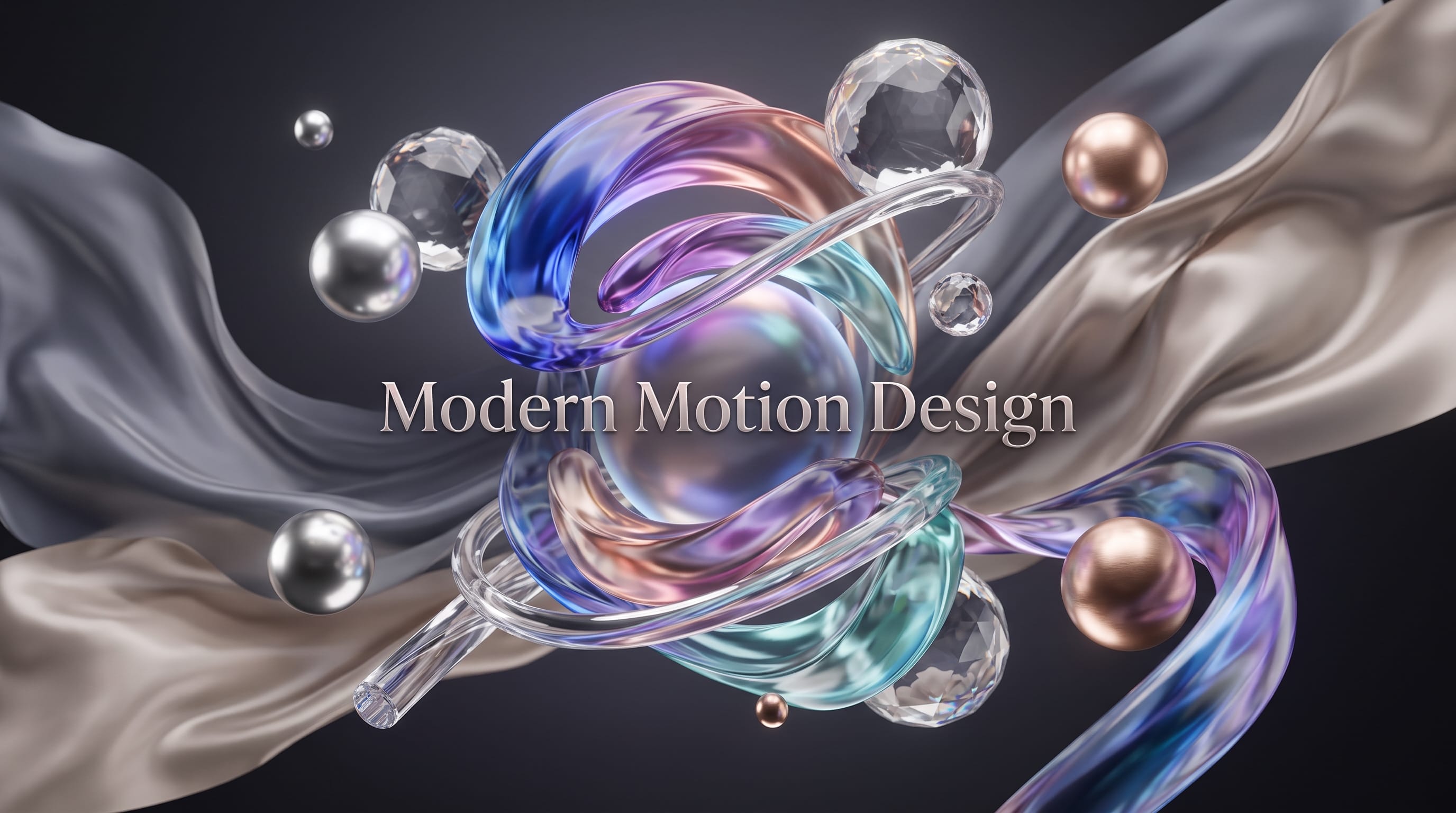
Modern motion design trends are changing how creators communicate ideas through animated typography, illustrations, interfaces, video, and three-dimensional graphics. Motion is no longer added only to make content look exciting. It has become a storytelling tool that controls attention, explains relationships, establishes mood, and gives brands a recognizable personality.
Audiences now encounter motion graphics across social media, websites, streaming platforms, digital advertising, product interfaces, live events, and branded content. This wide range of formats has encouraged designers to combine cinematic techniques with graphic design systems that remain readable on small screens.
Current visual-design reports point toward expressive typography, immersive energy, tactile materials, surreal imagery, and intentionally imperfect aesthetics. Adobe highlights exaggerated lettering, multisensory visuals, energetic compositions, and organic imperfection among its major 2026 design directions. Canva similarly describes a growing preference for tactile texture, warped reality, personal expression, and visual work that feels intentionally less polished.
The following modern motion design trends can help motion designers, video creators, marketers, and visual artists build more distinctive and meaningful stories.
Why Modern Motion Design Trends Matter
Motion design combines graphic design principles with timing, movement, sound, and sequence. A strong animation guides the viewer through information instead of moving every object without purpose.
Understanding current trends can help creators:
- Find new visual directions
- Improve brand storytelling
- Design content for emerging platforms
- Make typography more expressive
- Create stronger transitions
- Communicate complex ideas clearly
- Build more engaging social content
- Avoid work that feels visually outdated
Trends should be treated as creative references rather than strict rules. A technique only becomes valuable when it supports the message, audience, and brand.
The best modern motion design trends offer new ways to communicate while preserving hierarchy, readability, and emotional clarity.
1. Expressive Kinetic Typography
Kinetic typography remains one of the strongest tools in motion design. Instead of displaying words as static captions, designers use scale, rhythm, spacing, rotation, and distortion to give language physical energy.
A word may expand as a speaker becomes more confident. Letters may separate to suggest uncertainty. A sentence can move quickly across the screen to communicate urgency.
Adobe’s 2026 design forecast identifies exaggerated and playful lettering as a major visual direction, reflecting a broader interest in type that behaves as an expressive image rather than supporting text alone.
Use Typography to Reflect Meaning
Successful type animation connects movement to the meaning of the words.
For example:
- “Heavy” can fall with visible weight.
- “Quiet” can appear slowly with subtle opacity.
- “Fast” can stretch through motion blur.
- “Broken” can separate into fragments.
- “Repeat” can move in a looping pattern.
Avoid animating every letter differently without a clear reason. Too many unrelated movements make the message difficult to follow.
Expressive typography is especially useful for lyric videos, title sequences, advertisements, social posts, product launches, and educational content.
2. Intentionally Imperfect Motion
Highly polished digital animation can sometimes feel cold or overly mechanical. One of the most noticeable modern motion design trends is the return of irregular lines, uneven timing, rough edges, visible brushwork, and hand-created texture.
Canva describes 2026 as the year of “Imperfect by Design,” highlighting scribbles, playful grids, mixed typography, tactile surfaces, and less controlled compositions.
Creators can explore this direction through:
- Frame-by-frame drawing
- Wobbly outlines
- Handwritten notes
- Rough masks
- Paper scans
- Uneven letter spacing
- Stop-motion-inspired timing
- Visible construction marks
The goal is not to make the design careless. The imperfection should create personality, warmth, or authenticity.
This style works well for independent brands, music content, youth campaigns, editorial videos, personal storytelling, and handmade products.
3. Tactile Texture and Material Depth
Flat motion graphics are increasingly being combined with textures that suggest paper, fabric, clay, paint, glass, metal, plastic, and other physical materials.
Texture creates visual depth and helps digital content feel more sensory. Canva’s current design forecast identifies tactile realism and material experimentation as an important response to increasingly synthetic digital imagery.
Motion designers can add texture through:
- Film grain
- Scanned paper
- Ink bleeding
- Fabric movement
- Embossing
- Rough printing
- Clay animation
- Plastic reflections
- Painted brush strokes
- Surface scratches
Textures should not reduce readability. Keep essential typography and interface elements clear.
A useful approach is to apply texture to backgrounds, transitions, or selected objects while preserving clean areas for information.
4. Mixed 2D and 3D Motion Design
The separation between two-dimensional and three-dimensional motion graphics is becoming less important. Creators increasingly combine flat typography, vector shapes, photographs, and 3D objects within one composition.
A flat title may wrap around a three-dimensional product. A 3D object can move through an illustrated environment. Photographic cutouts may interact with procedural shapes and animated grids.
This visual mixture creates more freedom than committing to a fully realistic 3D scene.
Modern After Effects workflows are also expanding native 3D and vector possibilities, including improved 3D shape creation, animated SVG paths, and greater support for variable typography. These developments make it easier to combine graphic-design assets with spatial motion.
Keep Mixed-Media Scenes Consistent
When combining different styles, establish one unifying system.
Use consistent:
- Lighting
- Color
- Shadow direction
- Texture
- Perspective
- Movement speed
- Visual hierarchy
Without shared rules, mixed-media animation can look like unrelated assets placed together.
5. Surreal and Reality-Warping Animation
Surreal motion uses impossible scale, fluid environments, visual transformations, dreamlike transitions, and unexpected combinations of objects.
Adobe identifies surreal and absurdist imagery as a major visual trend, while Canva’s “Reality Warp” direction focuses on distorted photography and otherworldly scenes.
Possible techniques include:
- Objects transforming into different materials
- Rooms bending or expanding
- Faces merging with landscapes
- Products floating in impossible spaces
- Continuous zoom transitions
- Reversed gravity
- Animated optical illusions
- Seamless object morphing
Surreal motion is useful for music, fashion, technology, beauty, entertainment, and conceptual brand campaigns.
The effect is strongest when the unusual transformation supports an idea. Random surrealism may attract attention but fail to communicate anything meaningful.
Also Read: Graphic Design Basics and Principles for New Designers
6. AI-Assisted Motion Exploration
Artificial intelligence is becoming part of early concept development, image generation, video experimentation, rotoscoping, compositing, and motion planning.
AI can help creators explore:
- Storyboard variations
- Visual references
- Background concepts
- Texture directions
- Camera movement ideas
- Object transformations
- Style frames
- Early animation tests
Research into controllable image-to-video systems is also exploring how creators can specify camera paths and object movement rather than accepting completely automatic results. MotionCanvas, for example, investigates controls for both scene movement and cinematic camera design within image-to-video generation.
AI should support creative direction rather than replace it. Generated motion may contain visual inconsistencies, unstable details, incorrect physics, or weak timing.
Human creators remain responsible for narrative structure, brand accuracy, originality, editing, and final quality.
7. Variable Font Animation
Variable fonts allow one font file to contain adjustable properties such as weight, width, slant, and optical size.
In motion design, these properties can be animated smoothly. A headline might move from thin to bold, narrow to wide, or upright to italic without switching between separate font files.
This creates more fluid typography and allows the letterforms themselves to become part of the storytelling.
Variable font animation works well for:
- Logo reveals
- Music titles
- Product introductions
- Brand systems
- Interface animations
- Social media typography
- Event graphics
Recent After Effects updates have expanded support for variable font workflows, making animated type properties increasingly practical within professional motion projects.
Use the transformation carefully. Extreme adjustments can reduce readability or distort the intended personality of the typeface.
8. Data-Driven Motion Graphics
Animated charts, maps, timelines, and diagrams are becoming more visually sophisticated. Data motion helps audiences understand changes, comparisons, and relationships over time.
Examples include:
- Animated financial reports
- Social media statistics
- Climate visualizations
- Product analytics
- Sports data
- Election maps
- Educational diagrams
- Business presentations
A strong data animation reveals information in a controlled order. It should not move every number and shape simultaneously.
Use motion to:
- Introduce the topic.
- Establish the scale.
- Reveal the main comparison.
- Highlight the important result.
- End with a clear takeaway.
Data motion is most effective when the design remains accurate, accessible, and easy to pause or review.
9. Cinematic Camera Movement
Motion graphics are increasingly borrowing camera techniques from film and virtual production.
Creators use:
- Slow push-ins
- Parallax
- Tracking movement
- Orbital camera paths
- Rack-focus effects
- Handheld simulation
- Dramatic perspective changes
- Long continuous shots
Camera movement can make a simple scene feel more immersive, but it should guide attention rather than create constant visual instability.
A gentle camera move may create intimacy. A rapid orbit can communicate speed or chaos. A long push through multiple scenes can connect different parts of a story.
Plan the camera path during the storyboard stage instead of adding random movement after the design is complete.
10. Seamless Morphing and Continuous Transitions
Morphing connects scenes by transforming one shape, object, letter, or environment into another.
A circle may become a product, which transforms into a logo, which becomes the opening letter of a headline. This creates a continuous viewing experience without relying on ordinary cuts.
Modern motion-design research has explored methods for converting existing motion graphics into editable vector-based programs, allowing timing, movement, and appearance to be transformed more systematically.
Effective morphing depends on visual relationships. Look for shared:
- Shapes
- Colors
- Positions
- Silhouettes
- Lines
- Movement directions
The transition should connect ideas rather than exist only as a technical demonstration.
11. Retro-Futuristic Motion Styles
Retro-futurism combines visual references from older technology with modern animation techniques.
Common elements include:
- Pixel graphics
- Early computer interfaces
- Chrome typography
- CRT distortion
- Grid landscapes
- Neon gradients
- Vintage science-fiction imagery
- Analog noise
- Terminal text
- Geometric interface panels
This style works well for music, gaming, technology, fashion, and entertainment projects.
Avoid copying one historical period too literally. Combine retro references with modern spacing, typography, rendering, and pacing to keep the result contemporary.
Also Read: Best Retro Graphic Design Ideas for Modern Creatives
12. Minimal Motion and Digital Calm
Not every trend is moving toward greater intensity. Some creators are responding to digital overload with slower animation, restrained palettes, subtle transitions, and generous empty space.
Canva’s “Opt-Out Era” reflects this movement toward cleaner visual systems and reduced sensory pressure.
Minimal motion may include:
- Slow fades
- Gentle scaling
- Soft scrolling transitions
- Small typography shifts
- Calm looping backgrounds
- Limited color
- Controlled interface feedback
This direction is suitable for wellness, architecture, luxury, editorial, productivity, finance, and professional services.
The motion may be quiet, but it still needs precise timing and hierarchy.
13. Motion Systems for Brand Identity
Brands increasingly need more than one animated logo. They require repeatable motion systems that can be applied across video, websites, advertisements, presentations, applications, and social media.
A motion identity may define:
- Logo behavior
- Transition style
- Typography movement
- Object speed
- Easing
- Camera movement
- Intro and outro timing
- Sound cues
- Social media templates
For example, a playful brand may use bouncing motion and quick shape changes. A premium brand may use slower movement, smooth fades, and controlled spacing.
Consistent motion helps audiences recognize a brand even before the full logo appears.
14. Short-Form Motion for Social Media
Motion graphics for Reels, TikTok, YouTube Shorts, and Stories need to communicate quickly.
The first seconds are especially important. A strong social animation should establish the subject before viewers lose interest.
Useful techniques include:
- Large opening typography
- Immediate visual transformation
- Fast before-and-after comparisons
- Looping endings
- Vertical compositions
- Short caption sequences
- Clear focal points
- Sound-synchronized editing
Do not simply crop a horizontal design into a vertical frame. Rebuild the hierarchy for the smaller format.
Important text should remain inside safe areas where interface controls will not cover it.
15. Sound-Responsive Motion Design
Sound and motion are becoming more closely connected. Creators animate typography, shapes, transitions, and camera movement according to music, narration, or environmental audio.
Sound-responsive motion may follow:
- Beat
- Rhythm
- Volume
- Frequency
- Spoken emphasis
- Silence
- Emotional change
The most effective synchronization does not place movement on every beat. It uses selected moments to create contrast.
A pause can be as powerful as a rapid sequence. Silence may introduce a still frame before the next important movement.
Sound should be planned early instead of added only after the visual animation is complete.
How to Use Modern Motion Design Trends Effectively
Begin with the communication goal.
Ask:
- What should the audience understand?
- What should they feel?
- Which information appears first?
- Where will the animation be viewed?
- How long should it be?
- Does the brand already have motion guidelines?
Choose one dominant trend and use the others as supporting techniques.
For example:
Technology launch
- Mixed 2D and 3D
- Variable typography
- Cinematic camera movement
Editorial campaign
- Imperfect motion
- Paper texture
- Minimal color
Music visual
- Surreal transformation
- Sound-responsive movement
- Expressive typography
Business explainer
- Data-driven animation
- Clean transitions
- Restrained motion
A focused visual direction usually produces better storytelling than combining every popular technique.
Common Motion Design Mistakes
1. Moving Every Element
Movement loses impact when nothing remains still. Use contrast between motion and stability.
2. Ignoring Readability
Typography should remain visible long enough to understand. Decorative movement should not hide the message.
3. Using Trends Without Purpose
A visual effect may look impressive but fail to support the subject. Connect the technique to the story.
4. Overusing Transitions
Constant transitions can make a project feel like a demonstration reel. Let important scenes breathe.
5. Forgetting Sound
Timing may feel incomplete when music, narration, and visual rhythm are developed separately.
6. Designing Only for Desktop
Review motion on smartphones, vertical platforms, presentation screens, and other intended formats.
7. Copying Popular Work Too Closely
Use trend references to understand visual principles, then develop an original interpretation.
Also Read: Free Design Tools: Creators’ Guide To The Best
Final Thoughts on Modern Motion Design Trends
Modern motion design trends are moving in several directions at once. Some projects are becoming more immersive, surreal, textured, and energetic. Others are embracing slower pacing, imperfect details, and visual simplicity.
Expressive typography, mixed-dimensional scenes, variable fonts, tactile textures, cinematic camera movement, AI-assisted workflows, and brand motion systems all offer valuable creative opportunities.
The strongest work will not necessarily use the newest tool or most complex effect. It will use movement to clarify information, create emotion, and connect one moment to the next.
Treat these modern motion design trends as starting points. Adapt them to the project’s audience, platform, and purpose. When timing, typography, imagery, sound, and narrative work together, motion design becomes more than decoration. It becomes a powerful form of visual storytelling.

For high-quality fonts to boost your income, check out DM Letter Studio. Our professional fonts are perfect for branding, marketing, and content creation. So, don’t miss this opportunity.