
How to Create a Modern Website Design That Stands Out
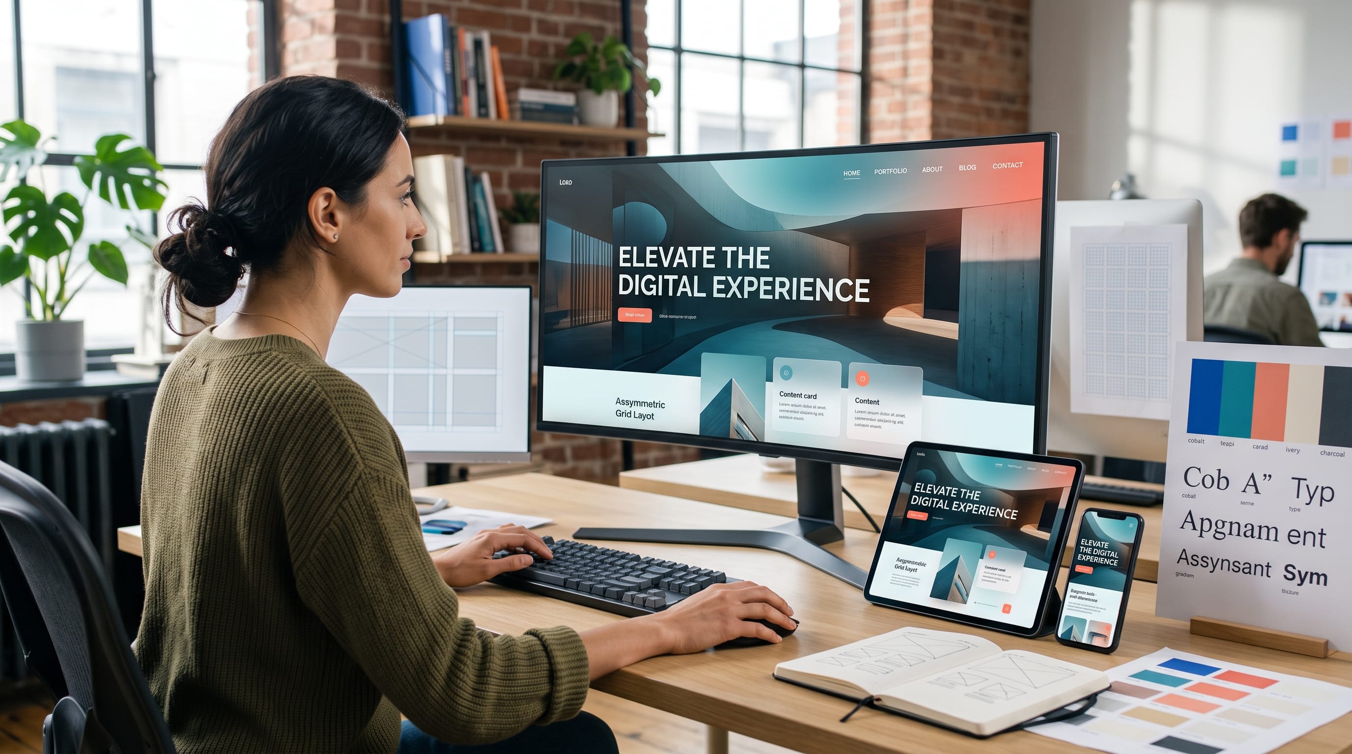
A strong modern website design combines visual personality with clear navigation, fast performance, useful content, and a comfortable experience across every screen. A website does not stand out simply because it uses bold colors, oversized typography, animation, or an unusual layout. It becomes memorable when those elements support the brand and help visitors understand what to do next.
Modern websites must compete for attention while remaining easy to use. Visitors often decide within seconds whether a page feels relevant and trustworthy. They need to identify the brand, understand the offer, locate important information, and recognize the next action without unnecessary confusion.
This means designers need to balance creativity with function. A visually experimental homepage may attract attention, but it can still fail when the text is difficult to read, the menu is unclear, or the page loads slowly.
This guide explains how to build a modern website design that feels distinctive while preserving usability, accessibility, responsiveness, and brand consistency.
What Makes a Modern Website Design Effective?
Modern does not always mean futuristic. A website can feel contemporary through thoughtful typography, strong spacing, clear hierarchy, responsive layouts, and consistent visual details.
An effective modern website design usually includes:
- Clear visual hierarchy
- Simple navigation
- Readable typography
- Responsive layouts
- Consistent brand colors
- High-quality imagery
- Purposeful motion
- Accessible contrast
- Fast loading
- Strong calls to action
The design should make the content easier to understand. Decorative elements should support the message instead of competing with it.
A professional website also needs consistency. Buttons, page sections, cards, headings, icons, and image treatments should follow a recognizable system.
Start With a Clear Website Purpose
Before developing the visual style, define what the website needs to achieve.
Possible goals include:
- Generating customer inquiries
- Selling products
- Displaying creative work
- Publishing educational content
- Building an email audience
- Promoting an application
- Accepting bookings
- Strengthening brand credibility
Choose one primary goal.
A portfolio website may focus on encouraging project inquiries. An ecommerce website should guide customers toward product discovery and checkout. A blog needs to make articles easy to find and comfortable to read.
The purpose should influence the page hierarchy, navigation, content, and calls to action.
A modern website design becomes stronger when every visual decision supports a clear user goal.
Define the Audience Before Designing
The website should reflect the expectations and needs of its intended users.
Consider:
- Age and background
- Industry knowledge
- Device preferences
- Problems they want to solve
- Information they need
- Actions they are expected to take
- Accessibility needs
- Reasons they may hesitate
A website for creative professionals may support more visual experimentation. A financial service website may need a more structured layout, restrained colors, and stronger trust signals.
Understanding the audience prevents designers from choosing trends only because they look impressive.
Build a Strong Visual Hierarchy
Visual hierarchy shows visitors which elements are most important.
It can be created through:
- Size
- Color
- Position
- Contrast
- Spacing
- Typography
- Alignment
- Shape
The main headline should be more visible than the supporting text. The primary button should stand out from secondary links. Important product information should be easier to locate than supporting details.
A page without hierarchy may contain attractive elements but still feel confusing.
Create One Primary Focal Point
Every page or section should have one main focus.
On a homepage hero, the focal point may be the headline and call-to-action button. On a product page, it may be the product image and purchase area.
Avoid making the logo, headline, navigation, background graphic, product image, and multiple buttons equally prominent.
The viewer needs a clear starting point.
Use Generous and Consistent Spacing
Spacing is one of the most important parts of modern website design.
It separates content, improves readability, and creates a more professional appearance.
Use consistent spacing between:
- Headings and paragraphs
- Sections
- Cards
- Buttons
- Images
- Navigation items
- Form fields
Empty space should not be treated as wasted space. It helps visitors understand which elements belong together.
Create a spacing system rather than choosing random values for every page. For example, use a small, medium, large, and extra-large spacing scale.
Consistency makes the website feel intentional.
Choose Modern Website Typography Carefully
Typography affects branding, readability, and emotional tone.
A modern website usually needs:
- One heading font
- One body font
- Clear size levels
- Consistent font weights
- Comfortable line spacing
- Strong contrast
Avoid using too many typefaces. Two coordinated fonts are normally enough.
Use Large Headings With Purpose
Oversized typography can create a strong introduction, but it should remain readable across different devices.
Large headings work well when:
- The wording is short
- The line breaks are controlled
- The contrast is strong
- The mobile version is adjusted
- The text does not cover important visuals
Do not use a very large heading simply because it is fashionable. The size should reinforce the message.
Keep Body Text Comfortable
Body text should remain easy to read during longer sessions.
Avoid:
- Extremely small font sizes
- Thin text on light backgrounds
- Very wide text columns
- Tight line spacing
- Long blocks of uppercase text
A comfortable text width and clear paragraph spacing can significantly improve the reading experience.
Create a Distinctive Color System
A professional color palette should support recognition and hierarchy.
A practical system may include:
- Primary brand color
- Secondary color
- Accent color
- Background colors
- Text colors
- Status colors
The accent color can highlight buttons, links, or important details. Neutral colors can balance stronger brand shades.
Use Bold Color Strategically
Bold colors can help a modern website design stand out, but they should have defined roles.
For example:
- Dark navy for primary backgrounds
- Warm white for content sections
- Bright orange for primary buttons
- Soft blue for supporting panels
- Charcoal for body text
Avoid using several saturated colors in equal amounts. The page may become visually tiring and lose its hierarchy.
Check Contrast
Text and buttons need sufficient contrast against their backgrounds.
Do not depend on color alone to explain important actions or states. Use labels, icons, patterns, or clear text where necessary.
Design a Memorable Hero Section
The hero is often the first major section visitors see.
A useful hero should answer:
- What is this website?
- What does the business offer?
- Who is it for?
- What should the visitor do next?
A strong hero may include:
- Clear headline
- Short supporting text
- Primary call to action
- Relevant image, video, or illustration
- Optional trust signal
Avoid vague headlines such as “Welcome to the Future.”
A more useful headline might be:
“Custom Website Design for Growing Creative Brands.”
The second version clearly communicates the service and audience.
Also Read: How to Make a Business Website That Looks Professional
Use High-Quality Images and Visuals
Images influence how professional and distinctive a website feels.
Useful visual directions include:
- Original photography
- Editorial images
- Product photographs
- Custom illustrations
- 3D objects
- Abstract compositions
- Interface screenshots
- Branded icons
Avoid generic stock images that do not connect to the company’s real personality.
The visual style should remain consistent across the website. Do not combine cinematic photography, flat cartoons, realistic 3D graphics, and unrelated stock images without a clear system.
Optimize Every Image
Large images can slow the website.
Before uploading:
- Resize images appropriately
- Compress files
- Use modern formats
- Crop them consistently
- Add descriptive alternative text
- Avoid uploading larger dimensions than needed
Visual quality and website performance should be considered together.
Explore Asymmetrical Layouts Carefully
Asymmetrical layouts can help a modern website design feel more dynamic.
Designers may use:
- Offset columns
- Overlapping images
- Uneven grids
- Large empty areas
- Text positioned beside irregular shapes
- Cropped visual elements
However, asymmetry still needs balance.
The page should not feel accidental or difficult to scan. Use consistent alignment points, repeated spacing, and controlled visual weight.
For content-heavy pages, a more structured grid may provide a better reading experience.
Use Grid-Based Website Layouts
A grid creates order behind the visible design.
It can help align:
- Headlines
- Images
- Cards
- Buttons
- Forms
- Navigation
- Footer content
A website can look creative while still following a consistent grid.
Modern layouts often combine structured grids with selected elements that break outside the grid. This creates contrast without losing organization.
Use the grid as a foundation and break it only when doing so supports the design.
Add Purposeful Motion and Interaction
Animation can make a website feel more responsive and engaging.
Useful motion may include:
- Button feedback
- Smooth section reveals
- Image transitions
- Menu animations
- Loading indicators
- Hover states
- Scroll-based storytelling
- Subtle background movement
Motion should communicate cause and effect.
For example, a button can change slightly when hovered over to show that it is interactive. A menu can slide into view so users understand where it came from.
Avoid animating every element. Constant motion can distract users and reduce performance.
A modern website should also respect visitors who prefer reduced motion.
Create Strong Card Components
Cards are frequently used for:
- Blog posts
- Products
- Services
- Team members
- Portfolio projects
- Testimonials
- Pricing plans
A professional card system should define:
- Image dimensions
- Padding
- Border treatment
- Corner radius
- Typography
- Button placement
- Hover behavior
Keep cards consistent while allowing important categories to have controlled variations.
Too many styles can make the website feel like several templates combined together.
Design Clear Calls to Action
A call to action tells visitors what to do next.
Examples include:
- Start a Project
- Request a Quote
- View Our Work
- Shop the Collection
- Book a Consultation
- Read the Guide
- Join the Newsletter
Use action-focused wording.
A primary button should have stronger visual emphasis than secondary options. Do not place several equally bold buttons next to each other unless the choices are genuinely equal.
Repeat the main call to action at logical points throughout longer pages.
Build Simple Website Navigation
Navigation should help visitors move confidently through the website.
A standard menu may include:
- Home
- Services
- Work
- About
- Blog
- Contact
Use familiar language. Avoid replacing clear labels with vague creative terms.
For larger websites, organize dropdown menus by category rather than creating one long list.
The navigation should remain accessible on mobile devices, and the menu icon should be easy to recognize and tap.
A modern navigation system can look distinctive without hiding essential pages.
Create a Responsive Modern Website Design
Responsive design allows the layout to adapt to different screen sizes.
Test the website on:
- Large desktop screens
- Laptops
- Tablets
- Smartphones
Review:
- Headline size
- Navigation
- Image cropping
- Button width
- Text columns
- Cards
- Forms
- Tables
- Footer links
- Spacing
Do not simply shrink the desktop design.
Some sections may need to be rearranged. A two-column layout may become one column, while a large decorative image may need a different crop.
Responsive modern website design should preserve the message and hierarchy even when the layout changes.
Also Read: Website Color Schemes That Build a Strong Brand Identity
Use Mobile-First Design Thinking
Mobile-first design begins with the smallest important layout before expanding to larger screens.
This encourages designers to prioritize:
- Essential content
- Clear calls to action
- Simple navigation
- Fast loading
- Readable typography
- Touch-friendly controls
Desktop layouts provide more room, but mobile layouts reveal whether the design is truly organized.
A website that works well on a phone can usually be expanded more successfully than a complex desktop layout that must later be compressed.
Improve Website Accessibility
Accessibility makes a website easier to use for people with different needs and abilities.
Important practices include:
- Sufficient color contrast
- Descriptive alternative text
- Keyboard navigation
- Visible focus states
- Clear form labels
- Logical heading structure
- Readable font sizes
- Meaningful link text
- Captions for video
- Reduced-motion options
Avoid using placeholder text as the only form label. Visitors need to understand what each field requests even after they begin typing.
Accessibility should be part of the original design process, not an optional adjustment at the end.
Make Forms Easy to Complete
Forms are important for inquiries, bookings, subscriptions, and checkout.
Keep forms as short as practical.
A contact form may only need:
- Name
- Subject
- Message
A project inquiry form might also ask for service type, budget range, and timeline.
Use clear labels and helpful error messages. Explain which fields are required.
Avoid asking for personal information that is not necessary.
Test forms on mobile devices and confirm that submitted messages reach the correct destination.
Add Trust Signals to Modern Website Design
Distinctive visuals may attract attention, but trust encourages action.
Useful trust signals include:
- Customer testimonials
- Real project examples
- Client logos
- Team photographs
- Clear contact details
- Professional author profiles
- Certifications
- Secure payment indicators
- Transparent policies
- Case studies
Place trust signals close to important decisions.
For example, show customer reviews near a pricing section or place relevant project examples near a contact button.
Do not use invented testimonials or misleading statistics.
Keep Website Performance in Mind
A visually impressive website may fail when it loads too slowly.
Common causes of poor performance include:
- Large images
- Background videos
- Excessive animation
- Heavy page builders
- Too many plugins
- Unnecessary scripts
- Multiple font files
- Complicated tracking systems
Improve performance by:
- Compressing images
- Limiting font weights
- Removing unused features
- Loading media only when needed
- Using caching
- Choosing reliable hosting
- Reducing unnecessary third-party tools
Performance is a design responsibility because it directly affects the visitor’s experience.
Create a Consistent Design System
A design system documents the reusable parts of the website.
It may define:
- Colors
- Typography
- Spacing
- Buttons
- Forms
- Cards
- Icons
- Image treatments
- Navigation
- Section layouts
This system helps new pages remain consistent.
Without a design system, teams may create slightly different buttons, headings, colors, and spacing on every page.
Even a small website can benefit from a simple style guide.
A reusable system makes modern website design easier to maintain as the website grows.
Use Trends Without Losing Brand Identity
Trends can provide inspiration, but they should not replace strategic thinking.
Popular website directions may include:
- Oversized typography
- Editorial layouts
- Minimalist interfaces
- Dark themes
- Bright gradients
- 3D visuals
- Retro influences
- Experimental grids
- Soft neutral palettes
- Organic shapes
Choose trends that match the brand.
A professional consultancy may benefit from an editorial grid and refined typography. A youth-focused creative brand may use brighter colors, playful motion, and unusual image cropping.
Avoid combining several unrelated trends only to appear modern.
Common Modern Website Design Mistakes
1. Prioritizing Style Over Clarity
An unusual design is not effective when visitors cannot understand the business.
2. Using Too Many Visual Effects
Excessive gradients, animations, textures, and 3D elements can create clutter.
3. Weak Typography
Small text, poor contrast, and inconsistent heading sizes reduce readability.
4. Hiding Navigation
Creative navigation should not make important pages difficult to find.
5. Ignoring Mobile Layouts
Every page needs to work on smaller screens.
6. Copying Trendy Websites Too Closely
Use visual references to understand principles, then create an original interpretation.
7. Inconsistent Components
Buttons, forms, cards, and headings should follow a shared system.
8. Slow Loading
Heavy design features may reduce engagement before visitors see the content.
9. Unclear Calls to Action
Visitors should know what the next step is.
10. Forgetting Accessibility
A modern-looking website should also be inclusive and practical.
Modern Website Design Checklist
Before launching, confirm that the website has:
- Clear brand purpose
- Defined audience
- Strong visual hierarchy
- Consistent color system
- Readable typography
- Organized navigation
- Focused hero section
- High-quality images
- Responsive layouts
- Mobile-friendly controls
- Accessible contrast
- Clear calls to action
- Working forms
- Trust signals
- Fast loading
- Consistent design components
- Tested links and buttons
- No placeholder content
This checklist helps ensure that the website stands out for the right reasons.
Also Read: Website Layout Design Principles Every Designer Should Know
Final Thoughts on Modern Website Design
A memorable modern website design balances creativity with clarity. Bold typography, asymmetrical layouts, expressive color, animation, and custom imagery can make a website distinctive, but these elements should always support the brand and visitor experience.
Begin with a clear purpose and audience. Build a strong hierarchy, establish consistent spacing, and create a flexible design system for typography, colors, buttons, cards, and forms.
Make every page responsive, accessible, and fast. Test the website on real devices and ask new users to complete important actions without instructions.
Do not follow trends only because they are popular. Select visual directions that strengthen the brand and help communicate its value.
The most effective modern website design does not stand out by making every element unusual. It stands out by creating a recognizable visual identity, presenting information clearly, and giving visitors a smooth, purposeful experience from the first screen to the final action.

For high-quality fonts to boost your income, check out DM Letter Studio. Our professional fonts are perfect for branding, marketing, and content creation. So, don’t miss this opportunity.