
Packaging Color Psychology Guide for Better Brand Perception
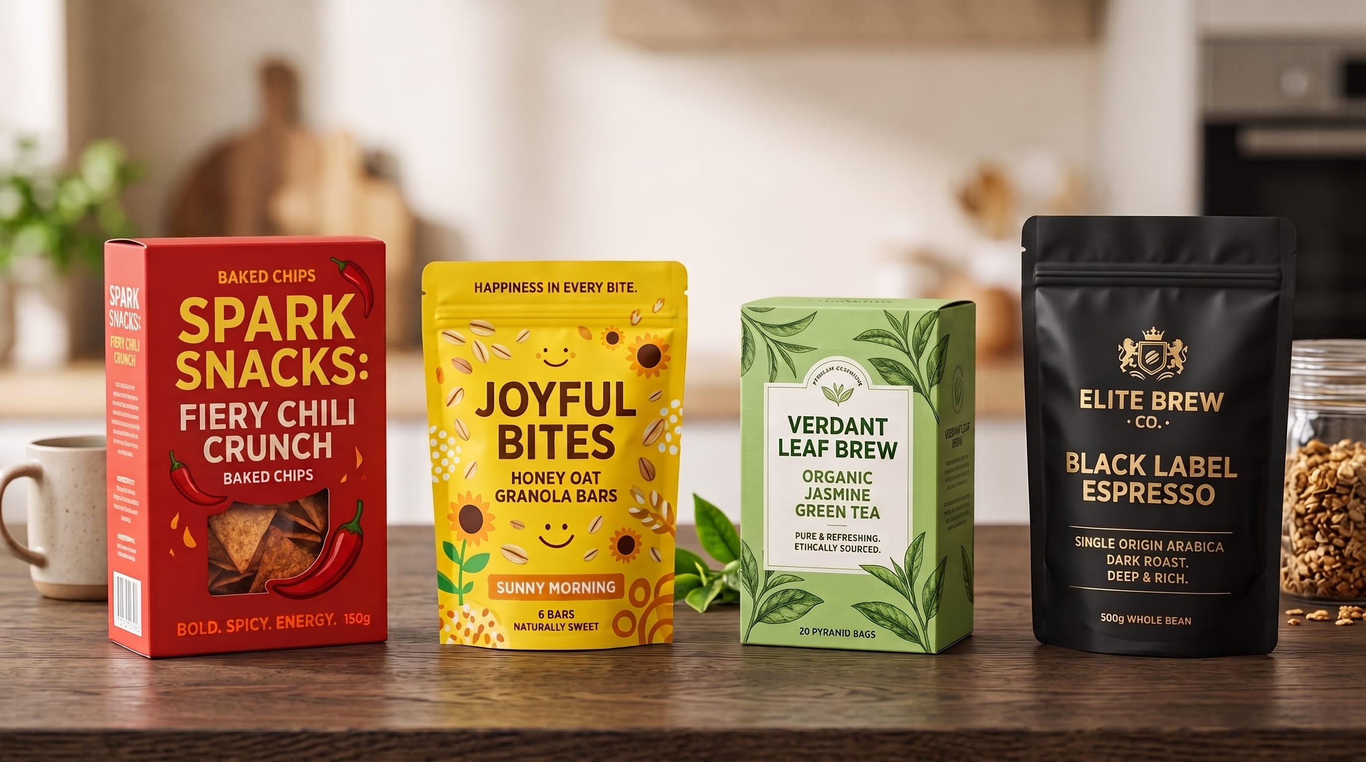
Packaging color psychology helps designers understand how color can influence the way customers perceive a product before they read its description or try what is inside. Color can make packaging feel natural, luxurious, playful, affordable, energetic, calming, or highly technical. It can also help shoppers recognize a product category and distinguish one brand from another on a crowded shelf.
However, color psychology is not a fixed formula. Red does not always mean excitement, and green does not automatically communicate sustainability. Meaning depends on context, culture, category conventions, typography, materials, photography, and the other colors used around it.
For designers, the goal is therefore not simply to choose an attractive palette. A stronger approach is to understand what the brand wants customers to feel and then build a color system that supports that perception consistently.
This guide explores practical packaging color psychology, the meanings commonly associated with major colors, and strategies for using color more effectively across different product categories.
Why Packaging Color Psychology Matters
Packaging often creates the first physical impression of a product.
Before customers understand:
- Ingredients
- Features
- Quality
- Price
- Benefits
they see the package.
Its colors immediately establish visual expectations.
For example, a dark navy package with restrained gold typography may suggest something premium. A bright yellow package with oversized lettering may communicate fun and accessibility.
Neither direction is automatically better.
The correct choice depends on the product and audience.
Understanding packaging color psychology gives designers another strategic tool for aligning appearance with brand positioning.
Color Shapes Brand Perception
Customers often form quick impressions.
Color contributes to whether packaging appears:
- Premium
- Affordable
- Natural
- Healthy
- Playful
- Technical
- Traditional
- Modern
Imagine identical chocolate bars placed in three different packages.
One uses matte black and gold.
Another uses cream and kraft brown.
The third uses hot pink and turquoise.
Even before tasting the chocolate, shoppers may expect three very different experiences.
This is why packaging color should support the story a brand wants to tell.
Packaging Color Psychology and Category Expectations
Product categories develop visual conventions over time.
Customers may expect certain colors from particular products.
Examples include:
- Green for natural or plant-based products
- Blue for water and personal care
- White for clean or clinical products
- Black for premium goods
- Bright colors for candy and children’s products
Following category conventions can make the product easier to understand.
Breaking them can create stronger differentiation.
The challenge is knowing when to do each.
If every organic tea package is green, a deep burgundy package might stand out. However, the design must still communicate tea clearly through imagery, typography, labeling, and other visual cues.
Red in Packaging Color Psychology
Red is visually powerful.
It can communicate:
- Energy
- Passion
- Strength
- Heat
- Urgency
- Excitement
Red frequently appears in:
- Food packaging
- Snacks
- Sauces
- Beverages
- Promotional products
Because it attracts attention, red can create strong shelf presence.
However, large amounts of highly saturated red can also feel aggressive.
For premium products, designers can try deeper shades such as:
- Burgundy
- Wine
- Oxblood
- Dark cherry
These colors maintain emotional intensity while creating a more sophisticated impression.
Orange for Friendly and Energetic Packaging
Orange combines warmth with energy.
It can feel:
- Friendly
- Optimistic
- Youthful
- Accessible
- Adventurous
Orange can work well for:
- Snacks
- Beverages
- Sports products
- Children’s products
- Outdoor brands
A bright orange package may communicate enthusiasm, while burnt orange can produce a more mature or natural feeling.
Context matters.
Pair bright orange with white for a fresh modern look.
Pair burnt orange with cream and dark brown for a more earthy personality.
Yellow Packaging for Optimism and Visibility
Yellow is one of the most noticeable colors.
It often communicates:
- Happiness
- Warmth
- Optimism
- Energy
- Creativity
Yellow works particularly well when brands want to feel approachable.
It can be effective for:
- Snacks
- Breakfast foods
- Children’s products
- Household goods
- Creative products
However, designers need strong contrast.
Small white typography on a pale yellow background may become difficult to read.
Dark gray, black, navy, or brown can provide stronger legibility.
Green in Packaging Color Psychology
Green has strong associations with:
- Nature
- Freshness
- Plants
- Wellness
- Sustainability
- Organic products
It appears frequently across:
- Food
- Tea
- Skincare
- Wellness
- Eco-conscious brands
Different greens create different personalities.
Bright Green
Feels fresh and energetic.
Sage Green
Feels calm, natural, and sophisticated.
Forest Green
Feels established and premium.
Olive Green
Can suggest organic, artisanal, or heritage qualities.
Because green is widely used for natural branding, designers should avoid assuming that color alone proves environmental responsibility.
The packaging should support any sustainability message with clear information and credible choices.
Blue Packaging for Trust and Calm
Blue is frequently associated with:
- Trust
- Reliability
- Calm
- Freshness
- Cleanliness
It is commonly used for:
- Water
- Healthcare
- Personal care
- Technology products
- Household products
Light blue can feel gentle and refreshing.
Deep navy can feel more premium and authoritative.
One challenge is food packaging.
Blue appears less frequently in some food categories, so it can either feel unusual or provide useful differentiation depending on the product.
Use packaging color psychology together with category research rather than relying on general assumptions.
Purple Packaging for Creativity and Luxury
Purple can communicate:
- Creativity
- Imagination
- Indulgence
- Mystery
- Premium character
Dark purple can feel luxurious.
Lavender can feel soft and calming.
Purple works especially well for:
- Beauty
- Wellness
- Chocolate
- Fragrance
- Specialty products
For example:
Deep plum + champagne
can create an elegant premium palette.
Meanwhile:
Lavender + cream
can feel gentle and contemporary.
Pink Packaging for Softness, Energy, or Playfulness
Pink has a broad emotional range.
Pastel pink may feel:
- Soft
- Romantic
- Delicate
- Calm
Bright pink can feel:
- Bold
- Playful
- Youthful
- Energetic
Dusty pink can feel:
- Elegant
- Mature
- Refined
Pink works across:
- Beauty
- Confectionery
- Lifestyle
- Fragrance
- Wellness
Designers should avoid assuming that pink must only target one gender.
Modern branding can use pink as a strong visual personality rather than relying on outdated demographic stereotypes.
Also Read: Professional Packaging Design Workflow for Better Client Projects
Black in Packaging Color Psychology
Black often creates associations with:
- Luxury
- Sophistication
- Power
- Exclusivity
- Modernity
It is frequently used for:
- Fragrance
- Chocolate
- Alcohol alternatives
- Coffee
- Beauty
- Electronics
- Premium foods
Black becomes especially effective when paired with:
- White
- Gold
- Silver
- Cream
- Deep red
Matte black packaging can feel highly premium when supported by quality printing and materials.
However, black is not always appropriate.
Products positioned around lightness, softness, or child-friendly experiences may require a different approach.
White Packaging for Simplicity and Cleanliness
White can communicate:
- Cleanliness
- Simplicity
- Purity
- Minimalism
- Modernity
It works particularly well for:
- Skincare
- Wellness
- Technology
- Healthcare
- Premium food
White also creates room for typography and photography.
A minimal package might use:
White background + black typography + one accent color
This can create a highly recognizable design when executed consistently.
The challenge is avoiding generic minimalism.
Distinctive typography, layout, icons, or structural packaging can add personality.
Brown and Earth Tones for Natural Products
Brown can feel:
- Earthy
- Organic
- Handmade
- Traditional
- Authentic
It appears frequently in:
- Coffee
- Chocolate
- Artisan food
- Natural products
- Sustainable packaging
Kraft paper strengthens these associations.
Earth colors can include:
- Terracotta
- Sand
- Warm beige
- Olive
- Clay
These palettes are useful when brands want to communicate warmth and craftsmanship rather than clinical perfection.
Gold and Metallic Colors for Premium Packaging
Gold is strongly associated with:
- Luxury
- Celebration
- Prestige
- Exclusivity
However, gold is most effective as an accent.
Use it for:
- Logos
- Borders
- Product names
- Small illustrations
- Foil details
Covering the entire package in metallic effects can reduce visual hierarchy.
A small gold logo on dark packaging may communicate premium quality more effectively than excessive ornament.
Silver for Modern and Technical Branding
Silver can feel:
- Modern
- Technical
- Sleek
- Innovative
- Premium
It works well for:
- Electronics
- Grooming
- Automotive products
- Modern beauty products
Metallic silver combined with black can create a strong technical identity.
Silver with white and pale blue can feel more clinical and futuristic.
Again, material finish matters.
A printed gray color and actual metallic foil may create very different perceptions.
Packaging Color Psychology for Food Brands
Food packaging has a particularly strong relationship with color because color can suggest flavor, freshness, and intensity.
Consider how brands might use:
- Red for spicy flavors
- Green for herbs
- Yellow for lemon
- Brown for chocolate
- Orange for cheese or citrus
These associations help shoppers navigate variants quickly.
However, a strong brand system should not depend exclusively on color.
Include:
- Flavor names
- Icons
- Illustrations
- Patterns
This improves accessibility and reduces confusion between products.
Packaging Color Psychology for Beauty Brands
Beauty packaging can range from clinical minimalism to expressive luxury.
Clean Skincare
Try:
- White
- Sage
- Pale blue
- Beige
Luxury Beauty
Try:
- Black
- Burgundy
- Gold
- Cream
Youthful Cosmetics
Try:
- Hot pink
- Purple
- Orange
- Bright blue
Botanical Beauty
Try:
- Forest green
- Cream
- Terracotta
Beauty brands should choose colors that reinforce their positioning rather than simply follow trends.
Packaging Color Psychology for Wellness Products
Wellness products often rely on colors that feel calm and reassuring.
Useful options include:
- Sage
- Lavender
- Soft blue
- Cream
- Warm beige
Highly saturated colors can still work, especially for modern wellness brands targeting younger audiences.
The key is matching the emotional tone of the product.
A sleep-related product may benefit from calmer colors than an energy-focused supplement accessory or fitness product.
Color Psychology for Luxury Packaging
Luxury packaging often reduces the number of colors rather than adding more.
Consider:
Black + Gold
Classic and dramatic.
Navy + Champagne
Elegant and trustworthy.
Burgundy + Cream
Warm and sophisticated.
Forest Green + Gold
Natural and premium.
Ivory + Black
Minimal and refined.
Luxury does not come from gold alone.
Typography, spacing, printing, materials, and construction all contribute.
A carefully designed cream package can feel more premium than a crowded gold package.
Packaging Color Psychology for Children’s Products
Children’s products often use bright colors to communicate energy and play.
Common choices include:
- Yellow
- Orange
- Turquoise
- Pink
- Green
- Purple
However, designers should still create hierarchy.
Using six saturated colors at equal intensity can make packaging difficult to scan.
Choose:
- One dominant color
- One secondary color
- One or two accents
This creates a playful appearance without unnecessary visual noise.
Also Read: How to Create Better Packaging Design for Food Delivery
Use Color to Differentiate Product Variants
Color coding is useful for product families.
Imagine a beverage brand with five flavors:
- Lemon = yellow
- Berry = purple
- Orange = orange
- Apple = green
- Original = blue
Customers can identify variants quickly.
However, the brand should still remain recognizable.
Keep consistent:
- Logo position
- Typography
- Package structure
- Graphic system
Only change selected elements.
This creates differentiation without losing brand recognition.
Build a Packaging Color System, Not Just a Palette
Strong packaging color psychology should lead to a repeatable system.
Define:
Primary Brand Color
The most recognizable color.
Secondary Colors
Support different layouts.
Product Colors
Differentiate variants.
Neutral Colors
Used for backgrounds and text.
Accent Color
Draws attention to important elements.
Document exact color values for both print and digital applications.
Consistency improves long-term recognition.
Use Contrast to Improve Packaging Readability
Psychology is not useful if customers cannot read the package.
Check contrast between:
- Text and background
- Product name and illustration
- Labels and decorative elements
For example:
Light gray on white may look elegant on a large monitor but become difficult to read on a small printed box.
Always test the physical scale.
Important information needs to remain clear.
Packaging Color Psychology and Shelf Impact
Designers should evaluate packaging in context, not in isolation.
A beautiful blue package may disappear if every competitor uses blue.
Create a simple shelf comparison.
Place the concept beside competing packaging and ask:
- Is the product visible?
- Does it look appropriate for the category?
- Is the brand recognizable?
- Does anything create meaningful distinction?
Sometimes the best packaging color is not the most attractive color individually. It is the color that creates the right contrast within the category.
Avoid Following Color Psychology Too Literally
One of the biggest mistakes is treating color meaning as a universal rule.
For example:
Green = healthy
is too simplistic.
Dark green with gold may feel luxurious.
Lime green with black may feel energetic.
Sage with beige may feel calm.
The same hue can communicate very different things depending on:
- Saturation
- Brightness
- Pairings
- Typography
- Materials
- Product category
Use packaging color psychology as guidance, not as a rigid formula.
Consider Cultural Differences in Color Meaning
Color associations can vary across cultures and markets.
A palette that works well in one country may communicate something different elsewhere.
Brands entering international markets should research:
- Cultural associations
- Local category conventions
- Competitor colors
- Regional preferences
This is particularly important for:
- Food
- Beauty
- Gifts
- Celebration products
- Healthcare
Do not assume that one psychological interpretation is universal.
Test Packaging Colors Before Launch
Designers can reduce guesswork through testing.
Create several controlled variations.
For example:
Version A
Navy + ivory
Version B
Forest green + cream
Version C
Burgundy + champagne
Show them to representative customers and ask:
- Which feels most premium?
- Which feels most trustworthy?
- Which product would you notice first?
- What price would you expect?
- What type of brand does this look like?
The responses can reveal differences between designer intention and customer perception.
Use Materials to Strengthen Color Perception
The same color can feel different depending on material.
For example:
Black on:
- Glossy plastic
- Matte paper
- Textured cardboard
- Soft-touch laminate
can create four different impressions.
Likewise, gold can appear as:
- Flat printed yellow-gold
- Metallic ink
- Foil stamping
Material choices therefore form part of the color experience.
For premium packaging, test actual printed samples whenever possible.
Common Packaging Color Psychology Mistakes
Choosing Color Only From Personal Preference
Design for the brand and customer, not only yourself.
Using Too Many Colors
Create hierarchy with a controlled palette.
Copying Category Leaders
Use conventions strategically without becoming indistinguishable.
Ignoring Contrast
Readability should remain a priority.
Depending Only on Color for Variants
Add labels, icons, or patterns too.
Assuming Meanings Are Universal
Context and culture matter.
Following Trends Without Strategy
Trendy colors can date quickly.
Ignoring Materials
Print finish changes color perception.
Forgetting Shelf Context
Compare the package against competitors.
Treating Color Psychology as Scientific Certainty
Use it as one part of broader design research.
Packaging Color Psychology Checklist
Before approving a color system, ask:
- What should customers feel?
- Does the palette support brand positioning?
- Does the color fit the product category?
- Is there enough differentiation from competitors?
- Is typography readable?
- Does the palette work at small sizes?
- Are variants easy to distinguish?
- Can customers identify the brand across different flavors or products?
- Does the design work in physical retail?
- Does it remain effective online?
- Have cultural differences been considered?
- Do materials support the intended impression?
- Is the color system documented?
- Has the design been tested with customers?
- Will the palette remain flexible as the brand grows?
If the colors look beautiful but contradict the intended positioning, reconsider the system.
Also Read: Tea Packaging Design Examples That Inspire Better Branding
Final Thoughts on Packaging Color Psychology
Effective packaging color psychology is not about memorizing a list of color meanings. It is about understanding how color interacts with brand positioning, audience expectations, product category, typography, imagery, materials, and context.
Red can communicate energy. Green can suggest nature. Blue can support trust. Black can create premium associations. White can communicate cleanliness. However, none of these meanings exist in isolation.
A successful designer looks at the complete package.
Start by defining how the product should be perceived. Research competitors and category conventions. Then create a controlled color system that supports that position while providing enough differentiation to attract attention.
Use packaging color psychology to guide choices, but combine it with testing and practical design judgment.
Remember to evaluate packaging on a real shelf, at its actual size, and across different product variants. Check readability, contrast, consistency, and how materials affect the final colors.
Most importantly, think beyond a single package.
Strong packaging color psychology should contribute to an entire visual system that customers can recognize across multiple products and touchpoints.
When color, typography, imagery, structure, and materials work together, packaging becomes more than decoration. It communicates what the brand represents, sets expectations for the product, and helps customers form a clearer, stronger impression before they even open the package.

For high-quality fonts to boost your income, check out DM Letter Studio. Our professional fonts are perfect for branding, marketing, and content creation. So, don’t miss this opportunity.