
How to Keep Packaging Design Consistency Across Product Lines
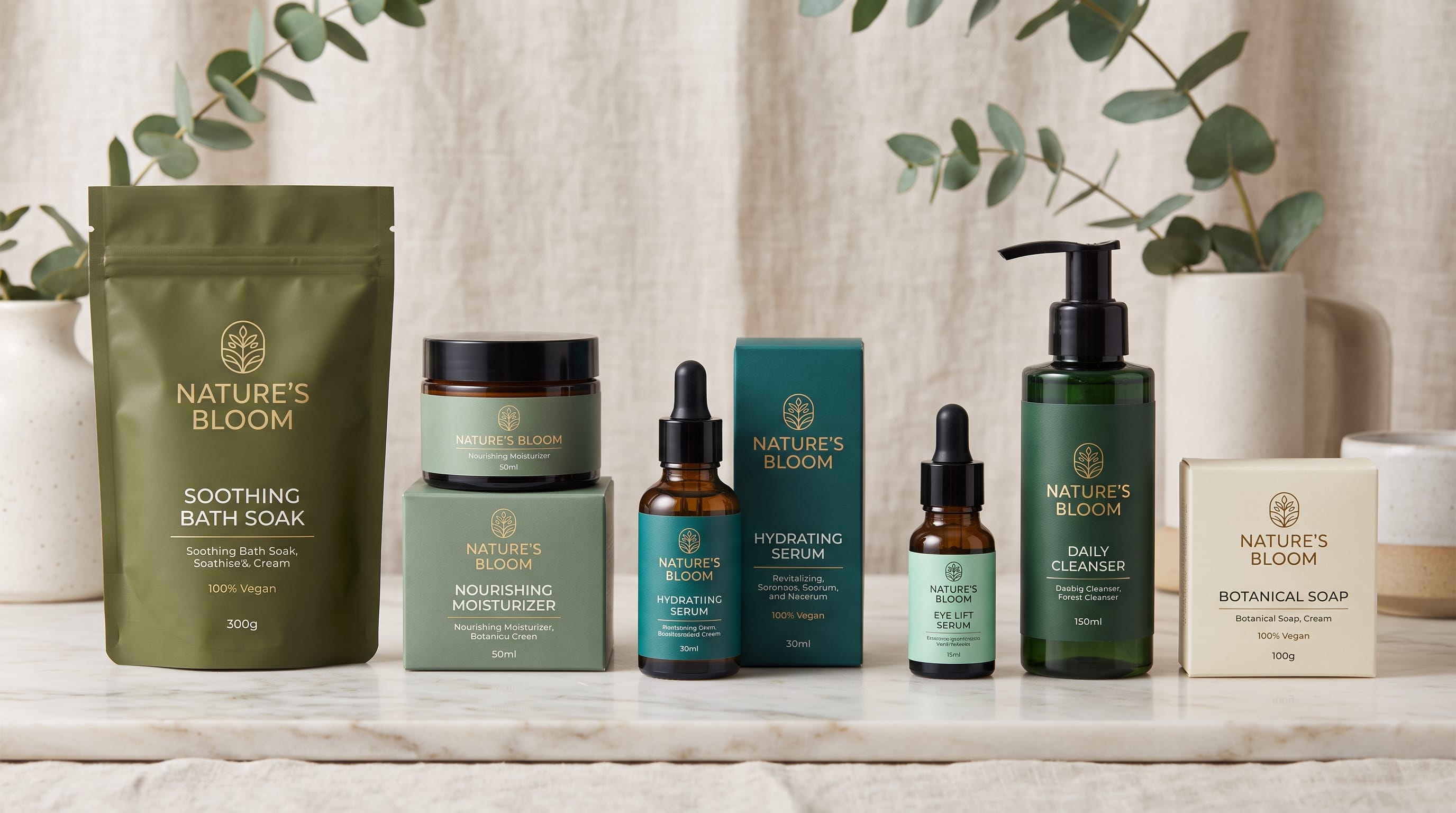
Packaging design consistency helps customers recognize a brand even when they are looking at different products, flavors, sizes, or categories. A strong packaging family should make every product feel distinctive enough to understand quickly while still clearly belonging to the same company.
This becomes increasingly important as a business grows. A company may begin with one product, then introduce three flavors, several package sizes, a premium collection, seasonal editions, and eventually an entirely new product category. Without a clear system, every launch can slowly move the visual identity in a different direction.
Consistency does not mean every package should look identical. Successful packaging systems combine fixed brand elements with flexible product-level elements.
The logo, typography, hierarchy, illustration style, and core brand colors may remain recognizable, while flavor colors, imagery, patterns, and product descriptors change.
This guide explains how designers can build packaging design consistency across growing product lines without making every package feel repetitive.
Why Packaging Design Consistency Matters
Customers often recognize packaging before they consciously read the brand name.
Repeated visual characteristics such as colors, typography, layout, and shapes can build recognition over time.
Consistent packaging can help:
- Strengthen brand recognition
- Make product families easier to understand
- Improve shelf presence
- Simplify new product launches
- Create professional ecommerce listings
- Improve internal design efficiency
- Reduce unnecessary redesign work
Imagine a snack company offering six flavors.
If every package has a completely different logo position, typeface, illustration style, and layout, customers may perceive them as unrelated products.
Strong packaging design consistency makes those six products appear as one intentional range.
Start With a Packaging Design System
Before designing individual products, establish the overall system.
Think about which elements should remain permanent.
These might include:
- Logo position
- Primary typography
- Secondary typography
- Core brand colors
- Grid
- Product-name position
- Information hierarchy
- Photography style
- Illustration style
- Package structure
Then define which elements can change.
These might include:
- Flavor color
- Ingredient image
- Product variant
- Pattern
- Secondary illustration
- Product descriptor
This separation between fixed and flexible elements creates scalability.
Keep the Logo Placement Consistent
Logo placement is one of the simplest ways to strengthen packaging design consistency.
For example, you might always place the logo:
- Top center
- Upper-left corner
- Inside a fixed badge
- At the bottom of the front panel
Once customers repeatedly see the same position, the package becomes easier to identify.
Avoid moving the logo dramatically between products unless the package format requires it.
Different packaging shapes may need slight adjustments, but the relative hierarchy should remain recognizable.
Create a Consistent Logo Clear Space
Logo size and surrounding space should also follow rules.
Define:
- Minimum logo size
- Maximum logo size
- Required clear space
- Approved background colors
- One-color versions
- Reversed versions
These details prevent individual packages from using the logo differently.
For example, one designer should not make the logo enormous while another uses it as a tiny decorative detail.
Consistency builds recognition.
Build Packaging Design Consistency With Typography
Typography can become one of the strongest identifying features across a product family.
Choose specific roles.
Brand Typeface
Used for:
- Logo or wordmark
- Major brand messages
Product Typeface
Used for:
- Product names
- Flavors
- Main headlines
Information Typeface
Used for:
- Descriptions
- Ingredients
- Instructions
- Technical information
Avoid choosing a new font every time a new product launches.
Changing typography too frequently can weaken packaging design consistency even when colors and logos remain the same.
Define a Packaging Type Scale
Font choice alone is not enough.
Define sizes and hierarchy.
For example:
- Product Name: 48 pt
- Flavor: 24 pt
- Descriptor: 14 pt
- Supporting Information: 10 pt
The exact measurements may change depending on package size, but the relative hierarchy should remain similar.
Customers should immediately understand:
- Brand
- Product
- Variant
- Supporting information
A consistent hierarchy makes an entire product family easier to scan.
Use a Core Packaging Color Palette
Choose colors that belong permanently to the brand.
For example:
Core Brand Colors
- Deep green
- Warm cream
- Charcoal
Then allow additional colors for product variants.
The core palette might remain visible through:
- Logo
- Borders
- Background areas
- Typography
- Icons
This keeps even highly varied products connected.
Use Color Coding Across Product Lines
Color coding is an effective way to differentiate variants while maintaining packaging design consistency.
For example, a snack brand might use:
- Blue = Sea Salt
- Orange = Cheddar
- Red = Barbecue
- Green = Jalapeno
- Purple = Sweet Chili
Everything else remains consistent:
- Logo placement
- Product typography
- Illustration
- Package architecture
Customers can identify both the brand and flavor quickly.
The same approach works for:
- Skincare
- Beverages
- Coffee
- Cosmetics
- Supplements
- Household products
Avoid Random Product Colors
Color coding should follow a planned system.
Do not select each new color in isolation.
Ask whether the entire palette works together when all packages appear side by side.
Some combinations may look attractive individually but inconsistent as a family.
Create a master palette showing all current and planned variants.
This helps prevent future products from introducing colors that clash with the existing range.
Build Packaging Consistency With Layout Grids
A grid provides invisible structure.
Create fixed zones such as:
- Top: Brand
- Middle: Product name and imagery
- Bottom: Variant and supporting information
Different products can have different content while respecting the same architecture.
For example, one package may feature almonds while another features cookies.
If both use the same typography placement, image scale, and spacing system, they still look related.
This is one of the most useful techniques for maintaining packaging design consistency.
Also Read: Sustainable Product Packaging That Inspires Better Branding
Keep Product Names in the Same Position
Product names should not move randomly between SKUs.
A customer scanning several packages should know where to look.
For example, every product name may appear:
- Centered in the upper third
- Left aligned beneath the logo
- Inside a fixed rectangular area
Then the flavor name might always appear directly underneath.
These repeated positions create familiarity.
Keep Illustration Styles Consistent
If the brand uses illustration, establish an art direction.
Decide whether illustrations should be:
- Flat
- Hand drawn
- Geometric
- Realistic
- Cartoon
- Line based
- Collage inspired
Do not use detailed watercolor illustrations for one product and simple vector icons for another unless the contrast is intentional.
A consistent illustration style can connect products even when the subjects change.
Maintain Consistent Photography
Photography should follow similar rules.
Define:
- Lighting
- Angle
- Background
- Cropping
- Shadows
- Color treatment
For example, every food package might show the product photographed from a 45-degree angle against a clean neutral background.
Or every skincare product might use soft diffused lighting.
Consistent photography supports packaging design consistency across ecommerce, advertising, and physical packaging.
Create Reusable Packaging Templates
Templates make expansion easier.
Create master files for:
- Primary package
- Small package
- Large package
- Box
- Pouch
- Bottle
- Label
Each template should include:
- Logo placement
- Typography styles
- Grid
- Color areas
- Image zones
- Required information sections
When launching a new variant, designers should modify approved fields rather than rebuilding the package from scratch.
Define Fixed and Flexible Elements
A useful system separates packaging elements into two categories.
Fixed Elements
These rarely change:
- Logo
- Main fonts
- Grid
- Information hierarchy
- Illustration style
- Core brand colors
Flexible Elements
These can change by product:
- Flavor color
- Product imagery
- Ingredient graphics
- Product descriptor
- Pattern variation
This structure creates the right balance between variety and packaging design consistency.
Create Clear Product Architecture
Growing brands often have several levels of information.
For example:
- Brand: Grove
- Category: Granola
- Product: Protein Crunch
- Flavor: Cocoa Almond
The visual hierarchy should make these relationships obvious.
Customers need to understand whether two packages are:
- Different flavors
- Different product types
- Different collections
- Different brands
A packaging architecture prevents confusion as the portfolio grows.
Keep Different Product Categories Connected
Consistency becomes more challenging when a company expands beyond one packaging type.
Imagine a coffee company that sells:
- Whole beans
- Ground coffee
- Instant coffee
- Coffee pods
- Ready-to-drink cans
The containers are completely different.
Do not force identical layouts onto every package.
Instead, preserve recognizable brand cues such as:
- Typography
- Brand colors
- Logo
- Photography style
- Patterns
- Naming system
This creates flexible packaging design consistency without ignoring the physical differences between products.
Use Patterns as a Brand Element
Patterns can help unify different packaging formats.
A brand might use:
- Repeating geometric shapes
- Ingredient illustrations
- Lines
- Dots
- Waves
- Custom symbols
The pattern can change color for different products while keeping the same structure.
For example:
- Chocolate flavor = brown pattern
- Vanilla flavor = cream pattern
- Berry flavor = pink pattern
The variations remain recognizable as one system.
Create Consistent Icons
Icons are useful for communicating:
- Vegan
- Organic
- Spicy
- Sugar free
- Recyclable
- Preparation
- Product features
Choose one icon system.
Keep consistent:
- Stroke width
- Corner radius
- Size
- Style
- Placement
Randomly mixing outline, filled, realistic, and cartoon icons can make packaging feel unorganized.
Standardize Information Placement
Required product information can become complicated.
Create rules for:
- Net weight
- Ingredients
- Nutrition information
- Allergens
- Instructions
- Barcodes
- Manufacturer details
Standardization helps both designers and customers.
When possible, keep information in predictable areas across similar package formats.
Regulatory requirements vary by market and category, so the design system should be flexible enough to accommodate applicable labeling obligations.
Also Read: Tea Packaging Design Examples That Inspire Better Branding
Maintain Packaging Design Consistency Across Sizes
A product might be sold in:
- Single serving
- Regular size
- Family size
- Multipack
Do not simply scale the same artwork proportionally.
Small packages may need:
- Shorter text
- Larger relative typography
- Simplified illustrations
Large formats can support more information.
Maintain the hierarchy while adapting the composition to the available space.
Adapt Packaging for Ecommerce
Packaging now needs to work as a digital thumbnail.
Test every design at small sizes.
Can customers still identify:
- Brand
- Product type
- Flavor
If not, strengthen the hierarchy.
Ecommerce can expose inconsistency quickly because multiple products may appear beside one another in the same product grid.
Strong packaging design consistency makes the range look more professional online.
Create Rules for Limited Editions
Seasonal products can introduce visual experimentation.
For example:
- Holiday flavors
- Collaborations
- Anniversary editions
- Special launches
Allow limited editions to change selected elements.
Perhaps the brand introduces:
- New pattern
- Metallic finish
- Seasonal illustration
- Special accent color
Keep important brand anchors such as the logo, typography, and core architecture.
A limited edition should still look like your product.
Maintain Consistency During Brand Collaborations
Collaborations introduce another identity into the packaging.
Decide:
- Which brand leads?
- How large should each logo appear?
- Which typography system dominates?
- How are colors combined?
Avoid simply placing two unrelated identities beside each other.
Create a shared visual language while preserving recognizable elements from both brands.
Build a Packaging Style Guide
A packaging guideline should document the system.
Include:
Logo
- Placement
- Minimum size
- Clear space
Typography
- Typefaces
- Weights
- Hierarchy
Color
- Core colors
- Product colors
- Print specifications
Imagery
- Illustration style
- Photography direction
Layout
- Grid
- Alignment
- Spacing
Product Architecture
- Naming
- Variant hierarchy
- Category rules
A documented system makes packaging design consistency easier to maintain when multiple designers, agencies, or suppliers are involved.
Create a Master Packaging Library
Store approved files in one organized location.
Include:
- Logos
- Fonts
- Icons
- Templates
- Color specifications
- Photography
- Illustrations
- Packaging dielines
- Brand guidelines
Avoid having designers search through old email attachments to find the latest logo.
Clear file organization reduces accidental inconsistencies.
Establish a Packaging Approval Process
Consistency also depends on workflow.
Before production, review new packaging against established standards.
Check:
- Logo
- Typography
- Colors
- Layout
- Product naming
- Required information
- Image style
For larger organizations, assign someone responsibility for final brand review.
This helps prevent gradual design drift.
Audit Packaging Design Consistency Regularly
Brands evolve.
Products are discontinued and new ones appear.
Review the entire range periodically.
Place package designs side by side and ask:
- Do they clearly belong together?
- Are older products visually outdated?
- Has typography changed accidentally?
- Are colors still organized?
- Are there duplicate or confusing variants?
A periodic audit helps identify problems before they become widespread.
Know When Packaging Consistency Becomes Repetition
Consistency does not mean cloning.
If every package is identical except for a tiny flavor label, customers may struggle to differentiate products.
Create variation through:
- Color
- Illustration
- Photography
- Product names
- Patterns
while retaining stable brand elements.
The goal is:
Recognizable brand + identifiable product.
Both matter.
Common Packaging Design Consistency Mistakes
1. Changing Fonts Between Products
This weakens family recognition.
2. Moving the Logo Randomly
Create predictable placement.
3. Using Unplanned Colors
Develop a complete variant palette.
4. Changing Illustration Styles
Maintain consistent art direction.
5. Creating Every Package From Scratch
Use templates and grids.
6. Making All Products Too Similar
Allow enough visual distinction for customers to identify variants.
7. Ignoring Ecommerce
Test the range as small thumbnails.
8. Failing to Document Rules
A system only works if future designers understand it.
9. Letting Limited Editions Become Completely Different Brands
Keep recognizable brand anchors.
Packaging Design Consistency Checklist
Before approving a new product, ask:
- Is the logo positioned correctly?
- Is the approved typography used?
- Does the product follow the established hierarchy?
- Is its color part of the approved palette?
- Does the illustration or photography match the brand?
- Is the grid consistent?
- Is the product easy to distinguish?
- Does it belong visually with the rest of the range?
- Does it work at small ecommerce sizes?
- Are icons consistent?
- Does required information have a clear location?
- Does the package work in its physical format?
- Can future variants follow the same system?
Also Read: How to Choose the Best Packaging Design Software
Final Thoughts on Packaging Design Consistency
Strong packaging design consistency does not mean forcing every product into exactly the same design. It means creating a recognizable system that balances stable brand elements with flexible product-level variation.
Start by defining the elements that should remain consistent, including the logo, typography, grid, brand colors, information hierarchy, imagery style, and naming architecture.
Then decide where variation is useful.
Different products may use unique colors, ingredients, illustrations, patterns, or photography while maintaining the same overall design language.
Templates and documented guidelines become increasingly important as a product range grows. They allow designers to introduce new SKUs without reinventing the identity every time.
Regular audits can also prevent gradual visual drift, particularly when several designers, agencies, manufacturers, or internal teams contribute to packaging development.
Most importantly, evaluate packaging as a complete family rather than as individual products.
A package can look beautiful by itself while still weakening the range if it appears unrelated to everything around it.
When packaging design consistency is built into the system from the beginning, brands can launch new flavors, sizes, collections, and product categories more efficiently while preserving the recognition customers have already learned.
The result is not only better-looking packaging. It is a stronger, more scalable brand identity that can remain recognizable as the business grows.

For high-quality fonts to boost your income, check out DM Letter Studio. Our professional fonts are perfect for branding, marketing, and content creation. So, don’t miss this opportunity.