
Photoshop Poster Effects Tutorial for Better Designs
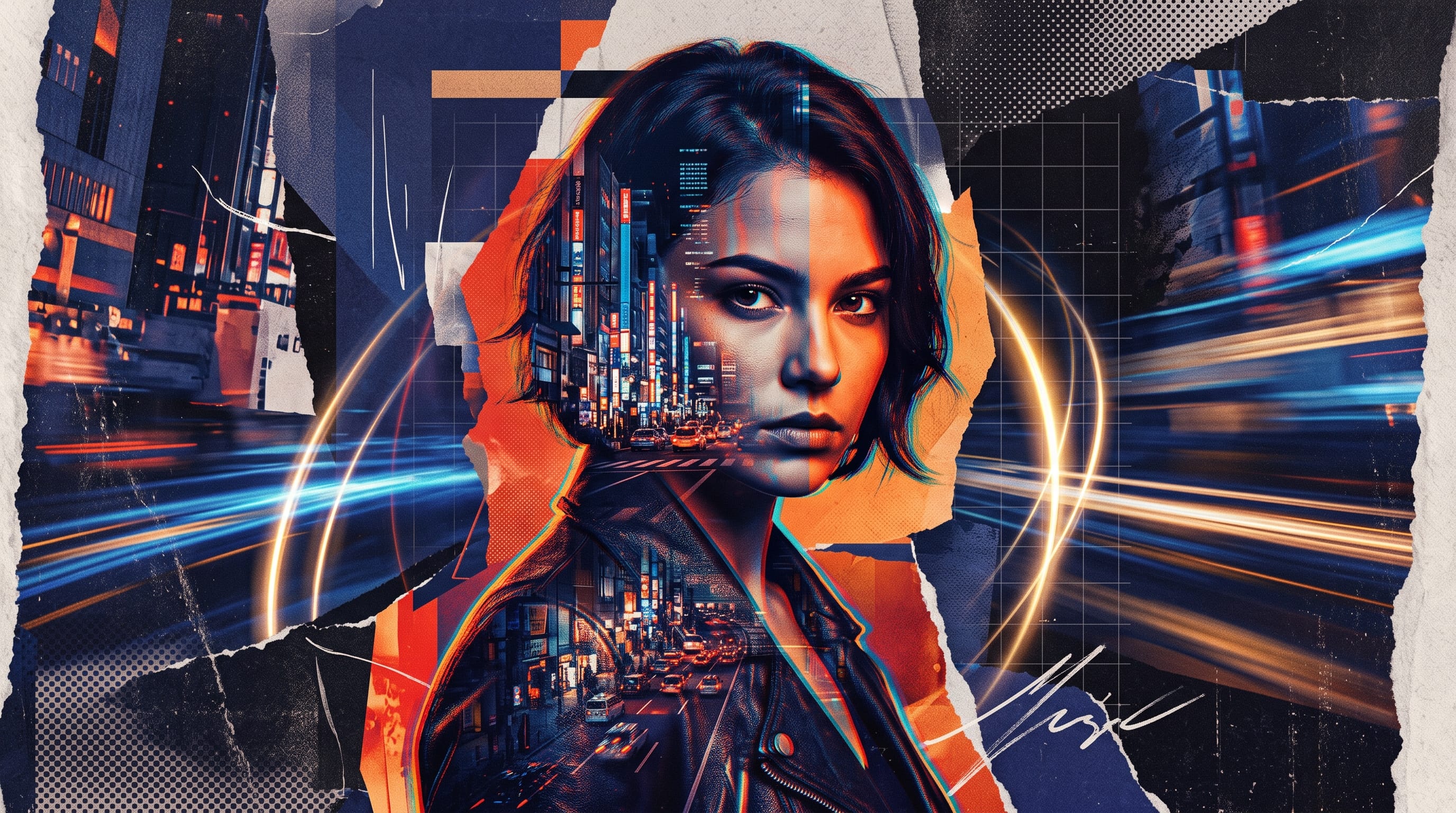
Photoshop poster effects can transform an ordinary composition into a bold and memorable design. By combining typography, photographs, textures, light, color, and controlled distortion, creators can produce posters that attract attention while communicating a clear message.
However, effective poster design is not about applying every available filter. Too many effects can weaken readability and make a composition feel disorganized. The best results come from selecting one or two dominant effects that support the poster’s subject, audience, and visual style.
Photoshop provides filters, layer styles, adjustment layers, masks, and blending modes that can be edited without permanently damaging the original artwork. Adobe recommends converting layers into Smart Objects before adding filters because Smart Filters can be adjusted, hidden, reordered, or removed later.
This Photoshop poster effects tutorial explains several practical techniques for improving posters, including glow, motion blur, grain, halftone patterns, layered typography, double exposure, color grading, and depth.
Prepare Your File for Photoshop Poster Effects
Before adding effects, create a clean and organized Photoshop document. Good preparation makes experimentation easier and prevents the Layers panel from becoming confusing.
For printed posters, use the final print dimensions and a resolution of 300 pixels per inch. Confirm the required color mode, bleed, and export format with the printer. For digital posters, RGB mode is normally suitable.
Organize the file into groups such as:
- Background
- Main subject
- Typography
- Graphic elements
- Textures
- Color adjustments
- Final effects
Name important layers instead of leaving titles such as “Layer 12 copy.” This small habit becomes valuable when a poster contains several effects, masks, and duplicated elements.
Convert important photographs and graphics into Smart Objects before resizing or filtering them. Smart Objects preserve the original source content and allow supported filters to remain editable.
1. Create a Bold Glow Effect
Glow is one of the most versatile Photoshop poster effects. It works well for music posters, gaming graphics, nightlife events, futuristic campaigns, and technology-related designs.
Begin with a dark background because a bright glow will appear more visible against it.
Create a Simple Outer Glow
- Select the subject or text layer.
- Click the Add a Layer Style icon in the Layers panel.
- Choose Outer Glow.
- Select a bright accent color.
- Adjust the blend mode, opacity, spread, and size.
- Click OK.
Photoshop layer styles are editable effects attached to a layer, allowing you to revise their settings without permanently changing the original content.
For a more natural effect, avoid making the glow equally strong around every object. Reduce the opacity and use a large size to create softer light.
Add a Painted Glow
Create a new layer behind the subject. Use a large, soft brush to paint the chosen accent color, then reduce the layer opacity.
Try a lightening blend mode such as Screen or Linear Dodge, depending on the image. Blending modes change how the active layer interacts with the layers beneath it.
Use a layer mask to remove the glow from areas where it becomes distracting.
2. Add Motion Blur for Energy
Motion blur can make a static poster feel faster and more dynamic. It is especially useful for sports, automotive, music, dance, and action-oriented designs.
To create the effect:
- Duplicate the subject layer.
- Convert the duplicate into a Smart Object.
- Select Filter > Blur > Motion Blur.
- Choose an angle that follows the direction of movement.
- Adjust the distance.
- Place the blurred copy behind the sharp subject.
- Use a mask to control where the blur appears.
Photoshop’s blur filters can soften details or create an impression of movement, and applying them to a Smart Object keeps the effect adjustable.
The sharp original subject should remain visible above the blur. Otherwise, the entire composition may look unfocused.
Create Repeated Motion Trails
Duplicate the subject several times. Move each copy slightly in one direction and gradually reduce its opacity.
You can also apply different amounts of blur to the copies. This creates a layered movement effect that works well behind dancers, athletes, performers, or products.
Keep the direction consistent. Random movement can make the poster feel chaotic rather than energetic.
3. Use Grain for a Printed Texture
Digital artwork can sometimes appear too smooth. Grain introduces small variations that make the poster feel more tactile and visually unified.
Create a new layer above the design and fill it with a middle gray. Then:
- Choose Filter > Noise > Add Noise.
- Select a moderate amount.
- Choose Gaussian distribution.
- Enable Monochromatic.
- Change the layer blend mode to Overlay or Soft Light.
- Reduce the opacity.
Grain works particularly well with retro, editorial, fashion, music, and film-inspired posters.
Do not make the texture so strong that small text becomes difficult to read. The grain should be noticeable at normal viewing size without becoming the main visual feature.
4. Create a Halftone Poster Effect
Halftone patterns imitate traditional printing techniques by representing tones with dots or repeated shapes. They are commonly associated with comic books, vintage advertising, punk posters, and pop-art design.
One method is to prepare a grayscale copy of the image, increase its contrast, and apply a halftone-related filter. Photoshop’s Filter Gallery can preview and combine multiple artistic effects, and it can remain editable when used with Smart Objects.
After creating the pattern:
- Place it over the original image.
- Try Multiply or Overlay blend modes.
- Reduce the opacity.
- Add a layer mask.
- Keep the pattern away from essential text.
You can also use a halftone texture as a separate graphic element rather than applying it to the entire photograph.
Combine Halftone with Bold Color
Add a Gradient Map adjustment layer above the halftone image. Choose two contrasting colors to replace the shadows and highlights.
This technique can create an energetic duotone style. Try combinations such as:
- Black and red
- Navy and orange
- Purple and cyan
- Dark green and yellow
- Black and bright pink
The effect becomes stronger when the typography uses one of the same colors.
5. Build Layered Typography Effects
Typography can become the central visual element of a poster. Layered type creates depth, movement, and visual rhythm without requiring a complicated photograph.
Begin by creating a large headline. Duplicate the text layer several times and experiment with:
- Different colors
- Small position changes
- Lower opacity
- Outlined versions
- Blur
- Distortion
- Masked sections
One copy can remain sharp while other copies sit behind it as shadows, echoes, or color separations.
Create a Color Offset Effect
Duplicate the headline twice. Apply different bright colors to the lower copies, then move one slightly left and the other slightly right.
Keep the top layer readable. The offset layers should add energy rather than reduce clarity.
This Photoshop poster effects technique works well with modern, digital, experimental, and music-oriented posters.
Place Text Behind the Subject
Create depth by positioning part of the headline behind a person or object.
- Place the text beneath the subject layer.
- Duplicate or isolate the subject.
- Keep the isolated subject above the text.
- Use a layer mask to refine the overlap.
Photoshop layer masks hide or reveal parts of a layer without permanently deleting the image.
Avoid hiding so much of the headline that viewers cannot read it.
Also Read: Photoshop Tutorial for Professional Social Posts
6. Create a Double-Exposure Poster Effect
Double exposure combines two images inside one composition. A portrait may be blended with a city, forest, texture, smoke pattern, or architectural photograph.
To create a simple version:
- Isolate the main subject.
- Place the second image above it.
- Create a clipping mask.
- Test different blending modes.
- Adjust the position and scale.
- Add a layer mask to refine the transition.
- Use Curves or Levels to improve contrast.
A clipping mask uses the transparency of a lower layer to control where the upper layer appears.
The second image should contribute meaning. For example, a forest may communicate nature or personal growth, while a city may suggest ambition or urban culture.
Do not choose two visually complicated images that compete equally. One should remain the main subject.
7. Add a Paper Tear Effect
A torn-paper effect can give the poster an editorial, handmade, rebellious, or collage-based style.
You can use a photographed paper edge or create one manually with a rough selection and mask.
Place a contrasting photograph, color, or text below the torn section. Add a subtle shadow along the edge to create separation.
Useful variations include:
- A photograph revealed beneath solid paper
- Two different portraits divided by a tear
- A headline crossing the torn edge
- Handwritten notes layered over paper
- Tape, staples, or marker textures
Keep the shadow soft and narrow. A heavy shadow may make the paper look like a thick object rather than a thin printed sheet.
8. Create a Gradient Map Color Effect
Gradient Maps are useful for applying a controlled color style across a poster. They map one end of a gradient to dark areas and the other end to highlights.
To use one:
- Add a Gradient Map adjustment layer.
- Choose two or more colors.
- Edit the color positions.
- Test a blend mode.
- Reduce the opacity if necessary.
- Use the mask to protect selected areas.
This effect can unify photographs from different sources and create a consistent campaign style.
For better control, apply different Gradient Maps to the background and subject. Clipping the adjustment to a specific layer prevents it from affecting the rest of the design.
9. Use Gaussian Blur to Create Depth
Gaussian Blur can separate foreground and background elements, create atmospheric light, or soften duplicated shapes.
A common technique is to duplicate an object, enlarge the copy, blur it, and place it behind the main subject. This creates a soft color field that reinforces the subject’s shape.
You can also blur background images so typography becomes easier to read.
Photoshop allows filters to be applied non-destructively as Smart Filters, meaning the blur amount can be revised after it is added.
Avoid blurring every element. A poster needs some sharp details to create focus.
10. Create a Light Leak Effect
Light leaks imitate the colored exposure marks found in film photography. They can create a warm, nostalgic, or cinematic atmosphere.
Create a new layer and paint soft areas of red, orange, yellow, or pink along an edge. Apply Gaussian Blur, change the blend mode to Screen, and reduce the opacity.
You can also use gradients for a smoother result.
Keep the light source believable. A light leak usually feels more natural when it enters from an edge instead of appearing as an isolated bright circle in the center.
11. Add a Cutout Shadow Effect
A cutout shadow creates the appearance of paper, stickers, or separated graphic layers.
After isolating the subject:
- Duplicate the subject layer.
- Move the copy beneath the original.
- Fill the lower copy with a dark color.
- Move it slightly to one side.
- Add a small blur.
- Reduce the opacity if needed.
For a bold editorial style, keep the shadow sharp and use a bright color instead of black. This can make the subject resemble a printed paper cutout.
This is one of the simplest Photoshop poster effects, but it can produce a strong visual result.
Also Read: Photoshop Tutorial Photo Editing for Better Contrast
12. Apply a Displacement Effect
Displacement effects distort an image according to the brightness values of another file. They can make typography appear printed on fabric, wrapped around a textured surface, or affected by natural wrinkles.
A basic workflow includes:
- Create a grayscale version of the texture.
- Increase its contrast.
- Save it as a separate Photoshop file.
- Convert the text or image to a Smart Object.
- Apply the Displace filter.
- Select the saved texture file.
- Adjust the layer blend mode and opacity.
The exact settings depend on the image size and texture. Begin with low values because strong displacement can make text unreadable.
Combine Photoshop Poster Effects Carefully
The strongest designs usually combine a small number of compatible effects.
For example:
Music poster
- Color-offset typography
- Grain
- Motion blur
- Dark gradient background
Fashion poster
- Cutout subject
- Paper tear
- Elegant type
- Soft Gradient Map
Technology poster
- Neon glow
- Geometric shapes
- Light trails
- Cyan and purple palette
Retro event poster
- Halftone pattern
- Limited colors
- Paper texture
- Offset printing effect
When combining Photoshop poster effects, choose one dominant technique and use the others as support. Every effect should contribute to the same visual direction.
Maintain Readability While Adding Effects
Poster effects should never hide essential information.
The viewer should be able to identify:
- The main headline
- Event or product name
- Date and time
- Location
- Call to action
- Website or contact information
Check the poster as a small thumbnail. If the main message disappears, simplify the composition or strengthen the hierarchy.
Keep body text and event details away from highly textured areas. A solid panel, gradient, or darker overlay can improve contrast without changing the overall style.
Use a Non-Destructive Photoshop Workflow
A non-destructive workflow lets you test new ideas without permanently changing the original design.
Use:
- Smart Objects
- Smart Filters
- Layer masks
- Adjustment layers
- Clipping masks
- Layer styles
- Organized groups
- Duplicated backup layers
Adobe recommends converting a layer to a Smart Object before applying filters when you want the effect to remain editable. Smart Filters can then be adjusted, reordered, hidden, or removed from the Layers panel.
Save the working file as a PSD. Export separate versions for printing, websites, and social media.
Common Photoshop Poster Effects Mistakes
1. Applying Too Many Effects
A poster with glow, distortion, blur, grain, halftone, shadow, and several textures may become visually exhausting. Remove any effect that does not improve the message.
2. Using Effects Without a Concept
A futuristic glow may not fit an elegant classical concert poster. Select techniques that support the audience and subject.
3. Making Typography Unreadable
Distorted or layered typography still needs to communicate. Keep at least one clean and readable text layer.
4. Using Excessive Blur
Blur can create depth, but too much makes the poster feel unfinished. Preserve sharp focal points.
5. Ignoring the Print Result
Fine textures and bright screen colors may look different when printed. Test important designs at actual size before producing a large quantity.
6. Editing Destructively
Applying filters directly to the only image layer makes revision difficult. Use Smart Objects, masks, and adjustment layers whenever possible.
Also Read: Photoshop Poster Design Tips for Better Layout & Readability
Final Thoughts on Photoshop Poster Effects
Photoshop poster effects can help creators develop stronger visual identities for events, products, campaigns, films, music, and social media projects. Glow, blur, grain, layered typography, halftone, double exposure, paper textures, and color grading can all improve a poster when they support a clear concept.
Start with a strong layout before applying effects. Establish the headline, image, color palette, and information hierarchy first. Then select one main effect that reinforces the mood of the project.
Keep the workflow editable by using Smart Objects, Smart Filters, masks, and adjustment layers. This gives you the freedom to experiment without permanently damaging the design.
Most importantly, remember that Photoshop poster effects should strengthen communication rather than replace it. A successful poster attracts attention, delivers its message quickly, and gives viewers a reason to look again.

For high-quality fonts to boost your income, check out DM Letter Studio. Our professional fonts are perfect for branding, marketing, and content creation. So, don’t miss this opportunity.