
How to Make a Professional Brand Mood Board From Scratch
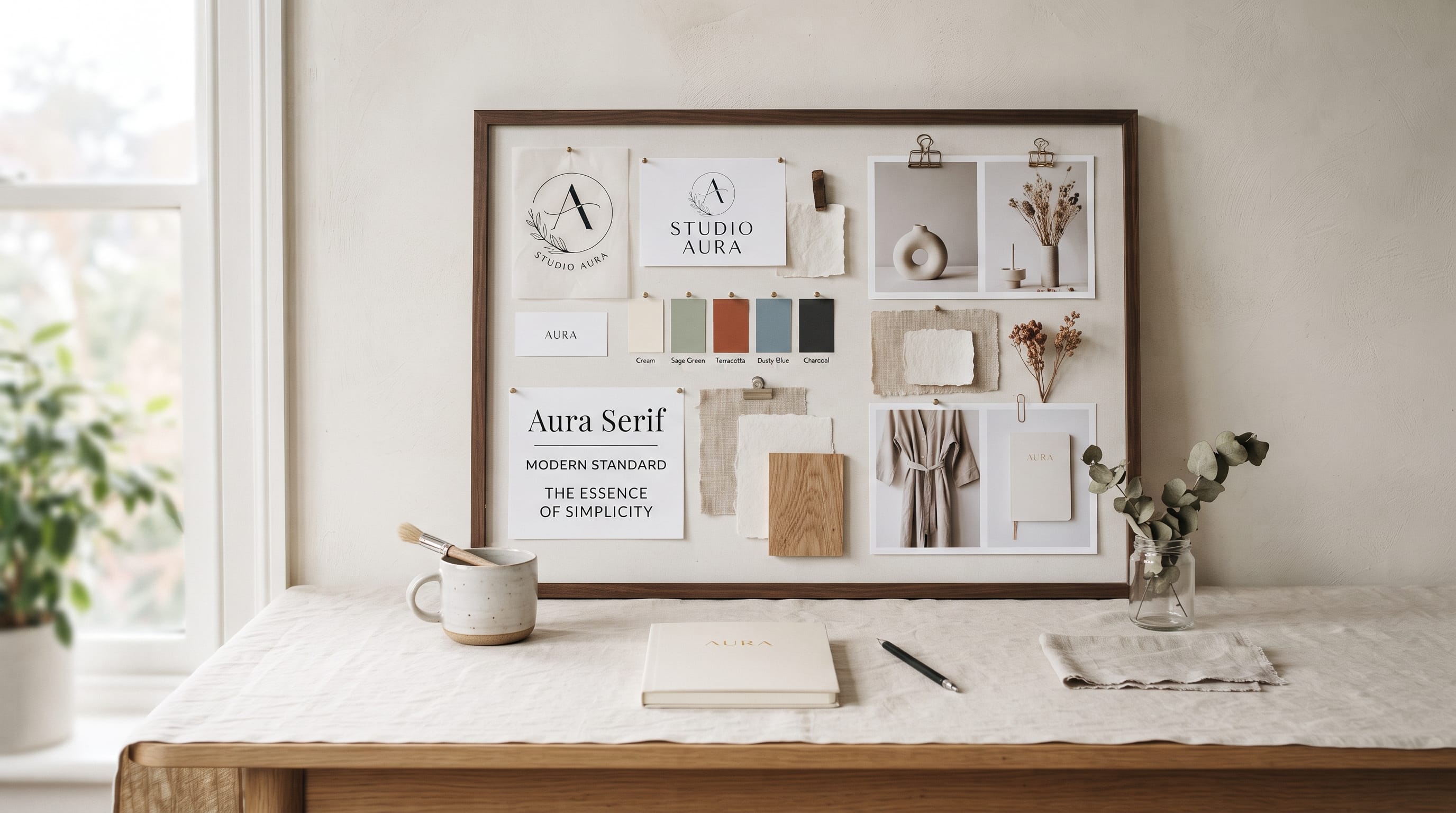
A brand mood board helps designers turn abstract ideas about a brand into a visual direction that clients, collaborators, and creative teams can understand. Before designing a logo, packaging system, website, or complete visual identity, a mood board can communicate how the brand should feel through imagery, color, typography, texture, layout, and other visual references.
The purpose is not to create a collection of attractive pictures.
A professional brand mood board should support a strategy.
Every image should contribute to a specific impression. If the brand needs to feel premium, warm, youthful, technical, natural, or playful, the mood board should make that personality visible before detailed design work begins.
For designers, this can reduce uncertainty and make client approval easier. Instead of discussing vague words such as “modern” or “elegant,” everyone can look at the same visual reference and discuss what those words actually mean.
This guide explains how to create a professional brand mood board from scratch and turn scattered inspiration into a focused creative direction.
What Is a Brand Mood Board?
A brand mood board is a curated collection of visual references representing the intended look and feeling of a brand.
It may contain:
- Photography
- Color palettes
- Typography
- Logo references
- Patterns
- Materials
- Illustration
- Architecture
- Packaging
- Fashion
- Interior design
- Graphic layouts
The references do not have to come from the same industry.
For example, a luxury skincare identity could draw inspiration from:
- Editorial fashion photography
- Natural stone
- Minimal architecture
- Soft neutral interiors
- Refined serif typography
The goal is not to copy those references.
The goal is to understand the visual characteristics they share and translate them into an original identity.
Why a Brand Mood Board Matters
Design projects often begin with descriptive words.
A client may say:
“I want the brand to feel modern, premium, and friendly.”
The problem is that everyone may interpret those words differently.
One person may think premium means black and gold.
Another may imagine warm cream, refined typography, and quiet photography.
A brand mood board makes those interpretations visible.
It helps align decisions before spending time on:
- Logo concepts
- Packaging
- Websites
- Social media
- Printed materials
This can reduce revisions later because the visual territory has already been discussed.
Start With Brand Strategy Before Visual Inspiration
Do not begin by browsing attractive images.
Start with the brand itself.
Define:
- Target audience
- Positioning
- Personality
- Values
- Product or service
- Market category
Ask:
What should people feel when they encounter this brand?
Possible answers include:
- Confident
- Relaxed
- Inspired
- Excited
- Safe
- Curious
- Exclusive
Then define what the brand should not feel like.
For example:
- Should feel: sophisticated, calm, natural
- Should not feel: clinical, trendy, overly feminine
These boundaries make the brand mood board much easier to build.
Choose Three to Five Brand Keywords
Keywords create a filter for visual research.
Avoid choosing too many.
A useful set might be:
- Refined
- Warm
- Minimal
- Natural
- Timeless
Now every visual reference can be evaluated against those words.
Ask:
- Does this image feel refined?
- Does this typeface feel timeless?
- Does this color palette feel warm?
If the answer is no, remove it even if the image looks beautiful.
This is one of the biggest differences between random inspiration and a strategic brand mood board.
Research the Brand Category
Look at competitors before creating the board.
Study:
- Common colors
- Typography
- Photography
- Packaging
- Layouts
- Graphic motifs
You are not researching so you can copy them.
You are trying to understand category conventions.
For example, many natural skincare brands may use:
- Green
- Beige
- Botanical photography
- Minimal serif fonts
This tells you what customers may already expect.
Then you can decide whether your brand should follow part of that language or deliberately move in a different direction.
Look Beyond Direct Competitors
Some of the strongest mood boards include inspiration from outside the client’s industry.
If you are designing a restaurant brand, you might study:
- Fashion
- Architecture
- Editorial design
- Ceramics
- Photography
If you are creating a technology brand, references might come from:
- Product design
- Automotive interiors
- Industrial design
- Modern art
Cross-industry inspiration can help create a more original brand direction.
Collect More Inspiration Than You Need
During the early research stage, collect freely.
You might gather:
- 40 photographs
- 20 color references
- 10 typography ideas
- Several packaging examples
Do not worry about perfect organization yet.
The first goal is exploration.
Afterward, you will reduce the collection.
This is often easier than trying to find the perfect ten images immediately.
Edit the Brand Mood Board Aggressively
A professional brand mood board should not include everything you like.
Once you have collected enough inspiration, start removing images.
Look for repetition.
If six images communicate the same idea, choose the strongest one or two.
Ask:
- Does this add something new?
- Does it support the brand keywords?
- Does it conflict with another reference?
- Would the board still work without it?
Editing creates clarity.
A smaller board with strong visual agreement is usually more effective than a crowded board filled with unrelated inspiration.
Choose a Clear Photography Direction
Photography often takes up a large portion of the mood board because it strongly affects brand perception.
Consider:
- Lighting
- Subject matter
- Camera angle
- Color treatment
- Composition
- Mood
For example:
Luxury Photography
- Controlled lighting
- Strong shadows
- Editorial composition
- Refined materials
Friendly Lifestyle Photography
- Natural light
- Real people
- Warm colors
- Candid moments
Minimal Product Photography
- Clean backgrounds
- Soft shadows
- Simple objects
- Large negative space
Make the direction consistent.
Do not combine dark cinematic photography with bright casual lifestyle imagery unless the contrast is intentional.
Add a Brand Color Palette
Color should reinforce the mood.
A useful brand mood board may contain:
- 1 dominant color
- 1 to 2 secondary colors
- 1 accent
- 1 or 2 neutrals
For example:
Quiet Luxury
- Warm ivory
- Charcoal
- Burgundy
- Muted gold
Natural Wellness
- Sage
- Cream
- Olive
- Warm brown
Bold Creative
- Cobalt
- Red
- Black
- Soft gray
Do not finalize exact technical values too early unless needed.
At mood-board stage, the goal is usually to establish visual direction.
Exact brand colors can be refined later.
Use Color Proportion Carefully
A palette can feel completely different depending on which color dominates.
Imagine:
80% cream + 15% burgundy + 5% gold
This may feel elegant.
Reverse it to:
70% burgundy + 20% gold + 10% cream
and the identity becomes much more dramatic.
Show approximate proportions in the brand mood board so clients understand how colors may actually be used.
Add Typography References
Typography communicates personality quickly.
Your mood board may include:
- Serif headlines
- Sans serif body text
- Script accents
- Condensed display fonts
- Monospaced details
For example:
Luxury
High-contrast serif + minimal sans serif
Modern Technology
Geometric sans serif + mono accent
Friendly Handmade
Rounded type + handwritten accent
Editorial
Elegant serif + neutral sans serif
You do not always need to choose final fonts during mood-board development.
It is enough to establish the typographic direction.
Also Read: Creative Brand Typography Examples That Inspire Better Logos
Include Typography in Context
Showing only a font name is less useful than showing typography in use.
Try adding references such as:
- Magazine spreads
- Packaging
- Website headings
- Poster layouts
This helps communicate:
- Scale
- Spacing
- Alignment
- Hierarchy
A typeface may feel completely different when used as tiny body copy versus oversized display text.
Include Texture and Material References
Texture can make a brand feel more physical and distinctive.
Possible references include:
- Paper
- Stone
- Fabric
- Wood
- Metal
- Glass
- Grain
- Ink
For example, a premium handmade brand might use:
- Uncoated paper
- Linen texture
- Warm wood
- Embossed printing
A technology brand could use:
- Glass
- Chrome
- Smooth black surfaces
- Reflective materials
These references help explain the desired tactile feeling.
Add Graphic Shapes and Patterns
A brand mood board can include abstract graphic ideas.
Examples include:
- Curves
- Grids
- Arches
- Stripes
- Organic shapes
- Geometric patterns
These elements may later influence:
- Packaging
- Website sections
- Social graphics
- Brand patterns
For example, repeated arches in a mood board may eventually become a signature graphic element in the identity.
Include Illustration Direction When Relevant
If illustration will be important, define its style early.
Possible directions include:
- Minimal line drawing
- Hand-drawn
- Geometric
- Botanical
- Retro
- Collage
- Cartoon
Do not mix several illustration styles unless the brand intentionally uses variation.
Consistency helps the final identity feel professional.
Include Logo References Carefully
Logo examples can be useful, but this part needs caution.
You do not want the mood board to appear as if you are preparing to copy another logo.
Instead of collecting symbols that look exactly like what you want to create, focus on broader characteristics.
For example:
- Minimal monograms
- Strong wordmarks
- High letter spacing
- Geometric marks
Explain that these are references for visual qualities, not templates for the final logo.
Use Layout Inspiration
Brand identity is not only color and logo.
Layout style can become highly recognizable.
Include examples that demonstrate:
- Alignment
- Grid
- White space
- Image placement
- Type scale
For example:
A luxury brand mood board may show large margins, centered typography, and minimal imagery.
A youthful creative brand may use asymmetrical layouts and oversized type.
These references help designers understand how the identity may behave across applications.
Create a Consistent Visual Rhythm
Once all elements are collected, look at the board as one composition.
Does it feel like one brand?
Or does it look like several unrelated Pinterest searches?
Look for repetition in:
- Colors
- Shapes
- Lighting
- Typography
- Texture
Repeated visual characteristics create cohesion.
If one image feels completely different, remove it.
Organize the Brand Mood Board Clearly
A simple grid often works best.
Possible layout:
Left Side
Photography references
Center
Typography and graphics
Right Side
Colors, textures, materials
Another option is a more editorial layout with large hero images and smaller supporting references.
Avoid making the mood board itself overly decorative.
The presentation should support the references rather than compete with them.
Use One Strong Hero Image
A large main image can establish the mood immediately.
Choose the image that best represents the intended feeling.
For example:
- A premium travel brand might use a dramatic resort photograph.
- A beauty brand might use a refined editorial portrait.
Then surround the hero image with smaller references that support the same direction.
This gives the board stronger hierarchy.
Keep the Mood Board Focused
Around 8 to 15 strong references may be enough for many projects.
More does not always mean better.
If the board contains:
- 30 photographs
- 10 fonts
- 15 colors
the direction becomes difficult to understand.
A professional brand mood board communicates one idea clearly.
Add Short Descriptive Notes
Mood boards can benefit from a few words explaining important references.
For example:
- Photography: soft natural light, quiet compositions
- Typography: elegant serif with clean supporting sans serif
- Color: warm neutrals with deep green accent
Keep descriptions short.
The board should remain visual.
Present More Than One Direction When Needed
Sometimes the strategy allows several valid creative territories.
You might create:
Direction 1 – Quiet Premium
Minimal
Warm
Refined
Direction 2 – Bold Modern
Confident
Graphic
Energetic
Direction 3 – Natural Editorial
Organic
Sophisticated
Human
Presenting two or three clearly different mood boards can help a client choose a direction before detailed design begins.
Avoid presenting several nearly identical boards.
Each should represent a meaningful strategic choice.
Also Read: How to Define Your Brand Voice for Better Marketing Results
Explain the Brand Mood Board to Clients
Do not simply send the board and ask:
“Do you like it?”
Explain why the references were selected.
For example:
“The warm neutral palette supports the brand’s natural positioning, while the editorial photography keeps the visual identity from feeling too rustic.”
This directs feedback toward strategy.
You want the client to discuss:
- Mood
- Positioning
- Audience
- Brand fit
rather than personal preference alone.
Ask Better Client Feedback Questions
Useful questions include:
- Does this direction feel appropriate for your audience?
- Does it match how you want the brand to be perceived?
- Which elements feel most aligned?
- Is anything too formal, playful, or minimal?
- Does the overall direction reflect the business?
Avoid asking whether they like each individual image.
The goal is agreement on the overall visual language.
Refine the Mood Board After Feedback
After presentation, adjust the board if needed.
You may need to:
- Remove certain colors
- Make photography warmer
- Simplify typography
- Add more personality
- Reduce luxury cues
Update the visual direction before designing the final brand identity.
This is much more efficient than discovering major disagreements during the logo stage.
Turn the Brand Mood Board Into a Visual Identity
Once approved, translate the references into original design decisions.
For example:
Mood Board Reference
Warm stone photography
Brand Translation
Warm gray and ivory palette
Mood Board Reference
High-contrast editorial serif
Brand Translation
Refined headline typeface
Mood Board Reference
Curved architectural forms
Brand Translation
Arch-based graphic motif
This is where inspiration becomes design.
Do not reproduce individual references directly.
Extract the principles behind them.
Use the Brand Mood Board for Logo Design
The approved mood board gives the logo a visual context.
Ask:
Should the logo feel:
- Bold or delicate?
- Geometric or organic?
- Modern or traditional?
- Minimal or decorative?
A brand with refined editorial references may suit a sophisticated wordmark.
A playful brand may benefit from a more expressive display style.
The mood board narrows the possibilities.
Use the Mood Board for Website Design
The same visual direction can guide:
- Hero images
- Colors
- Typography
- Button style
- Layout
- Icons
This prevents the website from becoming visually disconnected from the rest of the identity.
A strong brand mood board becomes a reference point throughout the project rather than disappearing after the logo is approved.
Use It for Packaging and Social Media
Mood boards can also guide:
Packaging
- Materials
- Colors
- Illustration
- Typography
- Finishes
Social Media
- Photography
- Graphic templates
- Text hierarchy
- Background colors
The more consistently the visual direction is applied, the stronger brand recognition becomes.
Digital vs. Physical Brand Mood Boards
Most designers now create mood boards digitally.
Digital boards are useful because they are:
- Easy to edit
- Easy to share
- Fast to duplicate
- Suitable for remote presentations
Physical boards can still be useful when material and texture matter.
For example, packaging designers may include:
- Paper samples
- Fabric
- Foil
- Printed colors
This gives clients a tactile understanding of the concept.
Tools for Creating a Brand Mood Board
You can build a brand mood board in many design tools.
Common options include:
The specific software matters less than the quality of the curation.
Choose the tool that makes it easy to:
- Organize references
- Resize images
- Add color swatches
- Present clearly
Common Brand Mood Board Mistakes
Using Only Pretty Images
Every reference should support strategy.
Adding Too Many Images
Curate aggressively.
Mixing Conflicting Styles
Create one clear direction.
Copying Competitors
Use references as inspiration only.
Ignoring Typography
Type is part of the mood.
Ignoring Layout
Show how visual elements may be organized.
Using Too Many Colors
Keep the palette controlled.
Skipping Brand Strategy
Define personality first.
Asking Clients Only What They Like
Discuss brand fit instead.
Treating the Mood Board as Final Design
It is a direction, not a finished identity.
Brand Mood Board Checklist
Before presenting your board, ask:
- Is the target audience clear?
- Does the board support the positioning?
- Are the brand keywords visible in the references?
- Does photography feel consistent?
- Is the color direction clear?
- Is typography represented?
- Are materials or textures relevant?
- Are graphic elements included?
- Is the layout direction visible?
- Do references feel cohesive?
- Have unnecessary images been removed?
- Is there one dominant mood?
- Can I explain why every reference is included?
- Does the board feel distinct from competitors?
- Can this direction translate into a complete identity?
If the board cannot answer these questions, refine it further.
Also Read: Brand System Components for Better Cross-Team Collaboration
Final Thoughts on Creating a Professional Brand Mood Board
A professional brand mood board is much more than a collage of attractive inspiration.
It is a strategic design tool that turns words such as modern, elegant, playful, natural, or premium into a visible creative direction.
Start with brand strategy.
Define the audience, positioning, personality, and a small group of keywords. Then research broadly, collect more inspiration than you need, and reduce the selection until every reference supports the same visual idea.
Use photography, color, typography, texture, layout, patterns, and materials to create a complete visual atmosphere.
Keep the board focused.
A small group of carefully selected references will communicate more effectively than dozens of unrelated images.
Then present the brand mood board strategically. Explain why each visual direction supports the business and ask clients for feedback based on brand fit rather than personal preference.
Once the direction is approved, translate the underlying principles into original design decisions for logos, websites, packaging, social media, and other touchpoints.
The strongest mood boards do not tell designers exactly what the final identity must look like.
Instead, they create boundaries and inspiration.
That balance gives designers enough clarity to move forward while still leaving room for creativity.
When built carefully, a brand mood board becomes one of the most useful tools for turning strategy into a coherent visual identity.

For high-quality fonts to boost your income, check out DM Letter Studio. Our professional fonts are perfect for branding, marketing, and content creation. So, don’t miss this opportunity.