
How to Use Retro Fonts in Modern Graphic Design
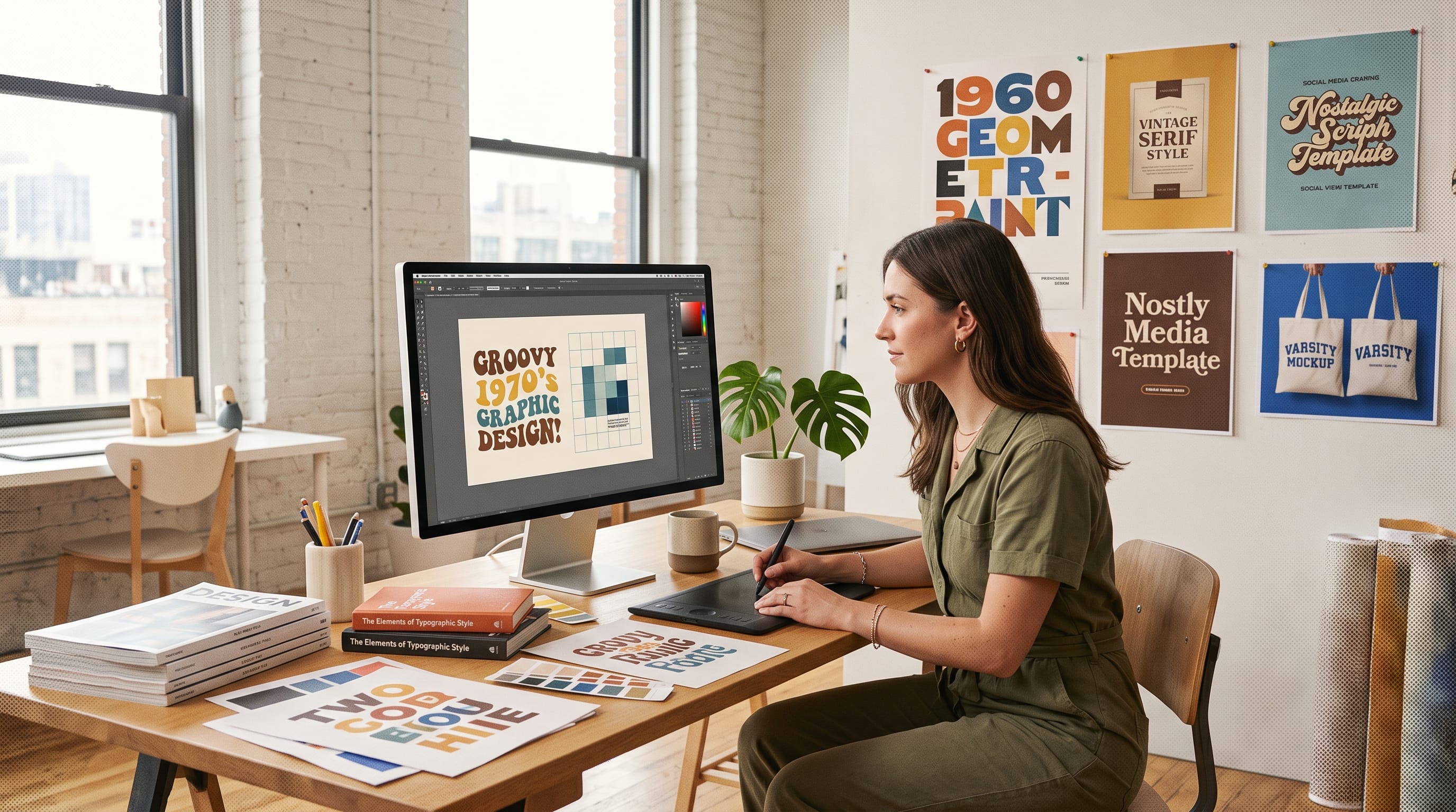
Retro fonts are one of the easiest ways to bring personality, nostalgia, and visual character into modern graphic design. Inspired by typography from past decades, these fonts can instantly suggest vintage advertising, old-school sports graphics, neon signs, classic packaging, record covers, retro technology, or handmade signage.
The challenge is using retro typography without making the entire project look outdated.
Modern designers often achieve the best results by combining nostalgic type with contemporary layouts, restrained color palettes, clean supporting fonts, and generous spacing. Instead of recreating an old design exactly, they borrow recognizable visual characteristics from a specific era and reinterpret them for modern audiences.
That approach makes retro fonts useful for branding, posters, packaging, social media graphics, merchandise, editorial design, and digital campaigns.
Whether you prefer 1950s signage, 1970s rounded lettering, 1980s scripts, or 1990s-inspired display typography, this guide explains how to make retro type feel relevant in contemporary design.
Why Retro Fonts Still Work in Modern Graphic Design
Typography can communicate a period of time before viewers even read the words.
A bold varsity typeface may remind people of classic college apparel. A flowing script can suggest vintage automotive signage or 1980s music graphics. Rounded display letters might evoke 1970s packaging and advertising.
This emotional connection is one reason retro fonts remain useful.
They can communicate:
- Nostalgia
- Authenticity
- Personality
- Heritage
- Fun
- Rebellion
- Craftsmanship
- Familiarity
Retro typography also stands apart from the clean geometric sans serif styles commonly associated with contemporary digital products.
When everyone uses similar minimalist typography, introducing one expressive vintage-inspired font can make a composition more distinctive.
Understand the Era Behind Retro Fonts
“Retro” is a broad category.
Different decades have very different visual personalities.
Before choosing a typeface, decide which period or mood you want the design to reference.
1950s Retro Fonts
Typography inspired by the 1950s may include:
- Sign-painter scripts
- Diner lettering
- Bold condensed fonts
- Hand-painted styles
- Decorative advertising typography
This style works well for:
- Restaurants
- Food packaging
- Automotive graphics
- Vintage logos
- cafe branding
1960s Retro Typography
1960s-inspired typography can feel playful and experimental.
Look for:
- Rounded letters
- Psychedelic shapes
- Unusual curves
- High-contrast forms
- Decorative display styles
These retro fonts can work for music, fashion, festivals, posters, and artistic branding.
1970s Retro Fonts
The 1970s introduced some of the most recognizable retro typography.
Typical characteristics include:
- Thick rounded letters
- Soft curves
- Groovy shapes
- Warm personality
- Tight spacing
This direction can feel relaxed, optimistic, and expressive.
1980s Retro Fonts
1980s typography often brings more energy.
Designers may use:
- Bold scripts
- Chrome effects
- Neon-inspired lettering
- Geometric display fonts
- Athletic typography
This style works especially well for entertainment, music, gaming, fashion, and promotional graphics.
1990s Retro Typography
1990s-inspired design can include:
- Chunky display fonts
- Distorted typography
- Sports lettering
- Grunge
- Early digital aesthetics
- Colorful youth-oriented type
Choosing a specific era makes your retro design more intentional.
Use Retro Fonts as a Focal Point
One of the simplest ways to use retro fonts in modern design is to make them the primary focal point.
Instead of filling the entire layout with decorative typography, choose one important phrase.
For example:
- SUMMER CLUB
- ORIGINAL GOODS
- EST. 1985
- STAY WILD
- CLASSIC SUPPLY
Use the retro font for the main headline while keeping supporting information simple.
This creates contrast between expressive and functional typography.
The retro element attracts attention, while modern supporting type maintains readability.
Pair Retro Fonts With Clean Sans Serif Type
A highly effective modern-retro combination is:
Retro display font + clean sans serif
The retro font provides character.
The sans serif provides clarity.
For example:
- Headline: expressive vintage script
- Subheading: uppercase sans serif
- Body: neutral sans serif
This approach works particularly well for:
- Packaging
- Posters
- Websites
- Branding
- Social media
- Menus
Avoid pairing several decorative retro fonts together unless you have a strong reason.
Too many expressive typefaces can compete for attention.
Build Clear Typography Hierarchy
Retro typography works better when every piece of text has a clear role.
A basic hierarchy could be:
Primary Headline
Large retro display font.
Secondary Information
Smaller modern sans serif.
Body Copy
Highly readable neutral typeface.
Decorative Text
Small vintage-inspired details such as dates, locations, or slogans.
This hierarchy allows the retro type to remain visually powerful.
If everything is bold and decorative, nothing becomes the focal point.
Use Retro Fonts With Modern White Space
Vintage designs were often dense because of printing limitations and advertising conventions.
You do not have to reproduce that density.
One way to modernize retro fonts is to surround them with generous negative space.
Imagine:
- Cream background
- One large retro wordmark
- Small clean subtitle
- Minimal graphic
- Plenty of empty space
The typography still communicates nostalgia, but the composition feels contemporary.
White space is particularly useful for premium brands that want a vintage influence without looking overly decorative.
Combine Retro Typography With Minimal Layouts
Another effective technique is contrast.
Use expressive lettering inside a very simple grid.
For example:
- Large centered headline
- One photograph
- Two supporting text blocks
- Small logo
- Limited palette
The old-style typography provides personality while the layout provides modern structure.
This approach works well for fashion lookbooks, album covers, posters, packaging, and editorial content.
Choose Retro Colors Carefully
Typography and color strongly influence one another.
If you combine a vintage typeface with historically accurate colors and textures, the design can become extremely nostalgic.
If you pair the same font with cleaner contemporary colors, it may feel much more modern.
1970s-Inspired Palette
Consider:
- Burnt orange
- Mustard
- Brown
- Olive
- Cream
1980s-Inspired Palette
Try:
- Hot pink
- Cyan
- Purple
- Black
- Electric blue
Classic Athletic Palette
Use:
- Navy
- Cream
- Burgundy
- Forest green
- Red
Modern Retro Palette
Try simplifying everything to:
- Black
- Warm white
- One bold accent
A restrained palette often makes retro fonts easier to integrate into modern branding.
Also Read: Graphic Design Typography for Better Branding and Identity
Use Texture Without Overdoing It
Texture is commonly associated with retro graphic design.
Examples include:
- Paper grain
- Halftones
- Ink distress
- Screen-print textures
- Film grain
- Faded colors
- Rough edges
These elements can add authenticity.
However, adding heavy distress effects everywhere may reduce readability.
A more contemporary approach is to apply texture selectively.
For example:
Use clean typography with subtle grain in the background rather than heavily distressing every letter.
Retro Fonts for Modern Logo Design
Retro fonts can be extremely effective for logo design because they create immediate personality.
They work especially well for businesses such as:
- Cafes
- Restaurants
- Clothing brands
- Barbershops
- Creative studios
- Sports brands
- Music businesses
- Automotive companies
A retro logo does not need to look like a historical reproduction.
Try combining:
- Vintage-inspired wordmark
- Minimal symbol
- Clean secondary type
- Contemporary color palette
You can also create several versions:
- Primary Logo: full retro wordmark
- Secondary Logo: simplified badge
- Icon: initial or symbol
This makes the identity flexible across digital and print environments.
Retro Fonts for Poster Design
Posters allow designers to be more experimental.
Large retro fonts can dominate the composition.
Try techniques such as:
- Oversized lettering
- Curved text
- Tight spacing
- Overlapping images
- Vertical text
- Outline effects
- Drop shadows
- Distortion
Retro posters work particularly well for:
- Music events
- Festivals
- Fashion
- Sports
- Restaurants
- Product launches
Keep important information such as dates, locations, and calls to action easy to read.
Retro Fonts for Packaging Design
Retro packaging can create familiarity and character on store shelves.
Typography can reference:
- Classic grocery packaging
- Vintage soda labels
- Old cosmetics
- Traditional food brands
- Sports merchandise
A strong packaging system may use:
- Front: expressive retro display font
- Product Details: clean modern type
- Ingredients or Specifications: highly readable supporting typography
This balance provides personality without sacrificing functionality.
Retro Fonts for Social Media Design
Social content needs immediate visual impact.
Retro typography can help because its shapes often stand out in crowded feeds.
Use retro fonts for:
- Promotional headlines
- Product launches
- Quotes
- Event graphics
- Reels covers
- Carousel titles
Keep text short.
Large expressive lettering works better on small mobile screens than paragraphs written in decorative typefaces.
Create reusable templates so the typography remains consistent across multiple posts.
Retro Fonts for Merchandise
Vintage typography is especially effective on physical products.
Common applications include:
- T-shirts
- Hoodies
- Hats
- Tote bags
- Stickers
- Posters
Consider how the type will reproduce.
Extremely thin details may disappear during printing or embroidery.
Bold display fonts are often more practical for merchandise.
Varsity styles are particularly useful because they naturally connect with sportswear, school apparel, and nostalgic American graphics.
Add Modern Photography to Retro Fonts
Combining old-inspired typography with contemporary photography creates strong contrast.
Try placing vintage lettering over:
- Clean fashion photography
- Modern architecture
- Minimal product images
- Editorial portraits
- Contemporary lifestyle photography
This creates a design that references the past without becoming trapped in it.
Avoid applying a vintage filter to every image automatically.
Sometimes clean photography makes the typography feel more interesting.
Also Read: 20+ Typography Logo Ideas That Look Premium and Simple
Experiment With Oversized Retro Typography
A modern technique is to make typography extremely large.
Let letters:
- Extend beyond the canvas
- Overlap photographs
- Become background shapes
- Wrap around objects
This can make retro fonts feel more experimental.
For example, a chunky 1970s display font could fill most of a poster while a small modern caption sits in one corner.
The combination of old typography and modern scale creates a fresh result.
Use Retro Fonts in Badge Designs
Badge and emblem layouts naturally complement vintage typography.
A badge might contain:
- Brand name
- Establishment date
- Small symbol
- Location
- Tagline
Possible shapes include:
- Circles
- Shields
- Ovals
- Rectangles
Retro badge designs work well for restaurants, sports teams, outdoor brands, merchandise, and heritage-inspired companies.
To modernize the badge, simplify the number of elements and avoid unnecessary ornament.
Font Suggestions for Retro Graphic Design
DM Letter Studio currently offers several fonts that work especially well for vintage, collegiate, athletic, and nostalgic design directions.
1. Retro Varsity for Classic Nostalgia
Retro Varsity is one of the strongest choices for modern retro projects.
DM Letter Studio describes it as a display font combining classic collegiate lettering with retro character. Its strong lines make it suitable for posters, logos, merchandise, headlines, and team graphics.
Use Retro Varsity for:
- Sports branding
- Vintage clothing
- T-shirt designs
- College-inspired posters
- Retro logos
- Merchandise
To modernize it, pair it with a neutral sans serif and avoid excessive decoration.
2. Eighties for Retro Script Typography
Eighties is a nostalgic script typeface inspired by bold 1980s typography.
Its energetic strokes make it suitable for branding, posters, album covers, social graphics, and vintage-inspired promotional design.
It works especially well for:
- Music branding
- Retro events
- Automotive graphics
- Fashion
- Nightlife
- 1980s-themed campaigns
Pair Eighties with clean uppercase supporting typography to maintain a modern balance.
3. Scholar Varsity for Heritage Typography
Scholar Varsity offers a more traditional academic and athletic personality.
Its structured all-caps forms reference classic letterman jackets, sports jerseys, and school signage. DM Letter Studio positions it for apparel, university logos, posters, events, and branding.
This font works well for:
- Heritage branding
- Academic graphics
- Sportswear
- Vintage campus themes
- Apparel
- Old-school posters
Combine it with modern photography to keep the design from feeling too literal.
4. Blockton Varsity for Modern Retro Impact
Blockton Varsity blends traditional sports typography with a cleaner contemporary edge.
Its thick and readable letterforms make it particularly useful for logos, packaging, signage, merchandise, and posters.
Use it for:
- Bold retro branding
- Streetwear
- Sports merchandise
- Packaging
- Promotional posters
Blockton Varsity is especially useful when you want retro character without sacrificing clarity.
5. Echoline Varsity for Retro Athletic Design
Echoline Varsity uses strong collegiate letterforms, sharp edges, and vintage sports influence.
DM Letter Studio recommends it for sportswear branding, college graphics, logos, event posters, and retro branding.
It works well for:
- Athletic branding
- Team graphics
- College-inspired apparel
- Bold posters
- Retro merchandise
Try combining it with understated layouts and one accent color.
6. Plump Varsity for Friendly Retro Design
Plump Varsity combines traditional collegiate typography with rounded, bubble-like forms.
This creates a friendlier and more playful retro personality. DM Letter Studio highlights uses including shirts, stickers, banners, sports camps, gamer squads, graduation merchandise, and social media graphics.
Use it for:
- Youth brands
- Casual apparel
- Playful retro posters
- Stickers
- College events
- Social graphics
Its rounded forms are particularly effective when traditional varsity typography feels too serious.
Avoid Using Too Many Retro Fonts
A common mistake is combining several eras in the same composition.
For example:
- 1950s script
- 1970s bubble font
- 1980s neon display font
- 1990s grunge type
Together, they can create visual confusion.
Choose one dominant nostalgic direction.
Then support it with neutral modern typography.
A practical rule is:
One expressive retro font + one functional supporting font.
This is usually enough.
Make Retro Fonts Responsive for Digital Design
Decorative typography can become difficult to read on smaller screens.
If using retro fonts on websites or mobile designs:
- Test the type on phones
- Increase spacing where necessary
- Avoid very long headlines
- Maintain strong contrast
- Use simpler fonts for body copy
Responsive typography may require different headline sizes at different breakpoints.
Do not assume a layout that works on desktop will automatically work on mobile.
Common Retro Font Mistakes
1. Using Decorative Fonts for Paragraphs
Retro display fonts are usually designed for headlines.
2. Combining Too Many Eras
Pick one visual direction.
3. Overusing Distress Effects
Texture should support typography rather than destroy readability.
4. Ignoring Hierarchy
Not every piece of text should compete for attention.
5. Making Everything Vintage
Modern photography, layouts, and supporting typography can create stronger contrast.
6. Choosing Fonts Only Because They Look Cool
Typography should fit the project’s brand personality.
7. Forgetting Licensing
Always confirm that your font license covers the intended commercial use.
Retro Fonts Checklist for Designers
Before finalizing your design, check:
- Does the font match the intended era?
- Is the typography easy to read?
- Is there one clear focal point?
- Are supporting fonts simpler?
- Does the color palette support the concept?
- Is texture used carefully?
- Does the composition still feel contemporary?
- Have mobile sizes been tested?
- Does the font work in print?
- Is the design consistent with the brand?
- Have licensing requirements been reviewed?
Also Read: The Best Packaging Design Typography Guide for Designers
Final Thoughts on Using Retro Fonts in Modern Graphic Design
Retro fonts allow designers to borrow personality and emotional associations from the past while creating something that feels relevant today.
The strongest retro-inspired projects rarely reproduce an old design exactly.
Instead, they combine nostalgic typography with modern ingredients such as clean grids, bold scale, restrained color, contemporary photography, strong hierarchy, and generous negative space.
Use an expressive vintage typeface as the focal point and allow simpler typography to handle supporting information. Choose a specific era rather than mixing every retro influence together.
DM Letter Studio fonts provide different approaches to nostalgic typography, from traditional academic styles to energetic scripts and friendly rounded collegiate lettering.
Most importantly, treat retro fonts as a creative ingredient rather than a complete design strategy.
When old-school typography is balanced with contemporary layout principles, it can make modern branding, posters, packaging, social media, and merchandise feel distinctive, memorable, and full of personality.