
Seasonal Autumn Design Trends for Better Visual Campaigns
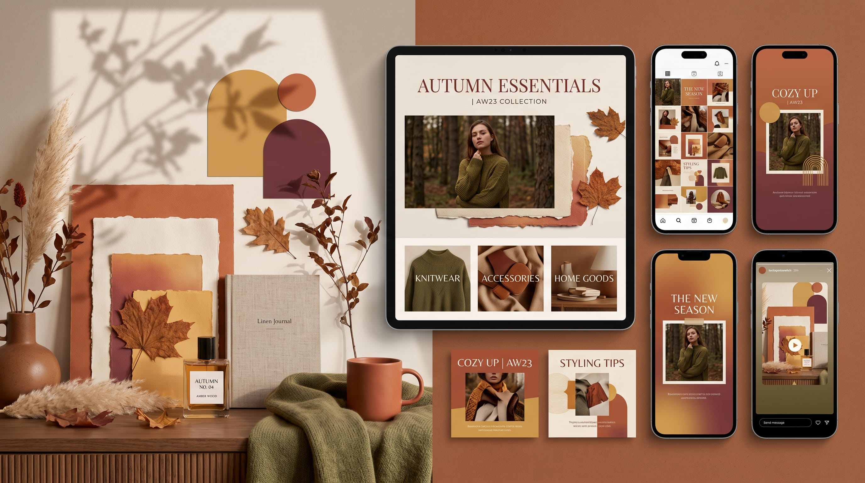
Seasonal autumn design trends help creators and small brands build visual campaigns that feel warm, timely, and emotionally connected to the season. Autumn design is often associated with orange leaves, brown backgrounds, and rustic textures, but effective seasonal branding can go far beyond familiar fall imagery.
Modern autumn campaigns combine warm colors with editorial typography, tactile materials, natural photography, clean layouts, and carefully selected decorative details. The strongest designs communicate the atmosphere of autumn without making every graphic look identical.
A successful seasonal campaign should also remain connected to the existing brand. Customers still need to recognize the company across social media, websites, email promotions, packaging, advertisements, and printed materials.
Typography plays an important role in creating that connection. A classic serif can make an autumn campaign feel established, while a handcrafted display font can communicate warmth and personality. Elegant monogram fonts may suit premium products, whereas bold lettering can support modern retail promotions.
This guide explores practical seasonal autumn design trends and matching font suggestions from the DM Letter Studio catalog.
Why Seasonal Autumn Design Trends Matter
Seasonal design can make a campaign feel more relevant to what customers are currently experiencing. Autumn often represents comfort, transition, harvest, tradition, preparation, and slower routines.
These associations are useful for:
- Ecommerce campaigns
- Social media content
- Restaurant promotions
- Home and lifestyle brands
- Fashion collections
- Seasonal packaging
- Event posters
- Email campaigns
- Blog graphics
- Local business marketing
However, seasonal design should not replace the brand identity. It should temporarily adapt the existing system.
For example, a clean technology brand may use muted amber and deep navy instead of suddenly adopting rustic wooden textures. A luxury fashion label may introduce burgundy and warm ivory while preserving its elegant typography and generous spacing.
The best seasonal autumn design trends feel appropriate to both the season and the brand.
Start With an Autumn Campaign Concept
Before choosing colors or fonts, define what autumn means for the campaign.
Possible directions include:
- Cozy and comforting
- Rustic and handmade
- Elegant and luxurious
- Editorial and modern
- Natural and sustainable
- Playful and family-friendly
- Dark and cinematic
- Vintage and nostalgic
A campaign for handmade candles may emphasize warmth and comfort. A fashion collection may focus on layered materials and deep colors. A café promotion may use harvest imagery and handwritten typography.
Choose one clear direction before creating individual graphics. This helps the entire campaign feel consistent.
1. Warm Earth-Tone Color Palettes
Earth tones remain central to seasonal autumn design trends because they reflect natural materials, changing leaves, soil, wood, and harvest colors.
A practical palette may include:
- Burnt orange
- Terracotta
- Mustard yellow
- Olive green
- Deep brown
- Warm beige
- Cream
These colors work well for home décor, food, fashion, travel, wellness, and handmade products.
Avoid using every autumn color in equal amounts. Choose one dominant shade, one supporting color, and one accent.
For example:
- Cream background
- Terracotta section blocks
- Deep brown text
- Mustard accent
This creates seasonal warmth without making the design visually heavy.
2. Deep Burgundy and Plum Autumn Design
Autumn does not need to rely only on orange and brown. Burgundy, plum, wine red, and dark rose create a more refined seasonal direction.
These colors suit:
- Fashion campaigns
- Beauty products
- Jewelry
- Premium food
- Events
- Hospitality
- Luxury ecommerce
Pair burgundy with:
- Warm ivory
- Dusty pink
- Muted gold
- Charcoal
- Deep forest green
This palette can make a campaign feel elegant without losing the autumn atmosphere.
3. Natural Paper and Printed Textures
Tactile surfaces are one of the most useful seasonal autumn design trends for making digital campaigns feel warmer.
Useful textures include:
- Recycled paper
- Kraft paper
- Linen
- Cardboard
- Ink grain
- Rough print
- Handmade brush marks
- Torn edges
- Subtle film noise
Textures work especially well for artisan products, cafés, bookstores, independent shops, and local events.
Apply them carefully. Heavy texture behind small text can reduce readability. Use texture mostly in backgrounds, borders, packaging mockups, or large decorative areas.
4. Editorial Autumn Layouts
Editorial layouts create a modern alternative to traditional rustic seasonal design.
This style may include:
- Large serif headlines
- Structured grids
- Generous margins
- Overlapping photography
- Small category labels
- Narrow text columns
- Strong image cropping
- Neutral backgrounds
Editorial seasonal autumn design trends are suitable for fashion, travel, home décor, food, culture, and premium ecommerce.
Instead of covering the design with decorative leaves, use one strong autumn photograph and clear typography.
For example, a fashion campaign could feature a full-width image of layered clothing with a large burgundy headline and small cream text.
5. Botanical Autumn Illustrations
Botanical graphics remain popular, but modern campaigns are moving beyond simple leaf borders.
Creators can use:
- Detailed branch illustrations
- Acorns
- Dried flowers
- Mushrooms
- Berries
- Wheat
- Seeds
- Autumn herbs
- Forest plants
Illustrations may be realistic, hand-drawn, flat, engraved, or abstract.
A botanical campaign works well for:
- Natural beauty brands
- Food packaging
- Wellness products
- Stationery
- Home décor
- Sustainable businesses
Use illustrations as supporting elements rather than covering the entire composition.
Also Read: 25 Quick Graphic Design Ideas You Can Try Today
6. Dark and Cinematic Autumn Campaigns
Some seasonal autumn design trends use darker colors and dramatic lighting instead of soft cozy visuals.
A cinematic autumn palette may include:
- Near-black
- Deep brown
- Burnt red
- Copper
- Amber
- Smoky gray
This style suits:
- Music
- Film
- Events
- Premium beverages
- Fashion
- Photography
- Nighttime promotions
Use directional light, deep shadows, and strong contrast. A single orange or amber highlight can create seasonal atmosphere without relying on obvious fall symbols.
7. Cozy Lifestyle Photography
Cozy photography is one of the most recognizable autumn directions, but it works best when the scene feels natural rather than staged.
Useful visual elements include:
- Soft blankets
- Warm drinks
- Books
- Candles
- Wooden surfaces
- Knitted clothing
- Window light
- Indoor plants
- Ceramic cups
- Seasonal food
This approach works well for blogs, home brands, lifestyle products, wellness, cafés, and ecommerce.
Use warm but realistic color grading. Excessive orange filters can make skin tones, food, and products appear unnatural.
8. Minimal Autumn Design Trends
Minimal autumn design uses seasonal color and typography without adding many decorative elements.
A simple campaign may use:
- Warm cream background
- One deep orange accent
- Dark brown text
- Large product photography
- Clean grid
- Small seasonal label
This approach suits professional brands that want to acknowledge the season without changing their identity significantly.
Minimal seasonal autumn design trends work especially well for:
- Technology
- Professional services
- Modern ecommerce
- Architecture
- Skincare
- Premium products
9. Vintage Harvest Graphics
Vintage harvest graphics borrow from old packaging, market posters, agricultural labels, and printed advertisements.
Common elements include:
- Engraved illustrations
- Curved typography
- Limited color palettes
- Rough ink
- Decorative borders
- Badge shapes
- Hand-lettered labels
- Stamp textures
This style is useful for:
- Food brands
- Farmers’ markets
- Coffee shops
- Bakeries
- Local events
- Craft products
Keep the design organized. Too many vintage elements can make the campaign feel crowded.
10. Modern Autumn Gradients
Gradients can make autumn campaigns feel more digital and contemporary.
Possible combinations include:
- Burnt orange to burgundy
- Mustard to terracotta
- Olive to deep forest green
- Warm beige to muted peach
- Plum to dark brown
Use gradients for:
- Hero backgrounds
- Social posts
- Email headers
- Promotional banners
- Video transitions
- Packaging mockups
Keep text in an area with consistent contrast. Complex gradients may need a dark overlay behind headlines.
11. Handwritten Autumn Typography
Handwritten typography can make seasonal content feel personal, friendly, and handmade.
It works well for:
- Quotes
- Café menus
- Invitations
- Social graphics
- Gift packaging
- Recipe cards
- Local business promotions
Use handwritten fonts for short phrases rather than long paragraphs.
A phrase such as “Hello Autumn” may work beautifully in script, while detailed product information should use a clear supporting typeface.
12. Layered Autumn Fashion Campaigns
Autumn fashion design often reflects the physical idea of layering.
Designers can create visual layers using:
- Overlapping photographs
- Transparent color blocks
- Stacked typography
- Cropped fabric textures
- Repeated silhouettes
- Paper collage
- Shadowed shapes
This style connects naturally with coats, scarves, knitwear, boots, and seasonal accessories.
Use one dominant image and let the other layers support it.
Also Read: Best Graphic Design Ideas for Social Media Content in 2026
13. Autumn Monogram Branding
Monograms can give seasonal packaging and campaigns a refined, personalized appearance.
They work especially well for:
- Gift products
- Fashion labels
- Wedding stationery
- Hospitality
- Handmade businesses
- Personal brands
- Premium food
An autumn monogram may include:
- Initials
- Circular frames
- Wreaths
- Branches
- Acorns
- Minimal leaf forms
- Geometric borders
Keep seasonal decoration removable so the main monogram can continue being used after autumn.
14. Playful Autumn Graphics for Small Brands
Autumn design does not need to feel serious or rustic. Small brands can use playful colors, illustrations, and rounded shapes.
A playful palette may include:
- Pumpkin orange
- Soft pink
- Mustard yellow
- Teal
- Cream
- Dark purple
Use simple icons such as:
- Cups
- Sweaters
- Leaves
- Books
- Pumpkins
- Bags
- Stars
- Smiling seasonal objects
This style suits children’s products, stationery, cafés, lifestyle shops, and social media campaigns.
15. Sustainable Autumn Design Trends
Autumn naturally connects with environmental themes, natural materials, and slower consumption.
Sustainable campaigns may use:
- Recycled paper
- Minimal packaging
- Natural dyes
- Green and brown palettes
- Product lifecycle information
- Reusable materials
- Documentary photography
- Simple icons
Avoid adding natural imagery only for appearance. The campaign should communicate real sustainable actions when making environmental claims.
How to Build a Seasonal Autumn Campaign
Use a consistent system across every campaign asset.
Define:
- Main autumn concept
- Primary and secondary colors
- Headline font
- Supporting font
- Photography style
- Texture rules
- Illustration style
- Button and call-to-action colors
- Social media templates
- Website and email adaptations
Create a small style guide before producing the full campaign.
For example:
Concept: Warm editorial autumn
Colors: Burgundy, cream, muted gold, charcoal
Headline font: Quirky Autumn
Supporting font: Clean sans serif
Photography: Soft side lighting and deep shadows
Texture: Subtle paper grain
Layout: Large images with wide margins
This gives every designer or marketer a clear direction.
Match DM Letter Studio Fonts to Autumn Brand Styles
Rustic and Handcrafted
Use Gobbie Gobble.
These fonts can support bakeries, handmade products, local businesses, and artisan packaging.
Elegant and Premium
Use Pear Leaves.
These directions suit fashion, jewelry, beauty, hotels, and luxury ecommerce.
Modern and Minimal
Use Autumn Sunset.
These fonts can work for technology, professional services, skincare, and modern retail.
Editorial and Heritage
Use Quirky Autumn.
These fonts suit magazines, cultural campaigns, professional brands, and premium home products.
Decorative and Botanical
Use Autumn Lover.
These options work well for flowers, stationery, weddings, beauty, and natural products.
Common Autumn Campaign Design Mistakes
1. Using Too Many Autumn Symbols
Leaves, pumpkins, acorns, branches, cups, and sweaters do not all need to appear together. Choose one or two relevant symbols.
2. Making Everything Orange
Autumn includes burgundy, olive, plum, mustard, cream, brown, and deep green. A broader palette creates more flexibility.
3. Ignoring the Existing Brand
Seasonal visuals should adapt the brand rather than replace it.
4. Using Decorative Fonts for Body Text
Display fonts work best for logos and headlines. Keep paragraphs and practical information easy to read.
5. Overusing Texture
Heavy paper grain and rough printing can reduce clarity, especially on mobile screens.
6. Copying Competitors
Use seasonal references to build an original direction rather than repeating the same leaf-and-pumpkin layouts.
7. Forgetting Mobile Formats
Create dedicated vertical and square layouts instead of simply cropping desktop banners.
Also Read: Minimalist Graphic Design Inspiration for Modern Brands
Final Thoughts on Seasonal Autumn Design Trends
The most effective seasonal autumn design trends combine warmth, structure, and brand consistency. Earth tones, burgundy palettes, natural textures, botanical illustrations, editorial layouts, cozy photography, and monogram branding can all support strong seasonal campaigns.
Start by defining the mood and audience. Then choose a limited palette, a clear typography system, and one main visual direction.
DM Letter Studio fonts can help reinforce different autumn styles. Noblecraft, Quillcrest, and Elmsworth suit rustic and handcrafted campaigns. Marquessa, Doraluxe, Monarchine, and Averleigh support premium seasonal branding.
For modern campaigns, consider Finaris, Velantra, Monoluxe, or Primorion. Editorial and heritage designs can explore Crestoria, Kingsleigh, Elenford, and Gildemere.
The best seasonal autumn design trends do not depend on adding as many seasonal decorations as possible. They create an atmosphere through color, type, texture, photography, and thoughtful composition. When these elements support the brand and message, the campaign feels timely, memorable, and professionally designed.