
Summer Graphic Design Style Guide for Better Seasonal Branding
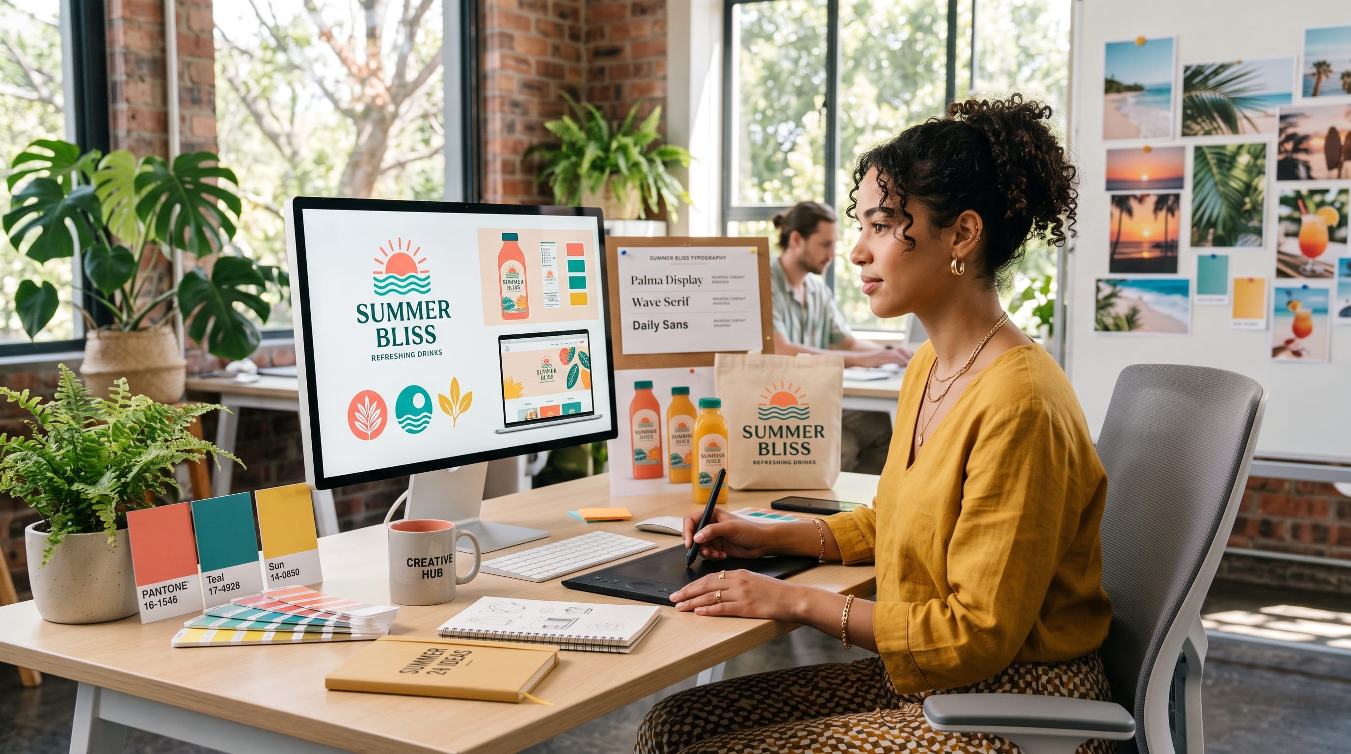
A strong summer graphic design style can instantly make a brand feel brighter, more energetic, and more connected to the season. Summer visuals often use warm colors, playful typography, tropical imagery, coastal references, bold photography, and relaxed compositions to communicate sunshine, travel, outdoor experiences, and positive energy. However, effective seasonal branding requires more than simply adding palm trees or bright yellow backgrounds to every design.
The best summer campaigns still feel connected to the existing brand.
Colors, fonts, illustrations, photography, and layouts should support the personality customers already recognize while introducing enough seasonal character to make the campaign feel fresh.
This guide explores practical ways to create a summer graphic design style for branding, social media, packaging, posters, promotions, and other seasonal creative work.
Why Summer Graphic Design Style Matters for Seasonal Branding
Seasonal design gives brands an opportunity to refresh their visual communication without completely changing their identity.
A summer campaign can help promote:
- Seasonal products
- Limited collections
- Sales
- Travel offers
- Outdoor events
- Food and beverage products
- Fashion collections
- Social campaigns
- Holiday promotions
The visual direction helps customers understand the mood before they read the message.
A bright citrus palette may suggest freshness and energy, while pale blue and sand tones can create a more relaxed coastal feeling.
The goal of summer graphic design style is not to make every brand look identical. Instead, it is to identify seasonal elements that fit the brand’s audience and personality.
1. Build a Summer Color Palette
Color is often the fastest way to create a seasonal impression.
Summer palettes can range from bold and tropical to soft and coastal.
Bright Summer Colors
Consider:
- Coral
- Tangerine
- Lemon yellow
- Aqua
- Turquoise
- Hot pink
- Lime green
These colors work well for:
- Youth brands
- Food
- Events
- Travel
- Fashion
- Entertainment
Coastal Summer Colors
For a calmer summer graphic design style, try:
- Soft blue
- Seafoam
- Warm white
- Sand
- Beige
- Muted teal
This palette can work well for:
- Hotels
- Wellness
- Home decor
- Skincare
- Lifestyle brands
Sunset-Inspired Palettes
Sunset colors can create warmth and emotion.
Try:
- Peach
- Coral
- Orange
- Rose
- Deep purple
Use one dominant color and a small number of supporting shades rather than filling every design with six equally strong colors.
2. Tropical Summer Graphic Design Style
Tropical graphics remain one of the most recognizable summer directions.
Common elements include:
- Palm leaves
- Tropical flowers
- Citrus fruits
- Pineapples
- Ocean waves
- Exotic birds
- Bright patterns
The key is avoiding generic compositions.
Instead of placing random tropical graphics around a logo, develop a consistent illustration system.
For example, a beverage brand could create simplified illustrations of oranges, leaves, ice, and glasses using the same line weight and color palette.
These assets can then appear across:
- Packaging
- Posters
- Instagram posts
- Menus
- Website banners
A consistent system makes the tropical theme feel intentional.
3. Coastal Summer Graphic Design Style
Not every summer campaign needs bright tropical colors.
Coastal branding offers a quieter alternative.
This direction often uses:
- Ocean blues
- Neutral sand tones
- White space
- Natural textures
- Linen-inspired backgrounds
- Simple serif typography
- Soft photography
A coastal summer graphic design style works particularly well for premium lifestyle brands.
Imagine a resort campaign using pale blue backgrounds, elegant typography, large beach photography, and small cream-colored text blocks.
The result can feel seasonal without becoming overly playful.
4. Use Bold Summer Typography
Typography can immediately change the personality of a campaign.
For energetic summer designs, consider:
- Bold sans serif
- Rounded display fonts
- Retro lettering
- Handwritten styles
- Chunky typography
Large words such as:
- SUMMER
- SUNSHINE
- ESCAPE
- FRESH
can become graphic elements themselves.
Pair expressive typography with a simpler supporting font.
For example:
- Display font: bold and playful like Lost Island
- Supporting font: clean sans serif like Melvick
This keeps the campaign energetic while maintaining readability.
5. Retro Summer Graphic Design Style
Retro design is naturally suited to summer because it can reference vintage travel posters, beach advertising, surf culture, and old vacation photography.
A retro direction may include:
- Warm orange
- Mustard yellow
- Dusty blue
- Cream backgrounds
- Grain textures
- Rounded typography
- Vintage illustration
- Faded photography
Imagine a summer music festival poster inspired by 1970s travel graphics.
Large curved lettering, warm gradients, simplified sunset shapes, and grainy texture can create a nostalgic visual direction.
Retro summer graphic design style can work especially well for:
- Fashion
- Music
- Food
- Cafes
- Surf brands
- Lifestyle products
The important part is choosing one period of inspiration rather than mixing every vintage style together.
6. Use Fruit-Inspired Graphics
Fruit is a simple way to communicate freshness and warm weather.
Common summer choices include:
- Lemon
- Orange
- Watermelon
- Strawberry
- Peach
- Pineapple
- Coconut
These can become:
- Illustration motifs
- Pattern elements
- Photography subjects
- Color inspiration
- Packaging graphics
For example, a skincare campaign for a citrus product could use orange and cream with illustrated slices and clean typography.
Fruit-based summer graphic design style works particularly well for food, beauty, beverage, and lifestyle brands.
Also Read: Restaurant Graphic Design for Better Customer Experience
7. Try Playful Illustration
Illustration can make summer campaigns feel more unique.
Instead of relying completely on stock photography, create custom visual elements.
Possible illustration themes include:
- Beach umbrellas
- Sunglasses
- Cold drinks
- Flip-flops
- Bicycles
- Pools
- Seashells
- Ice cream
- Flowers
- Surfboards
Choose a consistent visual style.
It might be:
- Flat vector
- Hand-drawn
- Monoline
- Collage
- Watercolor
- Bold geometric
The illustration style should match the personality of the brand.
8. Create Summer Collage Designs
Collage can combine photography, typography, shapes, and illustration in one energetic composition.
For example, a fashion campaign could mix:
- Cutout model photography
- Handwritten notes
- Bright geometric shapes
- Sticker graphics
- Large display typography
Collage works particularly well for younger audiences and social-first campaigns.
However, create hierarchy.
One photograph should lead the composition, while supporting graphics add personality.
Without a clear focal point, collage can quickly become cluttered.
9. Summer Graphic Design Style for Social Media
Social media is one of the easiest places to introduce seasonal branding.
You can create a small summer content system with several reusable templates.
Promotional Template
Use bold color, large product imagery, and clear pricing.
Quote Template
Use lighter backgrounds and more space.
Product Feature
Let photography dominate.
Seasonal Announcement
Use expressive typography and seasonal graphic elements.
These templates should still share:
- Brand colors
- Font system
- Logo placement
- Graphic style
- Photography treatment
Consistency is what transforms individual posts into a recognizable summer graphic design style.
10. Summer Packaging Design
Seasonal packaging can create a sense of exclusivity.
Brands may introduce temporary summer versions of existing products.
Ideas include:
- Brighter label colors
- Fruit illustrations
- Limited-edition patterns
- Summer typography
- New packaging sleeves
- Seasonal stickers
A coffee company might use a special cold brew package with blue and orange graphics.
A candle brand could introduce a coastal collection using pale blue, sand, and cream.
Summer packaging should still be recognizable as part of the parent brand.
Do not replace every visual element at once.
11. Summer Branding for Food and Beverage
Food and beverage brands have many opportunities to use seasonal design.
The visual language can emphasize:
- Cold
- Fresh
- Fruity
- Refreshing
- Outdoor
- Social
Photography is particularly important.
Use details such as:
- Condensation
- Ice
- Bright sunlight
- Fresh fruit
- Outdoor tables
- Poolside environments
Pair strong photography with simple typography.
Let the product look refreshing before the customer even reads the description.
12. Summer Graphic Design Style for Travel Brands
Travel naturally fits summer themes.
A travel campaign can draw inspiration from:
- Vintage postcards
- Boarding passes
- Maps
- Beach photography
- Destination colors
- Handwritten notes
For example, a Mediterranean travel campaign might use:
- Deep blue
- Warm white
- Terracotta
- Lemon yellow
Typography can remain refined while photography provides most of the seasonal energy.
A travel-focused summer graphic design style should make people imagine the experience rather than simply show decorative summer symbols.
13. Use Photography With Strong Summer Light
Lighting can instantly make photography feel seasonal.
Look for:
- Golden-hour light
- Hard midday shadows
- Bright blue skies
- Warm skin tones
- Sunlit interiors
- Beach reflections
- Outdoor lifestyle scenes
Hard shadows can work particularly well in graphic compositions.
For example, strong sunlight passing through palm leaves can create natural patterns across a product photograph.
Photography can become the main seasonal element while typography and layout remain consistent with the brand.
Also Read: 50 Social Media Graphic Design Ideas for Better Visual Content
14. Add Texture to Summer Designs
Texture can prevent digital graphics from feeling too flat.
Try:
- Grain
- Paper texture
- Sand
- Film noise
- Brush marks
- Watercolor
- Rough edges
Retro summer designs often benefit from subtle grain.
Coastal designs might use linen or handmade-paper textures.
Do not apply heavy texture to everything.
Use it selectively to support the mood.
15. Create Summer Patterns
Patterns can provide reusable assets for a seasonal campaign.
Build patterns from:
- Fruit
- Leaves
- Waves
- Flowers
- Suns
- Stars
- Shells
- Abstract shapes
Patterns can appear on:
- Packaging
- Bags
- Social graphics
- Website backgrounds
- Posters
- Merchandise
A small collection of patterns can make a summer graphic design style feel much more complete.
16. Keep Summer Branding Consistent
Seasonal branding should still look like the same company.
Keep some core elements unchanged.
These may include:
- Logo
- Primary typography
- Layout system
- Photography style
- Core brand color
Then introduce seasonal elements through:
- Accent colors
- Patterns
- Illustration
- Photography
- Campaign typography
Think of summer branding as an extension of the identity rather than a replacement.
17. Build a Summer Design Mood Board
Before creating the campaign, collect references.
Include:
- Photography
- Color
- Typography
- Packaging
- Posters
- Fashion
- Travel
- Nature
- Materials
Then identify repeated characteristics.
For example, your references may suggest:
Warm / nostalgic / coastal
or:
Bold / tropical / playful
This gives the campaign a clear direction before design begins.
A mood board makes it easier to avoid adding unrelated visual ideas later.
18. Adapt Summer Graphic Design Style for Different Audiences
The same seasonal theme can look completely different depending on the audience.
Luxury Brand
Use:
- Minimal color
- Elegant typography
- Premium photography
- Subtle seasonal references
Youth Brand
Use:
- Bold colors
- Playful fonts
- Stickers
- Collage
Natural Brand
Use:
- Earth tones
- Botanical graphics
- Organic textures
Family Brand
Use:
- Friendly illustration
- Bright color
- Clear typography
A good summer graphic design style should always begin with the brand personality rather than the season alone.
19. Avoid Common Summer Design Mistakes
Summer branding can become predictable if every campaign uses the same imagery.
Avoid:
Too Many Tropical Elements
Palm trees, pineapples, sunglasses, and flamingos do not all need to appear together.
Too Many Bright Colors
Choose a controlled palette.
Poor Typography Contrast
Make sure headlines remain readable.
Copying Trends Too Closely
Use trends as inspiration, not as the entire concept.
Ignoring Existing Brand Identity
Seasonal campaigns should remain recognizable.
20. Create a Simple Summer Branding System
A practical campaign can be built from just a few assets.
Define:
- Primary seasonal color
- Secondary color
- Display typeface
- Core brand font
- Photography direction
- One illustration style
- One pattern
Then apply the system across:
- Social posts
- Website banners
- Email graphics
- Packaging
- Advertising
- Print materials
This approach creates consistency without making seasonal design complicated.
Also Read: 30 Minimalist Graphic Design Ideas That Elegant and Simple
Final Thoughts on Summer Graphic Design Style
A successful summer graphic design style combines seasonal energy with a clear understanding of the brand behind it.
Bright tropical graphics can work beautifully for playful products. Coastal neutrals may be better for premium lifestyle brands. Retro typography can create nostalgia, while bold photography can communicate sunshine and outdoor energy without relying on obvious summer icons.
Start with a defined palette, typography system, and visual mood.
Then choose a small number of seasonal elements that support the concept.
The strongest summer branding does not need to use every possible seasonal symbol. It simply needs to feel brighter, warmer, more relaxed, or more energetic in a way that fits the audience.
When color, typography, imagery, illustration, and layout work together, summer graphic design style becomes more than decoration. It becomes a flexible seasonal system that can make campaigns, packaging, social content, and brand communication feel fresh while still remaining recognizable.