
Winter Graphic Design Style Guide for Better Seasonal Branding
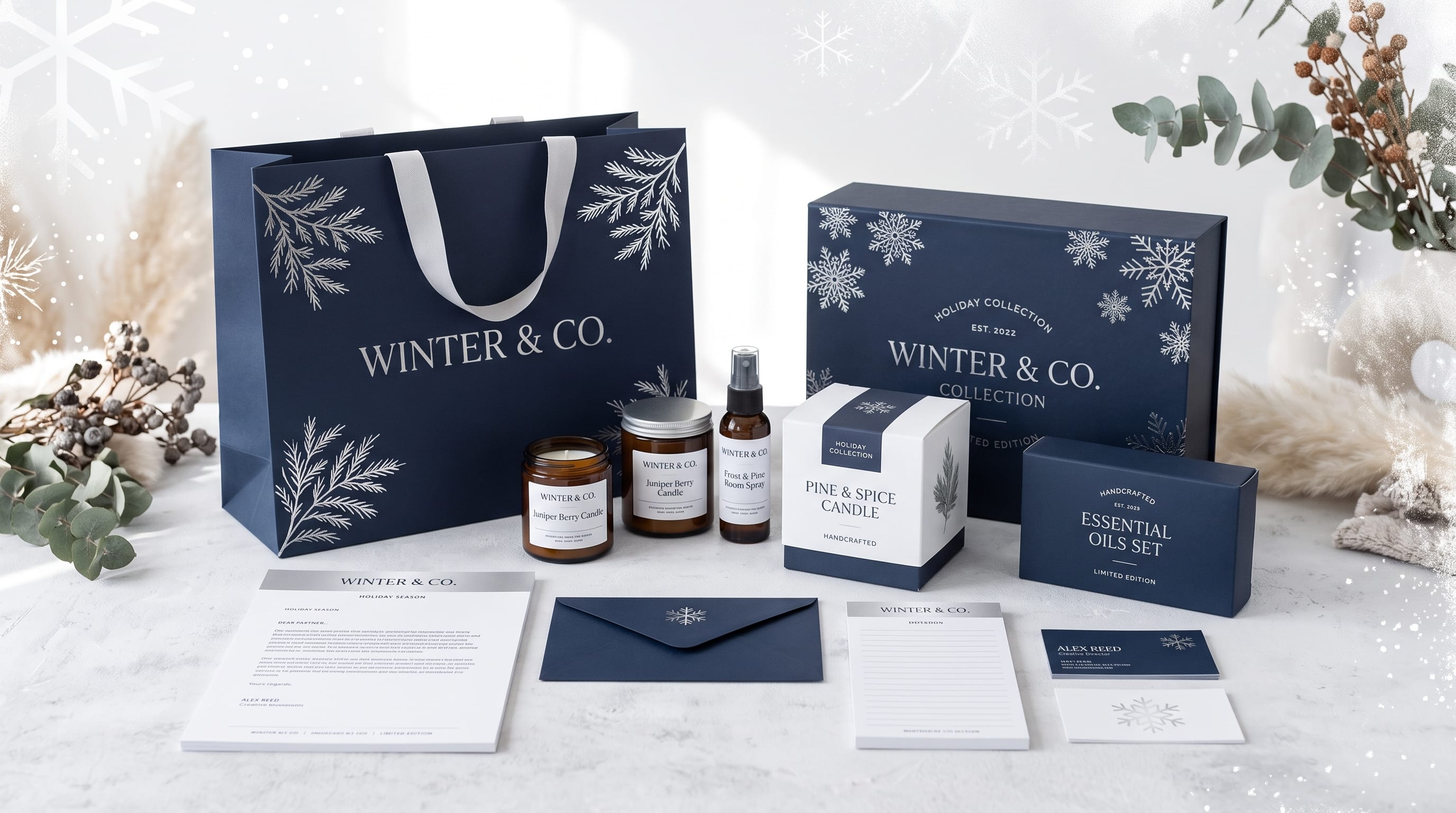
A strong winter graphic design style can help brands create seasonal visuals that feel cozy, elegant, festive, or atmospheric without losing their existing identity. Winter branding often uses cool color palettes, textured backgrounds, refined typography, snowy imagery, warm lighting, and seasonal decorative elements to communicate comfort, celebration, calm, or premium quality.
However, effective winter design should go beyond adding snowflakes to every layout.
The best seasonal campaigns keep the core brand recognizable while introducing visual details that reflect winter in a way that suits the audience.
A luxury skincare brand may use icy neutrals and elegant serif typography, while a family-focused business may prefer warm reds, playful illustrations, and cozy textures.
This guide explores practical ways to build a winter graphic design style for branding, packaging, social media, posters, advertisements, and seasonal campaigns.
Why Winter Graphic Design Style Matters
Seasonal design gives brands an opportunity to refresh their communication without creating an entirely new identity.
Winter campaigns can support:
- Holiday collections
- Seasonal products
- Gift promotions
- Winter sales
- Food and beverage launches
- Travel campaigns
- Home decor
- Fashion collections
- Social media content
Visual cues help customers understand the seasonal mood immediately.
For example, pale blue with silver may create an icy premium feeling, while cream, deep green, and warm brown can communicate comfort and coziness.
The goal of a winter graphic design style is to choose visual elements that feel seasonal while still matching the personality of the brand.
1. Build a Winter Color Palette
Color is one of the easiest ways to establish a seasonal direction.
Winter palettes can range from cool and icy to warm and festive.
Cool Winter Colors
Consider:
- Ice blue
- Silver
- White
- Navy
- Slate gray
- Frosted lavender
These colors work well for:
- Beauty
- Technology
- Luxury products
- Winter travel
- Fashion
Cozy Winter Colors
For a warmer winter graphic design style, try:
- Cream
- Chocolate brown
- Forest green
- Burgundy
- Warm beige
- Muted rust
This direction works especially well for:
- Home decor
- Coffee
- Food
- Lifestyle brands
- Handmade products
Festive Winter Colors
For holiday-focused campaigns, you can use:
- Deep red
- Evergreen
- Gold
- Warm white
- Burgundy
Keep the palette controlled.
Two or three main colors are often enough to create a strong visual system.
2. Cozy Winter Graphic Design Style
Cozy branding focuses on warmth, softness, and comfort.
Common elements include:
- Knitted textures
- Warm photography
- Soft typography
- Beige backgrounds
- Candles
- Wood
- Wool
- Snow outside windows
- Warm drinks
Imagine a winter candle campaign using cream packaging, dark brown lettering, soft indoor photography, and subtle pine illustrations.
The design feels seasonal without becoming overly festive.
A cozy winter graphic design style is especially suitable for:
- Home decor
- Cafes
- Candles
- Skincare
- Clothing
- Lifestyle products
3. Icy and Minimal Winter Design
Another direction is clean, cool, and refined.
This style may use:
- White space
- Light gray
- Pale blue
- Silver
- Fine typography
- Minimal photography
- Frosted textures
Imagine a skincare brand using soft blue packaging with thin serif typography and close-up photography of glass, snow, or water.
The result can feel premium and calm.
This type of winter graphic design style works well when the brand wants seasonal character without traditional holiday imagery.
4. Use Winter Typography Carefully
Typography can change the emotional direction of the campaign.
For sophisticated winter branding, consider:
- Elegant serif fonts
- Refined sans serif fonts
- High-contrast typography
- Small uppercase labels
For cozy winter designs:
- Handwritten fonts
- Soft serif fonts
- Rounded display fonts
- Casual scripts
For festive designs:
- Decorative lettering
- Bold display fonts
- Vintage type styles
Avoid using too many decorative fonts at once.
A good combination is often:
- Display font: expressive or seasonal like Caskford Winter
- Supporting font: simple and readable like Mellow Jello
The typography should make the winter graphic design style feel stronger without making important information difficult to read.
5. Scandinavian Winter Graphic Design Style
Scandinavian-inspired design is a natural match for winter.
This direction often includes:
- Minimal layouts
- Warm neutrals
- Simple typography
- Natural materials
- Pine branches
- Geometric graphics
- Soft lighting
Scandinavian winter branding can feel modern and cozy at the same time.
A packaging concept might use:
- Warm white background
- Dark green text
- Minimal branch illustration
- Clean layout
- Kraft paper details
This works especially well for home decor, candles, stationery, food, and lifestyle products.
6. Vintage Winter Graphic Design Style
Vintage winter design can reference old holiday posters, ski resorts, postcards, and traditional packaging.
Common elements include:
- Muted red
- Dusty blue
- Cream
- Retro typography
- Illustrated mountains
- Grain texture
- Vintage photography
- Decorative borders
A winter travel poster could use a limited palette with bold retro lettering and a simplified snowy mountain illustration.
Vintage winter graphic design style works particularly well for:
- Travel
- Cafes
- Fashion
- Holiday events
- Food brands
- Local businesses
The important part is choosing a clear era of inspiration instead of mixing unrelated vintage styles.
Also Read: Best Graphic Design Ideas for Social Media Content in 2026
7. Create Snow-Inspired Graphic Elements
Snow is one of the most obvious winter references, but it should be used with restraint.
Possible applications include:
- Small snowflake icons
- White grain textures
- Soft particle patterns
- Frosted borders
- Snow-covered photography
- Abstract icy shapes
Instead of covering the entire layout with snowflakes, choose one subtle detail.
A premium winter campaign might use a very light snow texture behind large typography.
This keeps the design elegant.
8. Winter Graphic Design Style for Social Media
Social media is a practical place to apply seasonal branding.
Create several reusable templates.
Winter Promotion
Use bold seasonal colors and clear product imagery.
Quote Graphic
Use soft backgrounds and elegant typography.
Product Feature
Use winter photography or subtle seasonal props.
Holiday Announcement
Use stronger decorative elements while keeping the brand colors visible.
All templates should share:
- Typography
- Logo placement
- Color system
- Image treatment
- Layout rhythm
This creates a recognizable winter graphic design style across the feed.
9. Winter Packaging Design
Seasonal packaging can make products feel special or giftable.
Ideas include:
- Winter label variations
- Limited-edition sleeves
- Holiday stickers
- Seasonal patterns
- Special color palettes
- Gift boxes
For example, a coffee brand might keep its standard logo but introduce deep green packaging with cream typography and subtle pine graphics.
A skincare brand might use icy blue packaging for a limited winter collection.
The seasonal layer should support the original brand rather than replace it.
10. Winter Branding for Food and Beverage
Food and beverage brands can use winter visuals to communicate warmth and comfort.
Useful imagery includes:
- Steam
- Hot chocolate
- Coffee
- Baked goods
- Cinnamon
- Dark chocolate
- Warm lights
- Cozy tables
Possible palettes include:
- Brown and cream
- Burgundy and beige
- Deep green and gold
- Navy and warm white
Photography can do much of the seasonal work.
Warm lighting and texture can make the product feel comforting before the customer reads the message.
11. Winter Travel Design Style
Travel brands can use winter design to promote:
- Mountain destinations
- Ski resorts
- Cabins
- City breaks
- Holiday markets
- Northern landscapes
A travel-focused winter graphic design style might use:
- Large scenic photography
- Minimal typography
- Cool color palettes
- Map-inspired details
- Postcard layouts
For a premium direction, keep the graphic elements simple and let the photography create most of the atmosphere.
12. Add Winter Texture
Texture can make winter visuals feel richer.
Consider:
- Frost
- Grain
- Wool
- Paper
- Snow
- Wood
- Linen
- Felt
A cozy campaign could use soft paper grain and knitted textures.
An elegant campaign might use subtle frost or glass textures.
Avoid applying heavy textures to every section.
Use texture to support the visual direction rather than overpower it.
13. Create Winter Patterns
Patterns can become useful reusable assets.
Winter pattern ideas include:
- Snowflakes
- Pine branches
- Stars
- Mittens
- Trees
- Mountains
- Small geometric shapes
- Abstract frost
Patterns can be used on:
- Packaging
- Gift wrap
- Social backgrounds
- Bags
- Website banners
- Cards
A strong winter graphic design style often benefits from one or two simple pattern systems.
Also Read: Minimalist Graphic Design Inspiration for Modern Brands
14. Use Winter Photography With Intention
Photography can establish seasonal mood without graphic decoration.
Useful directions include:
Outdoor Winter
- Snow
- Mountains
- Forests
- Cold blue light
- Winter clothing
Indoor Cozy
- Warm lamps
- Blankets
- Coffee
- Wood
- Candles
Luxury Winter
- Minimal interiors
- White surfaces
- Glass
- Metallic details
- Soft shadows
Choose one photography direction and repeat it consistently.
Mixing bright studio photos with dark rustic winter imagery may make the campaign feel disconnected.
15. Winter Graphic Design Style for Luxury Brands
Luxury winter branding usually works best when it is restrained.
Try:
- Deep navy
- Ivory
- Silver
- Charcoal
- Muted gold
Combine these with:
- Elegant serif typography
- Minimal layouts
- High-quality photography
- Subtle foil or metallic effects
Avoid overusing traditional holiday imagery.
A luxury brand may communicate winter simply through cool colors, materials, and lighting.
16. Winter Graphic Design Style for Small Brands
Small brands do not need complicated seasonal campaigns.
Create a compact system.
For example:
Base brand elements:
- Existing logo
- Existing body font
Winter additions:
- One seasonal accent color
- One display font
- One pattern
- One photography direction
This is enough to update:
- Social media
- Email banners
- Website headers
- Packaging stickers
- Promotional graphics
A simple system is easier to apply consistently.
17. Build a Winter Design Mood Board
Before creating a campaign, collect references.
Include:
- Photography
- Typography
- Packaging
- Color palettes
- Materials
- Fashion
- Nature
- Interiors
Then describe the direction using a few words.
For example:
Cozy / warm / natural
or:
Icy / minimal / premium
or:
Festive / playful / nostalgic
This helps define the winter graphic design style before you begin designing.
18. Adapt Winter Branding to Different Audiences
Winter branding should change depending on the customer.
Premium Audience
Use:
- Restrained colors
- Sophisticated typography
- Minimal graphics
Family Audience
Use:
- Friendly illustration
- Warm colors
- Playful typography
Youth Audience
Use:
- Bold layouts
- Bright winter colors
- Stickers
- Collage
Natural Audience
Use:
- Pine green
- Kraft textures
- Botanical graphics
- Earthy photography
The winter theme should support the audience, not overpower it.
19. Avoid Common Winter Graphic Design Mistakes
Seasonal branding can become repetitive if every campaign looks the same.
Avoid:
Too Many Snowflakes
Use them sparingly.
Too Much Red and Green
Winter can use many other palettes.
Poor Contrast
Light text on snowy imagery may become difficult to read.
Too Many Seasonal Fonts
Choose one expressive font and keep supporting typography simple.
Losing the Core Brand
Seasonal design should still be recognizable as part of the company.
Overdecorating
Winter mood can come from color, texture, and photography without adding many decorative elements.
20. Create a Simple Winter Branding System
A practical winter campaign can be built from a small number of elements.
Define:
- Primary winter color
- Secondary color
- Seasonal display font
- Main brand font
- Photography style
- One texture
- One pattern
Then apply these across:
- Social media
- Website banners
- Packaging
- Email graphics
- Ads
- Printed materials
This makes the winter graphic design style easier to maintain and reuse.
Also Read: Different Graphic Design Styles and What Makes Each One Unique
Final Thoughts on Winter Graphic Design Style
A successful winter graphic design style should feel seasonal without making the brand unrecognizable.
Cool icy palettes can create a clean and premium mood. Warm neutrals, wood, and texture can communicate comfort. Vintage winter visuals can add nostalgia, while Scandinavian layouts can make seasonal branding feel minimal and modern.
Start with the existing brand identity.
Then decide whether the winter direction should feel cozy, festive, elegant, playful, rustic, or minimal.
Build the visual system around a controlled palette, clear typography, consistent photography, and a small number of seasonal graphics.
The strongest winter branding does not depend on using every snowflake, pine tree, or holiday symbol available.
When color, type, photography, texture, and layout work together, winter graphic design style becomes a flexible seasonal tool that can help packaging, social media, advertising, and brand communication feel fresh while remaining consistent.