
7 Essential Elements of Graphic Design for Better Visual Work
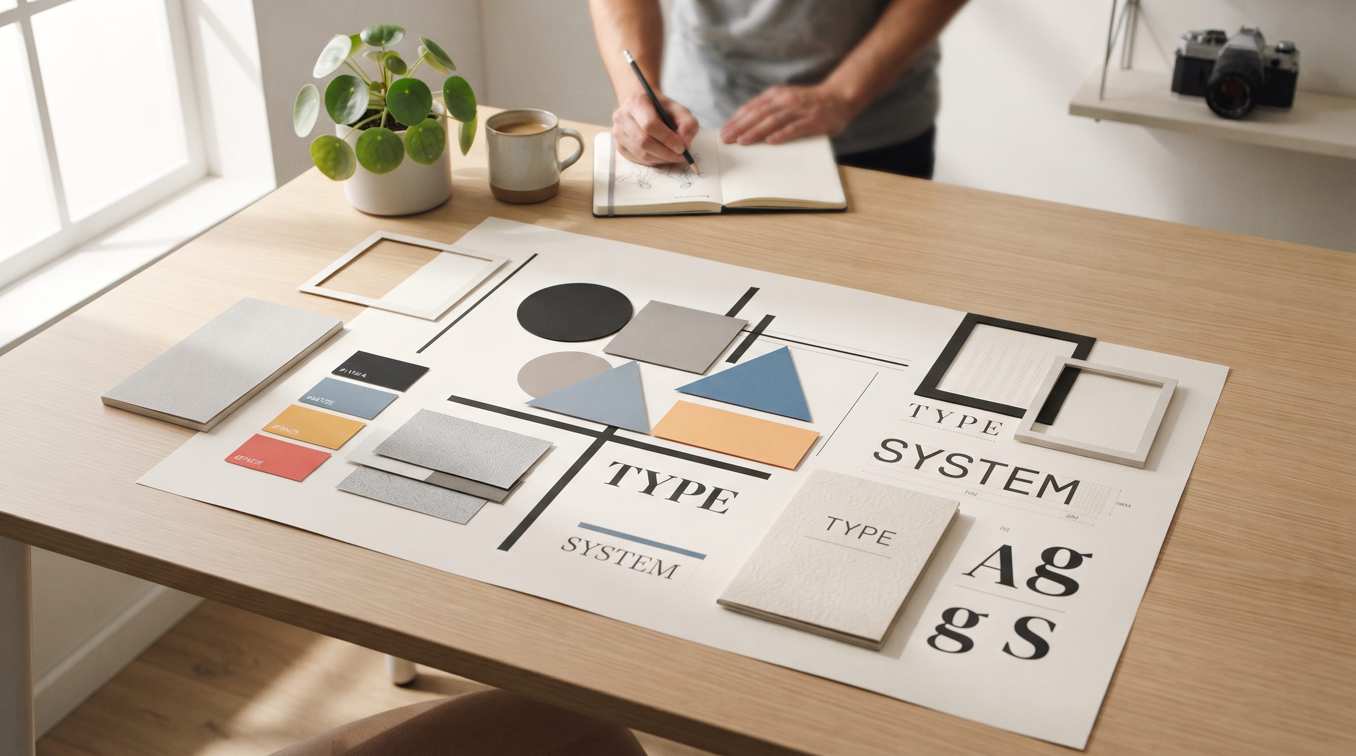
Understanding the elements of graphic design is one of the first steps toward creating visual work that feels clear, balanced, and intentional. Designers use elements such as line, shape, color, typography, space, texture, and imagery to organize information and communicate ideas. These components may appear simple individually, but the way they interact can completely change how a poster, logo, website, package, or social graphic is perceived.
Good design rarely depends on decoration alone.
A successful composition usually works because the designer understands why each element is present and how it supports the message.
A bold line may direct attention. A shape can organize content. Color can establish mood. Typography creates hierarchy, while space prevents a layout from becoming overwhelming.
For design students, learning these fundamentals makes it easier to analyze existing work and improve your own.
This guide explores seven essential elements of graphic design and explains how to use each one more effectively.
Why the Elements of Graphic Design Matter
The elements of graphic design are the basic visual components designers combine to build compositions.
They influence:
- Hierarchy
- Readability
- Balance
- Mood
- Brand personality
- Visual direction
- User attention
Think of them as a visual vocabulary.
Just as a writer combines words and sentences, a designer combines lines, colors, shapes, typography, and other elements to communicate meaning.
Understanding these fundamentals also helps when something in a design feels wrong.
Instead of simply saying:
“The design does not look good,”
you can ask more useful questions.
- Is the spacing too tight?
- Is there insufficient contrast?
- Are the shapes competing?
- Is the typography too weak?
- Does the image dominate the message?
This makes design decisions easier to explain and improve.
1. Line as One of the Basic Elements of Graphic Design
A line may seem simple, but it can perform many jobs in a layout.
Lines can:
- Separate sections
- Connect related information
- Direct attention
- Create movement
- Build patterns
- Define boundaries
A line does not always have to be visible.
Sometimes the alignment between several elements creates an implied line that guides the eye through the page.
Thick and Thin Lines
Line weight changes personality.
A thick line can feel:
- Bold
- Strong
- Modern
A thin line may feel:
- Elegant
- Delicate
- Minimal
Consider a luxury packaging design.
A thin gold line around a label might create a refined effect.
The same border in a very thick black stroke would create a completely different feeling.
Direction Changes Meaning
Horizontal lines often create stability.
Vertical lines can suggest strength or height.
Diagonal lines introduce movement and energy.
When studying the elements of graphic design, notice how directional lines guide your eyes even when you are not consciously aware of them.
2. Shape in Graphic Design
Shapes are another fundamental building block.
Basic geometric shapes include:
- Circles
- Squares
- Rectangles
- Triangles
Designers also use organic and abstract shapes.
Different shapes can create different visual personalities.
Geometric Shapes
Geometric forms tend to feel structured and controlled.
They work well for:
- Technology
- Corporate branding
- Architecture
- Modern layouts
Organic Shapes
Organic shapes are more irregular.
They may resemble:
- Leaves
- Clouds
- Water
- Hand-drawn forms
These shapes can make a design feel softer or more natural.
Use Shape to Organize Information
Shapes can also function as containers.
For example, a website might use rectangular cards to organize:
- Services
- Products
- Articles
- Testimonials
The shape itself creates structure before users even read the content.
Among the elements of graphic design, shape is especially useful for creating order and recognizable visual systems.
3. Color as an Essential Graphic Design Element
Color has a major influence on how people experience a design.
It can create:
- Emotion
- Contrast
- Hierarchy
- Recognition
- Atmosphere
A bright orange layout may feel energetic.
Muted beige can feel calm.
Dark navy can communicate professionalism, while soft green may feel natural.
However, designers should avoid relying too heavily on simplified color psychology.
Color meaning changes depending on context, culture, saturation, typography, and surrounding imagery.
Build a Controlled Palette
A design rarely needs every color available.
A simple palette might include:
- Primary color: used for brand recognition
- Secondary color: supports the primary
- Accent color: highlights important details
- Neutral colors: backgrounds and text
For example:
Navy + cream + orange
can create a professional but energetic identity.
Use Contrast Carefully
Color contrast helps important information stand out.
A call-to-action button should be easy to identify.
Text needs enough contrast from its background.
When learning the elements of graphic design, practice designing in grayscale too. If the hierarchy still works without color, the composition usually has a stronger foundation.
4. Typography as One of the Most Important Elements of Graphic Design
Typography is not simply choosing a beautiful font.
It involves organizing written information so people can understand it easily.
Important typographic decisions include:
- Font choice
- Size
- Weight
- Leading
- Tracking
- Alignment
- Line length
Typography strongly affects personality.
- A high-contrast serif can feel elegant.
- A geometric sans serif may feel modern.
- A handwritten font can feel personal or informal.
Create Clear Type Hierarchy
A simple hierarchy might include:
- H1: main headline
- H2: major section heading
- Body: primary reading text
- Caption: secondary information
The levels should be visually different enough that readers immediately understand the structure.
You can create hierarchy through:
- Size
- Weight
- Color
- Spacing
Avoid adding a completely different font every time you need contrast.
One or two type families are often enough.
Readability Comes Before Decoration
Decorative fonts work well for short headlines or logos.
They are usually less suitable for long paragraphs.
Typography is one of the elements of graphic design that students should practice constantly because poor type choices can weaken an otherwise strong composition.
Also Read: Graphic Design Color Guide That Makes Learning Easy
5. Space and Negative Space
Space is the area around and between visual elements.
Design students sometimes feel that empty areas need to be filled.
They do not.
Whitespace, also called negative space, can improve:
- Readability
- Hierarchy
- Focus
- Elegance
- Organization
For example, imagine two advertisements.
The first includes:
- Large headline
- Five images
- Four buttons
- Long paragraph
- Decorative patterns
The second uses:
- One headline
- One image
- One CTA
- Generous whitespace
The second may be easier to understand because the viewer knows where to look.
Use Space to Group Information
Elements placed close together usually appear related.
Elements separated by more space appear less connected.
This simple principle can help organize:
- Forms
- Menus
- Cards
- Editorial layouts
- Posters
Among all elements of graphic design, space may be one of the easiest to underestimate because it is technically the area where nothing appears.
Yet that emptiness plays an important role.
6. Texture in Graphic Design
Texture creates the impression of a physical surface.
It may feel:
- Rough
- Smooth
- Grainy
- Glossy
- Handmade
- Metallic
Texture can come from:
- Paper
- Fabric
- Wood
- Grain
- Brush strokes
- Photography
Digital designs can also simulate physical texture.
Use Texture to Add Personality
Imagine a coffee package.
A perfectly smooth white layout may feel modern.
The same design with recycled paper texture could feel more handmade or natural.
Texture should support the brand message rather than become decoration without purpose.
Avoid Too Much Texture
Heavy textures can reduce readability.
This is especially true when texture appears behind small text.
Use it selectively.
For example:
- Background area
- Product label
- Illustration detail
- Large headline
A little texture can make the elements of graphic design feel more tactile and visually interesting.
7. Imagery as a Core Graphic Design Element
Photography, illustration, icons, and graphics are all forms of imagery.
Imagery can communicate complex ideas very quickly.
A photograph can establish:
- Product context
- Emotion
- Lifestyle
- Scale
An illustration may communicate:
- Personality
- Imagination
- Brand character
- Abstract concepts
Choose Images With a Purpose
Avoid adding images simply because an empty area exists.
Ask:
- Does this image support the message?
- Does it fit the audience?
- Does it match the brand?
- Is the composition useful?
For example, a healthcare website may benefit from clear, trustworthy imagery.
A children’s brand may use playful illustration instead.
Maintain a Consistent Image Style
If one photo uses warm natural light and another uses cold studio lighting, the visual identity may feel disconnected.
Create simple image rules.
Define:
- Lighting
- Cropping
- Background
- Color treatment
- Subject style
Consistency helps imagery work with the other elements of graphic design rather than competing with them.
How the Elements of Graphic Design Work Together
The seven elements are rarely used independently.
Imagine designing a poster.
You might use:
- Line: to divide information.
- Shape: to frame the main image.
- Color: to create contrast.
- Typography: to establish hierarchy.
- Space: to prevent overcrowding.
- Texture: to add depth.
- Imagery: to communicate the main visual idea.
The result depends on how these decisions support each other.
A technically beautiful image cannot rescue unreadable typography.
A great font cannot fix poor spacing.
Good design comes from the relationship between elements.
Elements of Graphic Design and Visual Hierarchy
Visual hierarchy determines what viewers notice first, second, and third.
You can create hierarchy using several elements together.
For example:
First Level
Large bold headline.
Second Level
Strong image.
Third Level
Short description.
Fourth Level
Small supporting details.
Color and space can reinforce the same hierarchy.
The important point is that not everything should compete equally for attention.
A good design guides rather than overwhelms.
Also Read: Different Graphic Design Styles and What Makes Each One Unique
Elements of Graphic Design and Balance
Balance describes how visual weight is distributed.
There are several approaches.
Symmetrical Balance
Elements mirror each other around an axis.
This often feels:
- Stable
- Formal
- Controlled
Asymmetrical Balance
Different elements create visual equilibrium without being identical.
This can feel:
- Dynamic
- Modern
- Creative
For example, one large image on the left might balance three smaller text blocks on the right.
Both approaches can work.
The choice depends on the project’s personality and purpose.
Use Contrast to Strengthen Graphic Design
Contrast creates distinction.
You can create contrast through:
- Light vs dark
- Large vs small
- Bold vs thin
- Smooth vs textured
- Geometric vs organic
Contrast helps viewers understand hierarchy.
Without enough contrast, a design may feel flat or difficult to scan.
However, too much contrast can create visual chaos.
Choose a small number of strong differences instead of making every element dramatically different.
Practical Exercise for Design Students
One of the best ways to learn the elements of graphic design is to practice them individually.
Try this simple exercise.
- Create a poster using only black lines.
- Redesign it using only geometric shapes.
- Add a three-color palette.
- Introduce typography.
- Improve the spacing.
- Add one subtle texture.
- Introduce one image.
Compare each stage.
You will see how every element changes the communication and personality of the composition.
Common Mistakes When Using Graphic Design Elements
Beginners often make several predictable mistakes.
Using Too Many Elements
More decoration does not automatically create a better design.
Weak Typography
Poor type hierarchy can make information difficult to understand.
Filling Every Empty Area
Whitespace is useful.
Using Too Many Colors
A limited palette often creates stronger consistency.
Mixing Unrelated Imagery
Keep photography or illustration styles connected.
Adding Texture Everywhere
Use texture selectively.
Ignoring Hierarchy
Decide what the viewer should notice first.
Understanding the elements of graphic design makes these problems easier to identify and fix.
A Simple Workflow for Using the Elements of Graphic Design
Use this process when starting a new project.
Define the Message
What should the design communicate?
Identify the Main Element
Will typography, photography, or illustration lead the composition?
Create Structure With Shape and Line
Build a simple layout.
Add Typography
Establish clear hierarchy.
Choose Color
Create an appropriate palette.
Refine Space
Improve readability and grouping.
Add Texture Only When Needed
Give the design additional character.
Review the Imagery
Make sure it supports the message.
Simplify
Remove anything that does not improve communication.
This workflow helps turn the elements of graphic design into practical tools instead of abstract theory.
Also Read: Graphic Design for Beginners: Everything You Need to Get Started
Final Thoughts on the Elements of Graphic Design
Learning the elements of graphic design gives students a stronger foundation for almost every type of visual project.
Line can guide attention and separate information. Shape creates structure. Color adds emotion and contrast. Typography organizes language and establishes personality. Space improves clarity, while texture adds depth and tactile character. Imagery can communicate stories and ideas quickly.
None of these elements works completely alone.
Strong graphic design happens when they support one another.
A simple poster can become memorable through typography and space. Packaging can feel premium through color, texture, and hierarchy. A website becomes easier to use when shape, spacing, imagery, and type create clear organization.
For students, the goal should not be to use every visual technique in every project.
Instead, learn what each element does and choose the ones that serve the message.
The more you practice analyzing and combining the elements of graphic design, the easier it becomes to create visual work that feels intentional, balanced, professional, and effective.

For high-quality fonts to boost your income, check out DM Letter Studio. Our professional fonts are perfect for branding, marketing, and content creation. So, don’t miss this opportunity.