
Best Art Deco Graphic Design Ideas for Luxury Brands
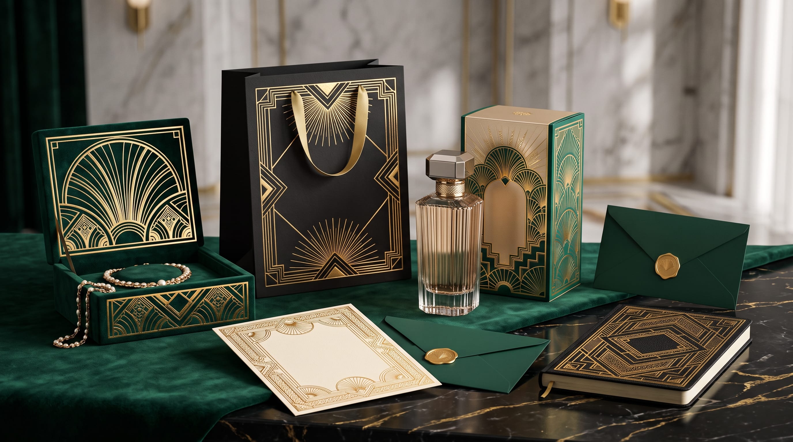
Art Deco graphic design is one of the strongest visual styles for brands that want to communicate luxury, sophistication, glamour, and timeless confidence. Recognized for geometric shapes, strong symmetry, metallic accents, elegant typography, and dramatic contrast, the Art Deco aesthetic continues to influence branding, packaging, fashion, hospitality, beauty, and premium product design.
The style became especially influential during the 1920s and 1930s, but modern designers do not need to recreate historical artwork exactly. Contemporary brands can borrow the most recognizable Art Deco principles and combine them with cleaner layouts, modern photography, and digital-friendly typography.
For luxury brand creators, the goal is to use Art Deco graphic design selectively. Too many decorative lines, borders, gold effects, and geometric patterns can make a project feel theatrical rather than premium.
The strongest designs balance ornament with simplicity.
Below are practical Art Deco design ideas you can apply to logos, packaging, social graphics, invitations, websites, editorial layouts, and complete luxury brand identities.
1. Use Geometric Art Deco Graphic Design Patterns
Geometry is one of the most recognizable elements of Art Deco.
Common shapes include:
- Fans
- Sunbursts
- Arches
- Diamonds
- Triangles
- Stepped forms
- Parallel lines
- Repeating rectangles
These elements can become decorative frames, background patterns, packaging details, or logo symbols.
For example, a luxury fragrance brand might use a small geometric sunburst behind its monogram.
A hotel identity could use repeating arches across stationery and room key cards.
The key is repetition.
Instead of adding random shapes, create a consistent geometric system that appears throughout the brand.
2. Build Art Deco Graphic Design Around Symmetry
Symmetry creates a sense of order, prestige, and formality.
Many classic Art Deco compositions use a clear central axis.
You can apply this to:
- Logos
- Posters
- Packaging fronts
- Invitations
- Menu designs
- Social graphics
For example:
Place the logo in the center.
Add geometric ornament on both sides.
Position supporting text beneath it.
This creates an elegant visual rhythm.
Modern Art Deco graphic design can also break symmetry occasionally, but starting with a structured symmetrical foundation usually creates a stronger luxury feeling.
3. Use Black and Gold for Classic Luxury
Few color combinations communicate Art Deco as immediately as black and gold.
A simple palette might include:
- Black
- Warm gold
- Ivory
- Dark charcoal
Use gold sparingly.
It can appear in:
- Thin borders
- Logo details
- Icons
- Headlines
- Packaging foil
- Decorative patterns
If every element becomes metallic, the design can lose sophistication.
A black background with one restrained gold geometric motif often feels more luxurious than a heavily decorated composition.
4. Try Alternative Art Deco Color Palettes
Luxury branding does not need to rely only on black and gold.
Consider:
Emerald Luxury
- Deep emerald
- Gold
- Cream
- Black
Burgundy Deco
- Burgundy
- Champagne
- Ivory
- Charcoal
Midnight Blue Deco
- Navy
- Soft gold
- White
- Gray
Rose Art Deco
- Dusty rose
- Burgundy
- Champagne
- Cream
Modern Monochrome
- Black
- White
- Silver
- Cool gray
These palettes retain the elegance of Art Deco graphic design while giving the brand a more distinctive personality.
5. Use Tall and Elegant Typography
Typography is central to the Art Deco aesthetic.
Traditional Deco-inspired type often includes:
- Tall proportions
- Strong vertical lines
- Geometric construction
- High contrast
- Decorative capitals
For luxury brands, typography should feel intentional rather than overly theatrical.
Use decorative type for:
- Brand names
- Headlines
- Product names
- Event titles
Then pair it with a simpler typeface for:
- Body copy
- Ingredients
- Contact details
- Supporting information
This keeps the design readable.
6. Use Typography as the Main Art Deco Element
You do not always need complicated ornaments.
A strong typographic logo can communicate the Art Deco style by itself.
For example:
MAISON ELIORA
in tall, widely spaced lettering can feel sophisticated even before you add graphic decoration.
Try:
- Large uppercase letters
- Increased letter spacing
- Center alignment
- Thin geometric borders
This works particularly well for beauty, fashion, fragrance, jewelry, and hospitality brands.
7. Create Elegant Art Deco Logo Designs
Art Deco logo design often combines geometry with refined typography.
Popular logo structures include:
Geometric Wordmark
Elegant lettering with angular construction.
Monogram
One or two initials placed inside a geometric frame.
Badge
Brand name surrounded by symmetrical ornament.
Symbol
Sunburst, fan, arch, or geometric flower.
Luxury brands should keep the logo adaptable.
A highly detailed logo may look beautiful on a large poster but become unreadable as a social profile image.
Create simplified variations when necessary.
8. Use Monograms for Luxury Branding
Monograms fit naturally within Art Deco graphic design because they combine exclusivity with symmetry.
Use:
- One initial
- Two overlapping initials
- Initials inside circles
- Initials inside diamond frames
- Initials surrounded by symmetrical lines
Monograms work especially well for:
- Hotels
- Jewelry
- Fashion
- Wedding brands
- Premium restaurants
- Beauty brands
They can also become secondary brand marks for packaging, social profiles, or product labels.
9. Add Sunburst Elements
The sunburst is one of the most recognizable Art Deco motifs.
It can represent:
- Energy
- Glamour
- Celebration
- Prestige
Use sunbursts behind:
- Logos
- Product names
- Event titles
- Monograms
Keep the lines clean and controlled.
Too many rays can create visual noise.
For modern luxury branding, a simplified sunburst with plenty of negative space is usually more effective.
Also Read: Different Graphic Design Styles and What Makes Each One Unique
10. Create Geometric Frames
Frames can instantly give a layout an Art Deco personality.
Try:
- Stepped borders
- Double-line frames
- Diamond corners
- Symmetrical line patterns
- Arch-shaped outlines
Frames work particularly well for:
- Invitations
- Product labels
- Posters
- Menu designs
- Certificates
Keep the central content simple.
The frame should support the hierarchy rather than overpower it.
11. Use Metallic Finishes in Packaging
Physical production offers opportunities that digital design cannot fully reproduce.
Luxury Art Deco graphic design can use:
- Gold foil
- Silver foil
- Embossing
- Debossing
- Metallic ink
- Spot gloss
Imagine a matte black perfume box with a small embossed gold monogram.
The design itself may be extremely simple, but the material finish creates a premium experience.
For luxury packaging, production choices can be as important as the graphic design.
12. Design Art Deco Packaging With Structure
Packaging should feel organized and intentional.
A typical front layout might include:
Small geometric icon
BRAND NAME
Product name
Short description
Volume or quantity
Geometric border
Use consistent spacing.
Avoid adding every available Deco motif to the same panel.
Good luxury packaging often uses only one or two signature decorative elements.
13. Create Luxury Fragrance Packaging
Fragrance is particularly suited to the Art Deco aesthetic.
Consider:
- Black glass bottle
- Gold geometric cap
- Tall serif or Deco-inspired wordmark
- Minimal label
- Symmetrical box pattern
A perfume brand might use a repeating fan motif inside the packaging while keeping the exterior simple.
This creates a sense of discovery without making the shelf appearance too busy.
14. Use Art Deco Graphic Design for Beauty Brands
Beauty and skincare brands can use softer versions of Art Deco.
Instead of heavy black and gold, try:
- Cream
- Champagne
- Dusty pink
- Burgundy
Use delicate geometric lines with refined typography.
This approach can feel:
- Elegant
- Feminine
- Premium
- Modern
It works especially well for:
- Cosmetics
- Perfume
- Skincare
- Salons
15. Apply Art Deco Style to Jewelry Branding
Jewelry naturally matches the precision of geometric design.
Use inspiration from:
- Gemstone cuts
- Diamond shapes
- Symmetry
- Fine linework
A jewelry logo might feature a simple geometric diamond framing the initials.
Packaging could continue the same motif through foil stamping and interior patterns.
The result feels cohesive without requiring many different graphic elements.
16. Use Art Deco for Luxury Hotel Branding
Hotels can use Deco influences across multiple touchpoints.
Consider:
- Building signage
- Room numbers
- Menus
- Key cards
- Stationery
- Website
- Wayfinding
A consistent geometric motif can unify the whole environment.
For example, an arch shape used in the logo can reappear in:
- Door signs
- Menu borders
- Website cards
- Printed folders
This creates strong visual recognition.
17. Create Art Deco Social Media Templates
Luxury brands still need social content.
Build templates using:
- Dark backgrounds
- Elegant typography
- Thin metallic lines
- Geometric frames
- High-quality photography
Do not make every social post heavily decorative.
Alternate between:
Type-Led Posts
Quote or announcement.
Photography Posts
Minimal branding.
Product Posts
Structured geometric layout.
This creates variety without losing consistency.
18. Use Art Deco in Editorial Layouts
Art Deco-inspired editorial design can feel dramatic and premium.
Use:
- Large headlines
- Strong alignment
- Decorative drop caps
- Geometric page numbers
- Thin dividers
- Wide margins
This approach works well for:
- Fashion magazines
- Luxury catalogs
- Lookbooks
- Brand presentations
Allow enough negative space so ornamental elements do not overwhelm the content.
Also Read: Graphic Design Color Combinations That Look Professional
19. Combine Art Deco With Modern Minimalism
One of the strongest contemporary approaches is combining Art Deco graphic design with minimalist design principles.
Use:
- One geometric motif
- One accent color
- Large typography
- Plenty of whitespace
- Simple photography
For example:
Ivory background.
Black wordmark.
Small gold fan symbol.
One product photograph.
This feels Deco-inspired without becoming a historical reproduction.
20. Use Photography With Art Deco Graphic Design
Photography should complement the visual system.
For luxury brands, consider:
- Dramatic shadows
- Architectural backgrounds
- Polished surfaces
- Sculptural poses
- Controlled lighting
- Symmetrical compositions
Avoid casual stock photography that conflicts with the sophistication of the layout.
If the graphic system feels premium but photography feels generic, the brand becomes inconsistent.
21. Create Art Deco Posters
Posters provide more space for decorative expression.
A strong structure could include:
Large headline
Geometric border
Central illustration or photograph
Date and supporting details
Use hierarchy carefully.
The poster should remain readable even when visually complex.
For a luxury event, a black, ivory, and gold poster with a large centered title can create immediate impact.
22. Art Deco Graphic Design for Invitations
Art Deco is especially popular for:
- Weddings
- Galas
- Anniversary events
- Luxury launches
Invitation layouts can use:
- Geometric borders
- Centered typography
- Monograms
- Metallic foil
- Thick premium paper
Keep important details readable.
The decorative style should frame information, not hide it.
23. Use Patterns as Secondary Brand Assets
A brand does not need to place its logo everywhere.
Patterns can create recognition more subtly.
Develop a repeatable system using:
- Fans
- Diamonds
- Arches
- Geometric flowers
Use patterns on:
- Tissue paper
- Packaging interiors
- Shopping bags
- Website backgrounds
- Social graphics
Patterns are particularly valuable for building a complete luxury brand system.
Avoid Overdecorating Art Deco Designs
One of the most common mistakes is using every recognizable Deco element at once.
A design might contain:
- Gold border
- Sunburst
- Fan pattern
- Diamond frame
- Metallic texture
- Decorative type
- Multiple ornaments
The result can quickly become overwhelming.
Instead, select two or three defining elements.
For example:
Geometric border + elegant type + gold accent
is often enough.
Maintain Strong Visual Hierarchy
Even highly decorative Art Deco graphic design still needs hierarchy.
Viewers should understand:
- Brand name
- Product or event
- Supporting information
- CTA
Use size and spacing to control attention.
Do not rely entirely on ornament.
The design must still communicate clearly.
Art Deco Graphic Design Checklist
Before finalizing your project, ask:
- Does the design use geometric structure?
- Is symmetry intentional?
- Is the color palette controlled?
- Are metallic accents used selectively?
- Is typography readable?
- Does the font match the luxury positioning?
- Is ornament balanced with whitespace?
- Does the logo work at small sizes?
- Are patterns consistent?
- Does photography match the brand style?
- Is packaging production considered?
- Do digital and print assets feel connected?
- Are supporting fonts simple enough?
- Does the design still feel modern?
If the design feels too busy, remove one decorative element and review it again.
Also Read: Restaurant Graphic Design for Better Customer Experience
Final Thoughts on Art Deco Graphic Design
The best Art Deco graphic design for luxury brands combines glamour with discipline.
Geometric forms, symmetry, metallic details, elegant typography, monograms, and sophisticated color palettes can immediately create a premium visual personality. However, modern designers should resist the temptation to use every Art Deco element at once.
Start with a clear visual system.
Choose one or two geometric motifs, establish a controlled color palette, select expressive but readable typography, and maintain consistent spacing throughout every brand touchpoint.
The strongest Art Deco graphic design does not simply copy the past.
It translates the confidence, geometry, glamour, and craftsmanship of the Art Deco era into a visual language that works for contemporary logos, packaging, websites, social media, and physical environments.
When decorative details are balanced with clarity and restraint, Art Deco can give a luxury brand something extremely valuable, a visual identity that feels distinctive, sophisticated, and memorable.

For high-quality fonts to boost your income, check out DM Letter Studio. Our professional fonts are perfect for branding, marketing, and content creation. So, don’t miss this opportunity.