
How to Design Minimalist Brand Graphics With Simple Templates
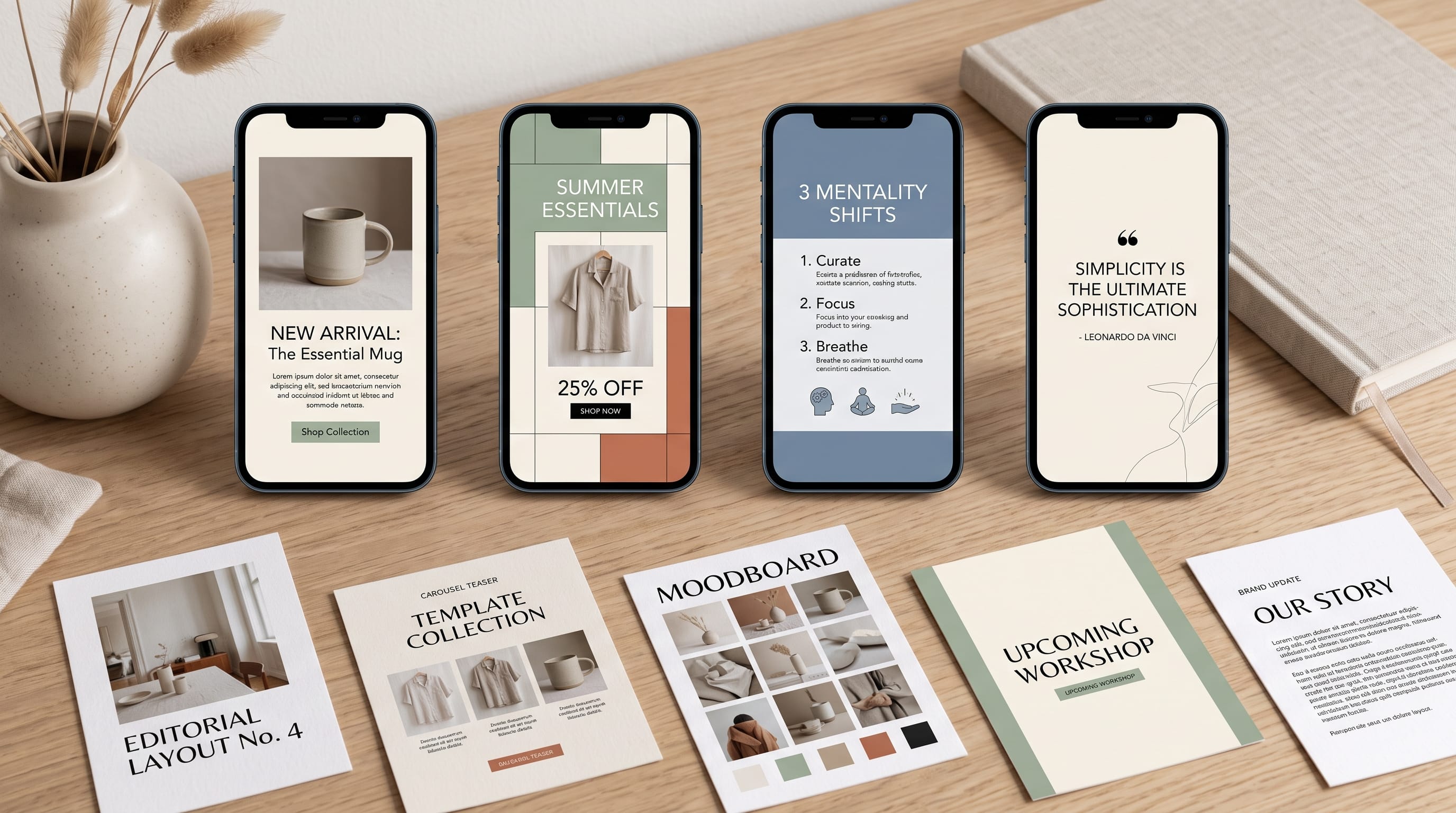
Minimalist brand graphics can help small businesses, creators, and beginner designers build a professional visual identity without filling every layout with unnecessary decoration. Instead of relying on complicated effects, minimalist design uses typography, color, spacing, imagery, and hierarchy carefully so that every element has a clear purpose.
Minimalism does not mean making everything plain or removing personality. Strong minimalist branding can still feel premium, playful, editorial, modern, elegant, or bold. The difference is that designers intentionally limit the number of visual elements competing for attention.
Simple templates make this approach even easier. Once you create a small collection of reusable layouts, you can produce social media posts, advertisements, announcements, presentations, blog graphics, and promotional materials without designing each piece from scratch.
This guide explains how to create minimalist brand graphics using practical template systems that beginners and small brands can maintain consistently.
What Are Minimalist Brand Graphics?
Minimalist branding uses a limited set of visual elements to communicate clearly.
A minimalist graphic might contain only:
- One headline
- One photograph
- One logo
- One accent color
- Plenty of empty space
The simplicity makes the message easier to understand.
However, removing elements alone does not automatically create good minimalism.
Every remaining element needs to be stronger.
Typography must be carefully selected. Alignment needs to feel intentional. Images should support the message. Colors must create enough contrast.
This is why effective minimalist brand graphics often require just as much planning as more decorative layouts.
Why Minimalist Brand Graphics Work for Small Brands
Small businesses rarely have unlimited design resources.
A complicated identity may require custom illustration, photography, detailed patterns, several typefaces, and constant art direction.
A simpler system can be easier to manage.
Benefits include:
- Faster content creation
- Better brand consistency
- Easier template reuse
- Lower design complexity
- Clearer communication
- Better mobile readability
- More professional presentation
Minimalism can also make a small company look more established because consistent design often feels more professional than constantly changing visual styles.
Start With a Simple Brand System
Before creating templates, establish the essential components of your identity.
You do not need a 100-page brand guideline.
Start with:
Primary Logo
Your main logo or wordmark.
Secondary Logo
A simpler version for small spaces.
Primary Colors
Usually two or three colors are enough.
Neutral Colors
Choose background and text colors.
Primary Typeface
Used for major headlines.
Supporting Typeface
Used for smaller text and descriptions.
Image Style
Decide what type of photography or illustration belongs to the brand.
These decisions become the foundation for every minimalist brand graphic you create later.
Limit Your Minimalist Brand Color Palette
Color is one of the easiest ways to create visual consistency.
Beginners sometimes believe a brand needs many colors to remain interesting.
Usually it does not.
A practical minimalist palette might include:
- One primary brand color
- One accent color
- One light neutral
- One dark neutral
For example:
- Primary: Forest green
- Accent: Warm beige
- Background: Soft white
- Text: Charcoal
Another brand might use:
- Primary: Black
- Accent: Bright orange
- Background: White
- Text: Black
Limiting colors helps minimalist brand graphics look connected even when the content changes.
Use Typography as a Main Design Element
Typography is particularly important in minimalist design because there are fewer decorative elements to create interest.
A strong headline can become the graphic.
Instead of adding icons, illustrations, gradients, and effects, try increasing the scale of the typography.
For example:
SUMMER COLLECTION
could occupy half the canvas.
Below it, add:
“Available June 15”
in much smaller supporting typography.
This creates hierarchy through scale instead of decoration.
Choose Only One or Two Brand Fonts
Too many typefaces can make minimalist branding feel inconsistent.
A simple system might use:
Display Typeface
For:
- Headlines
- Campaign titles
- Product names
Supporting Typeface
For:
- Descriptions
- Captions
- Buttons
- Information
You can create more variety by changing:
- Size
- Weight
- Uppercase
- Alignment
- Spacing
rather than introducing another typeface.
Good typography makes minimalist brand graphics feel intentional instead of unfinished.
Build Clear Visual Hierarchy
Viewers should understand what to look at first.
A simple hierarchy might be:
- Main headline
- Image
- Supporting message
- Call to action
- Logo
Not every element needs equal visual importance.
If the logo, headline, photograph, button, and promotional text are all equally large, the design becomes difficult to scan.
Minimalism works when the designer controls attention.
Use More Negative Space
Negative space is the empty area surrounding design elements.
Beginners often feel uncomfortable leaving areas empty.
They may think:
“There is room here, so something should go there.”
That instinct often leads to overcrowding.
Instead, ask:
“Does adding something improve communication?”
If the answer is no, leave the space empty.
Negative space allows important typography and imagery to stand out.
It is one of the defining qualities of professional minimalist brand graphics.
Create a Consistent Grid
A grid prevents templates from feeling random.
You might use:
- Centered layouts
- Two-column layouts
- Three-column grids
- Left-aligned editorial layouts
- Modular card systems
Choose two or three structures and reuse them.
For example:
- Template A: Centered promotional graphic
- Template B: Image left, text right
- Template C: Large image with text overlay
You now have a small flexible design system.
Minimalist Quote Graphic Template
Quote graphics are useful for social media, blogs, and lifestyle brands.
Use:
- Top: Small brand category
- Center: Large quote
- Bottom: Author or source
- Corner: Small logo
Keep the background simple.
Example:
CREATIVE NOTES
“Good design makes the message easier to understand.”
DM STUDIO
Avoid decorative quotation marks unless they contribute meaningfully to the composition.
Also Read: Graphic Design Color Combinations That Look Professional
Minimalist Product Promotion Template
A simple product template might use:
- Top: Small logo
- Center: Product photograph
- Below image: Product name
- Bottom: Price or call to action
Keep the background neutral.
For example:
NEW COLLECTION
(Product Image)
MONO CARRY
Shop Now
This formula creates minimalist brand graphics that can easily be reused for multiple products.
Replace only the photograph, product name, and supporting information.
Minimalist Social Media Announcement Template
Announcements do not need elaborate backgrounds.
Try:
- Small heading: ANNOUNCEMENT
- Large heading: NEW STORE OPENING
- Small text: Saturday, September 12
- CTA: Discover More
Use strong contrast between the headline and supporting copy.
A simple typography-driven template is often more effective than adding several unrelated decorative objects.
Minimalist Sale Graphic Template
Promotional graphics often become visually crowded.
Simplify the message.
Instead of:
“BIG HUGE AMAZING END OF SEASON SUMMER SPECIAL SALE UP TO 50% SHOP EVERYTHING TODAY”
try:
SUMMER SALE
UP TO 50% OFF
Shop Now
Three pieces of information may communicate the same idea more effectively.
Use the largest typography for the main promotional phrase.
Minimalist Brand Story Graphic Template
Small brands can use simple editorial templates to communicate their story.
Structure:
- Headline: OUR STORY
- Image: Founder, workspace, product, or studio
- Short paragraph: Two or three sentences
- Logo: Small and unobtrusive
This works particularly well for:
- Instagram carousels
- About-page graphics
- Brand presentations
- Media kits
Authentic photography can provide enough personality without additional decoration.
Minimalist Testimonial Design Template
Customer reviews can become strong social proof.
Try:
★★★★★
“Beautiful quality and incredibly easy to use.”
CUSTOMER NAME
Brand logo
Avoid adding excessive frames and quotation icons.
Let typography carry the layout.
For a carousel, keep every testimonial in exactly the same structure.
This consistency strengthens minimalist brand graphics across a campaign.
Minimalist Educational Carousel Template
Educational posts can use repeatable slide templates.
Slide 1
Large topic title.
Slides 2 to 6
Number + short heading + explanation.
Final Slide
Summary + call to action.
For example:
5 BRANDING MISTAKES
01
TOO MANY FONTS
Limit your identity to a consistent typography system.
02
TOO MANY COLORS
Use a focused palette.
This structure works particularly well for creators, agencies, consultants, and educational businesses.
Minimalist Blog Cover Template
Blog graphics should communicate the topic quickly.
A simple formula:
- Small category: DESIGN
- Large title:
HOW TO CREATE
A STRONG BRAND
- Small visual: Geometric shape or relevant image
- Logo: Bottom corner
Avoid placing the entire article title in a small decorative typeface.
Readability should come first.
Minimalist Event Promotion Template
Event graphics often need several pieces of information.
Use hierarchy.
Example:
CREATIVE WORKSHOP
AUGUST 28
Brand Identity for Beginners
Jakarta
10:00 AM
Register Now
The event name should dominate.
Date, location, and supporting information can be significantly smaller.
Consistent alignment keeps everything organized.
Minimalist Service Promotion Template
Service businesses can use a simple card system.
For example:
BRAND DESIGN
Logo
Typography
Color System
Social Templates
BOOK A PROJECT
This template can then be duplicated for:
- Website Design
- Photography
- Consulting
- Content Marketing
The structure remains the same while the service information changes.
How to Create Minimalist Brand Graphics With Photography
Photography can become the most dominant element in a minimal composition.
Choose images with:
- Clear subjects
- Simple backgrounds
- Good natural light
- Consistent editing
- Space for typography
Avoid combining several unrelated photographs in one layout.
A single strong image usually creates more impact.
You can also crop images creatively.
For example, let the photograph fill 70% of the canvas while the remaining 30% contains typography.
Also Read: Graphic Design Business Ideas for Freelancers and Beginners
Use Simple Geometric Shapes
Minimalism does not prohibit graphic elements.
Basic shapes can create structure.
Try:
- Circles
- Rectangles
- Lines
- Squares
- Simple borders
Use them intentionally.
A small circle behind a product might create enough contrast without requiring a complex illustration.
A thin horizontal line can separate information.
Small decisions like these make minimalist brand graphics feel polished.
Keep Icons Consistent
If your templates use icons, choose one style.
For example:
- Outline icons
- Filled icons
- Rounded icons
- Geometric icons
Do not combine several unrelated icon styles in one identity.
Keep stroke widths and sizes consistent.
Icons should support information rather than become decoration.
Use Repetition to Build Brand Recognition
Templates are powerful because they create repetition.
Imagine a brand uses:
- Cream background
- Black typography
- Green accent
- Left-aligned headings
- Large editorial photographs
After seeing several posts, customers may recognize the brand even before noticing its logo.
That is the goal of visual identity.
Consistent minimalist brand graphics can build familiarity using relatively few design elements.
Design Templates for Multiple Formats
Do not create one social template and stretch it into every size.
Develop variations.
For example:
Instagram Square
1080 × 1080
Portrait Social Post
1080 × 1350
Instagram Story
1080 × 1920
Pinterest Graphic
Use a taller vertical layout.
Website Banner
Use horizontal composition.
Keep typography, colors, and hierarchy consistent while adapting the placement to each format.
Create Template Families Instead of Single Templates
A useful brand system includes several related layouts.
For social media, you might create:
- Quote template
- Educational post
- Product announcement
- Promotion
- Testimonial
- Blog cover
All templates share:
- Typography
- Colors
- Logo treatment
- Spacing
- Image style
The layouts vary enough to keep the feed interesting.
This is more practical than creating one template for every post.
How Small Brands Can Use Minimalist Graphic Templates
Small brands can create a weekly system.
For example:
- Monday: Educational carousel
- Tuesday: Product graphic
- Wednesday: Customer testimonial
- Thursday: Behind-the-scenes photograph
- Friday: Promotion
Each content category uses an established template.
This reduces decision-making and speeds up production.
Instead of asking “How should this post look?” every day, the brand only needs to decide which template fits the content.
Make Minimalist Templates Easy to Edit
Templates should reduce work.
Keep them simple enough that anyone responsible for brand content can understand them.
Use clearly named layers such as:
- Headline
- Subtitle
- Product Image
- CTA
- Logo
Avoid unnecessary decorative layers.
Lock elements that should not move.
This prevents accidental changes that weaken consistency.
Know When to Break the Template
Consistency is important, but brands should not become visually repetitive.
Special campaigns can break established rules.
For example:
- Product launches
- Anniversaries
- Seasonal campaigns
- Major events
You might introduce a new accent color or larger typography while retaining recognizable brand elements.
Templates should provide structure, not creative restrictions.
Common Minimalist Brand Graphic Mistakes
1. Removing Too Much
Minimalism still requires personality.
Do not remove every distinctive brand element.
2. Using Weak Typography
When fewer elements are present, typography becomes more important.
3. Making Everything Tiny
Minimal design does not mean small typography.
Large headlines can create powerful minimal compositions.
4. Using Too Many Fonts
Keep your type system focused.
5. Filling Every Empty Space
Negative space is part of the design.
6. Random Stock Images
Photography should match the brand personality.
7. Creating Too Many Template Styles
A few flexible layouts are better than dozens of unrelated designs.
8. Forgetting Contrast
Light gray text on white may look minimal but can become difficult to read.
Accessibility and readability should remain priorities.
Minimalist Brand Graphics Checklist
Before publishing a design, ask:
- Is the main message immediately clear?
- Is there one dominant focal point?
- Are unnecessary elements removed?
- Does the typography match the brand?
- Are only approved colors being used?
- Is the logo appropriately sized?
- Is there enough negative space?
- Does the image support the message?
- Are elements aligned consistently?
- Is the text readable on mobile?
- Does the design match other brand content?
- Can this layout become a reusable template?
If most answers are yes, the design is likely moving in the right direction.
Also Read: Minimalist Graphic Design Inspiration for Modern Brands
Final Thoughts on Minimalist Brand Graphics
Strong minimalist brand graphics are not created by simply removing decoration. They are created by making deliberate choices about hierarchy, typography, color, imagery, alignment, and spacing.
For beginners and small businesses, simple templates make this process much easier.
Start by establishing a limited brand system with one or two fonts, a focused color palette, a consistent image direction, and a few reusable grid structures.
Then create templates for the content your brand produces most frequently, such as product promotions, educational posts, testimonials, quotes, blog covers, announcements, and events.
Keep the main message obvious. Use typography to create hierarchy. Allow negative space to support important elements rather than filling every available area.
Most importantly, design templates as a connected family rather than individual graphics.
When your minimalist brand graphics consistently use the same visual language, audiences begin to recognize the brand without needing to see a large logo on every post.
That is where minimalist design becomes especially valuable. With fewer elements, each decision carries more meaning, making a simple template system capable of building a professional, flexible, and memorable brand identity.

For high-quality fonts to boost your income, check out DM Letter Studio. Our professional fonts are perfect for branding, marketing, and content creation. So, don’t miss this opportunity.