
How to Create a Better Website Layout Design from Scratch
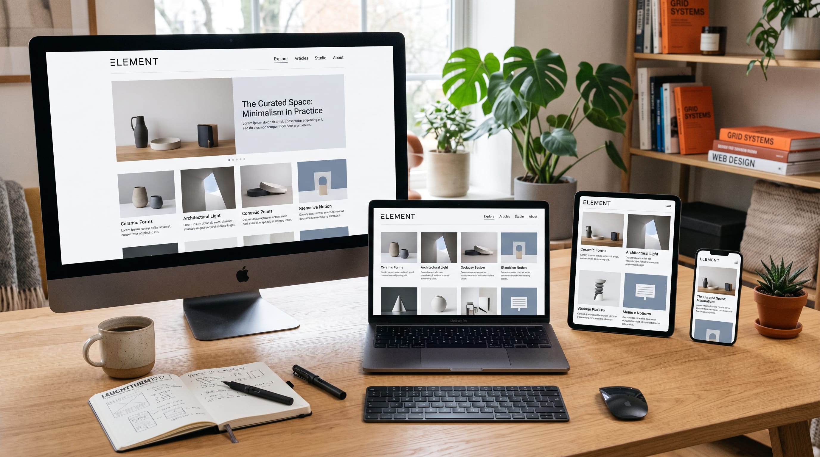
Website layout design is the process of arranging navigation, text, images, buttons, and page sections so visitors can understand and use a website easily. A successful layout does more than make a page look attractive. It guides attention, communicates priorities, and helps visitors find the information or action they need.
Creating a website from a blank canvas can feel difficult because there are many decisions to make. You need to choose where the navigation belongs, how wide the content should be, which section appears first, and how the design will adapt to smaller screens.
The best approach is to begin with structure rather than decoration. Before choosing colors, fonts, or photographs, decide what the page needs to communicate and how visitors should move through it.
This guide explains website layout design from the first planning stage to the final responsive review. It is suitable for creators, beginner designers, bloggers, freelancers, and small business owners who want to create clearer and more professional websites.
Start Website Layout Design With a Clear Goal
Every page should have one primary purpose. A homepage may introduce a brand and direct visitors toward important content. A landing page may encourage people to purchase a product, join an email list, or request a consultation.
Before designing, answer three questions:
- Who is the page for?
- What information do they need?
- What action should they take next?
These answers determine the layout.
For example, a portfolio website should make it easy to view selected work and contact the creator. An online store should help visitors browse products and complete purchases. A blog should prioritize useful content, categories, and readable articles.
Avoid starting website layout design by copying a visually attractive page without understanding its purpose. A structure that works for an ecommerce store may not suit a personal portfolio or educational website.
Identify the Essential Website Sections
Create a list of the sections the page needs before opening your design software or website builder.
A typical homepage may include:
- Header and navigation
- Hero section
- Introduction
- Services or categories
- Featured work or articles
- Benefits
- Testimonials
- Call to action
- Footer
Not every website needs every section. Include only the content that helps visitors understand the offer or continue their journey.
Arrange the sections according to importance. Visitors should receive the most useful information first instead of scrolling through a long introduction before understanding the website.
Create a Simple Content Outline
Write a basic page outline using words only.
For example:
- Header
- Main headline
- Supporting paragraph
- Primary button
- Featured categories
- Latest articles
- Short About section
- Newsletter invitation
- Footer
This simple outline becomes the foundation of the layout. It also prevents you from designing unnecessary decorative sections that do not support the page goal.
Sketch Your Website Layout Design
A rough sketch can solve major layout problems before you spend time styling the page.
You can sketch with:
- Pen and paper
- A whiteboard
- A tablet
- Wireframing software
- Presentation software
- Basic design applications
At this stage, use boxes and labels rather than detailed images and typography. Focus on placement, order, scale, and relationships.
Draw several alternatives. One version may use a centered hero section, while another may place text beside an image. Comparing quick sketches is faster than rebuilding a detailed design later.
Build a Low-Fidelity Wireframe
A wireframe is a simplified representation of the page structure. It shows where content will appear without including final styling.
Use grayscale boxes for:
- Images
- Text blocks
- Buttons
- Cards
- Navigation
- Forms
A low-fidelity wireframe helps you evaluate whether the page makes sense before colors and imagery influence your judgment.
Check whether visitors can easily identify the headline, supporting information, and next step. If the wireframe feels confusing, the finished design will probably remain confusing.
Use a Grid for Better Website Layout Design
A grid creates alignment and consistency. It divides the page into columns and helps elements share common edges.
Many desktop layouts use 12 columns because that system can be divided into several useful combinations. A section may use six columns for text and six for an image, while another may contain three cards using four columns each.
You do not need to make the grid visible in the finished page. It works as an underlying structure.
A grid can help you:
- Align text and images
- Create consistent card widths
- Control margins
- Balance columns
- Maintain rhythm
- Adapt sections responsively
Good website layout design often looks simple because the elements follow a consistent system.
Set a Maximum Content Width
Text and images should not stretch endlessly across large monitors. Set a maximum width for the main content container.
Common content widths often fall somewhere between 1,100 and 1,400 pixels, depending on the design. The exact number matters less than maintaining consistency.
Body text should be narrower than the full content area. Extremely long lines are difficult to read, especially on large screens.
Use generous outer margins so the page does not feel crowded against the browser edges.
Create Strong Visual Hierarchy
Visual hierarchy tells visitors what to notice first, second, and third.
You can create hierarchy with:
- Size
- Weight
- Color
- Contrast
- Position
- Spacing
- Imagery
- Alignment
The main headline should usually be more prominent than supporting text. A primary button should attract more attention than a secondary link. Section headings should clearly separate one topic from another.
Avoid making every element large, bold, or brightly colored. When everything competes for attention, the page becomes difficult to scan.
Use One Primary Focal Point
Each major section should have one dominant element.
In the hero section, that may be the headline. In a portfolio section, it may be a featured project. In a product section, it may be the product image or price.
Supporting content should reinforce the focal point rather than compete with it.
Zoom out from the layout or view it as a small thumbnail. The most important elements should remain visible.
Design an Effective Header and Navigation
The header is one of the most important parts of website layout design because it helps visitors understand where they are and where they can go.
A basic header may include:
- Logo
- Main navigation
- Search
- Account link
- Primary call-to-action button
- Mobile menu icon
Keep the main navigation focused. Too many menu items create decision fatigue and make the header feel crowded.
Use clear labels such as:
- Home
- About
- Services
- Blog
- Categories
- Contact
Avoid creative menu names that visitors may not understand.
Keep Navigation Consistent
The navigation should appear in a consistent location across the website. Visitors should not need to relearn how to use each page.
On mobile devices, the menu may collapse into a button or drawer. Make sure it remains easy to open, close, and navigate.
Important links should also appear in the footer, especially when the site contains legal pages, contact information, category links, or additional resources.
Also Read: Web Design For Beginners: A Simple Starter Guide
Create a Clear Hero Section
The hero section is the large area near the top of the page. Its purpose is to explain what the website offers and give visitors a clear next step.
A strong hero section often contains:
- Main headline
- Supporting paragraph
- Primary call to action
- Optional secondary action
- Relevant image or illustration
The headline should communicate the main value quickly. Avoid vague statements such as “Welcome to Our World” unless the supporting copy immediately explains the website.
A better structure is:
Headline: A clear result or benefit
Supporting text: Who the offer is for and how it helps
Button: The next action
Keep the hero focused. Adding several buttons, animations, promotional banners, and long paragraphs can weaken the main message.
Use Spacing to Improve Website Layout Design
Spacing is one of the most powerful tools in design. It separates sections, groups related elements, and gives the page room to breathe.
Use smaller spacing between connected elements, such as a heading and paragraph. Use larger spacing between unrelated sections.
Create a simple spacing system based on repeated increments. For example:
- 8 pixels
- 16 pixels
- 24 pixels
- 32 pixels
- 48 pixels
- 64 pixels
- 96 pixels
The exact values may change, but consistency matters.
Poor spacing can make even attractive content look disorganized. Generous, intentional spacing makes the same layout feel calmer and more professional.
Avoid Unnecessary Empty Space
White space is useful, but it should not force visitors to scroll through large empty areas without purpose.
Every gap should support readability, hierarchy, or visual balance. Excessive empty space between related elements can make the design feel disconnected.
Review the page on both large and small screens because spacing that works on desktop may feel excessive on mobile.
Design Sections With Clear Patterns
Repeating layout patterns helps visitors understand the page.
For example, service cards may all use:
- Icon
- Heading
- Short description
- Link
Blog cards may use:
- Featured image
- Category
- Title
- Excerpt
- Publication date
Use the same card structure throughout a section. Random differences in image size, text length, spacing, and alignment make the page feel unfinished.
However, do not repeat the same two-column section too many times. Alternate the structure occasionally to create visual variety.
You might use:
- Full-width section
- Two-column section
- Three-card grid
- Featured content block
- Testimonial section
- Call-to-action banner
The page should feel consistent without becoming repetitive.
Make Images Part of the Layout
Images should support the content instead of filling empty space.
Choose photographs, illustrations, or screenshots that help visitors understand the subject. Maintain a consistent visual style across the page.
Consider:
- Image proportions
- Cropping
- Subject placement
- Background style
- Color treatment
- Resolution
- Loading performance
Use consistent aspect ratios for card images. This prevents the grid from becoming uneven.
Avoid placing important parts of a photograph behind text unless the contrast remains strong. A subtle overlay may improve readability.
Use Typography to Support the Structure
Typography influences both readability and hierarchy.
A simple website type system may include:
- Display size for the main headline
- H2 size for major sections
- H3 size for cards or subsections
- Body size for paragraphs
- Smaller size for metadata and captions
Use one or two font families in most projects. Too many fonts create inconsistency.
Body text should remain comfortable to read. Use sufficient line height and avoid long paragraphs.
Maintain consistent heading levels. Do not use a large heading only because it looks attractive if it breaks the content structure.
Strong typography helps website layout design feel organized even before images and color are added.
Design Clear Calls to Action
A call to action tells visitors what to do next.
Examples include:
- View Projects
- Read the Guide
- Browse Categories
- Start Free
- Contact Us
- Get a Quote
- Shop Now
Use one primary button style consistently across the website. Secondary actions can use a lighter button or text link.
Place calls to action where they feel relevant. A service description may end with a contact button, while a blog section may end with a link to view all articles.
Avoid repeating several competing buttons in the same section.
Also Read: Free Website Tools to Launch in a Weekend
Create Responsive Website Layout Design
A responsive layout adapts to different screen sizes. A desktop design should not simply shrink on mobile.
On smaller screens:
- Columns may stack vertically
- Navigation may collapse
- Headline sizes should decrease
- Margins should become narrower
- Buttons may expand
- Images may move above text
- Decorative elements may be removed
Start thinking about mobile behavior during the first wireframe stage. Do not wait until the desktop page is complete.
Prioritize Content on Mobile
Mobile screens have limited space, so the most important content should appear first.
Reduce unnecessary decoration and simplify complex grids. A row of four cards may become two columns on a tablet and one column on a phone.
Touch targets should be large enough to select comfortably. Leave sufficient space between buttons and links.
Test the layout at several widths rather than checking only one phone size.
Improve Website Accessibility
Accessible website layout design makes content easier to use for more people.
Important considerations include:
- Strong color contrast
- Readable text size
- Clear heading structure
- Visible keyboard focus
- Descriptive button labels
- Alternative text for images
- Predictable navigation
- Sufficient spacing
- Forms with clear labels
Do not communicate important information through color alone. For example, an error message should include text or an icon in addition to a red border.
Avoid extremely small text and low-contrast gray paragraphs.
Accessibility improvements often benefit every visitor, not only users with disabilities.
Test the Website Layout Before Publishing
A layout that looks attractive inside a design application may behave differently in a real browser.
Review the website on:
- Desktop monitor
- Laptop
- Tablet
- Smartphone
- Different browser widths
Check:
- Navigation
- Buttons
- Forms
- Image cropping
- Text wrapping
- Section spacing
- Footer layout
- Loading behavior
Ask another person to complete a simple task, such as finding the contact page or locating a featured article. Observe where they hesitate.
User feedback can reveal problems that are difficult to notice after spending many hours on the design.
Common Website Layout Design Mistakes
1. Starting With Decoration
Choosing colors and effects before planning the content often creates a beautiful but confusing page. Begin with structure.
2. Using Too Many Sections
Long pages are not automatically better. Remove sections that repeat the same message or add little value.
3. Weak Visual Hierarchy
When headlines, paragraphs, and buttons look equally important, visitors struggle to know where to focus.
4. Inconsistent Alignment
Random edges and uneven card widths make the page feel unprofessional. Use a grid.
5. Crowded Navigation
Too many links create confusion. Keep the main navigation focused and move secondary links to the footer.
6. Ignoring Mobile Screens
A desktop-only layout may become difficult to use on phones. Plan responsive behavior early.
7. Excessive Animation
Movement can attract attention, but too many animations reduce clarity and may affect performance.
8. Poor Text Readability
Long lines, small type, weak contrast, and crowded paragraphs make content difficult to consume.
A Simple Website Layout Design Workflow
Use this process when creating a new page:
- Define the audience and goal.
- List the required content.
- Arrange the sections by importance.
- Sketch several layout options.
- Build a grayscale wireframe.
- Create a grid and spacing system.
- Establish visual hierarchy.
- Add typography and color.
- Insert images and supporting graphics.
- Design responsive versions.
- Test navigation and usability.
- Refine and publish.
Following a repeatable process reduces guesswork and helps you make design decisions based on purpose.
Also Read: Minimal Mobile UX for Designers Who Want Better Results
Final Thoughts on Website Layout Design
Effective website layout design begins with clear communication. A strong page helps visitors understand where they are, what the website offers, and what they should do next.
Start with the goal and content rather than decorative details. Use a grid to create alignment, spacing to improve readability, and visual hierarchy to guide attention. Keep navigation simple and make each section serve a clear purpose.
Responsive behavior should be part of the design from the beginning. Test the page across different screen sizes and remove anything that creates unnecessary complexity.
The best website layout design does not call attention to every design decision. It feels natural, organized, and easy to use. When visitors can move through the page without confusion, the layout is successfully supporting the content.

For high-quality fonts to boost your income, check out DM Letter Studio. Our professional fonts are perfect for branding, marketing, and content creation. So, don’t miss this opportunity.