
How to Make a Poster Design That Looks Eye-Catching
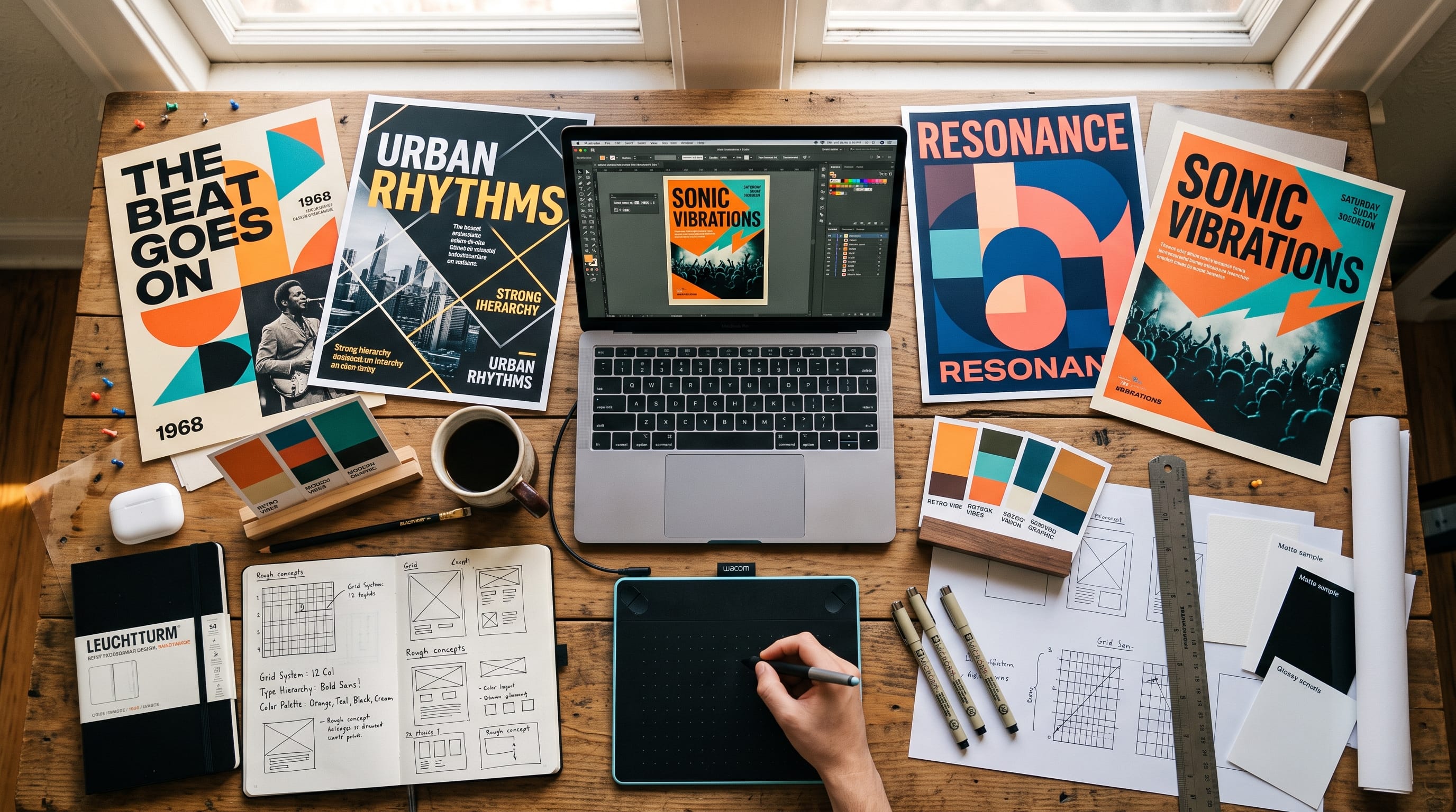
A strong poster design can capture attention in seconds, communicate a message clearly, and encourage people to take action. Whether you are creating a poster for an event, product, music release, business promotion, school project, or social campaign, the goal is not simply to make the page look attractive. The design must guide the viewer toward the most important information.
Beginners often make posters too complicated. They add several fonts, many colors, numerous images, and too much text because they want the design to feel exciting. However, strong posters usually achieve impact through simplicity, contrast, and clear visual hierarchy.
You do not need advanced graphic design skills to make a professional-looking poster. Instead, you need to understand a few basic principles and apply them consistently.
This guide explains how to create an effective poster design step by step, including typography, color, imagery, spacing, composition, and practical font recommendations from DM Letter Studio.
Start Your Poster Design With a Clear Purpose
Before opening your design software, determine what the poster needs to accomplish.
Ask yourself:
- What am I promoting?
- Who should notice the poster?
- What should viewers understand first?
- What action should they take?
- Where will the poster appear?
For example, a concert poster may need to communicate:
- Artist name
- Event date
- Venue
- Ticket information
Meanwhile, a product poster may prioritize:
- Product image
- Main benefit
- Promotional offer
- Call to action
Knowing the purpose helps you avoid adding information that does not support the message.
A successful poster design usually communicates one main idea rather than trying to explain everything at once.
Create a Strong Visual Hierarchy in Poster Design
Visual hierarchy determines what viewers notice first, second, and third.
One of the easiest ways to create hierarchy is through size.
For example:
- SUMMER MUSIC FESTIVAL
Large headline
- August 24 • Downtown Arena
Medium supporting information
- Tickets Available Now
Smaller call to action
The headline should usually have the strongest visual weight.
Supporting information should remain readable but should not compete with the headline.
You can create hierarchy through:
- Font size
- Font weight
- Color
- Contrast
- Position
- Spacing
- Image scale
Before finishing the poster, look at it from a distance.
If everything feels equally important, the hierarchy probably needs improvement.
Keep Your Poster Design Layout Simple
A good layout helps viewers understand information quickly.
Beginners often fill every empty area because they think unused space looks unfinished.
In reality, empty space can make a poster design feel more professional.
Try dividing the poster into simple visual areas:
- Top: Headline
- Middle: Main image or graphic
- Bottom: Details and call to action
Another layout might place a large photograph on one side and typography on the other.
The exact arrangement depends on the project, but every element should have a reason for being there.
Avoid placing objects randomly.
Use alignment to create structure.
Text, images, icons, and logos should feel connected rather than floating independently.
Use a Grid for Better Poster Design
A basic grid can make poster composition much easier.
You can divide the canvas into:
- Two columns
- Three columns
- Horizontal sections
- A modular grid
Then align design elements to those invisible guides.
Grids help create:
- Consistent margins
- Cleaner alignment
- Better spacing
- More professional compositions
You do not have to make every element perfectly symmetrical.
The grid simply gives the design a foundation.
Once the structure works, you can intentionally break the grid to make one element stand out.
Choose a Powerful Poster Headline
A poster headline needs to communicate quickly.
Keep it:
- Short
- Memorable
- Relevant
- Easy to read
Compare:
Join Us for Our Exciting Annual Summer Music Event
with:
SUMMER SOUND
The second option gives the designer much more room to create visual impact.
Short headlines can be enlarged dramatically and turned into a major part of the composition.
For promotional posters, the headline should communicate either:
- The event
- The product
- The offer
- The campaign idea
Avoid writing a paragraph where a few words would communicate the same message.
Typography Is Essential in Poster Design
Typography can completely change the personality of a poster design.
- A bold block font might communicate energy.
- A handwritten font can feel creative.
- A retro font may create nostalgia.
- A refined serif can communicate sophistication.
Before selecting typography, define the mood.
For example:
Music Poster
Try bold display, handwritten, retro, or experimental typography.
Sports Poster
Use varsity, block, condensed, or athletic lettering.
Luxury Event Poster
Choose refined serif or elegant script typography.
Creative Workshop Poster
Use playful display fonts or expressive handwriting.
The typography should support the subject rather than simply look fashionable.
Limit the Number of Fonts
Using too many fonts is one of the most common beginner mistakes.
For most posters, use One display font + one supporting font.
For example:
- Headline: Bold retro display
- Details: Clean sans serif
You may occasionally use a third style for small accents, but it is rarely necessary.
The more decorative your headline font becomes, the simpler your supporting type should be.
This helps maintain readability.
Use Contrast to Make a Poster Eye-Catching
Contrast attracts attention.
You can create contrast through:
- Large vs. small
- Light vs. dark
- Bold vs. thin
- Bright vs. muted
- Smooth vs. textured
- Simple vs. decorative
For example, a huge orange headline against a black background immediately creates visual impact.
Contrast also improves hierarchy.
If your poster feels flat, examine whether the major elements look too similar.
Increasing contrast may solve the problem without adding anything new.
Also Read: Logo Design Tutorials for Better Logos and Stronger Branding
Choose a Focused Poster Design Color Palette
Color can create emotion and establish a strong visual identity.
However, more colors do not automatically create a better design.
Start with:
- One dominant color
- One supporting color
- One accent
- One neutral
For example:
Bold Creative Poster
- Red
- Black
- Cream
Retro Poster
- Burnt orange
- Mustard
- Dark brown
- Cream
Modern Technology Poster
- Black
- Electric blue
- White
Playful Poster
- Pink
- Yellow
- Blue
- Cream
A limited palette makes your poster design easier to control.
Use One Strong Image Instead of Many Weak Images
Photography or illustration can become the visual center of a poster.
Instead of adding several unrelated images, choose one strong visual.
It might be:
- Portrait
- Product photo
- Illustration
- Abstract shape
- 3D object
- Texture
Then build the typography around it.
Large images create stronger visual impact than several tiny ones.
If you need multiple photos, create a clear system such as a structured collage or grid.
Use Cropping Creatively
Images do not always need to fit completely inside the canvas.
Try cropping:
- Faces
- Products
- Objects
- Illustrations
A close crop can make the composition feel more energetic.
For example, a musician’s portrait might extend beyond the edges of the poster while the headline overlaps part of the image.
Controlled overlap creates depth.
However, make sure important parts of the photograph remain recognizable.
Add Depth to Your Poster Design
Flat layouts can look excellent, but depth can make a poster feel more dynamic.
Try layering:
Background → Image → Headline → Small details
You can also place typography partly behind an object and partly in front.
Other techniques include:
- Shadows
- Blur
- Grain
- Transparency
- Gradient
- Texture
Use these carefully.
Effects should support the composition rather than distract from it.
Use White Space Intentionally
White space does not have to be white.
It simply means empty space around important elements.
Good spacing helps:
- Separate information
- Emphasize headlines
- Improve readability
- Create sophistication
If every corner contains text or graphics, the poster may feel stressful.
Allow important elements to breathe.
Sometimes removing one decorative object improves the entire poster design.
Make Important Text Readable From a Distance
Posters are often viewed from several feet away.
Therefore, test the headline at reduced size.
Zoom out.
Can you still understand the main message?
If not:
- Increase the headline size
- Improve contrast
- Reduce decorative effects
- Simplify the wording
Small details such as addresses and URLs can remain smaller, but the main information should be immediately visible.
Create Movement With Composition
A poster does not have to feel static.
Diagonal lines, angled typography, repeated shapes, and directional photography can guide the viewer’s eye.
For example:
Large headline top left → portrait center → event details bottom right
This creates a visual path.
Curved shapes can create softer movement, while diagonal shapes create energy.
Match the movement to the subject.
Sports and music posters may benefit from dynamic layouts, while luxury or professional designs often work better with calmer compositions.
Add Shapes and Graphic Elements Carefully
Simple graphic elements can give a poster personality.
Consider:
- Circles
- Stars
- Lines
- Arrows
- Frames
- Stickers
- Geometric patterns
However, these should support the focal point.
If viewers notice the decorative shapes before the headline or product, you may be using too many.
One recognizable graphic motif repeated throughout the composition often works better than several unrelated decorations.
Also Read: Website Design Tutorial for Better Navigation and UX
Use Texture for Character
Texture can prevent a digital poster from feeling too clean or generic.
Popular texture styles include:
- Paper grain
- Halftone
- Noise
- Distressed print
- Film grain
- Ink texture
Retro posters especially benefit from subtle texture.
Modern minimalist posters may need very little.
Keep texture subtle enough that text remains readable.
Create a Consistent Poster Design Style
If you are making several posters for the same brand or campaign, establish visual rules.
Keep certain elements consistent:
- Logo placement
- Typography
- Colors
- Margins
- Image treatment
- Graphic shapes
Then change the main content.
This approach makes multiple poster design variations feel connected without making them identical.
Font Suggestions for Poster Design
Typography is often the most expressive part of poster artwork. DM Letter Studio currently offers several display styles that are especially suitable for posters, event graphics, album artwork, merchandise, branding, and promotional designs.
Wavy Retro for Groovy Poster Design
Wavy Retro is one of the strongest options for 70s and 80s-inspired posters.
DM Letter Studio describes it as a groovy, nostalgic typeface with fluid wavy letterforms and specifically recommends it for posters, album covers, branding, and packaging.
Use it for:
- Music festivals
- Vintage events
- Fashion posters
- Creative markets
- Retro campaigns
Pair it with burnt orange, mustard, cream, purple, or brown.
Retro Wave for Music and Event Posters
Retro Wave combines a brush style with retro-inspired movement.
It is designed for posters, music album covers, merchandise, social graphics, and event promotions, making it especially useful for expressive creative projects.
Try it for:
MIDNIGHT WAVE
or:
SUMMER NIGHTS
Keep supporting information in a clean sans serif.
Blockton Varsity for Bold Poster Headlines
For sports, campus events, streetwear, team graphics, or strong promotional headlines, Blockton Varsity is an excellent option.
Its thick block letterforms are designed for clarity and are specifically suitable for posters, signage, logos, packaging, and merchandise.
Use it for:
- Sports posters
- College events
- Team campaigns
- Fitness promotions
- Bold merchandise
Its strong structure works particularly well with centered layouts.
Plump Varsity for Friendly Bold Posters
Plump Varsity combines varsity lettering with rounded, bubble-like shapes.
DM Letter Studio positions it for bold headlines, banners, social posts, merchandise, and energetic designs.
It can work well for:
- Youth events
- School posters
- Creative workshops
- Food promotions
- Fun sports graphics
The rounded appearance creates strong impact without feeling overly aggressive.
Bigbang for Expressive Poster Typography
For attention-grabbing creative posters, Bigbang is another useful direction.
This visual energy translates well to poster design.
Eighties for Retro Poster Graphics
For nostalgic poster layouts, Eighties can help create an 80s-inspired personality.
This work for:
- Retro parties
- Arcade events
- Music posters
- Pop-up shops
- Vintage product campaigns
Street Dash for Urban Posters
For street-inspired poster artwork, Street Dash provides a handwritten script direction with bold strokes and urban energy.
Use it selectively for:
- Fashion posters
- Streetwear campaigns
- Creative events
- Music promotions
Avoid setting long paragraphs in an expressive script.
Simple DM Letter Studio Font Pairing Ideas
Try these combinations:
Retro Poster
Wavy Retro + clean sans serif like ROSA
Music Poster
80s Poster
Sports Poster
Blockton Varsity + simple sans serif like Trevor
Playful Event Poster
Plump Varsity + clean geometric font like Stryvix
Urban Poster
Street Dash + bold brush font like Jasperon
The display font creates personality while the supporting font maintains readability.
How to Make Your Poster Design Look Professional
Before exporting, review the poster and remove anything unnecessary.
Check:
- Is the headline immediately visible?
- Does the layout have one clear focal point?
- Are fonts readable?
- Are colors consistent?
- Is spacing balanced?
- Does the image support the message?
- Are details accurate?
- Is the logo appropriately sized?
- Does the call to action stand out?
Then zoom out.
If the poster still communicates clearly when it appears small, the hierarchy is probably working.
Common Poster Design Mistakes to Avoid
Too Many Fonts
Limit yourself to two whenever possible.
Too Much Text
Posters should communicate quickly.
Weak Hierarchy
Make the most important message clearly dominant.
Too Many Colors
Use a focused palette.
Poor Image Quality
Use high-resolution visuals.
Filling Every Space
Allow breathing room.
Tiny Headlines
Remember that posters may be viewed from a distance.
Too Many Effects
Shadows, gradients, outlines, and textures should have a purpose.
Poster Design Checklist
Before publishing or printing your poster, check:
- Is the purpose clear?
- Does the headline attract attention?
- Can viewers understand the message quickly?
- Is there a clear visual hierarchy?
- Are fonts readable?
- Are only one or two font families being used?
- Does the color palette feel intentional?
- Is the main image strong enough?
- Is there sufficient white space?
- Are objects aligned consistently?
- Does the call to action stand out?
- Are dates, prices, and contact information correct?
- Does the poster work at both large and small sizes?
- Are images and fonts licensed for the intended use?
Also Read: Typography Tutorials for Designers Who Want Better Results
Final Thoughts on Creating an Eye-Catching Poster Design
An effective poster design does not need dozens of visual elements. Strong posters usually succeed because they combine one clear message with confident typography, a focused color palette, purposeful imagery, and a well-organized layout.
Begin with the message.
Decide what viewers need to notice first, then build the composition around that priority.
Use hierarchy to guide attention, contrast to create impact, white space to improve clarity, and typography to establish personality. Limit decorative elements so they support rather than compete with the content.
Fonts can dramatically change the final mood. DM Letter Studio options provide useful directions for retro, sports, music, playful, and urban poster styles.
Most importantly, do not judge a poster by how many elements you can add.
Judge it by how quickly someone can understand it.
When your poster design has a clear focal point, readable information, strong typography, balanced spacing, and one memorable visual idea, it has a much better chance of attracting attention and communicating effectively.