
How to Make a Clean and Effective Business Card Design
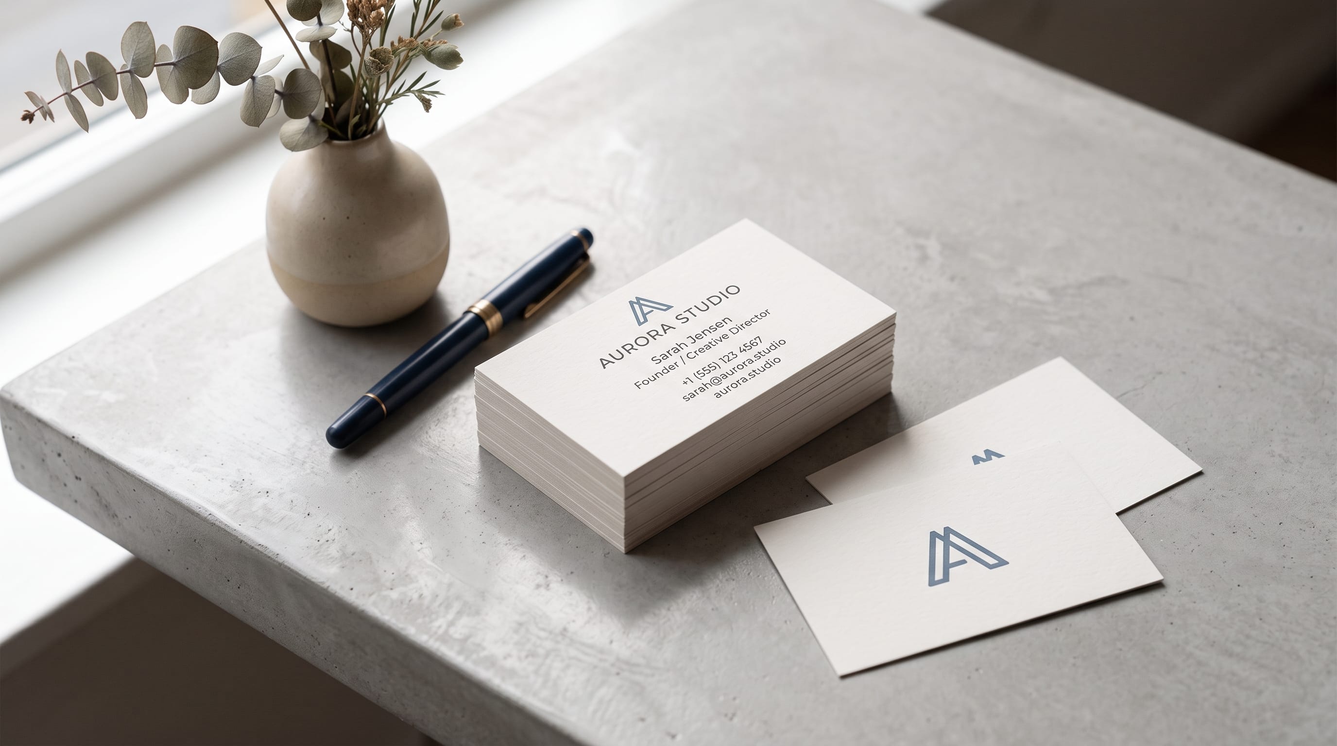
A strong business card design should communicate who you are, what you do, and how someone can contact you within just a few seconds. Even in a digital-first world, business cards remain useful for meetings, networking events, retail businesses, creative professionals, trade shows, and local services. The challenge is fitting important information into a very small space without making the card feel crowded.
For beginners, the best approach is usually simple. You do not need complicated illustrations, several fonts, or every piece of information about your business.
Instead, focus on hierarchy, readability, spacing, and consistency with the rest of your brand.
A clean business card design feels intentional. Every element has a purpose, and nothing competes unnecessarily for attention.
This guide explains the complete process, from deciding what information to include to preparing a print-ready file.
Start Your Business Card Design With a Clear Purpose
Before choosing colors or fonts, decide what the card needs to achieve.
A business card may be used to:
- Introduce your business
- Share contact details
- Promote a personal brand
- Direct people to a website
- Encourage portfolio visits
- Support networking
- Strengthen brand recognition
The purpose affects the content.
A freelance graphic designer may emphasize a website and Instagram account, while a local contractor may prioritize phone number and service area.
Do not include information simply because other cards include it.
Ask whether each detail helps the recipient take the next step.
Choose the Right Information
A basic business card design usually needs only a few elements.
Consider including:
- Name
- Job title
- Company name
- Logo
- Phone number
- Email address
- Website
- Relevant social profile
You may also include a short tagline if it clearly explains the business.
For example:
Maya Studio
Brand Identity & Packaging Design
This is more useful than a vague phrase such as:
Creating Better Experiences
Keep the information focused.
Avoid Putting Too Much on the Card
One of the most common beginner mistakes is trying to use every available space.
A crowded card becomes difficult to scan.
Avoid unnecessary details such as:
- Multiple phone numbers
- Long descriptions
- Several social profiles
- Large lists of services
- Long addresses unless necessary
If someone can find detailed information on your website, the card does not need to repeat it all.
Think of the card as an introduction, not a brochure.
Use a Standard Business Card Size
Business card dimensions vary by country and printer.
A widely used size is approximately:
3.5 × 2 inches
or around:
89 × 51 mm
Some printers use slightly different dimensions, so always check the specifications of the printing company before completing the artwork.
Your business card design should be created at the printer’s exact required size rather than resized at the last moment.
This helps avoid:
- Unexpected cropping
- Distorted layouts
- Incorrect margins
- Print production problems
Understand Bleed in Business Card Design
Bleed is extra artwork that extends beyond the final trim line.
It is important when:
- Background colors reach the edge
- Photographs fill the card
- Patterns continue to the edge
A typical printer may request around 3 mm or 0.125 inches of bleed, although specifications can vary.
Imagine your finished card has a blue background.
Do not stop the blue exactly at the trim line.
Extend it into the bleed area.
This prevents thin white edges from appearing if trimming shifts slightly during production.
Keep Important Content Inside the Safe Area
Bleed extends artwork outward.
The safe area does the opposite.
Important elements should stay comfortably inside the trim line.
Keep items such as:
- Names
- Phone numbers
- Logos
- Website addresses
away from the edge.
Even if a layout looks stylish with text very close to the border, small cutting variations may make the final card feel uneven.
A little breathing room creates a more professional result.
Build a Clear Business Card Design Hierarchy
Visual hierarchy tells the reader what to notice first.
Ask:
What is the most important information?
For many cards, the hierarchy might be:
- Name or company
- Role or service
- Contact details
The answer depends on the brand.
For a recognizable company, the logo may dominate.
For an independent consultant, the person’s name may be more important.
Use differences in:
- Size
- Weight
- Color
- Position
- Spacing
to establish hierarchy.
Do not make every line the same size and weight.
Use a Simple Grid
A grid can make even a basic business card design feel more polished.
You do not need a complicated layout system.
Start with:
- Consistent left alignment
- Equal margins
- Regular vertical spacing
For example:
LOGO
Maya Anderson
Brand Designer
maya@email.com
mayastudio.com
This simple structure is easy to understand.
Strong alignment often makes a design look more professional than additional decoration.
Choose One Strong Alignment
Beginners sometimes mix several alignments.
For example:
- Logo centered.
- Name aligned left.
- Phone centered.
- Website aligned right.
This can create visual disorder.
Instead, choose one primary alignment.
Left Alignment
Feels practical and contemporary.
Center Alignment
Can feel formal, elegant, or minimal.
Right Alignment
Can work for more unusual editorial compositions.
Consistency is more important than choosing one particular option.
Use White Space Generously
White space does not have to be white.
It simply means empty space around elements.
It helps:
- Separate information
- Improve readability
- Create hierarchy
- Make the card feel premium
A common beginner instinct is:
There is empty space, so I should add something.
Often, the opposite is true.
That empty area may be exactly what gives the design balance.
A clean business card design usually benefits from removing unnecessary elements rather than adding more.
Also Read: Mobile Photography Tutorial for Creators Who Want Better Photos
Choose Readable Business Card Typography
Typography is one of the most important design decisions.
The card is small, so readability matters.
Use fonts that remain clear at small sizes.
Avoid extremely:
- Thin lettering
- Decorative scripts
- Compressed fonts
- Detailed display fonts
for important contact information.
A decorative font can still work for a logo or name.
Pair it with a clean supporting typeface for:
- Phone
- Website
- Address
This creates both personality and usability.
Limit the Number of Fonts
Two fonts are usually enough.
For example:
- Font 1: Used for the name or brand.
- Font 2: Used for contact information.
You may even use one font family with different weights.
For example:
- Bold for the name
- Regular for the role
- Light for contact details
This creates hierarchy without introducing unnecessary visual styles.
Set Text at a Practical Size
Text that looks readable when zoomed to 300% may become too small after printing.
Always evaluate your business card design at approximately actual size.
Print a test copy on ordinary paper.
Then ask:
- Can I read the phone number comfortably?
- Is the email address clear?
- Is the job title too small?
- Are thin letters disappearing?
A physical test often reveals problems you will not notice on a large monitor.
Choose a Controlled Color Palette
Business cards do not need many colors.
A simple palette can include:
- One primary brand color
- One neutral
- One accent
For example:
- Modern
Black + white + electric blue - Natural
Forest green + cream + warm brown - Luxury
Navy + ivory + muted gold - Creative
Coral + black + pale peach
Follow the wider brand identity if one already exists.
Your card should look like it belongs to the same business as the website, packaging, social media, and other marketing materials.
Use Contrast for Better Readability
Good contrast makes information easy to read.
Strong combinations include:
- Black on white
- White on navy
- Dark green on cream
- Charcoal on pale beige
Avoid combinations with very similar brightness.
For example:
Light gray text on white may look sophisticated on-screen but become difficult to read in print.
The same applies to pastel text on pale backgrounds.
Clean design should never sacrifice usability.
Use Both Sides of the Business Card
Using the front and back can give information more room.
One effective structure is:
Front
Logo or brand name
Back
Name
Title
Phone
Email
Website
Another option:
Front
Name + contact details
Back
Large logo or simple brand pattern
Using both sides can prevent overcrowding.
However, do not add extra information simply because more space is available.
Create a Minimal Business Card Design
Minimal cards can look highly professional when spacing and typography are handled carefully.
A minimal card might contain only:
MAYA ANDERSON
Brand Designer
mayaanderson.com
That is enough if the website contains the remaining details.
Minimalism works especially well for:
- Designers
- Architects
- Consultants
- Photographers
- Luxury brands
- Creative studios
The fewer elements you use, the more important alignment, type quality, and print finish become.
Create a Modern Business Card Design
Modern cards often use:
- Bold typography
- Geometric layouts
- Strong contrast
- Simple colors
- Clean sans serif fonts
Try making the name significantly larger than the supporting text.
For example:
ALEX MORGAN
Creative Director
Small contact information underneath.
This establishes immediate hierarchy.
You can also use one large letter or geometric shape as a visual branding element.
Design a Professional Card for Small Businesses
Small business cards often need more practical information.
A plumber, photographer, florist, restaurant owner, or real estate professional may need customers to contact them quickly.
Prioritize:
- Business name
- Service
- Phone
- Website
If physical location matters, add the address.
Do not reduce the phone number to tiny type simply to make room for a slogan.
Functional information should remain easy to find.
Use QR Codes Carefully
QR codes can connect the printed card to digital content.
They can link to:
- Website
- Portfolio
- Contact page
- Booking page
- Digital business card
If you add a QR code:
- Give it enough space
- Maintain strong contrast
- Test it before printing
- Avoid making it extremely small
You should also provide a normal website address when appropriate.
A QR code should improve convenience, not become the only possible way to contact you.
Also Read: Video Editing Tutorial: How to Edit Videos Like a Professional
Use Icons Only When They Help
Small icons can identify:
- Phone
- Website
- Location
However, icons are optional.
A card can look cleaner without them.
If you use icons, choose one consistent style.
Do not mix:
- Outline icons
- Filled icons
- Hand-drawn icons
on the same card.
Keep icon size consistent and align them carefully with the text.
Keep Logo Placement Simple
The logo does not always need to be enormous.
Consider where the brand name already appears.
If the logo includes the full business name, repeating that name again at large size may be unnecessary.
Possible logo positions include:
- Upper left
- Center
- Separate reverse side
Give the logo enough clear space.
Avoid surrounding it with too much text.
Use Brand Patterns as Secondary Graphics
A subtle pattern can add personality without overwhelming the card.
Use:
- Geometric shapes
- Monograms
- Illustrations
- Brand symbols
For example, a floral company could use a minimal botanical pattern on the reverse side.
A technology company might use geometric lines.
Keep patterns secondary.
Contact information should remain the priority.
Prepare Images at High Resolution
If your business card design includes photographs or raster artwork, use sufficient resolution for print.
Low-resolution images can become:
- Blurry
- Pixelated
- Unprofessional
Avoid downloading small images from websites and enlarging them.
Logos are often best supplied as vector artwork when possible because vectors remain sharp at different sizes.
Understand RGB and CMYK
Screens commonly display color using RGB.
Commercial printing typically uses CMYK or another printer-specific production process.
This means some bright screen colors may appear different in print.
Highly vivid:
- Blues
- Greens
- Pinks
can shift after conversion.
Design with the printer’s requirements in mind.
If accurate brand color is important, request a proof or discuss color specifications with the printer.
Export Your Business Card Design Correctly
Printers often request PDF files because they preserve layout information well.
Before exporting, confirm:
- Final dimensions
- Bleed
- Color mode
- Image resolution
- Fonts
- Crop marks if requested
Do not assume every printer has the same requirements.
Check their specifications first.
A professional-looking design can still fail if the production file is prepared incorrectly.
Choose the Right Paper
Paper affects how the final card feels.
Common choices include:
- Matte
Clean and modern. - Gloss
Bright and visually strong. - Uncoated
Natural and tactile. - Textured
Premium or handcrafted. - Extra-Thick Stock
Creates a substantial, premium impression.
The best paper depends on the brand.
A handmade studio may benefit from textured uncoated paper.
A photography business may prefer a coated surface that reproduces images vividly.
Consider Special Print Finishes
Special finishes can add interest.
Options include:
- Foil stamping
- Embossing
- Debossing
- Spot UV
- Rounded corners
- Colored edges
Use these effects intentionally.
For example, gold foil may support a luxury brand.
Rounded corners may suit a friendly, modern business.
Adding several finishes at once can increase costs and make the design unnecessarily complicated.
Business Card Design Mistakes to Avoid
Too Much Information
Keep only essential details.
Tiny Typography
Print and test at actual size.
Too Many Fonts
Limit the typography system.
Weak Contrast
Prioritize readability.
Inconsistent Alignment
Use a clear grid.
No Bleed
Extend edge-to-edge artwork correctly.
Important Text Near the Edge
Respect the safe area.
Low-Resolution Images
Use print-quality assets.
Too Many Colors
Follow a controlled brand palette.
Designing Without Printer Specifications
Check production requirements before exporting.
Business Card Design Checklist
Before sending your artwork to print, review:
- Is the name spelled correctly?
- Is the job title accurate?
- Is the phone number correct?
- Is the email address correct?
- Does the website work?
- Is the logo clear?
- Is hierarchy obvious?
- Are fonts readable?
- Is contrast strong?
- Are margins consistent?
- Is important content inside the safe area?
- Does the background extend into the bleed?
- Are images high resolution?
- Is the color mode correct?
- Is the final size correct?
- Have you checked the printer’s requirements?
- Did you print a physical test?
- Did you scan the QR code?
- Is the final file exported correctly?
Always proofread contact information carefully.
A beautifully designed card with an incorrect email address is not effective.
Also Read: Email Marketing Tutorial for Better Results
Final Thoughts on Clean Business Card Design
The best business card design is not necessarily the most complicated one.
A clean card succeeds because it communicates the right information quickly while making the business feel professional and recognizable.
Start with purpose.
Decide which information is truly necessary, create a clear hierarchy, and build the layout with consistent alignment and generous spacing.
Choose readable typography and limit the number of fonts. Use colors that match the wider brand, maintain sufficient contrast, and avoid filling every empty area.
Then think beyond the screen.
A successful business card design must work as a physical printed object. Check the final dimensions, bleed, safe area, color mode, resolution, paper, and printer requirements before production.
Print a test at actual size whenever possible.
That simple step can reveal tiny text, poor spacing, weak contrast, and alignment problems before you spend money on a large print run.
Most importantly, remember the purpose of the card.
It should make it easy for someone to remember you and take the next step.
When typography, hierarchy, spacing, branding, and print preparation work together, a simple business card design can create a stronger professional impression than a visually complicated card filled with unnecessary information.

For high-quality fonts to boost your income, check out DM Letter Studio. Our professional fonts are perfect for branding, marketing, and content creation. So, don’t miss this opportunity.