
Best Luxury Logo Color Ideas for Premium Brand Identity
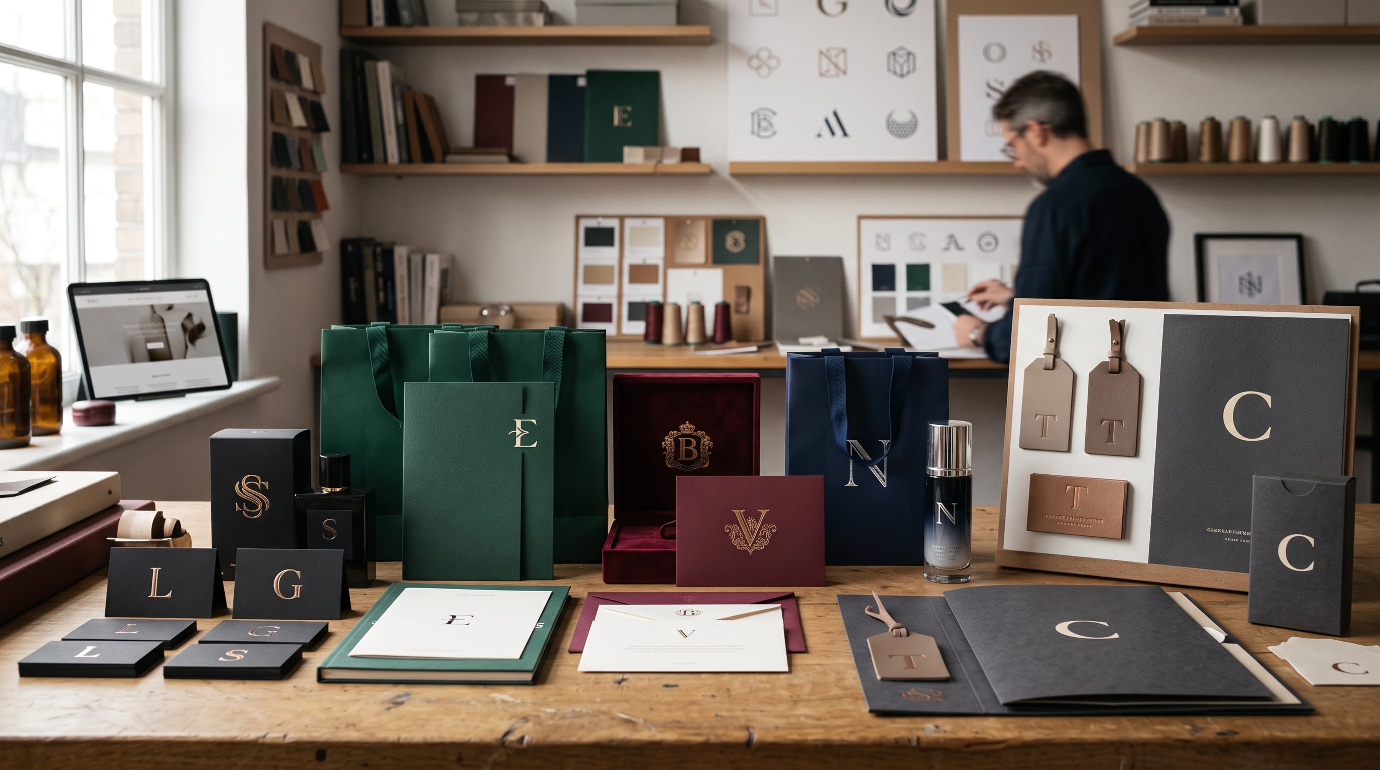
Luxury logo color ideas can completely change how a premium brand is perceived. The right palette can make a logo feel elegant, exclusive, sophisticated, timeless, or modern before customers read a single word. For luxury brands, color is not simply decoration. It becomes part of the emotional experience surrounding the product, service, packaging, website, and overall visual identity.
High-end branding often succeeds because it uses fewer colors more intentionally. Instead of filling a logo with many bright tones, luxury designers tend to focus on controlled combinations such as black and gold, ivory and charcoal, navy and champagne, or deep burgundy and cream.
The best palette depends on the personality of the business. A fine jewelry brand may use black and metallic gold, while a premium skincare company might feel more sophisticated with warm ivory, beige, and muted bronze.
This guide explores practical luxury logo color ideas for fashion, beauty, hospitality, jewelry, lifestyle, and premium service brands, along with advice for choosing combinations that support a strong and memorable identity.
Why Luxury Logo Color Ideas Matter
Color communicates personality quickly.
When customers encounter a logo for the first time, the palette can suggest whether a brand feels:
- Premium
- Traditional
- Modern
- Exclusive
- Artistic
- Feminine
- Masculine
- Natural
- Dramatic
- Minimal
Luxury branding often relies on restraint.
Using one dominant color with one supporting tone can create more sophistication than combining five or six competing colors.
The strongest luxury logo color ideas also need to work across many applications, including:
- Websites
- Packaging
- Shopping bags
- Product labels
- Business cards
- Social media
- Store signage
- Embossing
- Foil stamping
A palette that looks attractive on a screen should also remain recognizable when used in physical branding.
1. Black and Gold Luxury Logo Color Ideas
Black and gold is one of the most recognizable luxury combinations.
Suggested palette:
- Black: #111111
- Gold: #C6A15B
- Warm White: #F7F3EA
Black communicates strength, confidence, and exclusivity.
Gold introduces richness and prestige.
This combination works especially well for:
- Jewelry
- Fashion
- Restaurants
- Hotels
- Watches
- Premium cosmetics
- Luxury services
Avoid using highly saturated yellow as a substitute for gold.
Muted metallic-inspired tones usually create a more refined visual impression.
For printed materials, actual metallic foil can make this palette feel even more premium.
2. Ivory and Charcoal Premium Logo Palette
Not every luxury identity needs gold.
Ivory and charcoal provide a softer alternative.
Suggested palette:
- Ivory: #F6F0E5
- Charcoal: #292929
- Soft Beige: #D8CAB8
This palette feels:
- Minimal
- Editorial
- Calm
- Sophisticated
- Timeless
It works particularly well for:
- Interior design
- Fashion
- Architecture
- Wedding brands
- Photography
- Premium stationery
This is one of the strongest luxury logo color ideas for brands that want understated elegance rather than obvious opulence.
3. Navy and Champagne Luxury Branding
Dark navy can provide much of the authority of black while feeling slightly softer.
Suggested palette:
- Deep Navy: #101C2C
- Champagne: #D7C3A3
- Cream: #F7F3EC
This combination communicates:
- Trust
- Heritage
- Professionalism
- Refinement
It is suitable for:
- Luxury consulting
- Hotels
- Real estate
- Financial services
- Premium menswear
- Yacht or travel brands
Champagne adds warmth without becoming too bright.
4. Emerald Green and Gold Luxury Logo Colors
Deep green has strong associations with heritage, quality, and natural richness.
Suggested palette:
- Emerald: #123F35
- Soft Gold: #C8A96A
- Ivory: #F5F0E5
Emerald and gold work well for:
- Jewelry
- Hotels
- Restaurants
- Beauty
- Premium food
- Luxury lifestyle brands
Green can also help a premium identity feel less predictable than standard black-and-gold branding.
This is one of the most versatile luxury logo color ideas because it can feel both traditional and contemporary.
5. Burgundy and Cream Luxury Logo Palette
Burgundy offers a rich alternative to black.
Suggested palette:
- Burgundy: #5A1E2B
- Cream: #F3E6D1
- Warm Brown: #6D5144
The combination feels:
- Romantic
- Traditional
- Warm
- Premium
- Mature
It works especially well for:
- Wine-inspired branding
- Fashion
- Wedding businesses
- Boutique hotels
- Premium food
- Restaurants
Use burgundy as the dominant color and cream as the balancing neutral.
6. Chocolate Brown and Beige Luxury Logo Ideas
Brown can create a sophisticated identity when the shade is deep and controlled.
Suggested palette:
- Chocolate: #3B2923
- Beige: #D7C3AD
- Warm White: #F8F2E8
This palette is ideal for:
- Coffee
- Chocolate
- Fashion
- Leather products
- Interior design
- Luxury home brands
Brown also communicates warmth and craftsmanship.
For brands selling handmade premium products, it can feel more authentic than black.
7. Deep Purple and Champagne Gold
Purple has long associations with royalty and prestige.
The key is choosing a dark, restrained shade rather than a bright violet.
Suggested palette:
- Deep Purple: #3D284F
- Champagne Gold: #CDB893
- Ivory: #F8F3E9
These luxury logo color ideas work particularly well for:
- Fragrance
- Cosmetics
- Premium events
- Jewelry
- Luxury gifts
- Fashion
Use gold sparingly.
The purple should remain the dominant brand color.
8. Midnight Blue and Silver Luxury Logo Colors
For a cooler luxury aesthetic, combine deep blue with silver-inspired gray.
Suggested palette:
- Midnight Blue: #111C32
- Silver Gray: #B7BBC4
- White: #F7F8FA
This palette feels:
- Modern
- Technical
- Premium
- Sophisticated
It can work for:
- Technology
- Automotive brands
- Watches
- Professional services
- Premium electronics
Silver can feel more contemporary than gold, especially when paired with dark navy.
9. Forest Green and Cream Premium Branding
Forest green creates a natural but sophisticated visual identity.
Suggested palette:
- Forest: #263B2E
- Cream: #EEE5D5
- Muted Gold: #AD956D
This combination is suitable for:
- Eco-luxury
- Hotels
- Resorts
- Organic beauty
- Furniture
- Interior brands
The cream prevents the green from feeling overly heavy.
It is particularly effective when combined with tactile materials such as recycled paper, linen, wood, or matte packaging.
10. Black and White Minimal Luxury Logo Colors
Sometimes the simplest palette creates the most premium result.
Suggested palette:
- Black: #000000
- White: #FFFFFF
- Optional Gray: #A9A9A9
Black and white can create a strong identity for:
- Fashion
- Architecture
- Photography
- Creative agencies
- Interior design
- Premium technology
Typography becomes especially important because the palette contains almost no decorative color.
This approach demonstrates that luxury logo color ideas do not always need metallic tones.
Also Read: How to Create a Fashion Logo Design That Stands Out
11. Rose Gold and Blush Luxury Logo Palette
Soft rose tones are popular for feminine luxury identities.
Suggested palette:
- Rose Gold: #B98C83
- Blush: #E8D0CA
- Cream: #FBF5EF
- Charcoal: #342F30
Use this combination for:
- Beauty
- Wedding
- Skincare
- Jewelry
- Boutique fashion
Include charcoal or another dark neutral to keep the palette from becoming overly delicate.
The contrast can make the identity feel more mature and premium.
12. Terracotta and Warm Cream Luxury Colors
Terracotta can create a sophisticated Mediterranean-inspired identity.
Suggested palette:
- Terracotta: #A65E46
- Cream: #F3E5D0
- Espresso: #3D302A
This palette communicates:
- Craftsmanship
- Warmth
- Heritage
- Natural elegance
It can work beautifully for:
- Boutique hotels
- Restaurants
- Home decor
- Ceramics
- Fashion
- Lifestyle businesses
These luxury logo color ideas are especially useful for brands that want premium positioning without looking corporate.
13. Olive Green and Soft Gold Logo Palette
Olive green feels quieter and more understated than emerald.
Suggested palette:
- Olive: #646345
- Soft Gold: #C2AA7A
- Ivory: #F7F2E8
This combination works well for:
- Beauty
- Natural skincare
- Premium food
- Fashion
- Interior design
- Resorts
Olive is particularly effective when the brand identity focuses on craftsmanship, nature, or sustainability.
14. Deep Red and Black Luxury Logo Colors
For stronger visual impact, combine deep red with black.
Suggested palette:
- Deep Red: #731F26
- Black: #151515
- Warm White: #F5F0EA
This palette feels:
- Powerful
- Dramatic
- Confident
- Exclusive
It can work for:
- Automotive brands
- Fashion
- Restaurants
- Entertainment
- Premium sports products
Use red carefully.
Too much bright red can make the identity feel promotional rather than luxurious.
Darkening the tone makes the palette more sophisticated.
15. Taupe and Black Luxury Logo Color Ideas
Taupe is an excellent neutral for modern luxury branding.
Suggested palette:
- Taupe: #A79685
- Black: #161616
- Off White: #F3F0EA
This combination feels:
- Minimal
- Architectural
- Editorial
- Contemporary
It works particularly well for:
- Interior studios
- Fashion
- Beauty
- Architecture
- Creative agencies
A taupe-and-black identity can appear expensive without relying on gold.
16. Champagne and Espresso Premium Logo Colors
Warm neutrals can create a rich visual identity.
Suggested palette:
- Champagne: #D3BE9E
- Espresso: #322722
- Cream: #F7EFE5
This palette is useful for:
- Coffee
- Hospitality
- Furniture
- Premium food
- Fashion accessories
It creates warmth while retaining enough dark contrast for typography.
17. Cobalt Blue and Black Modern Luxury Logo Colors
Luxury branding does not need to rely exclusively on muted colors.
A powerful blue can create a more contemporary identity.
Suggested palette:
- Cobalt: #2948B8
- Black: #111111
- White: #F8F8F8
This works particularly well for:
- Fashion
- Technology
- Creative agencies
- Digital products
- Premium lifestyle brands
The brighter accent can make the identity feel younger and more experimental.
18. Sage and Ivory Luxury Logo Palette
Sage provides a calm direction for wellness and natural luxury.
Suggested palette:
- Sage: #94A48B
- Ivory: #F5F1E8
- Deep Green: #344339
This combination works well for:
- Wellness
- Spa businesses
- Skincare
- Natural beauty
- Boutique hotels
- Lifestyle brands
For a premium appearance, choose muted sage rather than highly saturated green.
19. Slate Gray and Warm White Luxury Colors
Gray can become elegant when the design relies on typography and spacing.
Suggested palette:
- Slate: #42484B
- Warm White: #F4F1EA
- Soft Gray: #B3B1AB
This palette feels:
- Architectural
- Professional
- Modern
- Minimal
It works well for:
- Architecture
- Furniture
- Technology
- Professional services
- Premium real estate
20. Monochromatic Luxury Logo Color Ideas
A monochromatic palette uses variations of one color.
For example:
Blue Monochrome
- #101E33
- #314763
- #8A9AAF
- #E8ECF0
Green Monochrome
- #19352D
- #45685C
- #94AA9F
- #EDF0EC
Monochromatic luxury logo color ideas can make branding feel sophisticated because the palette remains highly controlled.
Use differences in lightness and saturation to create hierarchy.
Also Read: 20+ Typography Logo Ideas That Look Premium and Simple
Luxury Logo Color Ideas for Fashion Brands
Fashion identities often work well with:
- Black + white
- Black + gold
- Burgundy + cream
- Cobalt + black
- Taupe + black
Fashion brands can often use high contrast because typography and photography carry much of the identity.
A minimalist black logo may appear significantly more premium than an overly complicated multi-color symbol.
Luxury Logo Color Ideas for Beauty Brands
Beauty businesses can explore:
- Ivory + champagne
- Rose gold + blush
- Deep green + cream
- Burgundy + soft beige
- Sage + ivory
Beauty branding benefits from colors that work consistently across packaging.
Test your palette on:
- Bottles
- Boxes
- Labels
- Social media
- Ecommerce backgrounds
The logo should remain visible against both light and dark packaging.
Luxury Logo Colors for Jewelry Brands
Jewelry branding frequently uses:
- Black + gold
- Emerald + gold
- Deep navy + silver
- Burgundy + champagne
- Ivory + charcoal
Metallic finishes can add physical depth through:
- Foil stamping
- Embossing
- Metallic ink
- Engraving
Remember that digital gold and physical metallic gold will not look identical.
Create appropriate versions for each application.
Luxury Color Palettes for Hotels and Hospitality
Premium hospitality brands can use richer environmental colors.
Try:
- Navy + champagne
- Forest green + cream
- Terracotta + warm white
- Burgundy + beige
- Chocolate + ivory
Consider how the logo will appear on:
- Exterior signage
- Key cards
- Towels
- Menus
- Room accessories
- Staff uniforms
- Websites
A hospitality identity needs to feel cohesive across many physical environments.
How to Choose the Right Luxury Logo Color Ideas
Begin with brand personality rather than choosing colors only because they look expensive.
Ask:
Should the Brand Feel Traditional?
Consider:
- Burgundy
- Navy
- Deep green
- Gold
Should It Feel Modern?
Try:
- Black
- White
- Slate
- Cobalt
- Silver
Should It Feel Natural?
Consider:
- Sage
- Olive
- Forest green
- Terracotta
- Beige
Should It Feel Feminine and Elegant?
Try:
- Blush
- Rose gold
- Champagne
- Ivory
- Burgundy
Your luxury logo color ideas should reinforce the personality customers should associate with the company.
Limit the Number of Luxury Brand Colors
More colors do not create more luxury.
Start with:
- Primary color: 1
- Secondary color: 1
- Neutral colors: 1-2
For example:
- Primary: Emerald
- Secondary: Gold
- Neutral: Ivory
This creates enough flexibility for websites, packaging, and marketing without making the identity complicated.
Use Metallic Colors Carefully
Gold, silver, bronze, and rose gold can enhance luxury identities.
However, metallic colors work differently depending on the medium.
Digital
Use flat colors or subtle gradients.
Consider metallic ink or foil.
Packaging
Try embossing or foil stamping.
Signage
Explore actual metal finishes.
Avoid creating unrealistic digital metallic effects with excessive bevels, shadows, and highlights.
A simpler treatment often looks more premium.
Consider Logo Typography Alongside Color
Color cannot make an unsuitable typeface luxurious.
Typography and color should work together.
For elegant identities, consider:
- Refined serif typography
- High-contrast letterforms
- Sophisticated scripts
- Minimal wordmarks
For modern luxury:
- Clean sans serif
- Wide spacing
- Simple uppercase lettering
For heritage luxury:
- Classic serif
- Crest-style monograms
- Traditional lettering
A black-and-gold palette with poor typography can still look inexpensive.
Treat color as one part of the overall brand system.
Test Luxury Logo Colors on Light and Dark Backgrounds
Every professional logo system should include several versions.
Create:
Primary Color Logo
Full approved palette.
Black Logo
For monochrome use.
White Logo
For dark backgrounds.
One-Color Logo
For embossing, engraving, or simple printing.
A luxury identity should not collapse when metallic colors are unavailable.
The logo structure must remain recognizable on its own.
Common Luxury Logo Color Mistakes
1. Using Too Much Gold
Gold should normally be an accent rather than covering every element.
2. Using Too Many Colors
A limited palette often feels more sophisticated.
3. Choosing Colors Only From Trends
Luxury branding should usually remain relevant for several years.
4. Ignoring Contrast
Elegant colors still need to remain readable.
5. Using Bright Yellow Instead of Gold
Choose more restrained tones for a premium appearance.
6. Forgetting Print Applications
RGB colors can appear different when printed.
7. Copying Competitors
Use familiar luxury cues without making the identity indistinguishable from other brands.
Luxury Logo Color Ideas Checklist
Before finalizing your palette, ask:
- Does the palette match the target audience?
- Does it communicate premium positioning?
- Are there too many colors?
- Does the logo work in black and white?
- Is text easy to read?
- Do colors work on packaging?
- Can the identity use metallic finishes?
- Does it work on light backgrounds?
- Does it work on dark backgrounds?
- Does the palette complement the typography?
- Is the combination different enough from competitors?
- Can the colors remain relevant for several years?
Also Read: Vintage Restaurant Logo Design for Better Branding Results
Final Thoughts on Luxury Logo Color Ideas
The best luxury logo color ideas create sophistication through control rather than complexity. Black and gold remain classic choices, but premium branding can also use emerald, navy, burgundy, champagne, ivory, taupe, chocolate, terracotta, sage, silver, and other carefully selected tones.
The right combination depends on the brand.
A fashion label might benefit from bold black and white. A jewelry company could use emerald and gold. A boutique hotel may feel more distinctive with terracotta and cream. A wellness business might choose sage and ivory.
Start with the desired personality, then build a palette containing one primary color, one supporting color, and a small selection of neutrals.
Test your chosen luxury logo color ideas across websites, packaging, social graphics, signage, print materials, and monochrome applications before finalizing the identity.
Most importantly, remember that color works together with typography, spacing, materials, photography, and logo structure.
When all these elements communicate the same premium personality, a simple and carefully controlled color palette can become one of the most recognizable parts of a luxury brand identity.

For high-quality fonts to boost your income, check out DM Letter Studio. Our professional fonts are perfect for branding, marketing, and content creation. So, don’t miss this opportunity.