
Minimalist Branding Examples to Inspire Better Visual Identity
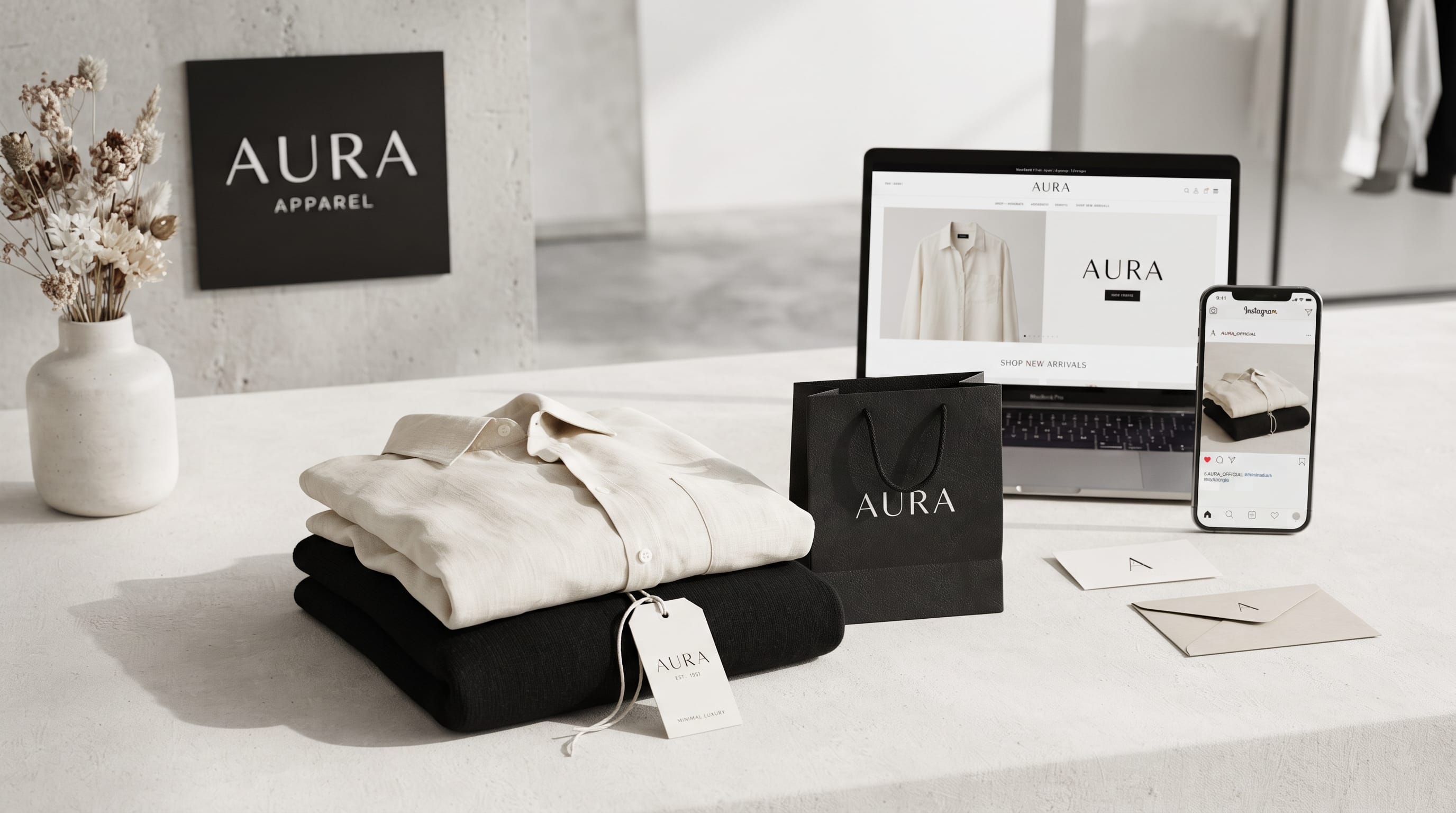
Strong minimalist branding examples show that a brand does not need excessive decoration to become memorable. A simple logo, carefully selected typography, limited color palette, and consistent use of spacing can often communicate more clearly than a complicated visual system. Minimalist branding works because it removes unnecessary elements and gives more attention to the details that matter most.
However, minimalism does not mean making everything plain.
Successful minimalist branding still needs personality, strategy, hierarchy, and visual distinction.
A black wordmark on a white background may look clean, but without thoughtful typography and positioning, it can also feel generic.
The best minimalist branding examples use simplicity with intention.
They create recognizable identities by controlling every visual element instead of adding more of them.
This guide explores practical minimalist branding directions designers can use for logos, packaging, websites, social media, stationery, and broader visual identity systems.
What Is Minimalist Branding?
Minimalist branding is a visual identity approach built around simplicity and clarity.
It often uses:
- Simple logos
- Limited color palettes
- Clean typography
- Generous whitespace
- Minimal decoration
- Structured grids
- Consistent imagery
The goal is to communicate the brand efficiently.
Instead of giving customers many visual signals at once, minimalist branding focuses attention on a smaller set of recognizable elements.
This can create an identity that feels:
- Modern
- Premium
- Calm
- Professional
- Timeless
The exact personality depends on how the system is designed.
Why Minimalist Branding Examples Are Useful for Designers
Studying minimalist branding examples can help designers understand how small choices create a larger identity.
You can learn from:
- Logo proportions
- Font selection
- Color relationships
- Grid systems
- Packaging hierarchy
- Photography direction
The goal is not to copy a finished identity.
Instead, ask why it works.
For example, a design may feel premium because it uses large amounts of whitespace, restrained typography, and one distinctive accent color.
Those principles can be adapted to a completely different brand.
1. Minimalist Branding Examples With Simple Wordmarks
Wordmark-based identities are among the clearest forms of minimalist branding.
They rely primarily on the company name.
A successful wordmark may use:
- Custom letter spacing
- Modified characters
- Distinct proportions
- Unusual capitalization
Because there is no complex symbol, typography becomes extremely important.
- A fashion brand might use a high-contrast serif wordmark.
- A technology company may choose a geometric sans serif.
- A wellness business could use a softer lowercase style.
The simplicity gives designers fewer places to hide weak decisions, so every detail needs attention.
2. Monogram-Based Minimalist Branding
Monograms reduce a brand name to one or two initials.
They are useful for:
- Fashion
- Beauty
- Interior design
- Hospitality
- Personal brands
- Premium services
A minimalist monogram may use:
- Interlocking letters
- Negative space
- Simple geometric forms
- Custom ligatures
Keep the design readable at small sizes.
A monogram should work on:
- Social avatars
- Product labels
- Favicon
- Embossing
- Packaging
The strongest minimalist branding examples often use a monogram as a compact secondary logo rather than replacing the primary wordmark entirely.
3. Black-and-White Minimalist Branding Examples
Black and white create one of the simplest visual systems.
This palette can feel:
- Editorial
- Modern
- Sophisticated
- Architectural
It works particularly well for:
- Fashion
- Photography
- Design studios
- Architecture
- Luxury services
However, black and white alone do not create a strong identity.
Typography and layout need to provide distinction.
A bold grotesk font creates a very different personality from an elegant serif.
The color system may be simple, but the design thinking should not be.
4. Neutral Minimalist Branding
Minimalism does not have to mean pure black and white.
Neutral palettes can create more warmth.
Consider:
- Cream
- Beige
- Warm gray
- Taupe
- Charcoal
- Soft brown
These colors work beautifully for:
- Home decor
- Wellness
- Skincare
- Fashion
- Lifestyle brands
For example:
Warm cream + charcoal
can feel softer than white and black.
Or:
Beige + dark brown
can create an earthy premium direction.
Neutral minimalist branding examples often rely heavily on texture and photography to prevent the identity from becoming too flat.
5. One-Accent-Color Minimalist Branding
A simple identity can become much more recognizable with one accent color.
For example:
Black + white + red
or:
Cream + charcoal + sage
The accent can appear in:
- Buttons
- Packaging labels
- Social graphics
- Website highlights
Use it consistently.
If the accent changes constantly, the brand loses one of its strongest recognition cues.
This approach works well for brands that want a clean foundation without becoming visually boring.
6. Minimalist Branding Examples With Bold Typography
Minimalism can still feel expressive.
One large typeface can create a powerful identity.
A bold typographic system might use:
- Oversized headlines
- Simple colors
- Strong grid alignment
- Large negative space
This is useful for:
- Creative studios
- Events
- Fashion
- Architecture
The typography becomes the main visual element.
Designers can create variation through:
- Scale
- Weight
- Position
- Cropping
instead of adding illustrations or decorative patterns.
7. Minimalist Branding With Elegant Serif Typography
Serif fonts can make simple branding feel more refined.
This works particularly well for:
- Luxury products
- Beauty
- Hospitality
- Editorial brands
- Interior studios
Pair the serif with a simple sans serif for smaller information.
For example:
- Primary: elegant serif
- Supporting: neutral sans serif
This creates hierarchy while keeping the identity controlled.
Strong minimalist branding examples often use typography pairing rather than many graphical elements to create personality.
Also Read: Summer Branding Ideas That Make Your Brand Stand Out
8. Minimalist Packaging Branding Examples
Packaging is a great place to apply minimalist branding.
A simple package might include:
- Logo
- Product name
- One color
- Small supporting text
The result can feel premium because customers are not overwhelmed with information.
This approach works especially well for:
- Skincare
- Food
- Coffee
- Candles
- Cosmetics
However, important product information still needs to remain visible.
Minimalism should improve clarity, not remove useful content.
9. Minimalist Skincare Branding
Skincare is one of the most common categories for minimalist visual identity.
A typical direction may include:
- White or cream packaging
- Black typography
- Small logo
- Simple ingredient information
- Clinical photography
For a softer natural direction, add:
- Sage
- Beige
- Warm gray
Avoid making every skincare brand look identical.
Small details such as custom typography, label structure, and color usage can create distinction.
10. Minimalist Food Branding Examples
Food packaging can also use a restrained identity.
For example, a premium chocolate company might use:
Dark brown + cream + serif typography
A coffee brand could use:
Black + warm beige + bold sans serif
A bakery might use:
Cream + muted terracotta + simple illustration
The product category should still be easy to understand.
Minimalist branding works best when simplicity improves communication rather than hiding what the product is.
11. Minimalist Branding Examples for Fashion
Fashion brands often benefit from simple visual systems because photography plays such a large role.
A fashion identity may use:
- Wordmark
- Monogram
- Black-and-white palette
- Clean product photography
The logo should not compete with the clothing.
Instead, it acts as a consistent signature across:
- Labels
- Packaging
- Website
- Social media
- Store signage
Minimal branding gives the products more visual space.
12. Minimalist Branding for Interior and Architecture Studios
Architecture and interior brands often use restrained design to communicate precision.
Useful elements include:
- Geometric typography
- Neutral colors
- Grid-based layouts
- Large project photography
A simple identity allows the portfolio work to remain the focus.
Avoid excessive visual effects.
One clear system across presentations, website pages, signage, and project documents can make the studio feel more professional.
13. Minimalist Branding Examples With Geometric Logos
Geometric logos can create modern and flexible identities.
Common approaches include:
- Circles
- Squares
- Simple lines
- Abstract letterforms
- Modular shapes
These marks work well for:
- Technology
- Architecture
- Consulting
- Creative studios
Keep the construction simple enough to recognize at small sizes.
Complex geometry may look interesting on a large presentation but disappear on a mobile screen.
14. Use Whitespace as Part of the Brand
Whitespace is one of the most important elements in minimal design.
It gives:
- Logos more presence
- Typography more clarity
- Images more focus
- Layouts more sophistication
Do not fill empty space simply because it exists.
For example, a product package may feel more premium if the logo occupies only a small area rather than filling the entire front panel.
Many strong minimalist branding examples feel expensive because they are comfortable leaving space unused.
15. Minimalist Branding Examples With Structured Grid Systems
A grid can keep branding consistent across many formats.
It helps align:
- Logos
- Headlines
- Images
- Body copy
- Buttons
- Product information
For example, a brand may use a consistent two-column structure on:
- Website pages
- Presentations
- Social media
- Brochures
The exact content changes, but the underlying structure remains recognizable.
This is particularly useful for brands that produce large amounts of content.
16. Minimal Photography Direction
Photography should also support the brand style.
Minimalist photography may use:
- Simple backgrounds
- Controlled lighting
- Limited props
- Clear focal points
- Consistent color treatment
A skincare brand might photograph one product on light stone with soft daylight.
A furniture brand could use clean interiors with generous negative space.
The visual environment should feel connected to the rest of the identity.
Also Read: 20 Spring Branding Ideas for a Fresh and Colorful Seasonal Look
17. Minimalist Branding Examples for Websites
A minimalist website may include:
- Simple navigation
- Large typography
- Limited colors
- Full-width photography
- Generous spacing
Avoid removing information simply to make the page look clean.
Users still need:
- Clear navigation
- Readable text
- Obvious buttons
- Useful product information
Minimal web design should reduce friction.
A page can be visually simple while still containing all the information visitors need.
18. Minimalist Social Media Branding
Social media often becomes visually crowded.
A minimalist brand can stand out by doing less.
Try:
- One image
- One headline
- Consistent margins
- Limited colors
Instead of adding borders, stickers, icons, gradients, and illustrations to every post, create a repeatable template.
This can make a social feed feel more organized.
Consistency is more important than making every post completely different.
19. Minimalist Branding Examples for Stationery
Stationery provides another opportunity to reinforce a simple identity.
Applications include:
- Business cards
- Letterheads
- Envelopes
- Notebooks
- Presentation folders
A minimalist business card might contain only:
- Front: logo
- Back: name and contact information
Premium paper or subtle embossing can add physical character without making the layout complicated.
20. Create a Minimalist Brand Color System
A simple brand may only need:
Primary Color
Used most frequently.
Secondary Color
Supports the main color.
Accent Color
Used sparingly.
Neutral Colors
For backgrounds and text.
For example:
- Primary: charcoal
- Secondary: warm cream
- Accent: muted green
The limited system makes it easier to maintain consistency.
21. Keep Typography Systems Simple
Too many fonts quickly weaken a minimalist identity.
Try using:
One font family
with several weights.
Or:
One display font + one body font
For example:
- Display: serif
- Body: sans serif
Create variation with:
- Size
- Weight
- Case
- Spacing
rather than constantly adding new typefaces.
22. Minimalist Branding Examples Without Looking Generic
The biggest challenge with minimalism is avoiding sameness.
Many brands use:
- Black wordmarks
- Beige backgrounds
- Clean sans serif fonts
To create distinction, consider:
- Custom letterforms
- Unique spacing
- Unexpected accent colors
- Strong photography
- Distinctive layouts
- Unusual logo proportions
One memorable detail can make a simple identity much stronger.
Minimal does not mean anonymous.
23. Make Minimalist Branding Flexible
A full visual identity should include more than one logo file.
Consider creating:
- Primary logo
- Secondary logo
- Monogram
- Icon
- Black version
- White version
- Color version
This gives the identity flexibility across different applications.
A long wordmark may work on a website header but not inside a social avatar.
A compact monogram solves that problem while remaining connected to the main identity.
Common Minimalist Branding Mistakes
Avoid several common problems.
Making the Brand Too Generic
Simple does not mean using the same visual language as everyone else.
Removing Too Much Information
Clarity comes before visual minimalism.
Using Weak Typography
Typography becomes more important when there are fewer elements.
Depending Only on Beige
Minimalism can use strong colors too.
Ignoring Brand Personality
The identity still needs emotional character.
Using Too Much Whitespace Without Structure
Space should support hierarchy.
Copying Inspiration Too Closely
Study design principles rather than reproducing existing identities.
A Simple Minimalist Branding Workflow
Use this process when developing a minimalist identity.
Define the Brand Personality
Choose three or four characteristics.
For example:
Modern, calm, premium, approachable
Simplify the Message
Clarify what the brand needs to communicate.
Explore Logo Directions
Try wordmarks, monograms, and simple symbols.
Choose a Limited Palette
Start with two or three key colors.
Build the Typography System
Choose fonts with clear roles.
Establish Layout Rules
Define grids, margins, and spacing.
Create Photography Direction
Keep images visually consistent.
Test Real Applications
Apply the identity to packaging, web, social media, and print.
Remove Unnecessary Elements
Simplify anything that does not improve recognition or communication.
Document the System
Create clear brand guidelines.
This turns inspiration into a usable identity rather than simply a collection of attractive references.
Also Read: Winter Branding That Inspire Beautiful Seasonal Designs
Final Thoughts on Minimalist Branding Examples
The best minimalist branding examples prove that simplicity can create a powerful visual identity when every decision has a clear purpose.
Minimal logos can become memorable through distinctive typography or clever monograms. Neutral colors can feel warm and sophisticated, while a single accent color can give a simple system more personality.
Minimalist packaging can communicate premium quality, and structured websites can improve readability while giving strong photography more space.
The goal is not to remove everything.
It is to remove what does not help.
A successful minimalist identity still needs strategy, hierarchy, personality, consistency, and enough distinctive detail to separate the brand from competitors.
Study minimalist branding examples for their underlying principles rather than copying the finished appearance. Look at how they use typography, spacing, grids, photography, color, and logo systems.
Then adapt those ideas to the brand you are designing.
When simplicity and distinction work together, minimalist branding can create an identity that feels clean, modern, memorable, and flexible enough to remain useful for years.

For high-quality fonts to boost your income, check out DM Letter Studio. Our professional fonts are perfect for branding, marketing, and content creation. So, don’t miss this opportunity.