
Minimalist Web Design Tips for Better User Experience
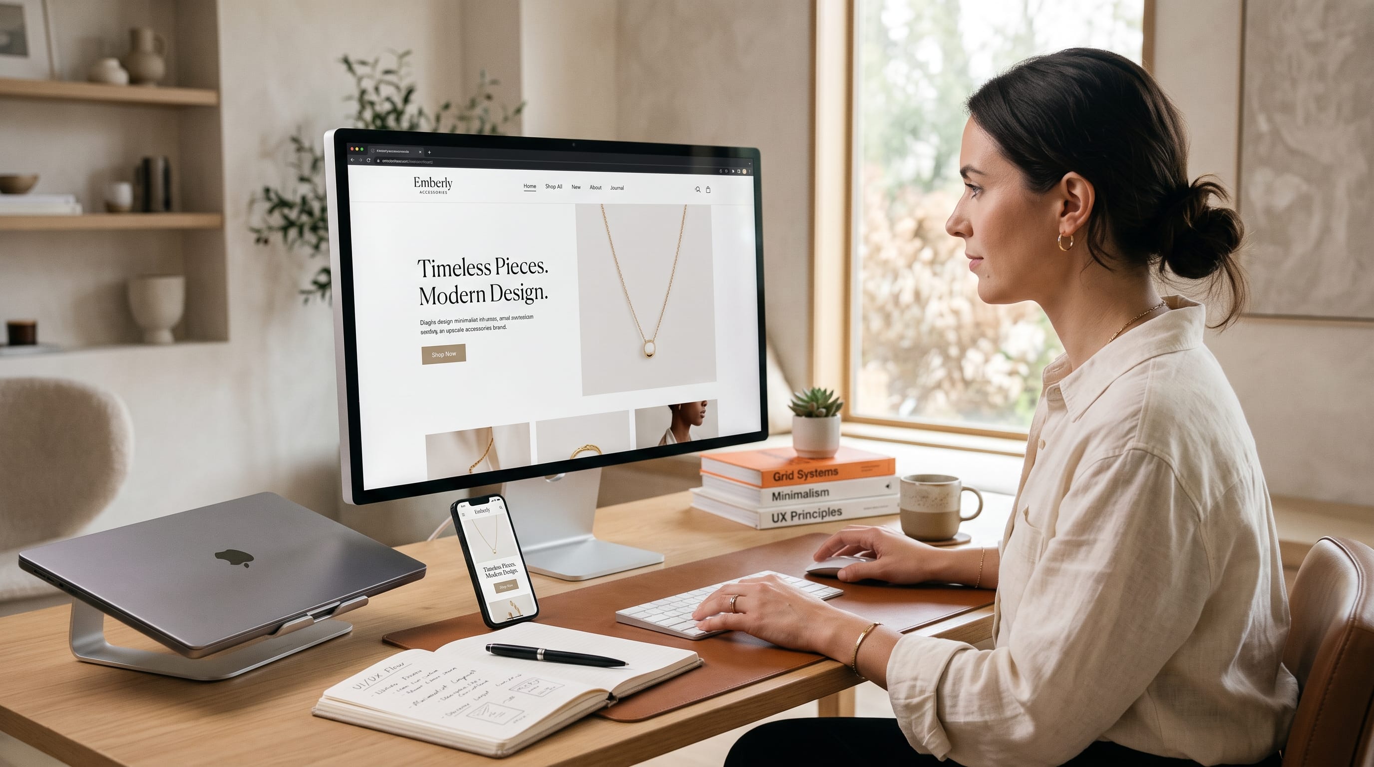
Minimalist web design focuses on removing unnecessary elements so users can understand and navigate a website more easily. Instead of filling every section with animations, decorative graphics, multiple colors, and long blocks of content, minimalist websites prioritize clarity, hierarchy, useful information, and intentional visual choices.
However, minimalism does not simply mean using a white background and very little content.
A successful minimalist website still needs personality, strong branding, useful features, and enough information to help visitors make decisions. The difference is that every element should have a clear purpose.
For designers, minimalism can improve both aesthetics and usability. Cleaner interfaces reduce distractions, make important actions easier to recognize, and often support faster page performance.
This guide explains practical minimalist web design techniques you can use to create websites that feel modern, professional, and easy to use.
Start Minimalist Web Design With a Clear Purpose
Before removing elements, determine what the website needs to accomplish.
A portfolio may need visitors to:
- View projects
- Understand the designer’s expertise
- Contact the designer
An ecommerce site may prioritize:
- Browsing products
- Comparing options
- Adding items to the cart
- Completing checkout
A service business may focus on:
- Explaining services
- Building trust
- Generating inquiries
Once the primary purpose is clear, evaluate every element against it.
Ask:
Does this element help visitors understand the website or complete an important action?
If the answer is no, consider removing it.
This mindset is one of the foundations of effective minimalist web design.
Use Whitespace as a Design Tool
Whitespace is one of the most recognizable characteristics of minimalist websites.
It refers to the empty area between:
- Headlines
- Paragraphs
- Images
- Buttons
- Navigation
- Sections
Whitespace creates separation and gives important content room to breathe.
For example, imagine a hero section containing:
Large headline
Short supporting statement
Primary CTA
Product image
If these elements are tightly packed, the section feels crowded.
Adding generous spacing allows the headline and CTA to receive more attention without increasing their size dramatically.
Whitespace also helps users understand which elements belong together.
Build Clear Visual Hierarchy
Minimalism relies heavily on hierarchy because fewer decorative elements are available to create emphasis.
Use:
- Size
- Weight
- Position
- Contrast
- Spacing
- Color
to show users what matters most.
A typical page hierarchy might look like:
- Main headline
- Primary CTA
- Section headings
- Body content
- Secondary information
Do not make every heading large and bold.
Variation creates structure.
For example:
- 48px: Hero headline
- 30px: H2 heading
- 20px: H3 heading
- 16px: Body copy
The exact sizes will depend on the project, but the relationships should remain obvious.
Keep Navigation Simple
Navigation is a critical part of minimalist web design.
Visitors should understand where links lead without having to think about them.
A small business site may only need:
- Home
- Services
- Work
- About
- Contact
An online shop may use:
- Shop
- Categories
- New
- About
- Cart
Avoid filling the main navigation with every page on the website.
Less important pages can appear in the footer.
Clear labels are also important.
Use Contact instead of something vague such as Let’s Connect With Possibilities.
Creative navigation labels can add personality, but clarity should come first.
Limit Your Minimalist Web Design Color Palette
Minimalist websites often use limited colors because fewer colors make hierarchy easier to control.
A simple palette could contain:
- Primary brand color
- Accent color
- Background
- Main text color
- Secondary text color
For example:
Neutral Minimalism
White
Charcoal
Light gray
Black
Warm Minimalism
Cream
Dark brown
Beige
Muted orange
Modern Technology
White
Black
Electric blue
Light gray
Natural Brand
Off-white
Deep green
Sage
Warm gray
One bright accent color can be especially effective for buttons and important links.
Use Color Strategically
When most of the page is neutral, color becomes powerful.
Imagine a mostly black-and-white interface with one bright blue button.
The user’s attention naturally moves toward that button.
This is more effective than making five different elements bright colors.
Use accent colors for:
- Primary CTA
- Important links
- Active states
- Selected options
- Key data
Strategic color reinforces the simplicity of minimalist web design while improving usability.
Choose Typography Carefully
Typography becomes extremely important in minimal layouts because text often carries much of the visual identity.
Choose fonts that are:
- Readable
- Appropriate for the brand
- Flexible across different sizes
- Clear on mobile screens
Most websites only need one or two font families.
For example:
Modern
Bold sans serif headline
Regular sans serif body
Editorial
Elegant serif headline
Simple sans serif body
Luxury
Refined serif headline
Neutral sans serif body
Creative
Expressive display headline
Clean body type
Avoid combining several decorative typefaces.
Strong typography should create personality without reducing readability.
Improve Minimalist Web Design With Better Line Length
Even beautiful typography becomes difficult to read when paragraphs stretch across extremely wide screens.
Keep body text within a comfortable width.
Long lines force the eye to travel too far.
Very short lines create unnecessary breaks.
For desktop layouts, place article or informational copy inside a narrower container rather than stretching it from edge to edge.
Also increase line height slightly to create breathing room.
These small decisions can significantly improve the reading experience.
Reduce Unnecessary Content
Minimalism should also apply to copy.
Review every section and ask whether it contributes useful information.
Instead of:
“Our innovative team is passionate about creating exceptional digital solutions designed to empower brands to achieve their goals in an increasingly competitive online environment.”
you might write:
“We design fast, conversion-focused websites for growing brands.”
The second version communicates the idea much faster.
Concise copy improves scanning and supports minimalist web design.
Break Long Content Into Sections
Minimal does not mean every website must contain very little information.
Some products and services require detailed explanations.
The solution is better structure.
Divide longer pages using:
- Headings
- Short paragraphs
- Lists
- Images
- FAQs
- Accordions
Users can scan the page and locate relevant information without confronting one massive block of text.
Content quantity is not necessarily the problem.
Poor organization is.
Also Read: Ecommerce Web Design Tips That Increase Sales
Create a Simple Hero Section
A minimalist hero section often needs only four elements:
- Headline
- Supporting text
- CTA
- Visual
For example:
Build Better Digital Products
Design and development for ambitious startups.
Start a Project
(Product interface image)
Avoid automatically adding:
- Multiple buttons
- Decorative icons
- Statistics
- Animated backgrounds
- Video
- Several paragraphs
- Social badges
unless they genuinely improve the experience.
The first screen should quickly communicate what the website offers.
Use One Primary Call to Action
A common design mistake is presenting several competing actions.
For example:
- Get Started
- Learn More
- Watch Video
- Subscribe
- Download Guide
When all five appear together, the user must decide which one matters.
Instead, establish one primary CTA.
Secondary actions can still exist, but they should have lower visual emphasis.
For example:
- Primary: Start Free Trial
- Secondary: View Demo
This creates a clearer path through the interface.
Use Simple Buttons
Buttons do not need complicated gradients, shadows, icons, animations, and decorative borders.
A minimalist button can use:
- Solid background
- Clear text
- Comfortable padding
- Subtle rounded corners
- Strong contrast
Make the interactive state obvious.
Users should immediately recognize clickable elements.
Consistency is equally important.
Use the same primary button style throughout the website.
Use Images With Purpose
Images can make minimalist layouts feel more engaging.
However, every image should contribute something.
Good uses include:
- Product photography
- Portfolio work
- Interface screenshots
- Team photography
- Service demonstrations
Avoid generic imagery that does not help visitors understand the product or brand.
One large, high-quality image often creates more impact than several smaller, unrelated images.
Use Consistent Image Treatments
Consistency strengthens minimalist interfaces.
Try maintaining similar:
- Aspect ratios
- Cropping
- Lighting
- Border radius
- Color treatment
For example, all portfolio thumbnails might use the same 4:3 ratio.
All product photos might use the same neutral background.
When visual rules stay consistent, the interface feels calmer and easier to scan.
Minimalist Web Design Should Still Feel Branded
Minimalism should not remove all personality.
Otherwise, different websites can begin to look identical.
Build character through:
- Typography
- Brand colors
- Photography
- Illustration
- Tone of voice
- Layout rhythm
- Small interactions
A luxury brand might use dramatic serif typography and generous whitespace.
A creative agency might use oversized type and experimental grid placement.
A technology startup might combine clean typography with bright accent colors.
The visual style can remain distinctive while still following minimalist principles.
Design a Consistent Spacing System
Random spacing creates visual inconsistency.
Instead, establish repeatable spacing values.
For example:
- 8px
- 16px
- 24px
- 32px
- 48px
- 64px
- 96px
Then reuse those values throughout the interface.
For example:
- Button padding: 16px
- Card gap: 24px
- Section spacing: 96px
A spacing system makes layouts easier to maintain and helps designers create visual rhythm.
Use Fewer Decorative Elements
Every additional:
- Line
- Shape
- Icon
- Pattern
- Background
- Border
adds visual information.
Before adding decoration, ask whether it improves hierarchy or communication.
A section may not need a colored background, icon, divider, shadow, and border simultaneously.
Often, spacing alone can separate sections effectively.
This is an important principle of minimalist web design.
Avoid Too Many Cards
Modern websites frequently place everything inside cards.
While cards are useful for grouping information, excessive card layouts can create visual clutter.
You do not necessarily need separate boxes around:
- Every service
- Every statistic
- Every paragraph
- Every image
Sometimes a simple grid with whitespace provides enough structure.
Use containers when they help establish relationships between elements.
Make Minimalist Web Design Mobile-Friendly
Minimalism can work especially well on mobile because limited screen space rewards clear priorities.
On smaller screens:
- Reduce unnecessary navigation
- Stack content logically
- Maintain readable typography
- Increase tap targets
- Simplify decorative elements
- Preserve adequate spacing
Do not simply shrink the desktop version.
Mobile layouts should be deliberately reorganized.
For example, a two-column hero may become:
- Headline
- Text
- CTA
- Image
This creates a more natural reading order.
Also Read: Dashboard UI Design Tips for Better Data Visualization
Improve Website Speed
A minimalist website should also feel fast.
Avoid unnecessary:
- Large videos
- Heavy animations
- Oversized images
- Third-party scripts
- Plugins
- Custom font files
Optimize images and load only the resources each page needs.
Faster performance supports better user experience and strengthens the overall feeling of simplicity.
Visual minimalism loses its value if the page takes too long to appear.
Use Animation Sparingly
Animation can improve minimalist interfaces when it provides feedback or direction.
Useful examples include:
- Button hover states
- Menu transitions
- Subtle image reveals
- Loading feedback
- Accordion expansion
Avoid animating every headline, image, card, and background simply because animation is available.
Movement attracts attention.
Therefore, too much movement creates competition.
Use animation where it supports usability.
Maintain Strong Contrast
Minimal designs sometimes use extremely pale colors in pursuit of a soft aesthetic.
This can damage readability.
Make sure there is enough contrast between:
- Text and background
- Buttons and surrounding areas
- Links and body copy
- Form borders and backgrounds
Light gray text on white may appear elegant on a design mockup but become difficult to read on real devices.
Good minimalist web design balances visual subtlety with practical accessibility.
Keep Forms Simple
Forms often create friction.
Ask only for information you actually need.
A contact form may require:
- Name
- Message
If you do not need the visitor’s phone number, company size, address, job title, and ten other details, do not request them.
Use clear field labels.
Make validation messages easy to understand.
Simple forms improve completion rates and fit naturally into minimalist interfaces.
Simplify Ecommerce Product Pages
Minimalist principles can also work well in ecommerce.
A product page should emphasize:
- Product image
- Name
- Price
- Key benefit
- Important options
- Add to Cart button
Secondary details such as:
- Shipping
- Specifications
- Care
- Returns
can appear farther down the page or inside expandable sections.
The goal is not to hide information.
Instead, organize it according to importance.
Use Minimalism to Improve Conversion Paths
A cleaner interface can make conversion paths easier to follow.
Imagine a service page with:
- One strong headline
- Clear benefits
- Three examples
- Customer testimonial
- Simple pricing
- Strong CTA
Now compare it with a page containing fifteen competing sections and several unrelated offers.
The first approach gives visitors fewer decisions.
This is where minimalist web design supports both usability and business goals.
Test Minimalist Web Design With Real Users
Designers understand their own interfaces because they built them.
Visitors do not have that advantage.
Test whether users can quickly:
- Understand the offer
- Find navigation
- Locate important information
- Recognize buttons
- Complete key actions
Watch for hesitation.
If several people struggle with the same element, simplify it.
Minimalism should reduce cognitive effort, not simply make the interface look cleaner.
Common Minimalist Web Design Mistakes
Removing Too Much Content
Minimalism should simplify information, not eliminate information customers need.
Weak Visual Hierarchy
Whitespace alone cannot establish priority.
Excessive White Space
Too much space can make related content feel disconnected.
Tiny Typography
Small text does not automatically look sophisticated.
Low Contrast
Accessibility should remain a priority.
Hidden Navigation
Do not sacrifice usability for a visually cleaner header.
Generic Branding
Minimalism still needs personality.
Too Many Animations
Movement can create unnecessary distraction.
Overly Abstract Copy
Clear language is more useful than vague brand statements.
Ignoring Mobile Layouts
A clean desktop design does not guarantee a good mobile experience.
Minimalist Web Design Checklist
Before launching your website, review these questions:
- Is the website’s purpose immediately clear?
- Does each page have one primary goal?
- Is navigation simple?
- Is typography easy to read?
- Is the color palette controlled?
- Is there enough contrast?
- Does whitespace improve hierarchy?
- Are images useful rather than decorative?
- Are calls to action obvious?
- Is content concise and scannable?
- Is spacing consistent?
- Are unnecessary elements removed?
- Does the mobile layout work properly?
- Are forms simple?
- Does the website load quickly?
- Are interactions easy to understand?
- Does the design still feel like the brand?
A minimalist website should feel effortless to use even when significant thought has gone into every detail.
Also Read: Website Color Schemes That Build a Strong Brand Identity
Final Thoughts on Minimalist Web Design
Successful minimalist web design is not about making a website empty. It is about creating clarity by deciding what deserves attention and removing elements that compete with it.
Begin with purpose.
Determine what visitors need to understand and what action they should take. Then build the interface around those priorities.
Use whitespace to separate content, typography to establish hierarchy, color to guide attention, and imagery to support the message. Simplify navigation and forms while keeping important information easy to find.
At the same time, do not remove so much that the website becomes confusing or generic.
Strong minimalist web design still needs branding, personality, useful content, trust, and visual interest.
The most effective minimalist interfaces often feel simple because their design systems are carefully organized behind the scenes. Consistent spacing, restrained colors, clear typography, purposeful imagery, and predictable interactions work together to reduce cognitive effort.
Performance matters too. A visually simple website should also load quickly and work smoothly across mobile and desktop devices.
Finally, evaluate your design from the user’s perspective.
Can visitors immediately understand what the website offers?
Can they navigate without hesitation?
Can they find important information and complete essential actions easily?
If the answer is yes, your minimalist web design is doing more than following an aesthetic trend. It is improving the user experience by making the website clearer, faster, more focused, and easier to use.

For high-quality fonts to boost your income, check out DM Letter Studio. Our professional fonts are perfect for branding, marketing, and content creation. So, don’t miss this opportunity.