
Modern Web Typography Trends for Better Visual Hierarchy
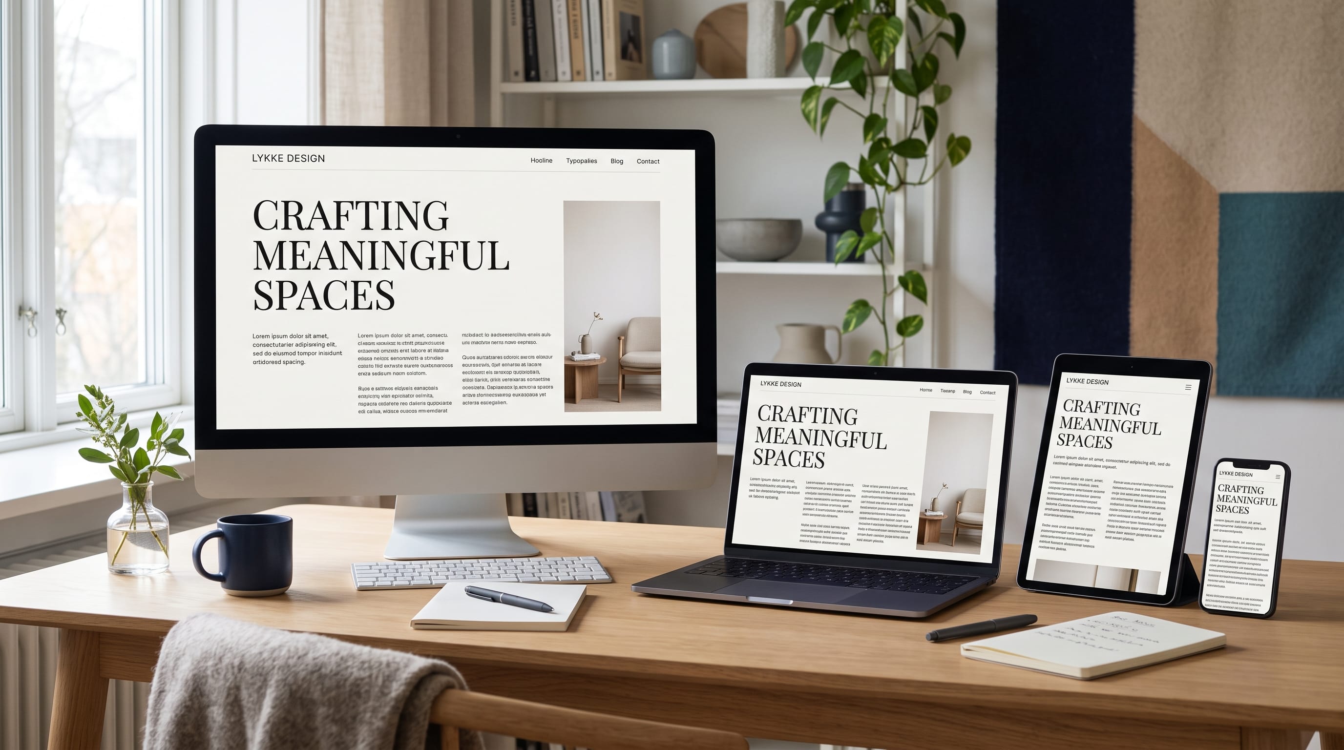
Modern web typography trends are changing how designers organize information, express brand personality, and guide visitors through digital content. Typography is no longer treated as a decorative layer added after the website layout is complete. It has become one of the main structural tools used to establish hierarchy, improve readability, and direct attention.
A website may contain strong photography, attractive colors, and polished animations, but it can still feel confusing when the typography system is inconsistent. Visitors need to understand which text is the main headline, which sections are important, what information supports the message, and where they should click next.
Modern typography combines expressive visual choices with practical considerations such as responsive sizing, loading performance, accessibility, and mobile readability. Large headlines, variable fonts, serif and sans serif pairings, animated type, and editorial layouts can all strengthen a website when used intentionally.
This guide explores important modern web typography trends and explains how creators can use them to build stronger visual hierarchy without sacrificing clarity or usability.
Why Modern Web Typography Trends Matter
Typography affects nearly every part of a digital experience.
It helps users:
- Identify the main message
- Understand content relationships
- Scan pages quickly
- Recognize interactive elements
- Read longer articles comfortably
- Distinguish headings from supporting information
- Connect the website with a specific brand personality
- Navigate across different sections
A clear type system reduces the amount of effort needed to understand a page.
When several text elements look equally important, visitors must decide where to begin. When typography creates an obvious hierarchy, the page becomes easier to scan.
The best modern web typography trends balance distinction with consistency. Designers can experiment with scale, weight, spacing, and movement, but the text should remain understandable on every screen.
1. Oversized Website Headlines
Oversized headlines are one of the most recognizable modern web typography trends. Designers use very large type to make the message the primary visual element of a page.
A large headline can:
- Establish a clear focal point
- Communicate confidence
- Replace unnecessary decorative graphics
- Strengthen brand personality
- Create a dramatic first impression
This approach works especially well for:
- Creative agencies
- Portfolios
- Product launches
- Fashion brands
- Editorial websites
- Technology companies
The headline should remain concise. A short phrase can support an extremely large scale, while a long sentence may create awkward line breaks and excessive scrolling.
Control Oversized Type on Mobile
Large desktop typography should not simply shrink automatically without review.
On smaller screens, adjust:
- Font size
- Line height
- Letter spacing
- Maximum width
- Line breaks
- Section padding
The message should still feel important without occupying several full screens.
2. Fluid and Responsive Typography
Responsive typography adapts to different screen dimensions.
Instead of using one fixed heading size for every device, fluid type can scale gradually between minimum and maximum values. This creates smoother transitions across smartphones, tablets, laptops, and large monitors.
Responsive modern web typography trends focus on maintaining proportion rather than only reducing size.
Designers should test:
- Headline wrapping
- Paragraph width
- Navigation labels
- Button text
- Captions
- Form labels
- Article headings
A heading that looks balanced on a desktop may break into five short lines on a mobile screen. Responsive adjustments help preserve the intended hierarchy.
Maintain Comfortable Body Text
Body text should remain readable without requiring visitors to zoom.
Use sufficient:
- Font size
- Line spacing
- Paragraph spacing
- Color contrast
- Text-column width
Responsiveness should improve reading comfort rather than simply make every element fit.
3. Variable Fonts in Modern Web Design
Variable fonts contain multiple adjustable styles within one font file.
Depending on the typeface, designers may control:
- Weight
- Width
- Slant
- Optical size
- Contrast
- Custom stylistic properties
This allows typography to adapt more smoothly across layouts and screen sizes.
A heading may use a wider, heavier variation on desktop and a narrower version on mobile. Interactive text could also shift weight when users hover over a link or button.
Variable fonts can support stronger hierarchy while potentially reducing the need to load many separate font files.
However, designers should avoid treating every available axis as an animation opportunity. The adjustment should support readability, emphasis, or brand character.
4. Expressive Serif Fonts
Serif fonts have become a major part of contemporary digital design. They can make websites feel editorial, sophisticated, warm, or distinctive.
Modern serif styles may include:
- High-contrast letterforms
- Soft rounded details
- Sharp fashion-inspired shapes
- Classic editorial proportions
- Unusual curves
- Decorative terminals
Expressive serifs are useful for:
- Fashion websites
- Creative portfolios
- Cultural publications
- Beauty brands
- Hospitality
- Lifestyle blogs
- Premium products
One of the strongest modern web typography trends is pairing a distinctive serif heading with a clean sans serif body font.
This creates contrast without requiring multiple decorative typefaces.
Use Serif Fonts Selectively
Highly expressive serif fonts are usually most effective in:
- Headlines
- Section titles
- Pull quotes
- Product names
- Short statements
For long paragraphs, choose a serif designed specifically for comfortable screen reading or use a neutral sans serif.
5. Clean Sans Serif Typography
Sans serif fonts remain essential for modern websites because they can provide clarity across interfaces, navigation, dashboards, and long-form content.
Clean sans serif typography works well for:
- Technology products
- Business websites
- Applications
- Ecommerce
- Educational platforms
- Service companies
- Online publications
Designers are increasingly using sans serif families with a broader range of personalities rather than relying only on plain geometric styles.
A modern sans serif may feel:
- Friendly
- Technical
- Editorial
- Minimal
- Human
- Industrial
- Premium
The font should match the brand rather than being selected only because it looks neutral.
6. Serif and Sans Serif Font Pairing
Combining serif and sans serif typefaces remains one of the most practical modern web typography trends.
A common system uses:
- Serif for large headings
- Sans serif for body text
- Sans serif for navigation and buttons
- Serif for quotes or editorial accents
The contrast helps visitors distinguish content levels quickly.
Choose fonts that differ clearly while sharing compatible proportions or visual energy.
Avoid pairing two fonts that are only slightly different. The result may look inconsistent instead of intentional.
Build a Limited Font System
Most websites need no more than two main type families.
A practical structure may include:
- Display font for H1 and selected H2 headings
- Body font for paragraphs, navigation, buttons, labels, and captions
Different weights within those families can create additional hierarchy without introducing more fonts.
7. Editorial Typography Layouts
Editorial layouts borrow principles from magazines, newspapers, and printed publications.
They often include:
- Large headlines
- Narrow text columns
- Small category labels
- Pull quotes
- Oversized numbers
- Structured grids
- Generous margins
- Distinctive image captions
Editorial modern web typography trends are popular because they make digital content feel curated and intentional.
This style is especially suitable for:
- Blogs
- Online magazines
- Portfolios
- Cultural websites
- Fashion publications
- Case studies
- Brand stories
The structure should still adapt to mobile screens. Multi-column desktop layouts normally need to become simpler single-column compositions on smartphones.
8. Typography as the Main Visual Element
Some modern websites use typography instead of large photographs or illustrations.
The design may rely on:
- Oversized words
- Repeated phrases
- Dramatic line breaks
- Rotated labels
- Contrasting weights
- Bold color blocks
- Layered text
- Custom letterforms
This approach can reduce the need for generic visual assets and create a more distinctive brand presence.
Typography-led layouts are useful for creative studios, events, campaigns, personal portfolios, and digital products.
The text must still communicate clearly. Decorative placement should not make important words difficult to read.
9. Strong Contrast Between Type Sizes
Visual hierarchy becomes clearer when text levels have meaningful differences.
A weak system may use:
- H1 at 40 pixels
- H2 at 36 pixels
- H3 at 32 pixels
These sizes are too similar to establish a strong hierarchy.
A more distinctive scale may use:
- H1 as a large display element
- H2 as a clear section title
- H3 as a smaller supporting heading
- Body text at a comfortable reading size
- Captions and labels at a controlled smaller size
Size should be supported by weight, spacing, and position.
The goal is not to create extreme contrast everywhere. It is to help visitors identify the relationship between content levels.
Also Read: Website Color Schemes That Build a Strong Brand Identity
10. Condensed Fonts for Bold Headlines
Condensed fonts have narrow letterforms that allow designers to fit more characters into a limited horizontal space.
They are useful for:
- Headlines
- Posters
- Event websites
- Navigation labels
- Product campaigns
- Editorial sections
- Sports or entertainment branding
Condensed typography can create a strong, energetic appearance.
However, narrow fonts may become difficult to read when used for body text or displayed at very small sizes.
Use condensed fonts for short, high-impact text and pair them with a more open typeface for paragraphs.
11. Wide and Extended Typography
Wide typefaces create a different visual effect. They may feel futuristic, confident, luxurious, or experimental.
Extended lettering is often used in:
- Technology branding
- Fashion websites
- Automotive design
- Music projects
- Product launches
- Portfolio introductions
Wide typography requires enough horizontal space, so designers should create alternative settings for mobile devices.
This is one of the more expressive modern web typography trends, but it should be applied selectively. Wide text can quickly dominate a page and reduce flexibility.
12. Monospace Fonts in Digital Interfaces
Monospace fonts give every character the same horizontal width. They were traditionally associated with typewriters and coding environments.
Modern designers use them for:
- Technical labels
- Metadata
- Dates
- Navigation accents
- Product specifications
- Portfolio categories
- Interface details
- Editorial captions
A monospace font can make a website feel technical, systematic, or intentionally retro.
It usually works best as a supporting typeface rather than the primary body font.
For example, a creative portfolio may use a serif headline, sans serif paragraphs, and small monospace project labels.
13. Lowercase Typography
Lowercase typography can create a softer, friendlier, and less formal personality.
It is often used for:
- Creative studios
- Lifestyle brands
- Personal portfolios
- Youth-focused products
- Wellness companies
- Modern applications
Lowercase wordmarks and headings can feel approachable, but they should not weaken clarity.
Long headings, navigation labels, and proper names may still benefit from standard capitalization.
Use lowercase as part of a deliberate brand system rather than applying it inconsistently.
14. Uppercase Microcopy and Labels
While large blocks of uppercase text can be difficult to read, uppercase works well for short labels.
Examples include:
- Categories
- Dates
- Navigation accents
- Section numbers
- Product types
- Button labels
- Metadata
Uppercase labels can create contrast between supporting information and larger headlines.
Add slight letter spacing when appropriate, but avoid making the text so widely spaced that it feels disconnected.
This combination of small uppercase labels and large expressive headings is common in editorial modern web typography trends.
15. Highlighted Words Inside Headlines
Designers can emphasize selected words within a headline using:
- Different color
- Italic style
- Heavier weight
- Underline
- Outline
- Alternative font
- Background shape
For example, a headline may use a clean sans serif while one important word appears in an expressive italic serif.
This creates a focal point and reinforces the message.
Use the technique selectively. Highlighting several words with different treatments can make the headline feel chaotic.
One strong contrast is usually more effective than multiple decorative changes.
16. Italic Typography for Expression
Italic typography is increasingly used as a visual accent instead of only for traditional emphasis.
A designer may use italics to communicate:
- Movement
- Emotion
- Elegance
- Urgency
- Personal voice
- Contrast
Expressive italic serifs work especially well in fashion, beauty, editorial, and cultural websites.
Keep highly stylized italics limited to short phrases or selected words. Long paragraphs need a more comfortable reading style.
17. Outlined and Hollow Text
Outlined typography removes the solid interior of the letters and displays only their edges.
It can create a modern, layered, or experimental appearance.
Outlined text works well for:
- Background words
- Large page numbers
- Decorative headings
- Hover effects
- Event graphics
- Creative portfolios
It should not be used for essential small text because thin outlines may disappear against complex backgrounds.
Check contrast carefully and provide a solid-text alternative when the wording is important.
18. Layered Typography and Images
Some modern web typography trends combine words with photography, video, illustration, or 3D graphics.
Text may:
- Appear behind a person
- Overlap a product
- Move across an image
- Become partially masked
- Interact with scrolling
- Change according to background content
Layering can create visual depth, but readability must remain the priority.
Do not hide essential parts of the headline behind images. The message should remain understandable even when decorative layering is removed.
19. Kinetic and Animated Web Typography
Animated typography can make a website feel interactive and expressive.
Possible effects include:
- Revealing words
- Changing weight
- Sliding lines
- Rotating labels
- Scrolling marquees
- Morphing letters
- Cursor-based movement
- Hover transformations
Motion should support the meaning or interaction.
For example, a menu label may shift slightly when hovered over, confirming that it is clickable. A headline may reveal line by line to control reading order.
Avoid animating every text element. Excessive movement can reduce readability and distract users.
Websites should also respect reduced-motion preferences.
Also Read: Website Layout Design Principles Every Designer Should Know
20. Scrolling Marquee Text
Marquee text moves continuously across the screen.
It is often used for:
- Announcements
- Brand messages
- Event details
- Product categories
- Promotional statements
- Decorative transitions
This technique can create energy and movement without using video.
However, continuously moving text should not contain essential information that users must read carefully.
Provide important details elsewhere in a stable format.
Use marquee typography as a supporting visual feature rather than the only method of communication.
21. Brutalist Web Typography
Brutalist typography often uses direct, raw, and intentionally unconventional design choices.
It may include:
- Large system fonts
- Strong black-and-white contrast
- Tight spacing
- Exposed grids
- Unpolished alignment
- Basic hyperlinks
- Limited decoration
This style can make creative projects feel rebellious or experimental.
However, intentional roughness should not become poor usability. Navigation, text contrast, and interaction should remain understandable.
Brutalist modern web typography trends work best when the visual approach matches the brand’s personality.
22. Soft and Humanist Typography
Not every modern website needs extreme contrast or experimental layouts.
Humanist typefaces use organic proportions and open letterforms that can make digital experiences feel warmer and easier to read.
They suit:
- Education
- Healthcare
- Wellness
- Nonprofits
- Family services
- Community platforms
- Professional businesses
Soft typography may use rounded details, gentle weights, and comfortable spacing.
This approach is especially valuable when the website needs to communicate trust, accessibility, and friendliness.
23. Dark-Mode Typography
Dark interfaces require careful typography decisions.
White text on a completely black background can create strong contrast but may feel harsh during long reading sessions.
Consider using:
- Soft off-white text
- Dark charcoal backgrounds
- Controlled accent colors
- Moderate font weights
- Comfortable line spacing
Thin fonts may appear weaker in dark mode, while bright colors can become visually intense.
Test headings, body text, links, buttons, and form labels in both light and dark settings.
Dark mode should be designed intentionally rather than created by automatically reversing every color.
24. Accessible Website Typography
Accessibility is a critical part of modern web typography trends.
A visually impressive type system should remain readable for people with different visual, cognitive, and physical needs.
Important considerations include:
- Sufficient color contrast
- Readable body-text size
- Clear heading hierarchy
- Comfortable line spacing
- Limited paragraph width
- Visible link styles
- Keyboard focus indicators
- Scalable text
- Meaningful labels
Do not place essential text inside images when real HTML text can be used.
Users should be able to increase text size without breaking the layout.
Accessibility improves the experience for a wider audience and often strengthens the overall design.
25. Performance-Friendly Web Fonts
Typography can affect website loading speed.
Using too many typefaces, weights, and styles may increase the amount of data visitors must download.
Improve performance by:
- Limiting font families
- Loading only necessary weights
- Using variable fonts when appropriate
- Removing unused characters where technically suitable
- Preloading essential fonts
- Providing reliable fallback fonts
- Avoiding unnecessary decorative type assets
A type system does not need ten font styles to feel sophisticated.
A smaller, carefully selected set often creates stronger consistency and better performance.
How to Build a Modern Web Typography System
Begin by defining the main text roles.
A practical system may include:
- Display headline
- H1 page title
- H2 section heading
- H3 supporting heading
- Body text
- Introductory paragraph
- Button text
- Navigation
- Caption
- Small label
For each role, define:
- Font family
- Font size
- Weight
- Line height
- Letter spacing
- Color
- Maximum width
- Responsive behavior
Document the system so the same styles can be reused across every page.
A consistent type system makes it easier to add content without redesigning the hierarchy each time.
How to Improve Visual Hierarchy With Typography
1. Make the Main Message Obvious
The largest or strongest text should usually communicate the page’s primary subject.
2. Create Meaningful Size Differences
Heading levels need enough contrast to show their relationship.
3. Use Weight Strategically
Bold text should identify important information rather than appear in every paragraph.
4. Control Text Width
Long lines are difficult to follow. Use a comfortable maximum width for paragraphs.
5. Add Consistent Spacing
The space above and below headings helps separate sections.
6. Limit Accent Styles
Use italics, colors, and decorative fonts only where they create useful emphasis.
7. Maintain Repetition
Repeated typography patterns help visitors understand unfamiliar pages quickly.
Common Web Typography Mistakes
1. Using Too Many Fonts
Several unrelated fonts can weaken brand consistency and increase loading time.
2. Choosing Style Over Readability
A decorative font may look impressive but fail in small sizes or long paragraphs.
3. Weak Heading Hierarchy
Similar font sizes make content harder to scan.
4. Ignoring Mobile Line Breaks
Large headlines may become awkward on narrow screens.
5. Using Body Text That Is Too Small
Visitors should not need to zoom to read comfortably.
6. Poor Color Contrast
Light text on a light background can make important information inaccessible.
7. Using Excessive Uppercase Text
Long uppercase paragraphs are harder to read.
8. Animating Essential Information
Users should be able to read important content without waiting for movement.
9. Loading Too Many Font Weights
Unused font files can reduce performance without improving the design.
10. Inconsistent Typography Across Pages
Headings, buttons, captions, and navigation should follow a shared system.
Modern Web Typography Trends Checklist
Before launching a typography system, confirm that:
- The H1 is clearly identifiable
- H2 and H3 levels are distinct
- Body text is comfortable to read
- Paragraph lines are not excessively wide
- Font contrast is accessible
- Mobile headlines wrap naturally
- Links are recognizable
- Buttons remain readable
- Fonts load efficiently
- Decorative styles are used selectively
- Type remains clear over images
- Reduced-motion preferences are respected
- Text can scale without breaking layouts
- Font choices support the brand
- Every type style has a clear purpose
Also Read: Top Website Design Trends That Will Dominate 2026
Final Thoughts on Modern Web Typography Trends
The strongest modern web typography trends combine visual expression with functional hierarchy. Oversized headlines, variable fonts, expressive serifs, clean sans serifs, editorial layouts, and animated type can all make a website more distinctive.
However, typography should always help users understand the content. A design becomes less effective when decorative fonts, extreme sizes, weak contrast, or constant movement interfere with readability.
Begin with a clear type scale and define the role of every text style. Use meaningful differences in size, weight, spacing, and color to guide attention. Test the complete system across desktop, tablet, and mobile layouts.
Limit font families and load only the styles the website genuinely needs. Maintain strong contrast, comfortable paragraph widths, and accessible body-text sizes.
The best modern web typography trends are not valuable simply because they look fashionable. They are valuable because they help brands communicate more clearly, make content easier to navigate, and turn typography into a functional part of the user experience.
When visual personality and readability work together, web typography becomes more than text styling. It becomes the structure that connects content, branding, and interaction across the entire website.
For high-quality fonts to boost your income, check out DM Letter Studio. Our professional fonts are perfect for branding, marketing, and content creation. So, don’t miss this opportunity.