
Packaging Design Strategy for Better Shelf Impact and Branding
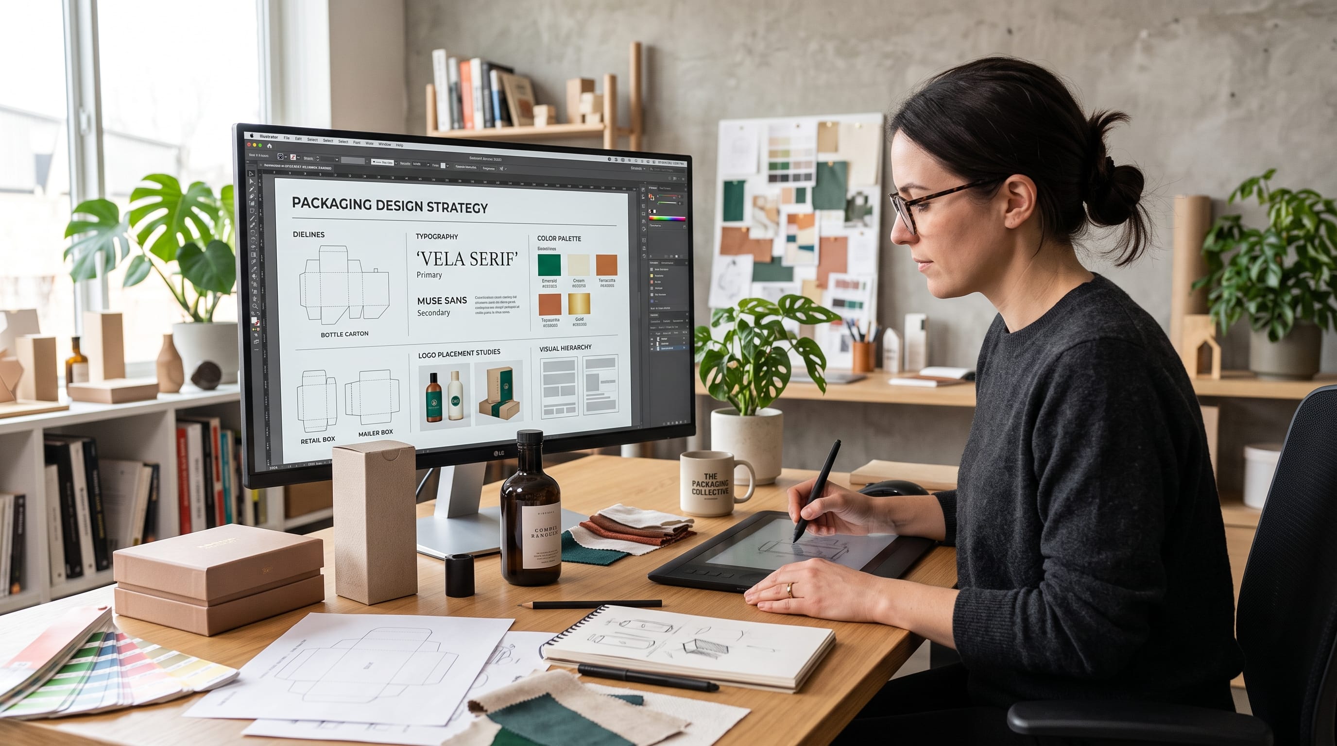
A strong packaging design strategy helps a product attract attention, communicate its value quickly, and remain recognizable across different formats and product lines. Packaging is not only a container. It is also a major brand touchpoint that influences how customers notice, understand, compare, and remember a product.
On a crowded retail shelf, customers may only spend a few seconds deciding what deserves closer attention. Online, the same package may appear as a small thumbnail surrounded by competing products. This means packaging needs to work at several levels at once.
It should be distinctive without becoming confusing.
It should communicate the category without looking identical to competitors.
It should also support long-term brand consistency as the business launches new variants, sizes, and product extensions.
A thoughtful packaging design strategy brings these decisions together before individual layouts are created.
Start Packaging Design Strategy With Clear Business Goals
Before choosing colors or typography, define what the packaging needs to achieve.
Possible goals include:
- Improve shelf visibility
- Strengthen brand recognition
- Support a premium price
- Attract a new audience
- Differentiate from competitors
- Simplify a growing product range
- Make variants easier to identify
- Improve ecommerce presentation
- Modernize an outdated brand
The objective influences nearly every visual decision.
For example, a business trying to enter the premium market may need restrained colors, stronger materials, and a simpler visual hierarchy.
A brand launching many new flavors may need a clearer system for color coding and variant names.
Without a clear goal, packaging decisions can become decorative rather than strategic.
Understand the Target Customer
An effective packaging design strategy begins with the people expected to buy the product.
Ask:
- Who is the ideal customer?
- What do they value?
- Where do they shop?
- What competing products do they already buy?
- What price range feels normal to them?
- What visual styles attract them?
- What information do they need before purchasing?
A premium skincare customer may respond differently from someone buying an affordable family snack.
The package should therefore reflect both the product and the expectations of its audience.
Research the Competitive Shelf
Packaging should never be designed only on a blank artboard.
Study the environment where the product will appear.
Look at competitors and document:
- Dominant colors
- Common typography
- Package shapes
- Photography styles
- Logo placement
- Information hierarchy
- Visual trends
Then ask:
- What does everyone look similar in?
- What visual territory is underused?
This research helps identify opportunities for differentiation.
For example, if nearly every competitor uses white and green packaging, a restrained burgundy or deep blue package may create stronger contrast while still feeling appropriate.
Packaging Design Strategy for Better Shelf Impact
Shelf impact is the ability of packaging to attract attention and remain recognizable among competing products.
Strong shelf impact does not always mean using the brightest color.
It can come from:
- Unusual simplicity
- Bold typography
- Distinctive color
- Consistent geometry
- Strong photography
- Unique package structure
The important question is whether the product can be recognized quickly.
A simple black package may stand out more than a neon one if the rest of the category is bright.
Context determines impact.
Build a Clear Visual Hierarchy
Customers should understand the package quickly.
A useful hierarchy often includes:
- Brand
- Product type
- Variant or flavor
- Main benefit
- Supporting details
Not every element deserves equal visual weight.
If the logo, flavor, certification, claim, illustration, product name, and promotion are all equally large, the package becomes difficult to scan.
A stronger packaging design strategy establishes rules for which information should be noticed first.
Make the Brand Easy to Recognize
Brand recognition should remain consistent across the full product range.
Create stable elements such as:
- Logo placement
- Core typography
- Main brand color
- Graphic motif
- Layout grid
- Illustration style
These should remain recognizable even when product variants change.
For example, a beverage brand may keep the same large wordmark and label structure while using different colors for each flavor.
The customer sees variety but still recognizes the parent brand immediately.
Use Color Strategically
Color is one of the fastest ways to create shelf recognition.
A strong packaging system might include:
Primary Brand Color
Used across all products.
Secondary Brand Colors
Support layouts and categories.
Variant Colors
Differentiate flavors or product types.
Neutral Colors
Create balance.
Accent Colors
Highlight important information.
Avoid changing every visual element for every SKU.
If each package looks completely different, customers may not realize they belong to the same brand.
Packaging Design Strategy for Product Variants
Growing brands often struggle with product extensions.
The first package may look good individually, but problems appear when ten variants are added.
Plan scalability from the beginning.
Decide which elements remain fixed and which can change.
For example:
Fixed
- Logo
- Grid
- Typography
- Product name placement
Variable
- Color
- Flavor illustration
- Variant name
This creates a flexible system without losing consistency.
Choose Typography for Recognition and Readability
Typography affects both personality and usability.
Use type to create clear roles.
Display Typeface
For the brand name or main product title.
Supporting Typeface
For benefits, descriptions, and secondary information.
Functional Typeface
For ingredients, instructions, or regulatory copy.
Avoid using too many fonts.
Two well-chosen typefaces are often enough.
Typography should remain readable at actual packaging size, not only when zoomed in on a monitor.
Use Large Product Names When Needed
Some brands benefit from emphasizing the product rather than the company name.
For example:
MATCHA LATTE
may appear much larger than the logo.
This can work if shoppers search by product type.
However, if the business is trying to build strong brand awareness, the brand name may deserve greater prominence.
The correct hierarchy depends on marketing goals.
Create a Distinctive Graphic Language
A strong packaging design strategy can include a recognizable set of visual assets.
Examples include:
- Repeating patterns
- Geometric shapes
- Illustration systems
- Icon styles
- Frames
- Texture
- Photography treatment
These elements help build recognition beyond the logo.
A simple wave, arch, stripe, or pattern can become a signature element across packaging, websites, advertisements, and social content.
Also Read: Gift Box Packaging Design for Better Customer Experience
Use Photography With Purpose
Product photography can help communicate:
- Ingredients
- Flavor
- Texture
- Usage
- Lifestyle
Food packaging may show the product itself.
Beauty packaging may benefit from cleaner, more minimal imagery.
Photography should support positioning.
A premium brand may use controlled, editorial photography.
A family snack might use brighter, more energetic images.
Avoid adding photography simply because competitors use it.
Use Illustration to Build Brand Personality
Illustration can make a brand more ownable.
It works especially well for:
- Food
- Beverages
- Children’s products
- Natural products
- Craft products
Choose one illustration direction and maintain it.
Possible styles include:
- Minimal line art
- Hand-drawn
- Botanical
- Geometric
- Vintage
- Playful cartoon
Inconsistent illustration styles can make a product range feel fragmented.
Packaging Design Strategy for Premium Products
Premium packaging often relies on restraint.
Consider:
- Fewer colors
- Larger margins
- Refined typography
- Strong materials
- Subtle finishes
Possible palettes include:
- Black + gold
- Cream + burgundy
- Navy + champagne
- Forest green + ivory
However, premium does not automatically mean metallic.
Quality can also come from:
- Texture
- Print precision
- Structural design
- Excellent typography
- Controlled spacing
Luxury packaging should feel intentional rather than overloaded.
Packaging Design Strategy for Affordable Brands
Affordable does not need to look cheap.
Value-focused packaging should communicate:
- Clarity
- Confidence
- Accessibility
Use:
- Strong product names
- Easy-to-read claims
- Simple illustrations
- Efficient hierarchy
Avoid unnecessary visual clutter.
Customers should understand the offer quickly.
Design for Ecommerce as Well as Retail
Modern packaging has to perform both physically and digitally.
In ecommerce, shoppers may see the package as a very small image.
Test whether these elements remain visible:
- Brand name
- Product type
- Key color
- Main visual asset
Details that work in-store may disappear online.
A strong packaging design strategy considers both thumbnail impact and physical shelf presence.
Use Package Structure as Part of Branding
The physical shape of the package can contribute to recognition.
Consider:
- Box proportions
- Bottle silhouette
- Closure style
- Label shape
- Window placement
Distinctive structure can become a major brand asset.
However, structural innovation should still consider:
- Cost
- Manufacturing
- Transportation
- Storage
- Shelf efficiency
A beautiful shape that creates major operational problems may not be sustainable for the business.
Consider Materials Early
Material decisions influence perception.
Examples include:
Kraft Paper
Feels natural and handmade.
Matte Finish
Feels modern and premium.
Glossy Finish
Can feel energetic and commercial.
Textured Stock
Can create tactile sophistication.
Clear Packaging
Can communicate honesty and product visibility.
The design team should consider material and graphics together.
A color palette may look very different on coated paper compared with recycled cardboard.
Use Finishes to Strengthen the Brand
Finishes can add visual and tactile impact.
Options include:
- Foil stamping
- Embossing
- Debossing
- Spot gloss
- Metallic ink
- Soft-touch laminate
Use them strategically.
For example, a small embossed logo may feel more premium than a package covered with multiple decorative effects.
Finishes should support positioning rather than compensate for weak design.
Make Important Information Easy to Find
Packaging is also functional communication.
Customers may need to locate:
- Product name
- Quantity
- Ingredients
- Usage instructions
- Benefits
- Warnings
- Certifications
Separate marketing information from functional information through clear hierarchy.
Avoid placing critical copy inside highly decorative backgrounds.
Readability builds confidence.
Build Trust Through Packaging Design
Trust can come from small decisions.
Examples include:
- Clear labeling
- Honest product photography
- Consistent claims
- Professional typography
- Legible information
- Authentic certifications
Do not make claims visually dominant if they are vague or difficult to support.
A trustworthy packaging system communicates clearly and avoids unnecessary exaggeration.
Packaging Design Strategy and Brand Consistency
Packaging should connect with the wider brand identity.
Use the same fundamental system across:
- Website
- Social media
- Advertising
- Retail displays
- Printed materials
- Shipping packaging
If the packaging looks premium but the website looks unrelated, the brand experience becomes weaker.
Consistency makes marketing more efficient because customers repeatedly encounter the same visual language.
Also Read: Modern Food Label Design That Inspires Better Packaging
Create Packaging Guidelines
Businesses with multiple products should document packaging rules.
A simple guide can include:
- Logo size and placement
- Color palette
- Typography
- Grid
- Variant system
- Icon style
- Photography rules
- Illustration rules
- Print finishes
This prevents every new product from becoming a completely separate design project.
It also helps external designers and production partners work more consistently.
Design With Future Products in Mind
A good packaging design strategy should support growth.
Ask:
What happens if the brand launches:
- Five new flavors?
- A premium line?
- A smaller size?
- A limited edition?
- A different product category?
A flexible system should allow expansion without requiring a full redesign every time.
Create enough structure to maintain recognition and enough flexibility to support new products.
Use Limited Editions Carefully
Limited editions can temporarily break some brand rules.
They may use:
- Seasonal colors
- Collaborations
- Special illustrations
- Premium finishes
However, the parent brand should still remain recognizable.
Keep at least a few consistent elements such as:
- Logo position
- Typography
- Package structure
This allows creativity without losing identity.
Test Packaging at Actual Size
Designers frequently review packaging at unrealistic sizes on large screens.
Print a basic prototype.
Then ask:
- Is the logo readable?
- Is the product name clear?
- Are claims too small?
- Does the hierarchy work?
- Is the color accurate?
- Does the design feel balanced?
Physical testing often reveals problems that are difficult to notice digitally.
Test Packaging in a Shelf Environment
Place the prototype beside competing products.
Observe it from:
- Close distance
- Several steps away
- Different angles
Ask:
- What do you notice first?
- Can you identify the brand?
- Can you identify the product?
- Does it stand out for the right reason?
Shelf testing is one of the most practical ways to evaluate packaging design strategy.
Test Packaging With Customers
Design teams should not rely only on internal opinions.
Show concepts to potential customers.
Ask specific questions.
Instead of:
Do you like it?
ask:
- Which looks more premium?
- Which product would you notice first?
- Which seems easiest to understand?
- Which brand would you remember?
- What price would you expect?
These questions produce more useful feedback.
Avoid Designing Only for Trends
Packaging trends can provide inspiration.
However, building the entire identity around a temporary visual trend can shorten its lifespan.
Trends may include:
- Particular gradients
- Retro type
- Minimal beige palettes
- Bold oversized typography
- Hand-drawn illustrations
Use trends selectively.
The core brand system should remain distinctive even after the trend becomes less popular.
Create Strong Front-of-Pack Communication
The front of the package has limited space.
Prioritize what the customer needs to know.
A typical structure might be:
BRAND
PRODUCT NAME
Main benefit or flavor
Visual cue
Quantity
Avoid turning the front panel into a full product brochure.
Additional details can move to side or back panels.
Use the Back of Pack Strategically
The back panel can communicate more detailed information.
Consider including:
- Brand story
- Product benefits
- Usage instructions
- Ingredients
- Certifications
- Website
- Social information
Maintain the same design language.
The back should feel like part of the same brand, not a regulatory afterthought.
Packaging Design Strategy for Strong Brand Recognition
Recognition develops through repetition.
Customers should begin to recognize the brand through:
- Color
- Shape
- Typography
- Pattern
- Logo placement
- Illustration
The strongest packaging systems do not depend on one element alone.
Imagine removing the logo.
Would the package still feel recognizable?
If yes, the visual identity is probably becoming stronger.
Common Packaging Design Strategy Mistakes
Designing Without Research
Understand competitors first.
Using Too Many Visual Elements
Prioritize hierarchy.
Making Every Variant Different
Build a consistent system.
Following Trends Too Closely
Create long-term brand assets.
Ignoring Small Sizes
Test ecommerce thumbnails.
Ignoring Materials
Print and structure affect perception.
Overusing Claims
Keep communication focused.
Creating Poor Contrast
Readability matters.
Designing Only the Front
Consider the entire package.
Ignoring Future Growth
Build a scalable system.
Packaging Design Strategy Checklist
Before launching, ask:
- Is the business objective clear?
- Is the target customer defined?
- Have competitors been reviewed?
- Does the package stand out appropriately?
- Is the brand easy to recognize?
- Is hierarchy clear?
- Are colors strategic?
- Is typography readable?
- Can variants be identified quickly?
- Does the system scale to future products?
- Does it work at ecommerce thumbnail size?
- Has the design been tested physically?
- Are materials appropriate?
- Are finishing techniques intentional?
- Is important information easy to find?
- Does packaging match the broader brand?
- Are guidelines documented?
- Has customer feedback been collected?
If the design looks attractive but cannot answer these questions clearly, the strategy may need further refinement.
Also Read: How to Choose the Best Packaging Design Software
Final Thoughts on Packaging Design Strategy
A successful packaging design strategy combines visual impact with business thinking.
Strong packaging should attract attention, but shelf visibility alone is not enough. It should also communicate the product clearly, strengthen brand recognition, support customer trust, and remain flexible as the business grows.
Start with positioning and audience research.
Then examine the competitive environment and determine where the brand can create meaningful distinction.
Build a clear visual hierarchy. Establish consistent rules for color, typography, imagery, structure, and variant differentiation. Consider materials and production early instead of treating them as final technical decisions.
Most importantly, design a system rather than a single package.
A scalable packaging design strategy makes it easier to launch new products without weakening the brand. Customers should be able to re, cognize the company whether they see the original product, a new flavor, a limited edition, or a future line extension.
Test designs at real size, compare them in realistic shelf environments, and collect feedback based on perception rather than personal preference.
When these decisions work together, packaging design strategy becomes far more than visual decoration. It becomes a practical business tool that improves shelf impact, strengthens branding, creates consistency, and helps products compete more effectively in both physical and digital marketplaces.

For high-quality fonts to boost your income, check out DM Letter Studio. Our professional fonts are perfect for branding, marketing, and content creation. So, don’t miss this opportunity.