
How to Create a Romantic Wedding Graphic Design Style
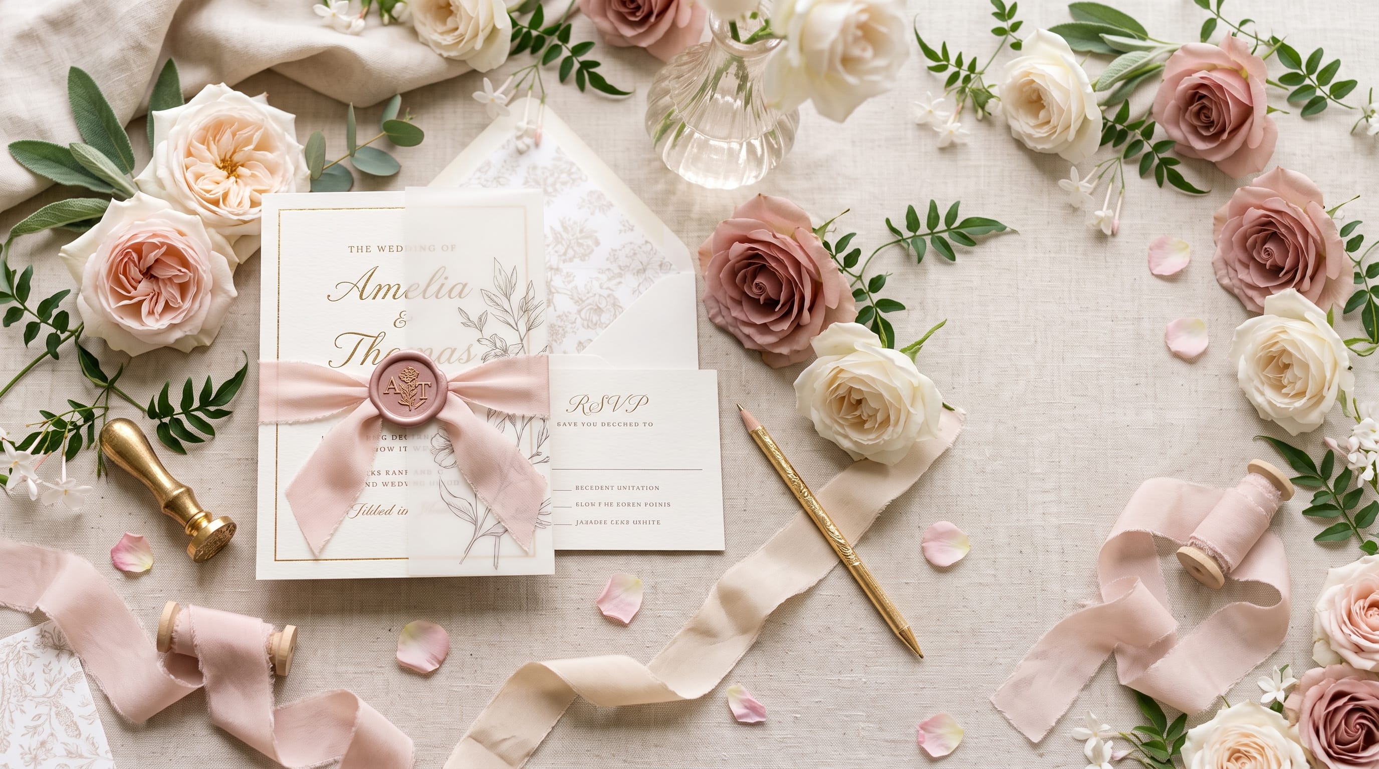
A romantic wedding graphic design style combines elegant typography, soft colors, thoughtful spacing, floral details, and consistent visual elements to create an emotional atmosphere before guests even arrive at the celebration. From invitations and save-the-date cards to menus, welcome signs, social graphics, and thank-you notes, every design element can help communicate the personality of the wedding.
Romantic wedding design does not have to mean excessive decoration. Some of the most beautiful wedding graphics use only a refined typeface, a soft neutral palette, a small botanical illustration, and generous white space.
The key is consistency.
A successful wedding visual system should feel connected across print and digital materials while still leaving enough flexibility for different information and formats.
This guide explains how to create a romantic wedding graphic design style using typography, color, florals, layout, photography, stationery, seasonal details, and selected DM Letter Studio fonts.
Start Your Wedding Graphic Design Style With a Clear Mood
Before choosing fonts or colors, decide how the wedding should feel.
Possible directions include:
- Romantic
- Elegant
- Modern
- Rustic
- Botanical
- Vintage
- Luxury
- Minimal
- Whimsical
- Garden-inspired
A couple planning an intimate garden wedding may need something very different from a formal ballroom celebration.
For example:
Romantic Garden Wedding
- Soft blush
- Sage green
- Ivory
- Handwritten script
- Botanical illustrations
Luxury Evening Wedding
- Black
- Champagne
- Ivory
- Refined serif typography
- Gold accents
Modern Minimal Wedding
- Warm white
- Taupe
- Charcoal
- Elegant serif
- Simple line details
Defining the mood early makes every later decision easier.
Build a Romantic Wedding Color Palette
Color is one of the strongest tools for creating emotion.
A romantic wedding graphic design style often uses soft, sophisticated colors rather than extremely bright combinations.
Blush and Sage
- Blush pink
- Sage green
- Ivory
- Warm gray
This palette works well for spring and garden weddings.
Champagne and Cream
- Champagne
- Cream
- Soft beige
- Warm brown
Ideal for elegant and neutral celebrations.
Burgundy and Dusty Rose
- Burgundy
- Dusty rose
- Ivory
- Muted green
A strong choice for autumn weddings.
Navy and Champagne
- Deep navy
- Champagne
- White
- Soft gray
Suitable for formal or evening events.
Lavender and Ivory
- Lavender
- Soft lilac
- Ivory
- Muted green
This direction can feel romantic without relying heavily on pink.
Choose two or three main colors and use the others as accents.
Use Color Consistently Across Wedding Graphics
Once the palette is defined, repeat it throughout the wedding system.
Use the same colors on:
- Invitations
- Save-the-dates
- Menus
- Welcome signs
- Table numbers
- Social graphics
- Thank-you cards
Consistency makes the event feel professionally designed.
You do not need to use every color on every piece.
For example, invitations may use ivory and sage, while place cards use sage and blush.
The overall wedding graphic design style should still feel connected.
Choose Elegant Wedding Typography
Typography often carries most of the emotional character of wedding design.
A romantic typography system usually contains two or three levels.
Primary Display Font
Used for:
- Couple names
- Main invitation headline
- Key phrases
This can be a script, signature, or elegant serif.
Supporting Serif or Sans Serif
Used for:
- Date
- Location
- Schedule
- Event details
Small Functional Text
Used for:
- RSVP information
- Website URL
- Additional notes
The supporting type should be highly readable.
Decorative fonts are most effective when used selectively.
Create Romantic Font Pairings
Contrast makes typography more interesting.
Try combinations such as:
Script + Serif
A flowing handwritten font for names with a classic serif for details.
Signature + Sans Serif
Personal and modern.
Elegant Serif + Minimal Sans Serif
Ideal for luxury or editorial wedding graphics.
Monogram + Serif
Excellent for invitations, menus, and signage.
Do not combine several decorative scripts.
One expressive typeface is usually enough.
Font Suggestions for Wedding Graphic Design Style
DM Letter Studio has several font directions from the saved collection that work particularly well for romantic wedding graphics.
The best choice depends on whether the event should feel elegant, personal, classic, modern, or luxurious.
Elegant and Premium Wedding Fonts
For refined wedding invitations and luxury stationery, consider:
Graciast
Use for:
- Couple names
- Invitation headlines
- Welcome signs
It works especially well when paired with clean supporting typography.
Gold Sherry
A strong direction for glamorous weddings.
Pair it with:
- Champagne
- Ivory
- Black
- Dusty rose
Halista
Halista can create a more timeless, editorial look.
It is suitable for:
- Formal invitations
- Menus
- Programs
- Luxury stationery
Warm and Personal Wedding Fonts
For a softer wedding graphic design style, consider:
These styles can feel more intimate and handwritten.
They work especially well for:
- Garden weddings
- Outdoor celebrations
- Handmade stationery
- Personalized thank-you cards
Butterfly Signature
Use it for short phrases such as:
A strong option for understated romantic design.
Together Forever
or:
With Love
Pair it with a clean serif for event information.
Modern Romantic Wedding Fonts
For contemporary weddings, consider:
These fonts can help create a cleaner and more current interpretation of wedding design.
Luxury Monogram Fonts for Wedding Branding
Monograms can give wedding stationery a personalized and premium identity.
Consider:
Monograms can appear on:
- Invitations
- Wax seals
- Menus
- Napkins
- Welcome signs
- Thank-you cards
- Social graphics
A simple monogram can become the central visual element of the wedding identity.
Create a Wedding Monogram System
A monogram does not need to appear everywhere at full size.
Create several variations.
Primary Monogram
Full decorative version.
Simple Initials
For smaller applications.
Monogram Pattern
Used subtly on backgrounds or packaging.
For example, initials A + M could appear:
- Large on the invitation cover
- Small on menu corners
- Embossed on favor tags
- Repeated as a faint pattern inside envelopes
This creates strong visual continuity.
Use Florals Carefully
Floral illustrations are a natural choice for romantic wedding graphics.
Popular directions include:
- Roses
- Peonies
- Wildflowers
- Olive branches
- Eucalyptus
- Fine botanical linework
However, floral graphics should support the content.
Avoid covering every corner with decorative flowers.
A cleaner composition may use one floral cluster in the upper corner and a smaller botanical detail at the bottom.
This gives the layout room to breathe.
Match Florals to the Season
Seasonal details can make the wedding graphic design style feel more intentional.
Spring
Use:
- Peonies
- Cherry blossoms
- Tulips
- Soft greens
Summer
Use:
- Wildflowers
- Roses
- Lavender
- Bright greenery
Fall
Use:
- Burgundy leaves
- Dahlias
- Dried flowers
- Warm foliage
Winter
Use:
- Pine branches
- White roses
- Eucalyptus
- Subtle snow-inspired details
Seasonal design helps connect stationery to the actual environment of the celebration.
Also Read: Best Retro Graphic Design Ideas for Modern Creatives
Design Romantic Wedding Invitations
Invitations often establish the first impression of the event.
A strong invitation might include:
- Couple Names
- Invite wording
- Date
- Venue
- Location
- RSVP information
Keep hierarchy clear.
The couple’s names can be the largest element.
Supporting information should remain easy to read.
Avoid making every line decorative.
Use White Space for Elegant Invitations
White space creates sophistication.
Do not fill every available area with:
- Florals
- Borders
- Icons
- Patterns
- Illustrations
Give important typography room.
For example:
- Large couple names
- Generous gap
- Small event details
- Minimal botanical illustration
This simple structure can feel more luxurious than a heavily decorated layout.
Design Save-the-Date Cards
Save-the-date designs can be more playful than formal invitations.
Consider using:
- Engagement photography
- Large date typography
- Short romantic phrase
- Monogram
A simple format could be:
EMILY & JAMES
06.20.27
Save the Date
New York
Keep supporting information minimal.
The formal invitation can provide more detail later.
Create Wedding Welcome Signs
A welcome sign should be readable from several feet away.
A simple hierarchy might be:
WELCOME
to the wedding of
EMILY & JAMES
June 20, 2027
Use the decorative font for the names and a simpler font for everything else.
Avoid tiny text or excessive details.
Large-format signage should prioritize clarity.
Design Wedding Menus
Menus provide another opportunity to reinforce the wedding graphic design style.
Keep them visually connected to the invitations.
Use the same:
- Fonts
- Colors
- Monogram
- Decorative motifs
A simple menu structure can include:
DINNER
Starter
Main Course
Dessert
Drinks
Do not let decorative typography interfere with food descriptions.
Create Elegant Table Numbers
Table numbers can become small pieces of decor.
Try:
- Large serif numbers
- Botanical frame
- Small monogram
- Neutral background
Materials can also contribute to the style.
For example:
- Thick paper
- Acrylic
- Wood
- Fabric
- Metallic card
The design should complement the tablescape.
Design Place Cards Consistently
Place cards are small, so simplicity matters.
Use:
Guest Name
Table Number if needed
Small monogram
Avoid placing long decorative phrases on small cards.
Handwritten or signature-style fonts can work beautifully for names when they remain readable.
Use Romantic Photography
Photography should match the visual identity.
Choose images with:
- Soft lighting
- Natural tones
- Gentle contrast
- Elegant compositions
Avoid combining warm romantic stationery with extremely cold or oversaturated photography.
Editing consistency helps the entire wedding identity feel cohesive.
Use Photography in Digital Wedding Graphics
Wedding websites and social posts can combine photography with typography.
Try:
- Full-screen engagement photo
- Small monogram overlay
- Simple date
- Neutral button style
Keep text away from busy areas of photographs.
A subtle overlay may improve readability.
Also Read: Restaurant Graphic Design for Better Customer Experience
Create Wedding Social Media Graphics
Wedding vendors and creators can use the same wedding graphic design style for promotional content.
Examples include:
- Venue announcements
- Countdown graphics
- Vendor introductions
- Moodboards
- Floral inspiration
- Behind-the-scenes content
Create repeatable templates rather than designing each post independently.
For example:
- Large photograph + small monogram
- Romantic quote + floral detail
- Event information + elegant border
This creates recognizable visual consistency.
Use Decorative Borders Sparingly
Borders can make stationery feel formal and finished.
Options include:
- Thin line border
- Double border
- Botanical corners
- Soft arch frame
- Geometric linework
Keep borders delicate.
A heavy frame can make romantic designs feel rigid.
Use enough space between the border and the main content.
Add Texture for a Handmade Feeling
Subtle texture can make digital designs feel more tactile.
Try:
- Handmade paper
- Watercolor wash
- Fine grain
- Linen texture
- Soft ink
Keep texture low contrast.
It should create depth without reducing readability.
Create a Luxury Wedding Graphic Design Style With Metallic Details
For luxury weddings, metallic details can add sophistication.
Options include:
- Gold foil
- Champagne foil
- Rose gold
- Silver
- Metallic embossing
Use metallic details on:
- Monograms
- Borders
- Couple names
- Small icons
Avoid making every line metallic.
Luxury often comes from restraint.
Build a Wedding Branding System
A complete wedding identity can include:
- Logo or monogram
- Color palette
- Font system
- Floral style
- Illustration style
- Photography direction
- Layout rules
Document these choices before creating every individual item.
For example:
- Primary font: Gold Sherry
- Supporting font: Classic serif
- Main colors: Dusty rose + ivory
- Accent: Champagne
- Graphic motif: Fine rose linework
- Monogram: A + M
This becomes the design system for all wedding materials.
Adapt Wedding Graphic Design Style Across Seasons
Romantic design can work throughout the year.
Spring Wedding Graphic Design Style
Use:
- Blush
- Sage
- Lilac
- Botanical illustration
Typography can feel delicate and airy.
Summer Wedding Graphic Design Style
Use:
- Warm white
- Peach
- Soft blue
- Fresh greenery
Layouts can feel lighter and more relaxed.
Fall Wedding Graphic Design Style
Use:
- Burgundy
- Terracotta
- Cream
- Warm brown
Combine romantic scripts with deeper colors.
Winter Wedding Graphic Design Style
Use:
- Ivory
- Forest green
- Navy
- Champagne
Refined serif typography and metallic details can create elegance.
Keep Digital and Print Designs Consistent
A modern wedding may include both:
Printed Materials
- Invitations
- Menus
- Programs
- Signage
Digital Materials
- Wedding website
- Email invitations
- Social graphics
- Digital RSVP
Use the same fundamental visual system across both.
Fonts, colors, monograms, and imagery should remain recognizable even when layouts change.
Common Wedding Graphic Design Style Mistakes
Using Too Many Script Fonts
One decorative script is usually enough.
Excessive Floral Decoration
Leave room for typography.
Weak Contrast
Soft colors still need readable text.
Inconsistent Stationery
Invitations, menus, and signs should feel connected.
Overusing Gold
Metallic accents work best selectively.
Tiny Text
Important details must remain readable.
Ignoring the Wedding Venue
The visual style should complement the setting.
Following Trends Too Closely
Trends can inspire, but the design should reflect the couple or brand.
Wedding Graphic Design Style Checklist
Before finalizing the design, ask:
- Is the romantic mood clear?
- Does the palette feel cohesive?
- Are fonts easy to read?
- Is there one main decorative font?
- Is hierarchy clear?
- Are florals used intentionally?
- Does the monogram work at different sizes?
- Are invitations and menus visually connected?
- Is the signage readable from a distance?
- Does photography match the color direction?
- Is there enough white space?
- Do seasonal elements fit the event?
- Are digital and print graphics consistent?
- Does the style feel personal rather than generic?
If several answers are no, simplify and refine the design system.
Also Read: Different Graphic Design Styles and What Makes Each One Unique
Final Thoughts on Romantic Wedding Graphic Design Style
Creating a romantic wedding graphic design style is about building a visual atmosphere that feels elegant, emotional, and consistent.
Start with the mood.
Choose a restrained color palette, then select typography that supports the personality of the celebration. Use scripts or signature fonts for expressive moments and pair them with highly readable supporting type.
DM Letter Studio fonts can support different romantic directions.
For personalized luxury branding, monogram options can create a distinctive identity for invitations, signage, menus, and keepsakes.
Continue the design through floral illustrations, photography, borders, monograms, and seasonal details, but avoid unnecessary decoration.
The strongest romantic wedding designs usually feel thoughtful rather than crowded.
When typography, color, imagery, spacing, and decorative elements all follow the same visual direction, a wedding graphic design style can transform separate pieces of stationery into one complete and memorable celebration identity.