
Simple Circle Logo Design Ideas for Better Branding
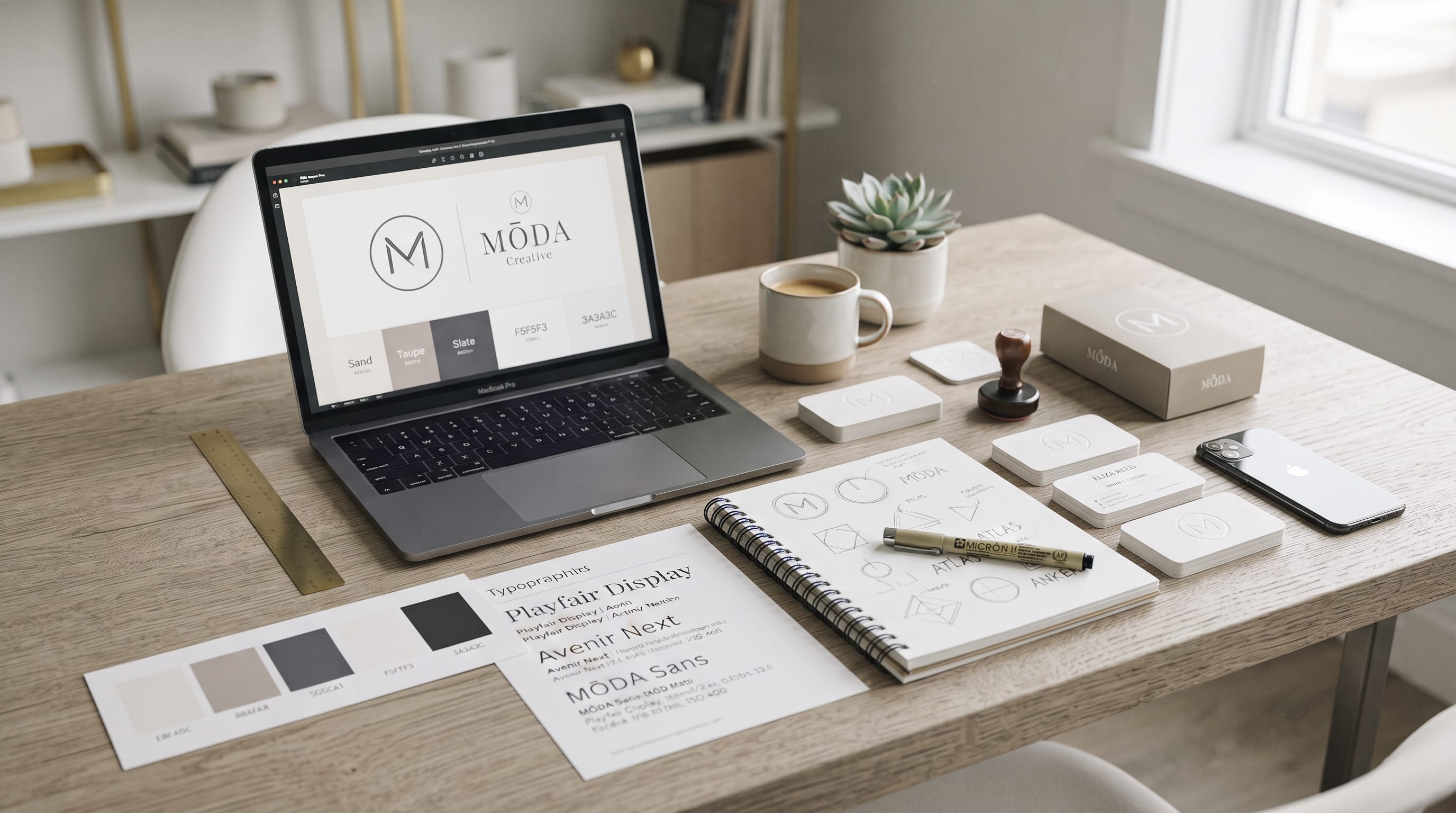
A strong circle logo design can create a sense of balance, unity, simplicity, and professionalism. Because circles have no sharp beginning or ending point, they naturally feel complete and harmonious. This makes circular logos useful for businesses that want a clean visual identity that works well on websites, social media profiles, packaging, signage, labels, and printed materials.
Circle logos can also be highly flexible.
A simple circular mark may contain:
- A monogram
- A geometric symbol
- A wordmark
- A badge
- An abstract icon
- Negative space
The challenge is keeping the design distinctive.
Because circles are widely used in branding, simply placing a business name inside a round border may not be enough. A professional circle logo design should use proportion, spacing, typography, and visual hierarchy carefully so the final mark feels intentional rather than generic.
This guide explores practical circle logo ideas and explains how designers can create minimal, recognizable, and versatile brand identities.
Why Circle Logo Design Works So Well
Circular forms are naturally balanced.
Unlike rectangles or triangles, a circle does not point strongly in one direction. This can create a calmer and more unified appearance.
Circles can communicate ideas such as:
- Community
- Connection
- Continuity
- Completeness
- Movement
- Protection
This makes them suitable for many industries.
For example:
- A wellness business might use a soft circular symbol to communicate harmony.
- A technology company might use interlocking circles to represent connection.
- A coffee shop could use a circular badge to create a traditional and approachable identity.
The same basic shape can support very different personalities depending on how it is designed.
Start Circle Logo Design With Brand Personality
Before drawing a circle, define the brand.
Ask:
- Should it feel modern?
- Premium?
- Friendly?
- Minimal?
- Traditional?
- Creative?
A circle logo design should reflect the personality rather than simply follow a shape trend.
For example:
Modern Technology Brand
Could use:
- Thin geometric lines
- Simple sans serif typography
- Abstract circular icon
Luxury Brand
Could use:
- Elegant monogram
- Refined serif
- Thin circular frame
Handmade Business
Could use:
- Organic circular border
- Handwritten typography
- Small decorative details
The circle is only the foundation.
The styling determines the personality.
1. Minimal Circle Logo Design
One of the simplest approaches is a clean circular outline with a small symbol or initial inside.
This works especially well for:
- Consultants
- Creative studios
- Wellness brands
- Personal brands
- Technology companies
Keep the number of elements low.
For example:
Circle + Initial
can create a more memorable result than:
Circle + Initial + Icon + Tagline + Decorative Lines
Minimalism works when every element has a clear purpose.
2. Circle Monogram Logo
Monograms fit naturally inside circular forms.
Use:
- One initial
- Two initials
- Three initials
For example:
A company named Luna Creative could create an interlocking LC inside a simple circle.
A monogram can become a compact secondary mark for:
- Social profiles
- Packaging
- Favicons
- Labels
- Merchandise
A well-designed monogram circle logo design can feel both minimal and premium.
3. Interlocking Initial Circle Logo
Instead of placing two letters separately, combine them.
Letters may:
- Share a stroke
- Overlap
- Mirror each other
- Connect through curves
This creates a stronger custom identity.
For example:
An A and M might share one vertical line.
Or a C could wrap around another initial.
The goal is not simply to fit the letters inside the circle.
Create a relationship between the letterforms.
4. Negative Space Circle Logo
Negative space can make a simple circle logo feel more intelligent.
Possible ideas include:
- Letter hidden inside a circle
- Animal silhouette created between shapes
- Leaf formed by two overlapping circles
- Arrow created from empty space
This technique works well because the design can remain visually simple while containing a second meaning.
A strong negative-space concept should still be recognizable at small sizes.
Avoid making the hidden element too complicated.
5. Geometric Circle Logo Design
Circles work naturally with geometric construction.
Try combining:
- Circles
- Lines
- Squares
- Arcs
- Triangles
For example:
A circular symbol could contain:
- Mountain shape
- Letter
- Compass
- Abstract grid
Geometric logos often feel:
- Modern
- Structured
- Professional
Use consistent stroke thickness and accurate alignment.
Small inconsistencies become more noticeable in simple designs.
6. Abstract Circular Logo
Not every circle logo design needs a literal symbol.
Abstract forms can create distinctive branding.
Try:
- Broken circles
- Multiple rings
- Rotating arcs
- Overlapping circles
- Circular gradients
- Curved segments
An incomplete circle can suggest:
- Movement
- Progress
- Openness
Several overlapping circles could represent:
- Collaboration
- Community
- Networks
Abstract symbols give designers more flexibility to develop unique brand concepts.
7. Badge-Style Circle Logo
Badge logos use text and symbols inside a defined circular structure.
They often include:
- Brand name
- Icon
- Establishment year
- Location
- Short tagline
Badge-style logos work particularly well for:
- Cafes
- Restaurants
- Outdoor brands
- Barbershops
- Craft businesses
The challenge is avoiding too much information.
Keep secondary text short enough to remain readable.
8. Circular Wordmark Logo
Instead of placing typography horizontally, arrange the brand name around the circle.
Text might follow:
- Top curve
- Bottom curve
- Full circular path
For example:
NORTH COAST
could sit above the symbol.
EST. 2026
could sit below.
This creates a strong badge structure.
Use enough spacing between letters so curved text remains readable.
9. Circle Logo With a Central Symbol
A straightforward composition is:
Circular border + central icon + small text
Possible symbols include:
- Leaf
- Star
- Mountain
- Sun
- Flower
- Wave
Choose a symbol that connects to the brand’s meaning.
Avoid selecting an icon only because it looks attractive.
The concept should support the business.
10. Circle Logo With a Lettermark
Lettermarks use one strong letter as the main symbol.
For example:
A brand beginning with R could create a custom R inside a circular frame.
The letter could be:
- Serif
- Sans serif
- Geometric
- Script
Customize the letter instead of using a standard font without modification.
You might:
- Extend a stroke
- Remove part of the letter
- Connect it to the circle
- Create negative space
Small modifications can make the mark more original.
Use Symmetry in Circle Logo Design
Symmetry works naturally with circles.
A symmetrical circle logo design can feel:
- Stable
- Professional
- Elegant
Try aligning:
- Initials
- Symbols
- Decorative shapes
around a central axis.
However, perfect symmetry is not always necessary.
Small asymmetrical details can make the design more interesting.
The key is maintaining overall visual balance.
Create Balance Without Perfect Symmetry
Some of the strongest circle logos use asymmetry.
For example:
Place:
- Small symbol in the upper right
- Larger letter in the center
- Open section in the lower left
The composition can still feel balanced because visual weight is distributed carefully.
Balance is more important than mathematical symmetry.
Use Consistent Line Weight
Minimal logos expose small mistakes easily.
If your circle logo design uses line art, keep line weights consistent.
For example:
If the outer circle uses a thin stroke, avoid adding a very heavy internal icon unless the contrast is intentional.
Consistent line weight makes the identity feel more polished.
It also improves reproduction at small sizes.
Consider an Open Circle
A circle does not always need to be complete.
Breaking part of the outline can make the logo feel:
- Modern
- Dynamic
- Open
- Forward-moving
For example:
An open circular line could form part of a letter.
This can create stronger integration between the symbol and typography.
Incomplete forms are especially useful for modern technology and creative brands.
Use Multiple Circles
More than one circle can create interesting visual systems.
Try:
- Concentric circles
- Interlocking circles
- Overlapping circles
- Repeated dots
Concentric circles may suggest:
- Focus
- Sound
- Targets
- Movement
Overlapping circles may communicate:
- Partnership
- Collaboration
- Connection
Keep the design simple enough to remain recognizable.
Circle Logo Design With a Sun Symbol
The sun is naturally circular and can create a strong logo concept.
Use:
- Simple central circle
- Minimal rays
- Half-sun
- Rising sun
This works for brands related to:
- Travel
- Wellness
- Lifestyle
- Food
- Sustainability
Avoid overly detailed rays.
Simple geometry usually scales better.
Circle Logo With Botanical Elements
Botanical graphics can create a softer visual identity.
Try:
- Leaf inside circle
- Floral monogram
- Branch wrapping around border
- Minimal plant icon
This works particularly well for:
- Beauty
- Wellness
- Skincare
- Handmade products
- Sustainable brands
Keep the botanical illustration controlled.
Detailed flowers may become difficult to recognize on small packaging or social avatars.
Circle Logo With Waves
Waves naturally pair with circular boundaries.
They can represent:
- Ocean
- Travel
- Flow
- Calmness
- Movement
A simple wave crossing through the circle can create a strong modern symbol.
This works well for:
- Surf brands
- Resorts
- Wellness
- Outdoor businesses
Keep the wave simple enough to work as a one-color logo.
Also Read: Text Logo Design Made Easy: Modern Wordmarks
Circle Logo Design for Modern Brands
Modern branding often benefits from:
- Simple geometry
- Clean sans serif type
- Limited color
- Strong negative space
For example:
Use a broken circle with a single custom initial.
Pair it with a clean wordmark.
This creates a flexible identity that can work across digital platforms.
Modern circle logo design usually performs best when unnecessary decoration is removed.
Circle Logo Design for Luxury Brands
Luxury circular logos often use:
- Fine lines
- Monograms
- Elegant serif fonts
- Controlled spacing
A thin circular border can frame a custom monogram.
Colors might include:
- Black
- Cream
- Deep green
- Burgundy
- Gold
However, luxury does not depend on metallic colors.
Typography, proportion, and spacing often create a more premium impression than decorative effects.
Circle Logo Design for Creative Brands
Creative brands can experiment more.
Try:
- Broken circles
- Unexpected typography
- Bright color
- Overlapping shapes
- Playful line art
For example:
A creative studio could use several incomplete circles forming an abstract letter.
The logo remains structurally simple but feels distinctive.
Circle Logo Ideas for Personal Brands
Personal brands can use initials effectively.
For example:
MP
inside a circular mark.
Add the full name next to it for the primary version.
This creates:
Primary Logo
Monogram + Full Name
Secondary Logo
Circular monogram only
The secondary version works especially well for:
- Profile images
- Watermarks
- Favicons
Circle Logo Ideas for Cafes
Circular badge logos fit cafes naturally.
Try:
- Cup icon
- Coffee bean
- Simple monogram
- Establishment year
For example:
ROAST & CO.
around the upper curve.
EST. 2022
on the lower curve.
Coffee branding can also use vintage-inspired circular badges for a more traditional personality.
Circle Logo Ideas for Beauty Brands
Beauty brands can create elegant circle logos using:
- Initials
- Floral line work
- Simple face profiles
- Abstract curves
Keep the overall design refined.
A beauty circle logo design should remain recognizable when printed on:
- Small labels
- Cosmetic boxes
- Product lids
Avoid tiny decorative details.
Circle Logo Ideas for Technology Brands
Technology logos often benefit from geometric simplicity.
Try:
- Broken circular paths
- Abstract network forms
- Rotating arcs
- Negative-space letters
These can communicate:
- Innovation
- Systems
- Connectivity
- Progress
Avoid overly complex circuit-like graphics.
Simple symbols are usually more scalable.
Choose Typography for Circle Logo Design
Typography is just as important as the symbol.
Good options include:
Sans Serif
For modern and minimal brands
Serif
For elegant and traditional branding
Script
For personal or handcrafted identities
Condensed Fonts
For badge-style logos with limited space
The font should support the brand personality.
Do not choose a typeface only because it fits inside the circle.
Use Curved Typography Carefully
Curved text can look professional when spacing is controlled.
Pay attention to:
- Tracking
- Letter orientation
- Distance from the circle
- Word length
Long names may become difficult to fit around a circular path.
If the name is too long, use:
- Shortened brand name
- Initials
- Horizontal wordmark
Do not force every logo into a circular text layout.
Combine Serif and Sans Serif Fonts
A circle logo can use two complementary typefaces.
For example:
Brand Name
Elegant serif
Supporting Text
Clean sans serif
This creates contrast without making the design feel complicated.
Use one font as the dominant personality.
The second should support readability.
Use Color Sparingly
Minimal circle logo design usually benefits from a limited palette.
Start with:
- One primary color
- One supporting color
- Neutral background
For example:
Professional
Dark navy + white
Natural
Olive + cream
Luxury
Black + warm beige
Creative
Cobalt + bright orange
A simple color system makes the identity easier to apply consistently.
Test Circle Logos in One Color
Every professional logo should work in one color.
Test:
- Black
- White
If the design depends completely on gradients or multiple colors, simplify the core symbol.
One-color versions are useful for:
- Embroidery
- Stamps
- Engraving
- Small printing
This also reveals whether the structure is strong.
Also Read: 25 Ecommerce Logo Design Ideas That Build Strong Brands
Avoid Making the Circle Too Heavy
One common mistake is using a thick border that overwhelms the symbol.
The frame should support the content.
It should not become the main visual element unless that is intentional.
Compare:
Heavy border + tiny icon
with:
Balanced border + strong central symbol
The second usually feels more professional.
Leave Enough Space Inside the Circle
Crowding makes logos difficult to read.
Keep breathing room around:
- Initials
- Icons
- Text
Negative space is particularly important in minimal branding.
A well-spaced design often looks more sophisticated.
Use the Circle as Part of the Symbol
The circle does not always need to act only as a frame.
It can become:
- Letter
- Eye
- Sun
- Wheel
- Globe
- Button
For example:
The circle might form the O in a wordmark.
This integrates the shape more naturally into the identity.
Make Circle Logo Design Responsive
A professional brand may need several versions.
Create:
Primary Logo
Full symbol + brand name
Secondary Logo
Circular mark
Small Icon
Simplified symbol or monogram
This responsive system helps the identity work across different sizes.
Test Circle Logos for Social Media
Circular marks are especially useful for social platforms because many profile images already use round cropping.
Test your logo inside:
Make sure important parts do not sit too close to the edge.
Small text should usually be removed from social avatar versions.
Test Circle Logo Design on Packaging
Circular logos work well on:
- Stickers
- Product labels
- Bottle caps
- Boxes
- Tags
Before finalizing, create mockups.
Ask:
- Is the logo readable?
- Does it feel balanced?
- Does the icon remain recognizable?
Testing real applications can reveal problems that are difficult to notice on an artboard.
Use Circle Logos on Signage
A circular emblem can work well for storefront signs.
However, signage needs strong readability.
If the logo contains curved text, test it from a distance.
The business name should not disappear inside decorative elements.
For very small or distant applications, use a simpler horizontal version.
Create Clear Space Around the Logo
A logo needs room to breathe.
Define a minimum clear-space rule.
For example:
Use the width of one letter as the minimum space around the logo.
This prevents other graphics from appearing too close.
Clear-space rules help maintain a professional visual identity.
Avoid Generic Circle Logo Design
Because circles are common, generic logos are a major risk.
Avoid simply combining:
Random icon + circle + business name
without a concept.
Instead, look for a relationship between:
- Shape
- Letter
- Brand meaning
For example:
A sustainability brand could combine a circular form with a leaf that also creates the company’s initial.
That feels more intentional.
Customize Existing Shapes
Simple geometry can still be original.
Try:
- Removing sections
- Connecting strokes
- Rotating shapes
- Creating custom intersections
Small changes can transform a basic circular mark into something more distinctive.
Do not add unnecessary complexity.
The goal is uniqueness through thoughtful construction.
Common Circle Logo Design Mistakes
Too Much Text
Keep curved text short.
Too Many Symbols
Use one main concept.
Overly Thick Borders
Balance the frame.
Tiny Details
Design for small sizes.
Generic Icons
Customize visual elements.
Weak Typography
Choose fonts strategically.
Poor Letter Spacing
Adjust tracking manually.
Relying Only on Color
Test one-color versions.
No Responsive Version
Create simplified alternatives.
Ignoring Brand Personality
The circle should support a clear positioning.
Circle Logo Design Checklist
Before finalizing your logo, ask:
- Does the shape support the brand concept?
- Is the main symbol clear?
- Is typography readable?
- Does the circle feel balanced?
- Is there enough negative space?
- Are line weights consistent?
- Does the logo work in black?
- Does it work in white?
- Is it recognizable at small sizes?
- Can it work as a social avatar?
- Does it work on packaging?
- Is curved text easy to read?
- Does it look different from competitors?
- Is there a simplified version?
- Can the identity scale as the brand grows?
If several answers are no, continue refining.
Also Read: How to Create a Fashion Logo Design That Stands Out
Final Thoughts on Simple Circle Logo Design
A professional circle logo design does not need complicated artwork to be memorable.
The strength often comes from:
- Clear concept
- Balanced proportions
- Strong typography
- Controlled spacing
- Simple geometry
Start with brand personality.
Then decide whether the circle should act as:
- Frame
- Monogram container
- Symbol
- Badge
- Negative-space device
Keep the main idea simple.
A single custom initial inside a well-proportioned circle can be more effective than several decorative symbols competing for attention.
Test the circle logo design in black and white, at small sizes, on social media, on packaging, and on signage.
Also create responsive versions so the identity works across different applications.
Most importantly, avoid relying on the circular shape alone to make the logo distinctive.
The circle provides structure.
Your concept, typography, proportions, and custom details create the personality.
When these elements work together, a simple circle logo design can feel minimal, professional, recognizable, and versatile enough to support a complete modern brand identity.

For high-quality fonts to boost your income, check out DM Letter Studio. Our professional fonts are perfect for branding, marketing, and content creation. So, don’t miss this opportunity.