
Modern Snack Packaging Design Trends for Better Branding
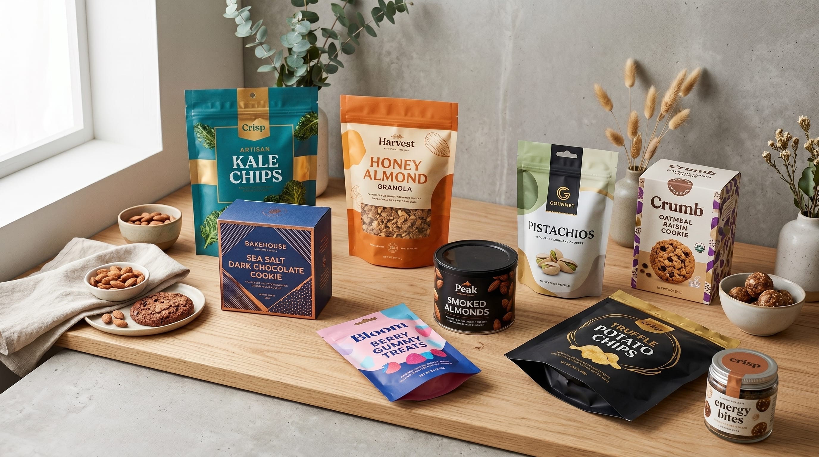
Snack packaging design trends are becoming increasingly important as food brands compete for attention both on physical shelves and across ecommerce, social media, and delivery platforms. A snack package now needs to communicate flavor, personality, product type, quality, and brand recognition within only a few seconds.
Modern packaging is also moving in several directions at once. Some snack brands are embracing oversized typography, bright colors, playful illustrations, and nostalgic visual language. Others are reducing unnecessary decoration and building cleaner systems that prioritize product information and consistency.
Current packaging coverage in 2026 shows that bold visual differentiation remains important, while sustainability, convenience, transparency, and simplification continue to influence food packaging decisions. Packaging Digest has highlighted these factors across recent food and packaging reporting, including renewed attention to bold graphics, simplified packaging systems, sustainability, and consumer trust.
For food businesses, the goal is not to follow every trend. The best snack packaging design trends are the ones that strengthen recognition, help shoppers understand the product quickly, and create a visual personality that can grow across multiple flavors and product lines.
Why Snack Packaging Design Trends Matter for Food Brands
Snack categories are highly competitive.
Products may sit beside dozens of alternatives offering similar flavors, ingredients, or benefits.
Packaging therefore needs to answer several questions quickly:
- What is the product?
- What flavor is it?
- Who is it for?
- Why is it different?
- Which company made it?
- Is it premium, healthy, fun, or indulgent?
Strong snack packaging design trends can help brands organize these answers while remaining visually distinctive.
Packaging also needs to work beyond the supermarket.
Consumers may first encounter a product through:
This means recognizable color and typography can be just as important digitally as they are on the shelf.
1. Bold Typography in Snack Packaging Design
Typography is becoming increasingly important as a primary packaging element.
Adobe’s 2026 design-trend forecast highlights exaggerated typography, including oversized sans serifs, bubbly lettering, distorted forms, and playful handwritten styles.
Snack brands can use this direction by making the product or flavor name the largest graphic element.
For example:
- CRUNCH
- SOUR
- CHILI
- COOKIE
- CHEESE
can become almost as visually important as an illustration.
Large typography is especially useful because it remains visible when the packaging appears as a small ecommerce thumbnail.
2. Bright and Saturated Snack Packaging Colors
Color remains one of the fastest ways to identify snack products.
Packaging Digest has noted that bold, colorful graphics continue to be important in snack packaging, particularly for brands trying to create stronger shelf visibility.
Modern snack palettes may include:
- Electric blue
- Orange
- Lime
- Hot pink
- Purple
- Yellow
- Red
- Turquoise
Instead of using every bright color on one package, brands can assign one dominant color to each flavor.
For example:
- Cheddar: Orange
- Barbecue: Red
- Sea Salt: Blue
- Jalapeno: Green
This creates differentiation while preserving a consistent product family.
3. Color-Coded Product Families
One of the most useful snack packaging design trends is creating a repeatable design system across multiple flavors.
Keep certain elements consistent:
- Logo position
- Typography
- Illustration style
- Product photography
- Information hierarchy
Then change:
- Primary color
- Flavor name
- Ingredient illustration
This creates shelf blocking, where several products together appear as one recognizable brand family.
A good packaging system should make new flavors easy to introduce without redesigning the brand every time.
4. Playful Bubble Typography
Rounded and bubbly typography can work especially well for:
- Candy
- Cookies
- Popcorn
- Children’s snacks
- Sweet products
- Casual snack brands
The shapes naturally communicate friendliness and fun.
Adobe specifically identifies bubbly, puffy, and wavy typography as part of current 2026 visual trends.
For packaging, keep supporting text simpler.
Use the expressive font for:
- Product name
- Flavor
- Short slogan
Use a clean sans serif for:
- Ingredients
- Nutrition information
- Weight
- Product descriptions
This balance keeps the packaging playful without reducing usability.
5. Retro Snack Packaging Design Trends
Nostalgia continues to influence visual design.
Retro packaging may reference:
- 1970s colors
- 1980s lettering
- Vintage grocery packaging
- Old candy wrappers
- Classic convenience-store graphics
This direction can use:
- Rounded retro typography
- Stripes
- Warm color palettes
- Grain
- Mascot illustrations
- Simple geometric patterns
The strongest retro packaging does not need to reproduce an old product exactly.
Instead, combine nostalgic typography with cleaner contemporary layouts.
This makes the packaging feel familiar without appearing outdated.
6. Handmade and Imperfect Packaging Graphics
Highly polished digital design is increasingly being balanced with more human and imperfect aesthetics.
Canva’s 2026 design reporting points to rising interest in DIY layouts, scrapbook styles, bold type, handmade details, and deliberately imperfect visual systems.
Snack brands can use:
- Hand-drawn illustrations
- Marker lettering
- Rough shapes
- Uneven borders
- Cut-paper effects
- Handwritten notes
This can be especially effective for brands positioned as:
- Independent
- Local
- Small-batch
- Handmade
- Natural
The imperfections should still be intentional and consistent.
7. Illustrated Snack Packaging
Illustration can help food brands create a more ownable identity than generic photography.
Popular approaches include:
- Character illustrations
- Ingredient drawings
- Line art
- Cartoon graphics
- Abstract food shapes
For example, a spicy chip brand could create a recurring chili character that changes expression across different heat levels.
Illustration can also make products easier to extend into:
- Social content
- Merchandise
- Stickers
- Advertising
- Limited-edition packaging
The illustration style should remain consistent across the entire range.
8. Mascot-Driven Snack Branding
Mascots are particularly suitable for snacks because the category often allows more playful communication.
A mascot might be:
- A potato
- A cookie
- An animal
- A fruit
- A fictional character
- An anthropomorphic ingredient
The mascot can appear in different situations for each flavor.
For example:
- Original flavor = relaxed mascot
- Spicy flavor = flaming mascot
- Cheese flavor = cheese-covered mascot
This adds personality while maintaining brand recognition.
Also Read: Packaging Design Trends for Better Visual Impact and Sales
9. Minimalist Snack Packaging Design Trends
Not every snack brand needs maximalism.
Canva’s 2026 trends also show growing interest in cleaner layouts, serif typography, simpler branding, and restrained palettes.
Minimal snack packaging can use:
- Large product name
- One small illustration
- Neutral background
- Simple color block
- Clear ingredient information
This approach may work particularly well for:
- Premium snacks
- Organic products
- Protein snacks
- Specialty foods
- Adult-focused brands
Minimalism can help communicate quality when competing packages are extremely colorful.
10. Product-First Photography
Photography remains useful when the product itself is visually appealing.
Examples include:
- Cookies
- Granola
- Chocolate
- Nuts
- Dried fruit
Use photography to communicate:
- Texture
- Ingredients
- Portion
- Flavor
Modern packages may combine one strong product image with oversized typography rather than surrounding it with many small decorative elements.
Food-centered product imagery is also visible in recent packaging redesigns, such as Jus-Rol’s 2026 refresh, where product shots, bold color, typography, and illustrations work together within one scalable packaging system.
11. Clearer Packaging Information
Packaging cannot focus only on decoration.
Consumers also need to understand what they are buying quickly.
Important information may include:
- Flavor
- Product type
- Ingredients
- Dietary information
- Weight
- Preparation instructions
- Nutrition
- Allergens
Food packaging in 2026 continues to place emphasis on transparency and consumer confidence alongside sustainability and functionality.
Create hierarchy so essential information is easy to find.
Do not let decorative typography interfere with required labeling.
12. Sustainable Snack Packaging Thinking
Sustainability remains one of the strongest broader forces affecting packaging.
Recent Packaging Digest coverage has continued to highlight recyclable materials, environmental impact, simplification, and more sustainable packaging development as significant industry priorities in 2026.
For snack businesses, sustainability can influence both material and design decisions.
Consider:
- Reducing unnecessary material
- Simplifying components
- Exploring recyclable options
- Using packaging appropriate to product shelf-life needs
- Providing clear disposal information
Avoid making unsupported environmental claims.
Visual design should accurately reflect what the packaging actually delivers.
13. Simplified Snack Packaging Systems
Modern packaging does not need endless layers and decorative details.
Simplification can improve both communication and production.
Packaging Digest has highlighted simplification as an important strategy in current packaging innovation, including reducing complexity while focusing on consumer needs and sustainability.
A simple snack package might use:
- Logo
- Large product name
- Flavor
- Small image
- Required information
Everything else should have a reason to exist.
14. Transparent Windows and Product Visibility
When technically appropriate for the food and packaging format, product visibility can build confidence.
A small transparent area can help customers see:
- Cookie texture
- Granola ingredients
- Nuts
- Dried fruit
- Candy colors
Packaging Digest notes that visibility and clear presentation can influence perceived safety, quality, and trust in food packaging.
Do not make the transparent area so large that it disrupts the design hierarchy.
15. On-the-Go Snack Packaging
Convenience remains important for snacks.
Packaging formats may need to support:
- Individual portions
- Lunch boxes
- Travel
- Office use
- School bags
- Gym bags
Packaging Digest has previously identified on-the-go packaging as a recurring trend across specialty snack categories.
Small-format packaging requires especially strong visual hierarchy because there is less space.
Prioritize:
Brand → Product → Flavor → Key information
16. Unexpected Packaging Shapes
Some brands intentionally challenge category expectations through unusual package formats.
This approach can attract attention, but it should be used carefully.
Packaging Digest’s 2026 coverage of “chaos packaging” notes that unconventional packaging may increase attention while also reducing trust when the format feels inappropriate for the product.
For food businesses, novelty should never interfere with:
- Product protection
- Safety
- Convenience
- Storage
- Customer understanding
Unexpected design works best when the format still makes sense.
Also Read: Packaging Design for Jewelry for Better Branding Results
17. Premium Snack Packaging Design Trends
Premium snacks can use a quieter design language.
Try:
- Deep colors
- Cream backgrounds
- Elegant serif typography
- Subtle metallic accents
- Minimal photography
Suitable products might include:
- Artisan chocolate
- Gourmet nuts
- Premium cookies
- Specialty popcorn
- Imported snacks
Premium packaging should feel controlled rather than empty.
Typography, spacing, printing finish, and materials become particularly important.
18. Bold Pattern-Based Packaging
Patterns can create strong product-family recognition.
Possible patterns include:
- Stripes
- Checkerboards
- Dots
- Abstract ingredients
- Waves
- Repeated icons
Keep one consistent pattern language across flavors.
Then vary colors.
Pattern-based snack packaging design trends can work especially well for packaging that needs to remain recognizable from a distance.
19. Social-Media-Friendly Packaging
Packaging now frequently becomes content.
A strong design may appear in:
- Unboxing videos
- Reviews
- Reels
- Product photography
- Influencer posts
Create packaging that remains recognizable when photographed.
Useful elements include:
- Large brand name
- Strong color
- Unique typography
- Repeatable icon
- Distinctive mascot
Small details that look beautiful in person may disappear completely on a phone screen.
20. Flexible Snack Packaging Design Systems
The strongest modern packaging is rarely a single isolated design.
It is a system.
Define rules for:
- Logo size
- Typography
- Flavor colors
- Illustration
- Product photography
- Information placement
- Pattern use
A scalable system helps brands introduce:
- New flavors
- New sizes
- Seasonal editions
- Multipacks
- Limited editions
without losing recognition.
Recent redesigns such as Jus-Rol’s 2026 packaging refresh demonstrate the value of creating a unified system that can organize an existing range while supporting future products.
Font Suggestions for Snack Packaging
Typography can make snack packaging feel playful, nostalgic, bold, youthful, premium, or handmade. The following fonts are currently represented in DM Letter Studio’s catalog and fit several useful food-packaging directions.
Playful and Friendly Snack Packaging Fonts
For candy, cookies, kids’ snacks, sweet foods, or cheerful brands, consider:
These fonts are strong candidates for:
- Cookies
- Candy
- Popcorn
- Cereal snacks
- Kids’ products
Bold Snack Packaging Typography
For packaging that needs immediate shelf impact, consider:
Keep product names short so the typography can remain large.
Retro Snack Packaging Fonts
For nostalgic food branding, try:
Bright and Youthful Snack Packaging Fonts
For social-first snacks, colorful products, or energetic food brands, consider:
This style can pair effectively with saturated backgrounds, colorful ingredient illustrations, or limited-edition flavors.
Strong Font Pairings for Snack Packaging
DM Letter Studio’s published font-pairing guide includes several combinations that translate naturally to packaging:
- Eighties + Bubble Dance for retro and playful packaging
- Bigbang + Blue Friday for bold, energetic products
- Rock Boys + Baby Smooch for a mix of toughness and sweetness
The guide recommends using contrast, establishing clear hierarchy, and generally limiting a design to two fonts.
For snack packaging, use the more expressive typeface for the product name and the simpler companion for supporting information.
How to Build a Consistent Snack Packaging System
Begin by defining permanent elements.
Keep consistent:
- Logo
- Primary typeface
- Product-name position
- Illustration style
- Information hierarchy
- Package structure
Then create flexible elements:
- Flavor color
- Secondary graphics
- Ingredient image
- Short descriptor
For example:
- Brand: CrunchCo
- Product: Baked Chips
Then:
- Orange = Cheddar
- Green = Jalapeno
- Purple = Barbecue
- Blue = Sea Salt
The packs remain different but clearly belong together.
Common Snack Packaging Design Mistakes
1. Using Too Many Colors
Bright does not mean chaotic.
2. Making the Flavor Hard to Find
Flavor identification should happen quickly.
3. Using Too Many Fonts
One display font plus one supporting font is usually enough.
4. Copying Category Leaders
Learn from category conventions without creating confusingly similar packaging.
5. Adding Too Many Claims
Prioritize the most useful information.
6. Ignoring Small Sizes
Test ecommerce thumbnails and individual portions.
7. Following Trends Without Brand Strategy
Not every snack packaging design trend fits every product.
8. Making Sustainability Claims Without Support
Environmental communication should accurately reflect the packaging and relevant requirements.
Snack Packaging Design Trends Checklist
Before approving the final package, ask:
- Is the brand name visible?
- Is the product immediately understandable?
- Is the flavor easy to identify?
- Does the package stand out?
- Is the typography readable?
- Do the colors fit the target customer?
- Does the design work as a small thumbnail?
- Is product information organized clearly?
- Can the system expand to more flavors?
- Does it work across multiple package sizes?
- Are required labels readable?
- Does the material protect the product properly?
- Are sustainability claims accurate?
- Does the package still feel distinctive without following every trend?
Also Read: Gift Box Packaging Design for Better Customer Experience
Final Thoughts on Modern Snack Packaging Design Trends
The strongest snack packaging design trends combine shelf impact with practical communication.
In 2026, designers are working across several visual directions at once. Bold typography, saturated colors, nostalgic styles, tactile imagery, handmade imperfections, and high-energy graphics are receiving renewed creative attention. At the same time, packaging professionals continue to focus on simplicity, transparency, sustainability, convenience, and consumer trust.
For food businesses, this creates plenty of creative possibilities.
DM Letter Studio fonts are currently positioned for applications that include branding, packaging, posters, labels, or bold display typography.
The key is consistency.
Choose a clear typography system, establish recognizable flavor colors, maintain a repeatable layout, and create rules that can expand when the business launches additional products.
When snack packaging design trends are combined with strong brand strategy rather than used as decoration, packaging can do much more than protect food. It can attract attention, communicate product personality, organize an entire product family, and become one of the most recognizable parts of the brand.