
Summer Sale Banner Colors for Ecommerce and Social Media
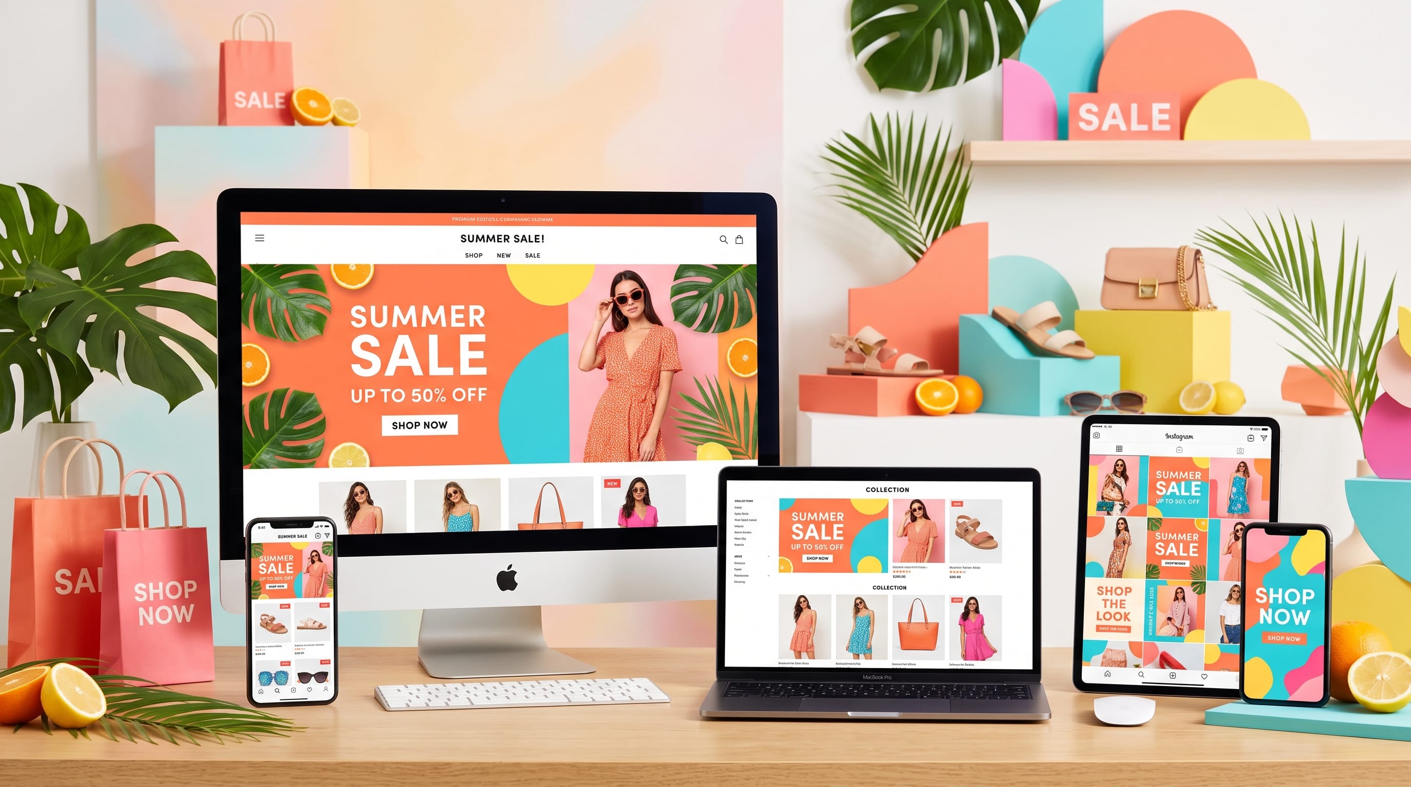
Summer sale banner colors can make seasonal promotions feel more energetic, relevant, and visually attractive. The right palette helps ecommerce brands capture attention, communicate discounts, and create a consistent campaign across websites, email, social media, and digital advertising.
Summer campaigns often use bright yellow, coral, turquoise, orange, pink, blue, and fresh green. However, using every bright color at once can make a banner look crowded or difficult to read. A successful design needs balance, contrast, hierarchy, and a clear connection to the brand.
Color should support the message rather than distract from it. Customers need to understand the offer quickly, especially when viewing a banner on a phone. The sale percentage, product, deadline, and call to action should remain visible even when the design includes bold seasonal colors.
This guide explores practical summer sale banner colors, palette combinations, branding principles, accessibility tips, and layout ideas for ecommerce stores and social media campaigns.
Why Summer Sale Banner Colors Matter
Seasonal promotions compete with many other advertisements, posts, emails, and product offers. Color is one of the fastest ways to create visual separation and communicate a summer mood.
A strong color system can help a campaign:
- Attract attention
- Communicate seasonal energy
- Highlight the sale percentage
- Separate products from the background
- Strengthen brand recognition
- Improve readability
- Guide viewers toward the call to action
- Create consistency across platforms
Poor color choices can create the opposite effect. A banner may look loud but still fail to communicate the offer. Low contrast can make text difficult to read, while unrelated colors may weaken the brand identity.
The best summer sale banner colors combine seasonal personality with clear commercial purpose.
Start With Your Existing Brand Colors
A summer campaign should feel seasonal without looking like it belongs to a completely different company.
Begin by reviewing the brand’s existing palette:
- Primary brand color
- Secondary color
- Accent color
- Background colors
- Text colors
- Button colors
Keep at least one recognizable brand color in the campaign. Then introduce one or two seasonal shades as temporary accents.
For example, a brand with navy and white may add coral and pale yellow for summer. A brand using beige and brown may add sage green or warm orange. A brand with purple may introduce pink or turquoise.
This approach protects recognition while giving the campaign a fresh seasonal appearance.
Do Not Replace the Entire Brand Identity
A summer sale does not require a complete visual rebrand. Customers should still recognize the company immediately.
Use seasonal colors for:
- Promotional backgrounds
- Sale labels
- Decorative shapes
- Social media graphics
- Email headers
- Product highlights
Keep the main logo, typography, and core brand structure consistent.
Use a Clear Color Hierarchy
Every color in the banner should have a specific role.
A simple hierarchy may include:
Dominant Background Color
This color covers the largest area. It should support the products and text without becoming overwhelming.
Primary Promotional Color
This color highlights the main offer, such as “50% Off” or “Summer Sale.”
Accent Color
The accent draws attention toward buttons, urgency messages, or small graphic details.
Text Color
The text color needs strong contrast with the background.
Neutral Support Color
White, cream, black, charcoal, or light gray can balance brighter seasonal shades.
Organized summer sale banner colors make it easier for viewers to understand the message quickly.
1. Yellow and Blue Summer Sale Banner Colors
Yellow and blue create a classic summer combination inspired by sunshine, clear skies, and coastal environments.
A possible palette includes:
- Sunshine yellow:
#FFD84D - Deep blue:
#175CD3 - Sky blue:
#8ED8F8 - White:
#FFFFFF - Navy text:
#102A43
Use yellow for the promotional headline or sale badge. Blue can provide a stable background, while white keeps the design clean.
This palette works well for:
- Travel products
- Swimwear
- Outdoor equipment
- Children’s products
- General ecommerce
- Summer events
Avoid using pale yellow text on a white background. Dark blue or navy will usually provide better readability.
2. Coral and Turquoise for Tropical Campaigns
Coral and turquoise create an energetic tropical mood without relying on obvious beach imagery.
Suggested colors include:
- Coral:
#FF6F61 - Turquoise:
#20C5C7 - Soft aqua:
#CFF7F3 - Warm white:
#FFF9F2 - Dark teal:
#123C3E
Coral works well for discount numbers, while turquoise can support backgrounds, buttons, or graphic elements.
This combination is suitable for:
- Beauty products
- Resort wear
- Travel campaigns
- Home décor
- Lifestyle brands
- Food and beverage promotions
Use one color as the main shade and the other as an accent. When both appear in equal amounts, the design may feel too visually active.
3. Orange and Pink Summer Sale Banner Colors
Orange and pink create a bold, youthful, and social-media-friendly palette.
A possible combination includes:
- Bright orange:
#FF7A00 - Hot pink:
#F83D8E - Soft peach:
#FFD8C2 - White:
#FFFFFF - Dark burgundy:
#4A1730
This palette works well for:
- Fashion
- Cosmetics
- Accessories
- Creator products
- Entertainment
- Youth-focused brands
Use a darker text color to balance the bright background. White text can work on deep pink or orange, but contrast should always be tested.
These summer sale banner colors are especially effective for Instagram Stories, Reels covers, and short promotional videos.
4. Lemon Yellow and Fresh Green
Yellow and green suggest citrus fruit, fresh produce, gardens, and outdoor energy.
Try:
- Lemon yellow:
#F7E547 - Fresh green:
#5BBE58 - Pale green:
#DDF5D7 - Cream:
#FFFBEA - Forest green:
#194D33
This palette is suitable for:
- Sustainable products
- Food brands
- Wellness businesses
- Gardening stores
- Outdoor lifestyle shops
- Natural beauty brands
Use lemon yellow for small, high-impact areas rather than long paragraphs or large text sections. Forest green can improve readability and add visual stability.
5. Sky Blue and Soft Orange
Sky blue and soft orange create a friendly, open, and optimistic summer palette.
Suggested colors:
- Sky blue:
#74C9F2 - Soft orange:
#FF9F5A - Pale sand:
#FFF0D8 - White:
#FFFFFF - Deep blue-gray:
#253B4A
This combination works well for brands that want summer energy without using extremely saturated colors.
It is suitable for:
- Family products
- Educational platforms
- Travel services
- Home products
- Subscription businesses
- Online marketplaces
Use sky blue as the dominant background and orange for the sale badge or call-to-action button.
Also Read: Seasonal Branding Trends for Better Marketing Results
6. Red, White, and Blue Summer Campaigns
Red, white, and blue can support national holiday promotions, outdoor events, and bold retail campaigns.
A balanced version may use:
- Deep navy:
#173B68 - Bright red:
#E8483F - Soft blue:
#B7DCF3 - White:
#FFFFFF - Light gray:
#F1F4F7
This palette can feel strong and commercial, making it useful for:
- Electronics
- Sporting goods
- Automotive products
- Department stores
- Holiday sales
- General retail
Use red for urgency and navy for structure. Large areas of red may feel aggressive, so white space is important.
7. Peach and Lavender for Soft Summer Branding
Peach and lavender offer a softer alternative to intense seasonal colors.
Suggested palette:
- Peach:
#FFB38A - Lavender:
#BBA6E8 - Pale pink:
#FFE4E1 - Cream:
#FFF9F5 - Deep plum:
#40304F
This combination is well suited to:
- Beauty brands
- Wedding products
- Stationery
- Handmade items
- Wellness
- Lifestyle ecommerce
Use deep plum for headings and body text. The softer colors can appear in backgrounds, shapes, gradients, and product frames.
These summer sale banner colors create an elegant seasonal mood without looking overly loud.
8. Aqua and White for Clean Ecommerce Banners
Aqua and white create a clean, refreshing visual style.
A possible palette includes:
- Aqua:
#35D0C5 - Pale aqua:
#D9F7F4 - White:
#FFFFFF - Charcoal:
#263238 - Deep teal:
#116A70
This combination works well for:
- Skincare
- Health products
- Technology
- Cleaning products
- Travel
- Water-related businesses
The large amount of white space helps products remain visible. Aqua can frame the promotion, while charcoal provides readable text.
Avoid using too many pale shades together. A darker teal or charcoal is necessary for structure.
9. Sunset Gradient Summer Sale Banner Colors
Sunset gradients can create dramatic and memorable summer graphics.
A gradient might move through:
- Warm yellow:
#FFD166 - Orange:
#FF8C42 - Coral:
#F25F5C - Magenta:
#C445A2 - Deep purple:
#5B3B8C
This style works well for:
- Music
- Fashion
- Events
- Creative products
- Digital services
- Social campaigns
Keep text inside a quieter part of the gradient. Add a dark or light overlay behind the text when necessary.
Do not place detailed product photographs over highly complex gradients without enough separation.
10. Beige and Terracotta for Natural Summer Campaigns
Not every summer banner needs neon colors. Beige and terracotta offer a warm, earthy alternative.
Suggested colors:
- Warm beige:
#EEDDC6 - Terracotta:
#C96C4A - Sand:
#F4E8D7 - Olive:
#7D8A59 - Dark brown:
#3E3028
This palette suits:
- Home décor
- Handmade goods
- Organic products
- Fashion
- Travel
- Artisan brands
Use terracotta for the main sale message and beige for the background. Olive can support smaller accents or category labels.
These summer sale banner colors feel warm, mature, and editorial.
11. Neon Green and Black for High-Impact Promotions
Neon green and black create a bold, modern, and highly visible campaign.
Suggested palette:
- Neon green:
#B9FF27 - Black:
#111111 - White:
#FFFFFF - Dark gray:
#2B2B2B
This combination works for:
- Streetwear
- Gaming
- Fitness
- Technology
- Music
- Sports
Use neon green carefully. It works best for large discount numbers, buttons, borders, and graphic elements.
Long paragraphs should use white or dark text depending on the background.
This palette can create strong impact, but it may not suit brands that want a soft or premium personality.
12. Cobalt Blue and Bright Yellow
Cobalt blue and bright yellow create strong contrast and work well in fast-moving ecommerce environments.
Try:
- Cobalt blue:
#2457D6 - Bright yellow:
#FFE047 - White:
#FFFFFF - Light blue:
#DCE7FF - Dark navy:
#14213D
This palette is effective for:
- Flash sales
- Electronics
- Online marketplaces
- Sports products
- General retail
- Back-to-school promotions
Yellow can highlight the percentage discount, while cobalt creates a confident background.
These summer sale banner colors remain readable when the banner uses large, bold typography.
13. Watermelon Pink and Green
Watermelon-inspired colors create a playful and recognizable summer mood.
Suggested shades:
- Watermelon pink:
#F45B69 - Fresh green:
#48A868 - Pale pink:
#FFD6D9 - Cream:
#FFF8ED - Dark green:
#173F2A
This palette works for:
- Food brands
- Kids’ products
- Summer events
- Accessories
- Social media promotions
- Creative stores
Use the colors in a simplified way. Avoid adding watermelon illustrations, stripes, seeds, and fruit textures all at once unless the campaign specifically requires a playful theme.
Also Read: Sustainable Branding That Builds Trust and Value
14. Navy and Gold for Premium Summer Sales
Luxury and premium brands can use summer colors without abandoning a refined identity.
A premium palette might include:
- Navy:
#172A46 - Muted gold:
#D6A94A - Warm ivory:
#FFF7E6 - Soft sand:
#E8D8BE - Dark brown:
#382C26
This combination suits:
- Jewelry
- Premium fashion
- Hotels
- Luxury home products
- Beauty
- High-end accessories
Gold should appear as a controlled accent. Large areas of flat yellow may not feel luxurious.
Use elegant typography, generous spacing, and high-quality photography to support the palette.
15. Monochromatic Blue Summer Banner Colors
A monochromatic palette uses multiple shades of one color. This creates a clean and consistent campaign.
A blue palette could include:
- Pale blue:
#E3F3FF - Sky blue:
#8FD3F4 - Medium blue:
#3A8DDE - Deep blue:
#1554A0 - Navy:
#0D2E4F
Use different shades to create hierarchy:
- Pale blue for background
- Medium blue for shapes
- Deep blue for headings
- Navy for text
- White for buttons or contrast
Monochromatic summer sale banner colors work well when the brand already uses blue and wants a seasonal update without introducing unrelated colors.
How to Choose Summer Sale Banner Colors
Use this process when creating a campaign palette:
- Review the existing brand colors.
- Define the campaign mood.
- Choose one dominant color.
- Add one promotional accent.
- Include a neutral background or text color.
- Test the palette with real product images.
- Check contrast and readability.
- Apply the palette across multiple formats.
- Remove unnecessary colors.
- Document the final color roles.
The palette should work with the products being promoted. Brightly colored products may need a neutral background, while simple products may benefit from a stronger campaign color.
Use Color to Highlight the Sale Message
The discount should be one of the first elements viewers notice.
Use strong color for:
- Sale percentage
- Limited-time message
- Discount code
- Call-to-action button
- Free shipping message
- Countdown section
Do not highlight every line. The banner needs a clear order of importance.
A practical hierarchy might be:
- “Summer Sale”
- “Up to 50% Off”
- Product category
- Promotion deadline
- Shop Now button
Use the brightest accent for one or two of these elements, not all five.
Match Summer Sale Banner Colors to Products
Product colors affect how the campaign palette should be used.
For example:
- Bright fashion products may need white or neutral backgrounds.
- Natural skincare may work with sage, cream, and terracotta.
- Electronics may suit blue, yellow, black, or cyan.
- Children’s products can use coral, yellow, aqua, and green.
- Premium jewelry may need navy, ivory, and gold.
Place the product images inside the banner early in the design process. Do not finalize the palette using color swatches alone.
A color combination may look attractive on its own but clash with the products.
Apply the Palette Across Ecommerce Platforms
A seasonal campaign should feel consistent across every customer touchpoint.
Apply the same summer sale banner colors to:
- Homepage hero banners
- Product category headers
- Email promotions
- Instagram posts
- Instagram Stories
- Facebook ads
- Pinterest graphics
- Website popups
- Paid display ads
- Checkout reminders
The layouts can change, but the main color roles should remain recognizable.
For example, use the same coral discount badge, turquoise background, and dark teal button across all formats.
Design Summer Sale Banners for Mobile Screens
Many customers will see the campaign on a phone. A detailed desktop banner may become unreadable when reduced.
For mobile banners:
- Use shorter headlines
- Increase text size
- Reduce the number of colors
- Keep one clear focal point
- Use high contrast
- Avoid tiny legal text
- Place the product away from important buttons
- Test the crop at several screen sizes
A vertical social banner may need a different arrangement from a horizontal homepage image.
Do not simply resize the same layout. Reorganize it for each format.
Improve Accessibility and Contrast
Bright seasonal palettes can create contrast problems.
Check whether:
- Text remains readable
- Buttons stand out from backgrounds
- Links are visible
- Sale labels can be understood
- Color-blind users can distinguish important states
- Text over photographs has enough separation
Avoid light yellow text on white, pale pink on cream, or aqua text on sky blue.
Use charcoal, navy, deep teal, or dark brown when black feels too harsh.
Do not communicate urgency or status through color alone. Add text, symbols, or clear labels.
Common Summer Sale Banner Color Mistakes
1. Using Too Many Bright Colors
Several saturated colors can create visual competition. Choose one dominant shade and one main accent.
2. Ignoring Brand Recognition
A summer campaign should still look connected to the business. Keep core brand elements visible.
3. Weak Text Contrast
Bright backgrounds can hide white or pastel text. Test readability before publishing.
4. Using Red for Every Promotion
Red creates urgency but may not fit every brand. Summer alternatives such as coral, orange, yellow, and pink can feel more seasonal.
5. Overusing Gradients
Gradients can add energy, but complex color transitions may compete with products and text.
6. Designing Only for Desktop
Always create dedicated mobile and vertical versions.
7. Forgetting Product Colors
The banner palette should complement the products instead of blending with or overpowering them.
8. Highlighting Everything
Use color to create hierarchy. When every element is bright, the main offer becomes less visible.
Also Read: Branding Colors How to Use Neutrals to Look More Premium
Final Thoughts on Summer Sale Banner Colors
The best summer sale banner colors combine seasonal energy with clear brand communication. Bright shades such as yellow, coral, turquoise, orange, pink, and green can attract attention, but they need neutral space, readable typography, and a clear hierarchy.
Begin with the existing brand palette and add one or two summer accents. Give each color a specific role, such as background, headline, discount badge, or call-to-action button.
Test the colors with real products and across website, email, social media, and mobile formats. Make sure the offer remains understandable at a glance.
Strong summer sale banner colors do not simply make a campaign look cheerful. They help customers recognize the brand, understand the promotion, and find the next action quickly. When the palette supports both visual appeal and usability, the entire summer campaign feels more professional and effective.

For high-quality fonts to boost your income, check out DM Letter Studio. Our professional fonts are perfect for branding, marketing, and content creation. So, don’t miss this opportunity.