
Supplement Label and Packaging Design Guide for Better Branding
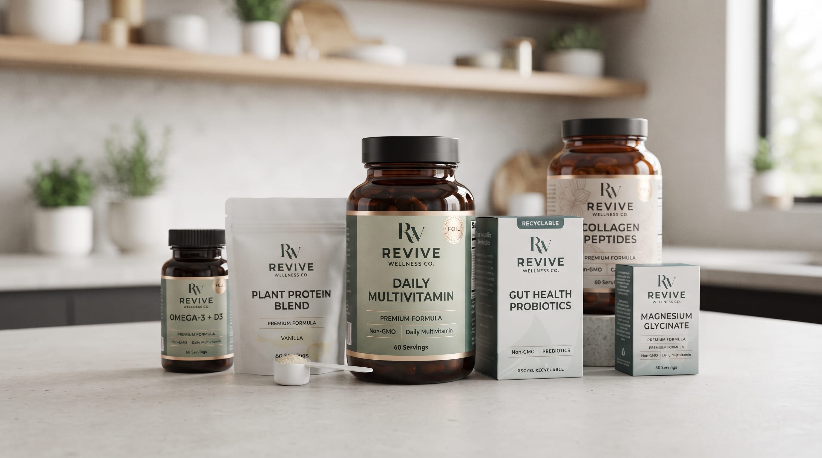
Effective supplement label and packaging design can make a major difference in how customers perceive a health or wellness product. Before someone reads the ingredient list or compares formulas, the package already communicates whether the brand feels professional, natural, scientific, premium, energetic, or trustworthy. For supplement brands competing on crowded shelves and online marketplaces, packaging is therefore much more than a container. It is one of the most visible parts of the brand identity.
A good package must balance aesthetics with clarity. Customers should quickly understand what the product is, who it is intended for, and what makes it different.
Typography, color, layout, bottle shape, label material, and information hierarchy all contribute to that first impression.
This guide explores practical ways to develop a stronger supplement identity while keeping packaging attractive, readable, and consistent.
Why Supplement Label and Packaging Design Matters
The supplement industry is highly visual.
Protein powders, vitamins, probiotics, collagen products, herbal supplements, sports nutrition, and wellness formulas often appear beside dozens of competing products.
Strong supplement label and packaging design helps a brand create immediate recognition.
It can communicate several qualities at once, including:
- Product category
- Brand personality
- Target customer
- Perceived quality
- Main benefit
- Flavor or formula
- Premium positioning
For example, a sports nutrition brand may use bold typography and strong contrast, while a botanical supplement company may prefer soft colors, natural textures, and elegant serif lettering.
The packaging should therefore reflect the positioning of the product rather than simply following whatever design style is currently popular.
Start Supplement Packaging Design With Brand Positioning
Before choosing colors or fonts, define what the supplement brand represents.
Ask questions such as:
- Is the brand scientific or natural?
- Is it designed for athletes or general wellness customers?
- Is the product affordable or premium?
- Is the target audience young and energetic or mature and health-conscious?
- Does the brand emphasize performance, beauty, sleep, immunity, or everyday nutrition?
Clear positioning makes supplement label and packaging design much easier.
A premium collagen product, for example, might use soft neutrals, elegant typography, and generous spacing.
A pre-workout supplement may use stronger visual contrast, oversized lettering, and dynamic graphic elements.
A botanical sleep supplement might combine muted greens, cream backgrounds, and subtle plant illustrations.
Design decisions become more consistent when they are connected to a specific brand personality.
Build a Clear Hierarchy in Supplement Label Design
Supplement packaging often contains a large amount of information.
The challenge is deciding what customers should notice first.
A useful front-label hierarchy might be:
- Brand name
- Product name
- Primary product benefit or category
- Formula or ingredient highlight
- Flavor or variation
- Quantity or serving information
Secondary information can then appear on the side or back panel.
Avoid giving every element the same visual weight.
When everything is bold, nothing feels important.
Effective supplement label and packaging design uses size, weight, spacing, and contrast to guide the customer’s eye naturally through the package.
Typography for Supplement Label and Packaging Design
Typography is one of the most important branding tools on supplement packaging.
Customers often see the brand name and product name before they notice any other element.
The right font can instantly influence the perceived personality of the product.
Modern Supplement Packaging Fonts
Modern wellness brands often benefit from clean typography with simple letterforms and strong readability.
DM Letter Studio fonts to consider include:
These styles can support minimalist supplement labels, vitamin bottles, wellness products, and contemporary nutrition brands.
Premium Supplement Brand Fonts
Luxury wellness products often require more refined typography.
Consider DM Letter Studio fonts such as:
These can work well for premium collagen, beauty supplements, women’s wellness products, and higher-end vitamin collections.
Use decorative or elegant fonts selectively.
Natural and Botanical Supplement Fonts
Herbal and plant-based products often benefit from warmer, more organic typography.
DM Letter Studio options can include:
These fonts can help create a handcrafted or botanical personality, especially when paired with natural illustrations and muted colors.
Keep ingredient lists and small informational text in a simpler typeface.
Decorative typography works best for brand names, collection titles, and short product names.
Use Color to Define Supplement Categories
Color is one of the fastest ways to organize a supplement product line.
A consistent color system can help customers identify different formulas without changing the entire packaging structure.
For example:
- Green for herbal wellness
- Blue for hydration
- Purple for sleep products
- Red for energy
- Orange for immunity
- Pink for beauty or collagen
- Black for performance
- White for minimalist daily vitamins
These associations are not strict rules.
What matters most is consistency.
Good supplement label and packaging design may use one core brand color across every product while introducing a secondary color for each formula.
This helps the product family look connected while still making individual products easy to distinguish.
Also Read: Tea Packaging Design Examples That Inspire Better Branding
Minimalist Supplement Packaging for Modern Wellness Brands
Minimalism has become common across health, skincare, and wellness branding because it can communicate simplicity and confidence.
A minimalist label might include:
- Large product name
- Small logo
- One supporting statement
- Minimal graphic elements
- Neutral background
- Strong typography
- Generous white space
The goal is not to remove information that customers need.
Instead, simplify the front panel and organize detailed information elsewhere.
For minimalist supplement label and packaging design, typography becomes especially important because fewer visual elements are available to create personality.
Natural Supplement Label and Packaging Design
Natural supplements need visual signals that support their botanical positioning.
Common approaches include:
- Botanical illustrations
- Earth-toned palettes
- Paper textures
- Green accents
- Ingredient photography
- Hand-drawn graphics
- Organic shapes
However, avoid making every natural supplement package look identical.
Instead of automatically using green leaves everywhere, consider building the identity around one distinctive ingredient or visual motif.
For example, an ashwagandha product could use a detailed botanical illustration with a warm beige background and dark typography.
A turmeric supplement might use a restrained golden accent.
This creates natural positioning without sacrificing individuality.
Supplement Bottle Packaging Design
Plastic and glass bottles remain common packaging formats for capsules, tablets, and gummies.
Because bottle labels have limited horizontal space, information hierarchy becomes especially important.
Keep the front panel focused.
The customer should not need to rotate the bottle several times simply to understand what the product is.
Important front-facing elements usually include:
- Brand
- Product name
- Primary ingredient
- Product type
- Quantity
- Formula variation
Good supplement label and packaging design also considers how the label looks when wrapped around the bottle.
Avoid placing critical words too close to the edges where they may disappear from the main viewing angle.
Supplement Pouch and Powder Packaging
Protein powders, greens, electrolyte products, collagen powders, and other powdered supplements often use pouches or large containers.
These formats provide more visual space than small supplement bottles.
Use that space carefully.
Large packaging does not mean every part of the surface needs decoration.
A strong pouch might feature:
- Large product name
- Clear flavor identification
- One dominant graphic
- Strong logo placement
- Easy-to-read benefit statement
- Consistent color coding
Performance supplements can support stronger display typography, while wellness powders may benefit from a calmer visual system.
Create a Consistent Supplement Packaging System
A strong supplement brand rarely sells only one product.
As the range grows, packaging consistency becomes increasingly important.
Develop rules for:
- Logo position
- Font combinations
- Product naming
- Color coding
- Icons
- Graphic style
- Label margins
- Ingredient highlights
- Bottle or pouch photography
- Benefit statements
A good supplement label and packaging design system should allow customers to recognize every product as part of the same family.
Imagine a brand selling:
- Multivitamins
- Magnesium
- Collagen
- Probiotics
- Sleep supplements
- Vitamin D
- Omega products
Each package can have its own accent color while maintaining the same typography, logo placement, grid, and overall structure.
This makes the entire product line feel more professional.
Also Read: Modern Food Label Design That Inspires Better Packaging
Avoid Too Many Fonts on Supplement Packaging
Using too many typefaces is one of the easiest ways to make packaging look inconsistent.
Most supplement brands only need two font roles:
Primary typeface:
Used for logos, product names, or major headings.
Supporting typeface:
Used for ingredients, descriptions, nutritional details, and secondary information.
The decorative font creates personality while the cleaner supporting font maintains readability.
A disciplined font system also makes future packaging much easier to produce.
Make Important Information Easy to Read
Creativity should never make important product information difficult to find.
Always maintain strong contrast between text and background.
Avoid using:
- Tiny lettering
- Extremely thin type
- Decorative scripts for long text
- Low-contrast color combinations
- Excessive uppercase copy
- Crowded information blocks
Strong supplement label and packaging design gives information enough space to breathe.
Small typography can look elegant on a computer monitor but become difficult to read once printed on an actual bottle.
Always test packaging at the real final size.
Use Packaging Materials to Support Brand Positioning
Packaging material also influences brand perception.
A glossy label may create a very different feeling from textured matte paper.
Premium brands might consider:
- Matte finishes
- Embossing
- Foil accents
- Spot finishes
- Frosted bottles
- Rigid secondary boxes
Natural brands may explore:
- Kraft paper
- Recyclable materials
- Soft-touch paper
- Minimal plastic
- Natural textures
Material should support the identity rather than becoming decoration for its own sake.
A beautifully designed label can lose impact if the finish feels inconsistent with the brand message.
Design Supplement Packaging for Online Shopping
Many customers now discover supplements through websites, social media, marketplaces, or advertising before seeing the physical package.
Therefore, your label must remain recognizable at thumbnail size.
Large product names and clear category colors can help.
Ask yourself:
- Can the customer identify the product when the image is small?
- Can they distinguish magnesium from collagen?
- Is the brand name still visible?
- Does the packaging photograph well against simple backgrounds?
Digital visibility should be considered during the supplement label and packaging design process rather than after the package is already finished.
Check Packaging Information Before Production
Supplement packaging often needs more functional information than ordinary consumer products.
Your final design may require elements such as:
- Ingredients
- Serving information
- Net quantity
- Product warnings
- Manufacturer details
- Storage instructions
- Batch information
- Barcode
- Certification marks where appropriate
Requirements can vary depending on the product and market.
Always verify the applicable labeling and packaging regulations before sending a design to production.
Create the brand concept first, but allow enough layout space for required information.
Also Read: Luxury Packaging Design Ideas for Premium Products and Brands
Final Thoughts on Supplement Label and Packaging Design
Successful supplement label and packaging design combines branding, usability, typography, color, and product information into one consistent visual system.
The package should quickly communicate what the product is while giving customers a clear sense of the brand behind it.
Modern supplement companies can explore Altrobyte Futuristic Font, Blockton, or Neonrift. Premium wellness products may benefit from ROSA, Melvick, or Omarta, while natural brands can consider warmer fonts such as Herbalique Monogram, Nuptalia, or Crestelle Monogram.
Whatever direction you choose, consistency matters more than decoration.
Strong supplement label and packaging design should make every bottle, pouch, box, and future product feel connected. When typography, color, materials, and information hierarchy work together, packaging becomes more than protection for the product. It becomes a recognizable part of the brand itself.