
Travel Logo Inspiration for Luxury, Adventure, and Local Tours
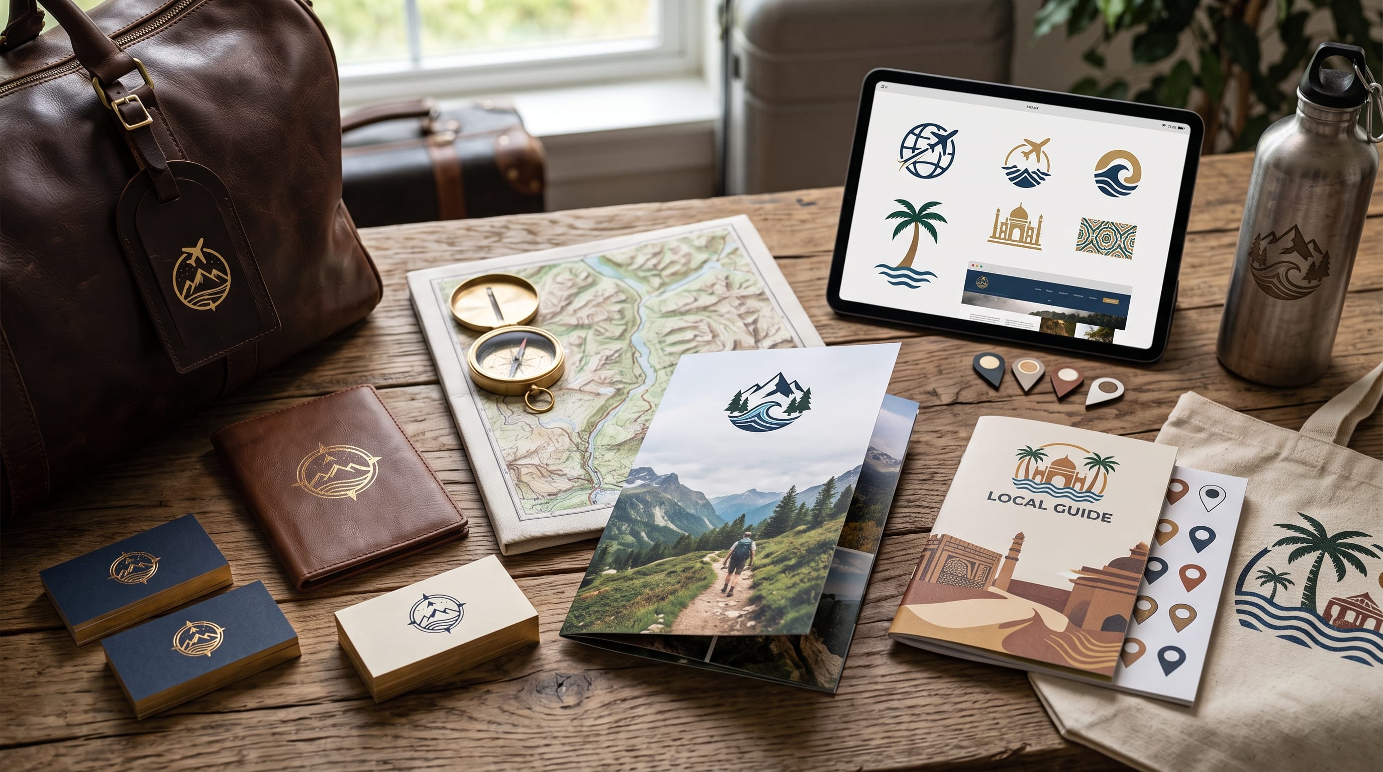
Travel logo inspiration can help agencies, tour operators, resorts, travel creators, and hospitality businesses develop identities that feel memorable and appropriate for the experiences they sell. Travel branding needs to communicate more than movement. It should express the type of journey customers can expect, whether that means premium comfort, outdoor adventure, cultural discovery, or intimate local experiences.
A luxury travel company may need refined typography and understated symbols. An adventure brand can use stronger shapes, energetic lettering, and nature-inspired icons. Meanwhile, a local tour business may benefit from a warmer identity connected to the destination, culture, or community it represents.
The strongest travel logos avoid trying to include every familiar travel symbol at once.
You do not need an airplane, suitcase, globe, mountain, compass, palm tree, and sun in the same design.
Instead, choose one clear concept and build the visual identity around it.
This guide explores practical travel logo inspiration for luxury, adventure, and local tour brands, plus color, typography, symbol, layout, and DM Letter Studio font suggestions.
Start Travel Logo Inspiration With Brand Positioning
Before choosing a symbol, define what kind of travel experience the business provides.
Ask:
- Who is the target traveler?
- What type of trips are offered?
- Is the brand premium or affordable?
- Does it focus on adventure, relaxation, culture, or convenience?
- Is it international or destination-specific?
- What should customers feel when they see the brand?
For example, a luxury travel advisor may want to communicate:
Exclusive journeys designed around personal preferences.
An adventure company may focus on:
Small-group outdoor experiences for active travelers.
A local tour operator could position itself as:
Authentic city experiences led by local experts.
These businesses all operate in travel, but their visual identities should feel very different.
Clear positioning makes your travel logo inspiration more relevant.
1. Use a Simple Travel Symbol
Travel logos often use familiar visual cues.
Popular symbols include:
- Airplanes
- Compasses
- Maps
- Mountains
- Waves
- Suns
- Palms
- Roads
- Location pins
These symbols work because customers recognize them quickly.
However, generic stock icons can make brands look interchangeable.
Instead, simplify or customize the symbol.
For example, an airplane path could form the first letter of the brand name.
A mountain silhouette might also create a hidden compass point.
A wave could become part of a monogram.
Small visual ideas like these can make familiar imagery feel more distinctive.
2. Build Travel Logo Inspiration Around a Destination
Destination-specific businesses can use visual elements connected to their location.
Possible inspiration includes:
- Architecture
- Landscape
- Local plants
- Coastlines
- Cultural patterns
- Famous geographic features
A Bali tour company might use an abstract tropical leaf or temple-inspired geometry.
A mountain guide could use a simplified silhouette of a recognizable peak.
A Mediterranean travel brand could use arches, sun shapes, and coastal colors.
Avoid turning the logo into a detailed illustration of the destination.
One distinctive reference is usually enough.
3. Create Luxury Travel Logo Design
Luxury travel branding should communicate confidence without becoming overly decorative.
Useful characteristics include:
- Refined typography
- Minimal symbols
- Generous spacing
- Restrained colors
- Strong monograms
A premium agency may not need an obvious airplane symbol.
Instead, it could use:
Elegant wordmark + custom monogram
This can feel more sophisticated while still allowing photography and marketing materials to communicate travel.
Luxury travel logo inspiration often works best when it borrows visual cues from hospitality, fashion, and editorial branding.
4. Use Monograms for Luxury Travel Brands
Monograms are particularly effective for:
- Luxury travel advisors
- Boutique hotels
- Private tours
- Destination management companies
- Premium resorts
Imagine a company called:
Aurelia Voyages
The initials A + V could form a refined monogram used on:
- Luggage tags
- Travel documents
- Website favicon
- Social profile
- Welcome packages
The full wordmark handles recognition, while the monogram creates a premium secondary mark.
5. Choose Elegant Luxury Travel Colors
Luxury travel does not always need black and gold.
Try palettes such as:
Classic Luxury
- Black
- Ivory
- Champagne gold
Coastal Premium
- Navy
- Cream
- Warm sand
Natural Luxury
- Forest green
- Taupe
- Ivory
Contemporary Premium
- Charcoal
- Stone
- Muted bronze
Keep the palette controlled.
The visual experience should feel polished rather than flashy.
6. Create Adventure Travel Logo Design
Adventure travel branding usually needs more energy.
Useful symbols include:
- Mountains
- Trails
- Rivers
- Tents
- Compasses
- Forests
Typography can be:
- Bold
- Condensed
- Rugged
- Geometric
An adventure logo should still remain simple enough to reproduce on:
- Outdoor clothing
- Vehicles
- Gear
- Social media
- Signage
A complicated mountain illustration may look impressive on a poster but fail when embroidered onto a jacket.
7. Use Badge Logos for Adventure Travel
Badge-style logos work especially well for outdoor brands.
A badge might contain:
- Company name
- Mountain silhouette
- Founding year
- Destination
For example:
NORTH RIDGE
Mountain icon
ADVENTURE TOURS
Keep supporting details limited.
Badge logos can become useful for:
- Patches
- Stickers
- Merchandise
- Equipment
- Vehicle graphics
They create a strong sense of membership and exploration.
8. Try Strong Adventure Color Palettes
Adventure travel can use more energetic natural colors.
Mountain Adventure
- Forest green
- Burnt orange
- Cream
- Charcoal
Coastal Adventure
- Deep blue
- Turquoise
- White
- Coral
Desert Adventure
- Terracotta
- Sand
- Dark brown
- Cream
Modern Outdoor
- Black
- Olive
- Beige
- Orange
The palette should reflect the type of landscape customers can expect.
9. Create Local Tour Logo Design
Local tour brands should feel knowledgeable and approachable.
Customers are often looking for:
- Local expertise
- Authentic experiences
- Easy booking
- Friendly guides
Therefore, branding can be warmer than corporate travel logos.
Consider:
- Friendly typography
- Local symbols
- Destination colors
- Human-centered photography
A walking-tour company might use a simple location pin combined with a local architectural detail.
A food-tour business could use a small culinary symbol connected to the city identity.
Also Read: 25 Ecommerce Logo Design Ideas That Build Strong Brands
10. Make Local Travel Branding Feel Authentic
Avoid generic tourism cliches when a more specific local reference is available.
Instead of:
Generic palm tree
consider:
A plant strongly associated with the location.
Instead of:
Generic skyline
use:
One simplified landmark or roofline.
Authentic visual references can make local travel logo inspiration more meaningful.
However, make sure cultural motifs are used respectfully and accurately.
11. Use a Compass in Travel Logo Design
Compasses symbolize:
- Exploration
- Navigation
- Discovery
They can work for both luxury and adventure brands.
A luxury version might use only four thin directional points.
An adventure version could use a stronger compass badge.
Avoid extremely detailed compass illustrations unless the logo will mostly appear at large sizes.
Simple geometry improves scalability.
12. Use Mountains for Adventure Logos
Mountains instantly communicate outdoor adventure.
The challenge is avoiding generic triangular mountain symbols.
Try:
- Custom peak silhouette
- Negative-space mountain
- Mountain integrated with initials
- Single continuous line
For example, the letter M in a brand name could subtly become a mountain.
This creates stronger ownership of the visual idea.
13. Use Airplane Symbols Carefully
Airplanes are one of the most common travel logo elements.
They work best for:
- Travel agencies
- Flight booking
- International tours
Instead of placing a basic airplane icon above the company name, integrate it into the design.
For example:
- Airplane trail forms a circle
- Plane replaces part of a letter
- Flight path creates a location pin
The more integrated the symbol feels, the more professional the result.
14. Use Roads and Paths as Travel Symbols
Roads communicate:
- Journey
- Exploration
- Discovery
- Movement
A curved line can create a simple travel logo without using an obvious vehicle or airplane.
This works especially well for:
- Road trips
- Motorcycle tours
- Local guides
- Camper travel brands
The path could also lead toward a mountain or sun.
Keep the composition simple.
15. Use Sun Symbols for Leisure Travel
Sun imagery works well for:
- Resorts
- Beach travel
- Tropical tours
- Wellness retreats
A simple sun can communicate warmth and relaxation.
Pair it with:
- Soft serif typography
- Warm neutrals
- Coastal blue
Avoid overly detailed tropical illustrations unless the visual style specifically requires them.
16. Use Waves for Coastal Travel Logo Inspiration
Waves are highly versatile.
They can represent:
- Ocean
- Freedom
- Relaxation
- Movement
They work well for:
- Island tours
- Surf travel
- Cruises
- Beach resorts
- Coastal rentals
A wave can also be integrated with:
- Sun
- Initial
- Circle
Use a simple curve rather than complicated water illustrations.
17. Create Travel Logos With Negative Space
Negative space can make a travel identity more memorable.
Examples include:
- Airplane hidden inside a letter
- Mountain inside a location pin
- Road between two initials
- Sun created by empty space
The concept should remain understandable.
If customers need a long explanation before recognizing it, simplify the design.
18. Use Wordmarks for Modern Travel Brands
Some travel companies do not need a symbol at all.
A strong wordmark can communicate:
- Premium positioning
- Modernity
- Confidence
For example:
NOMADA
with distinctive typography and generous letter spacing can feel more premium than a complicated logo containing six travel symbols.
Wordmarks also work well for businesses planning to expand into multiple travel categories.
19. Create a Strong Logo Hierarchy
A complete travel identity may include several versions.
Primary Logo
Full brand name + symbol.
Secondary Logo
Compact arrangement.
Icon
Symbol only.
Monogram
Initials.
This flexibility allows the brand to work across different formats without forcing one logo layout everywhere.
Also Read: Best Business Logo Ideas for Small Businesses in 2026
Font Suggestions for Travel Logo Inspiration
Typography plays a major role in whether a travel brand feels luxurious, adventurous, approachable, or modern.
Different fonts from the saved DM Letter Studio collection can support each direction.
Elegant and Premium Travel Fonts
For luxury travel agencies, resorts, and private tours, consider:
Luxury Travel Monogram Fonts
For high-end travel and hospitality brands, consider:
These work particularly well for:
- Private travel clubs
- Luxury hotels
- Villas
- Destination weddings
- Premium tour companies
Bold Adventure Travel Fonts
Adventure brands can use stronger display typography.
Consider:
Retro Travel Font Suggestions
Retro typography works well for:
- Road-trip brands
- Campgrounds
- Surf travel
- Vintage tourism
- Travel merchandise
Consider:
Combine them with:
- Burnt orange
- Mustard
- Olive
- Cream
- Brown
This can create nostalgic travel logo inspiration reminiscent of classic tourism posters.
Friendly Local Tour Fonts
Local tour companies may benefit from warm, approachable typography.
Consider:
These fonts can feel personal and human.
They work particularly well for:
- Walking tours
- Food tours
- Community experiences
- Creative workshops
Use them selectively and pair them with a clean font for functional information.
Modern Travel Font Suggestions
For contemporary agencies and digital travel platforms, consider:
These can work with:
- Geometric symbols
- Minimal color palettes
- Strong grids
20. Build Travel Logo Design Around Photography
The logo should complement your photography.
Luxury travel photography may use:
- Elegant hotels
- Dramatic landscapes
- Calm lighting
- Minimal composition
Adventure brands may use:
- Hiking
- Mountains
- Kayaking
- Camping
- Action photography
Local tours may focus on:
- Guides
- Streets
- Food
- Culture
- Community
A beautiful logo cannot compensate for inconsistent visual content.
The whole identity should feel connected.
21. Extend Travel Branding Into Social Media
Travel businesses rely heavily on visual platforms.
Create social templates using:
- Brand colors
- Logo
- Font system
- Consistent photography
Useful formats include:
- Destination guides
- Tour announcements
- Travel tips
- Testimonials
- Promotional packages
Do not place a large logo on every photograph.
Consistent colors, typography, and photography can create recognition more elegantly.
22. Apply the Logo to Travel Documents
Travel businesses may need branded:
- Itineraries
- Booking confirmations
- Travel guides
- Welcome letters
- Tickets
- Maps
These materials should follow the same identity.
For luxury travel companies, even a simple itinerary can feel premium through:
- Elegant typography
- Generous margins
- Small monogram
- Restrained colors
Every customer touchpoint contributes to the overall brand perception.
23. Use Travel Logo Design on Vehicles
Local tour operators may use:
- Vans
- Cars
- Buses
- Boats
Vehicle branding needs high readability.
Include:
- Logo
- Company name
- Website or phone
Avoid adding long service descriptions.
Viewers may only have a few seconds to read the vehicle.
24. Design Travel Merchandise
Strong travel brands can extend into:
- T-shirts
- Hats
- Tote bags
- Water bottles
- Stickers
- Luggage tags
Adventure badge logos are particularly suitable for merchandise.
Luxury brands may use understated monograms instead.
Always test whether the logo remains recognizable in one color before creating merchandise.
25. Keep Travel Branding Consistent
Consistency makes a travel business easier to remember.
Create basic guidelines covering:
- Primary logo
- Secondary logo
- Icon
- Colors
- Typography
- Photography
- Graphic motifs
Then apply them across:
- Website
- Social media
- Signage
- Vehicles
- Printed guides
A recognizable system is more valuable than constantly redesigning graphics for each new campaign.
Common Travel Logo Design Mistakes
Using Too Many Symbols
Choose one central idea.
Using Generic Stock Icons
Customize familiar travel imagery.
Overcomplicating the Logo
Simple designs scale better.
Choosing the Wrong Typography
Match the font to the travel experience.
Copying Competitors
Look for meaningful differentiation.
Using Too Many Colors
Limit the palette.
Ignoring Small Sizes
Test social icons and favicons.
Forgetting Photography
The logo must work with the broader visual identity.
Making Luxury Travel Too Decorative
Premium design often benefits from restraint.
Making Adventure Brands Too Rough
Rugged can still look professional.
Travel Logo Inspiration Checklist
Before finalizing the identity, ask:
- Is the target traveler clear?
- Does the logo match the travel experience?
- Is the main symbol distinctive?
- Is the typography readable?
- Does the color palette fit the positioning?
- Does the logo work in black and white?
- Can the symbol work alone?
- Does the logo remain clear at small sizes?
- Is the design suitable for signage?
- Does it work on merchandise?
- Can it extend to social media?
- Does photography support the identity?
- Are local cultural references appropriate?
- Is the design differentiated from competitors?
- Does the whole identity feel consistent?
A strong logo should work across all of these situations rather than only looking attractive in a presentation mockup.
Also Read: How to Create a Fashion Logo Design That Stands Out
Final Thoughts on Travel Logo Inspiration
The best travel logo inspiration starts with the experience a brand wants customers to imagine.
Luxury travel businesses can emphasize refinement, exclusivity, and personalized service through elegant typography, monograms, restrained colors, and minimal symbols. Adventure brands can use bolder fonts, badges, mountains, trails, and natural palettes to communicate energy and exploration. Local tour companies can create warmer identities based on destination details, community knowledge, and approachable typography.
Font selection should reinforce the same positioning.
DM Letter Studio fonts can support sophisticated luxury travel identities.
Whatever direction you choose, avoid filling the logo with every recognizable travel icon.
Select one strong concept.
Combine it with suitable typography, a controlled color palette, and a flexible logo system.
When these elements work together, travel logo inspiration becomes more than a collection of attractive symbols. It becomes a foundation for a recognizable travel brand that communicates the right experience before the customer even begins the journey.