
Website Color Scheme Ideas for Better Visual Design
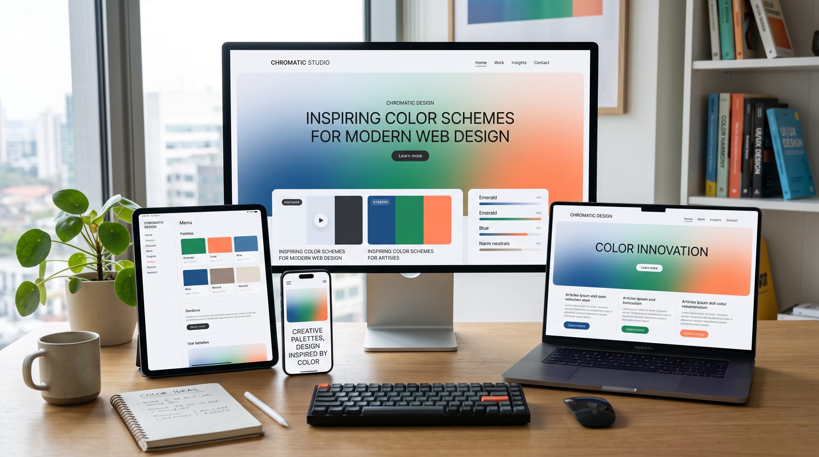
Website color scheme ideas can shape how visitors feel about a brand before they read a single paragraph. Color influences visual hierarchy, readability, mood, recognition, and the overall quality of a digital experience. A well-planned palette can make a website feel professional, calm, energetic, luxurious, friendly, or innovative.
Choosing website colors is not simply a matter of selecting several attractive shades. Every color needs a purpose. One color may guide attention toward buttons, another may support backgrounds, and another may help organize headings or cards. When too many colors compete, the page can quickly feel inconsistent and difficult to use.
The strongest website color scheme ideas usually begin with a limited palette, clear contrast, and a close connection to the brand’s personality. This guide explains how to choose, organize, test, and apply website colors for better visual design.
Why Website Color Scheme Ideas Matter
Color is one of the first design elements visitors notice. It can influence whether a website feels trustworthy, modern, creative, affordable, premium, or difficult to understand.
A strong color system can help you:
- Create a recognizable brand identity
- Improve text readability
- Guide users toward important actions
- Separate content sections
- Build emotional consistency
- Support visual hierarchy
- Make layouts feel more polished
- Improve accessibility
Poor color choices can create the opposite result. Low contrast may make text unreadable, overly bright palettes can feel tiring, and inconsistent shades can weaken the brand.
Good website color scheme ideas should support both visual style and practical usability.
Start With the Brand Personality
Before selecting colors, define how the website should feel.
Ask:
- Is the brand serious or playful?
- Is it modern or traditional?
- Is it bold or understated?
- Is it affordable or premium?
- Is it energetic or calming?
- Is it technical or human?
- Is it youthful or mature?
A financial website may need a stable and trustworthy palette. A children’s brand may benefit from brighter colors. A luxury portfolio may use restrained neutrals with one refined accent.
Create a short list of three to five brand qualities. These words will help you evaluate whether a palette supports the intended personality.
For example:
Brand qualities: calm, natural, welcoming
Possible palette: warm white, beige, sage green, muted brown
Brand qualities: bold, youthful, energetic
Possible palette: black, white, electric blue, bright orange
The palette should reflect the brand rather than simply follow a temporary trend.
Understand the Main Color Roles
A professional website usually needs more than a collection of random colors. Each shade should have a clear role.
A basic system may include:
Primary Color
The primary color represents the brand and appears in important visual areas. It may be used for buttons, links, headings, icons, or branded sections.
Secondary Color
The secondary color supports the primary color and adds variety. It may appear in cards, illustrations, category labels, or secondary buttons.
Accent Color
The accent color attracts attention. Use it carefully for important calls to action, badges, notifications, or highlighted information.
Background Colors
Background colors create structure and separate sections. Most websites use one main background and one or two alternative section backgrounds.
Text Colors
Body text should use a dark, readable neutral rather than pure black in many designs. Secondary text can be lighter, but it still needs sufficient contrast.
Defining these roles makes website color scheme ideas easier to apply consistently.
Use a Simple Color Ratio
One practical approach is the 60-30-10 rule.
- 60 percent dominant neutral or background color
- 30 percent secondary color
- 10 percent accent color
This is not a strict mathematical requirement, but it provides a useful starting point.
For example:
- 60 percent warm white
- 30 percent sage green
- 10 percent terracotta
The dominant color creates calm and space. The secondary color gives the design personality. The accent color attracts attention without overwhelming the page.
Avoid using several strong colors in equal amounts unless the design intentionally requires a highly expressive style.
1. Minimal Black, White, and Gray
A black, white, and gray palette creates a clean, editorial, and modern appearance. It works well for design portfolios, photography websites, fashion brands, architecture studios, and creative agencies.
Suggested roles:
- White for the main background
- Soft gray for secondary sections
- Charcoal for body text
- Black for headings and buttons
The strength of this palette comes from typography, spacing, photography, and layout rather than color variety.
Add one subtle accent when needed. A muted red, cobalt blue, or warm beige can highlight links and calls to action.
This is one of the safest website color scheme ideas for brands that want content and imagery to receive most of the attention.
2. Warm Neutral Website Color Scheme Ideas
Warm neutrals create a comfortable and approachable atmosphere.
A possible palette includes:
- Warm white
- Cream
- Light beige
- Taupe
- Dark brown
This combination works well for:
- Interior design websites
- Lifestyle blogs
- Handmade products
- Wellness brands
- Cafés
- Boutique stores
Warm neutrals feel more personal than cool gray palettes. They can also support photography featuring wood, textiles, food, nature, or home interiors.
Use dark brown or charcoal for text to maintain readability. Avoid using light beige text on a cream background because the contrast may be too weak.
3. Blue and White for Trust and Clarity
Blue is widely used in technology, finance, healthcare, education, and professional services because it can feel stable and clear.
A blue-based palette might include:
- White background
- Light blue section color
- Deep navy text
- Medium blue primary button
- Cyan accent
The darker shades create authority, while lighter blues keep the design open and friendly.
Avoid using the same blue for every element. Create a range with clear roles, such as dark navy for headings, medium blue for actions, and pale blue for backgrounds.
This is one of the most practical website color scheme ideas for businesses that need to communicate professionalism.
4. Sage Green and Natural Tones
Sage green works well with beige, cream, soft white, olive, and brown. The result feels calm, organic, and contemporary.
This palette is suitable for:
- Sustainable brands
- Home décor websites
- Gardening blogs
- Natural beauty products
- Wellness services
- Food and lifestyle brands
Use sage as the secondary or primary color rather than applying it everywhere. Large areas of muted green can become visually heavy when not balanced with neutral space.
A deeper olive shade can support headings or footer backgrounds, while a warm terracotta accent can add contrast.
Also Read: Dark Mode UX Best Practices for Better Usability and Design
5. Bold Blue and Orange
Blue and orange create strong complementary contrast. The combination can feel energetic, youthful, and action-oriented.
A modern palette may include:
- Deep navy background
- Bright blue primary color
- Orange accent
- White text
- Soft gray support color
This works well for:
- Sports brands
- Software companies
- Creative tools
- Marketing agencies
- Online learning platforms
- Technology startups
Use orange mainly for calls to action or highlighted details. If both colors are equally bright and used across the entire page, the design may feel visually exhausting.
6. Soft Pastel Website Color Scheme Ideas
Pastels can create a gentle, playful, or elegant mood.
Common pastel colors include:
- Pale pink
- Lavender
- Soft blue
- Mint green
- Light peach
- Cream
Pastel palettes work well for beauty, stationery, weddings, children’s products, lifestyle brands, and creative portfolios.
The main challenge is contrast. Pastel colors are often too light for body text or small buttons. Use darker versions for text and interactive elements.
For example, pair pale lavender backgrounds with dark purple headings rather than using light purple for both.
7. Dark Mode Color Schemes
Dark websites can feel modern, cinematic, premium, or technical. They are common in gaming, entertainment, creative portfolios, music, and software products.
A balanced dark palette may include:
- Near-black background
- Dark gray cards
- Soft white text
- Muted gray secondary text
- Bright accent color
Avoid using pure black behind pure white text across large areas. The contrast may feel harsh. A very dark charcoal background with slightly warm white text is often more comfortable.
Accent colors such as cyan, purple, lime, or orange can create strong visual energy.
When developing dark website color scheme ideas, test all buttons, forms, cards, and hover states carefully.
8. Purple and Pink for Creative Brands
Purple and pink can feel imaginative, expressive, youthful, and digital.
A palette might include:
- Deep purple
- Bright magenta
- Soft pink
- White
- Dark navy
This combination works for:
- Creative platforms
- Music brands
- Beauty products
- Digital agencies
- Event websites
- Creator tools
A gradient between purple and pink can be used for hero backgrounds, illustrations, or important promotional areas. Avoid placing long paragraphs directly over complex gradients unless contrast remains strong.
Keep body sections more neutral so the brighter colors maintain their impact.
9. Red, Black, and White
Red, black, and white create a bold and dramatic visual identity.
This palette suits:
- Sports
- Entertainment
- Automotive brands
- Events
- Streetwear
- Music
- Food promotions
Red naturally attracts attention, so it works well for important buttons, sale labels, active navigation, and key numbers.
However, using too much red can create visual tension. Balance it with white space and black or charcoal typography.
Red also has strong meanings related to warnings and errors. Do not use the same red for branding, success messages, and error states without clear distinction.
10. Earth-Tone Website Color Scheme Ideas
Earth tones create a natural, mature, and grounded style.
A possible palette includes:
- Sand
- Clay
- Terracotta
- Olive
- Deep brown
- Warm cream
These colors fit travel, food, handmade goods, outdoor brands, cultural projects, architecture, and sustainable businesses.
Earth tones can feel premium when combined with elegant typography and large photography. They can also feel rustic when used with textured backgrounds and handcrafted elements.
Use a darker neutral for body text to prevent the site from becoming too soft.
11. Monochromatic Color Schemes
A monochromatic scheme uses several shades and tints of one main color.
For example, a green monochromatic palette might include:
- Very pale green background
- Soft green cards
- Medium green buttons
- Dark green headings
- Deep forest footer
This creates strong consistency and is easier to manage than a palette with many unrelated colors.
Monochromatic website color scheme ideas are useful for brands that want a clear identity without visual complexity.
Add one contrasting neutral or accent color when important elements need more attention.
12. Retro Website Color Schemes
Retro palettes often use slightly muted colors rather than extremely bright digital tones.
Popular combinations include:
- Mustard yellow
- Burnt orange
- Avocado green
- Cream
- Brown
- Faded blue
These palettes work well for music, fashion, cafés, creative studios, posters, and vintage-inspired products.
Typography and texture play an important role. A retro palette may feel incomplete without suitable fonts, illustrations, grain, or photography.
Use the style consistently rather than adding retro colors to an otherwise unrelated modern interface.
Also Read: UX Web Design Playbook: Faster, Clearer, Better
13. Luxury Website Color Scheme Ideas
Luxury palettes are usually controlled, restrained, and supported by generous spacing.
Common combinations include:
- Black and gold
- Ivory and deep brown
- Navy and champagne
- Cream and burgundy
- Charcoal and silver
Metallic colors should be represented carefully on screens. A flat yellow does not automatically look like gold. Use gradients, texture, lighting, and subtle contrast to create a metallic impression.
Luxury design depends heavily on typography, photography, and composition. The palette should support those elements rather than become overly decorative.
14. Bright and Playful Color Schemes
Bright palettes can create a friendly and energetic experience.
A playful combination may include:
- Cobalt blue
- Bright yellow
- Coral
- Mint
- White
This style fits educational platforms, children’s brands, creator tools, events, and entertainment websites.
Give each bright color a specific function. One may represent primary actions, another may identify categories, and another may appear only in illustrations.
Use neutral backgrounds and dark text so the bright shades remain manageable.
15. Accessible High-Contrast Color Schemes
Accessibility should be part of every palette, not an optional final step.
A high-contrast design may use:
- White background
- Very dark navy text
- Strong blue links
- Dark green success messages
- Deep red error messages
- Clear focus outlines
Avoid relying on color alone to communicate meaning. An error should include text or an icon, not only a red border.
Check contrast for:
- Body text
- Small text
- Buttons
- Links
- Form labels
- Placeholder text
- Navigation
- Text over images
Accessible website color scheme ideas improve clarity for everyone, including people viewing the site in bright sunlight or on lower-quality screens.
How to Build a Website Color Palette
Use this simple process:
- Define the brand personality.
- Choose one primary color.
- Select one supporting color.
- Add one accent color.
- Create neutral background shades.
- Choose readable text colors.
- Define success, warning, and error colors.
- Test contrast.
- Apply the palette to a sample page.
- Remove unnecessary shades.
Create several variations before selecting the final palette. Compare them in realistic layouts rather than judging isolated color swatches.
A color that looks beautiful in a palette may feel overwhelming when used across a large hero section.
Apply Website Colors Consistently
Create a style guide that defines where each color should appear.
For example:
- Primary blue: main buttons and links
- Dark navy: headings and footer
- Light blue: background sections
- Orange: badges and selected highlights
- Charcoal: body text
- Gray: borders and secondary text
Consistent usage helps visitors understand the interface. If primary buttons change color from section to section, users may not recognize them as the same type of action.
Use repeated design tokens or saved styles inside your design and development tools.
Use Color to Support Visual Hierarchy
Color can guide attention toward important content.
Use stronger color for:
- Main call-to-action buttons
- Active navigation items
- Important statistics
- Selected pricing plans
- Category labels
- Key headlines
Use muted colors for:
- Supporting paragraphs
- Borders
- Background patterns
- Secondary icons
- Inactive elements
Do not highlight too many elements at once. One strong accent is more effective when surrounded by quieter colors.
Test Website Color Scheme Ideas on Real Content
Never finalize a palette using empty boxes alone.
Apply it to:
- A full homepage
- Navigation
- Buttons
- Forms
- Cards
- Blog posts
- Product pages
- Footer
- Mobile screens
Test the site with real headlines, paragraph lengths, photographs, and interface states.
A palette may work well on a simple landing page but struggle on a content-heavy blog or dashboard.
Also test hover, active, disabled, success, error, and focus states.
Common Website Color Mistakes
1. Using Too Many Colors
A large palette is difficult to control. Begin with a limited system and add colors only when necessary.
2. Choosing Colors Without Brand Context
A trendy palette may not fit the audience or industry. Select colors based on strategy.
3. Weak Text Contrast
Light text on light backgrounds reduces readability. Always check body text carefully.
4. Overusing the Accent Color
When every button, icon, label, and heading uses the accent, it loses its ability to guide attention.
5. Ignoring Image Colors
Photography can introduce additional colors. Make sure the palette works with the website’s usual images.
6. Using Pure Black Everywhere
Pure black can feel harsh. Dark charcoal or navy may create a more refined result for long-form text.
7. Forgetting Mobile Screens
Bright backgrounds and low-contrast text can be harder to read on small displays. Test every palette responsively.
Also Read: Mobile UX Trends: The New Rules for Small Screens
Final Thoughts on Website Color Scheme Ideas
The best website color scheme ideas combine visual personality with clear usability. A successful palette supports the brand, improves hierarchy, keeps text readable, and guides visitors toward important actions.
Start with the brand’s personality and choose a limited set of colors with clear roles. Use neutrals to create balance, accents to attract attention, and contrast to improve accessibility.
Test the colors on real pages instead of judging swatches alone. Review the design on desktop and mobile screens, and make sure buttons, forms, cards, and text remain easy to understand.
Strong website color scheme ideas do not need to be complicated. A simple, consistent palette often creates a more professional and memorable website than a design filled with unrelated colors. When every shade has a purpose, the website feels clearer, more balanced, and more visually confident.

For high-quality fonts to boost your income, check out DM Letter Studio. Our professional fonts are perfect for branding, marketing, and content creation. So, don’t miss this opportunity.