Top 10 Famous Band Logos and What They Represent
Logos are crucial to determining your identity, personality, concept, and branding, which would attract people’s interest in your brand. Famous music band logos would be the most important thing to see the band’s concept and genre. Here are facts about some famous band logos with its meaning behind unique shape and fancy font.
Meaningful Famous Band Logos
Famous bands in the world represent certain genres and identities through music and lyrics. Yet, the wonderfulness of music doesn’t only come from the melody and lyric representation, but also the band’s logos. Do you want to know how famous band logos represent their identity? Here are some examples.
1. Iconic Stuck-Out Tongue of The Rolling Stones

The Rolling Stones will always be a well-known band in the world with their iconic logo. The tongue and mouth became their identity to represent the anti-authoritarian values of the Rolling Stones. Additionally, their iconic logo is to express the Rolling Stones’ boldness with red color and fierce figure.
Also Read: 45+ Unique AI Prompt for Logo Design to Enhance Brand Identity
2. The Drop-T of The Beatles

The Beatles is one of the popular bands that has changed their logo multiple times, but they remain the drop-T letter since the beginning. It has become their trademark to make the audience easily recognize The Beatles even though their logo never appeared on UK albums.
3. Smiley of Nirvana

Famous band logos that look playful owned by Nirvana with an iconic smiley face logo, X-shaped eyes, crooked mouth, and stuck-out tongue. Those symbols represent an illustration of a grudge that suits Nirvana’s genre which is rock. Nirvana’s logo looks simple yet meaningful with familiar typography and friendly icon.
4. Pink Floyd

The beginning of Pink Floyd’s logo journey was in 1985 with an iconic rounded emblem and upside-down letter F. Furthermore, the journey continued until it became simpler with a prism. The meaning behind Pink Floyd’s logo is to represent a strong stage presence with lighting, ambition, and madness through music.
Also Read: Continuous Product Design: The Comprehensive Explanation
5. Current Electricity of AC/DC

One of the famous metal band logos that look unique to represent the band’s concept is the lighting and AC/DC name on it. Start from their name which means an abbreviation of electric current. The / (slash) in the middle of their name is reshaped into lighting to symbolize the current electricity abbreviation.
Along with their name and meaningful symbol, AC/DC shows how their music has a raw energy to trigger the crowd. In particular, AC/DC wants to show off their boldness through music and performances.
6. Iconic Letters of Metallica

Famous band logos that look iconic are from Metallica with their archetypal simple typography with special shapes on the first and last letters. This logo has been used since the ‘80s by a legendary rock band.
James Hetfield as Metallica’s lead vocalist and logo designer gains fame from their iconic band logo. It is a well-known and recognizable identity of Metallica to the audience.
7. Bon Jovi
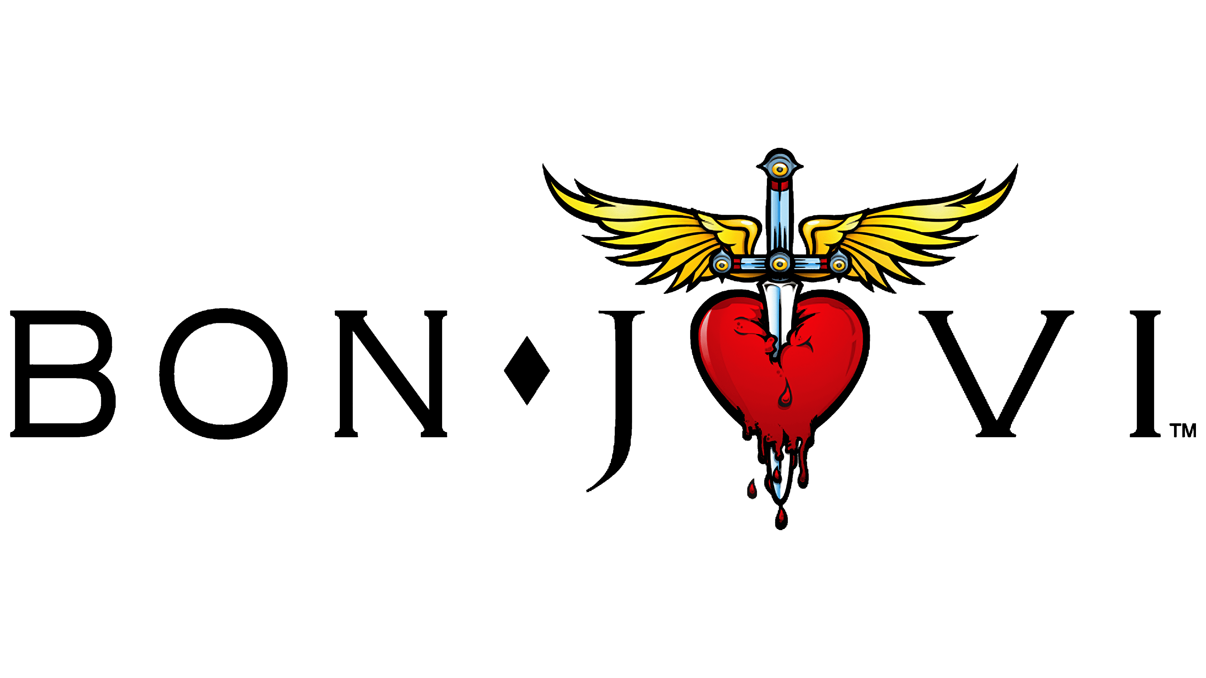
Once you take a look at Bon Jovi’s iconic logo, you are apparently acknowledging your heartbreak. A bloodied blade piercing deeply through a heart clearly represents how hard heartbreak could hurt you deep inside. The melancholic symbol with gothic icons gives such a dark concept as it is one of the famous metal band logos.
Additionally, it is a perfect symbol of Bon Jovi’s genre which more likely talks about heartbreak through music. The audience can feel the hurt and raw emotion of love that Bon Jovi tries to confess.
8. Fierce Logo of Slipknot
Furthermore, Slipknot’s logo looks dramatically wrapped in the darkness with sharp typography and complex nonogram shape. The nonogram symbol became the main icon of Slipknot to represent the band’s strength formed by the 9 members. The handwritten typography adds devilish and powerful sign with fierce chosen colors.
Also Read: Designing Brand Identity: Tips and Tricks for Successful Business
9. Simple Outline of Van Halen

Another one of the famous band logos that have such a long journey to get formed is Van Halen’s. The first version was formed with VH wings which were designed by Dave Bhang. Nowadays, the logo has been improved into a VH outline with geometric wings representing the eccentric style of Van Halen for their performances.
10. Fearless Sign of Red Hot Chilli Peppers’

Comes with an iconic emblem called Star of Affinity, the logo of Red Hot Chilli Peppers’ deeply represents the meaning of the chaotic crossroads of life. Additionally, the logo was made by Anthony Kiedis in a rush to show passion and dominance through the band’s anthem.
Also Read: 15 Common UX Mistakes That Lead You to Design Failures
Which One Famous Band Logos Look Stunning?
Among famous music band logos, you can find deep meaning in the complex shapes and typography. It is more likely to represent the band’s identity, genre, and concept which is turned into unique icons such as Metallica, The Beatles, Nirvana, and so on.
Especially, for metal and rock bands they are kind of creative to make the logo look extreme and fierce and hold a strength of the band’s concept. Thus, if you want to make a logo for your own band, consider choosing the most sophisticated design.
Your creativity works hard to create recognizable yet meaningful icons for your band. The more you can make it look different from the others, the more the audience can notice the performance you make. Additionally, it would be one of the famous band logos that people easily remember.