Graphic Design Color Palettes for Better Visual Results
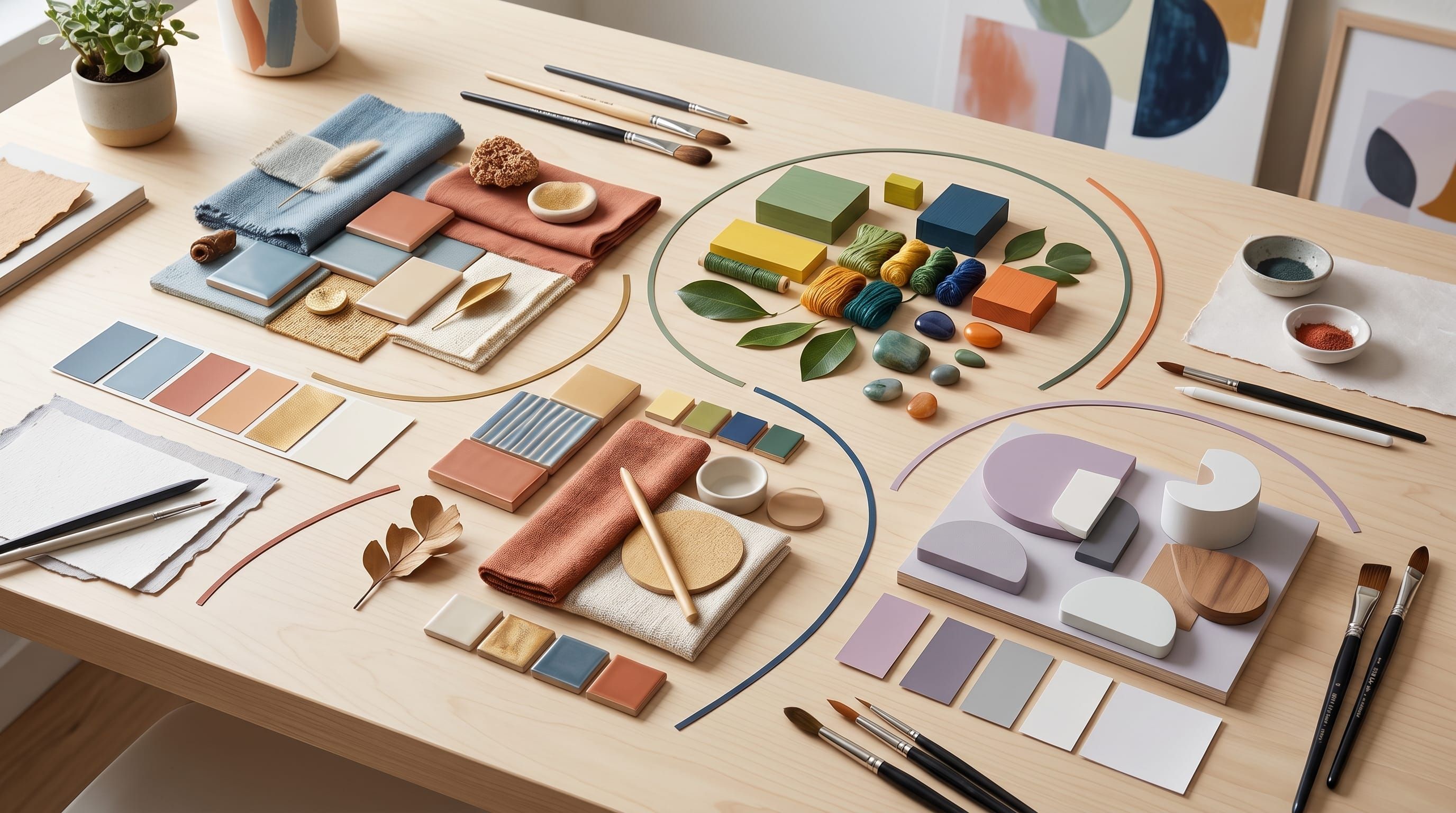
Using the right graphic design color palettes can completely transform the way your visuals look and feel. Many designers focus heavily on typography and layout but underestimate the impact of color. Strong graphic design color palettes help create balance, improve readability, and strengthen emotional connection with audiences.
In this guide, you’ll learn how to use graphic design color palettes effectively for branding, social media, web design, and creative projects. Whether you are a beginner or experienced creator, understanding graphic design color palettes will help you achieve better visual results.
Why Graphic Design Color Palettes Matter in Visual Design
Choosing effective color palettes for graphic design helps improve design quality.
Benefits include:
- Better visual harmony
- Stronger branding
- Improved emotional impact
When used correctly, color palettes for graphic design make designs more memorable and engaging.
Understanding Color Theory in Graphic Design Color Palettes
Color theory is the foundation of successful design color palettes.
1. Primary Colors
Red, blue, and yellow create the base for all color combinations.
2. Complementary Colors
Opposite colors create strong contrast and energy.
3. Analogous Colors
Similar colors create smooth and harmonious visuals.
Understanding these principles improves your design color palettes.
Minimalist Graphic Design Color Palettes
Minimalist design color palettes are popular in modern branding.
1. Neutral Color Combinations
Use white, beige, gray, and black.
2. Soft Accent Colors
Add muted blue or pastel tones.
3. Clean Visual Balance
Avoid overwhelming color usage.
These design color palettes create clean and professional visuals.
Bold and Vibrant Graphic Design Color Palettes
Bold design color palettes are ideal for energetic branding.
1. Bright Color Pairings
Use yellow, coral, turquoise, and orange.
2. High Contrast Elements
Improve visibility and engagement.
3. Dynamic Composition
Add energy to your visuals.
These design color palettes help designs stand out quickly.
Pastel Graphic Design Color Palettes for Soft Branding
Pastel design color palettes create calm and friendly visuals.
1. Soft Pink and Cream
Perfect for lifestyle brands.
2. Light Blue and Lavender
Create relaxing and modern aesthetics.
3. Muted Green and Beige
Work well for wellness and organic brands.
Pastel design color palettes are ideal for elegant and gentle branding.
Also Read: 25 Quick Graphic Design Ideas You Can Try Today
Dark Mode Graphic Design Color Palettes
Dark-themed design color palettes are growing in popularity.
1. Deep Gray and Black
Create a modern interface style.
2. Neon Accent Colors
Add vibrant highlights.
3. Balanced Contrast
Improve readability and focus.
Dark-inspired design color palettes feel modern and premium.
Seasonal Graphic Design Color Palettes
Seasonal design color palettes help brands stay fresh throughout the year.
1. Spring Palettes
Soft green, pastel pink, and sky blue.
2. Summer Palettes
Bright yellow, coral, and turquoise.
3. Autumn Palettes
Burnt orange, brown, and dark red.
4. Winter Palettes
Deep blue, silver, and white.
Seasonal design color palettes create emotional connection and relevance.
Graphic Design Color Palettes for Branding
Brand identity depends heavily on design color palettes.
1. Consistent Brand Colors
Use colors consistently across platforms.
2. Emotional Color Selection
Choose colors that reflect brand personality.
3. Memorable Visual Identity
Create recognizable combinations.
Strong design color palettes improve brand recognition.
Graphic Design Color Palettes for Social Media Content
Social media visuals benefit greatly from consistent design color palettes.
1. Bright and Engaging Colors
Increase attention and interaction.
2. Consistent Branding
Maintain recognizable visuals.
3. Platform Friendly Design
Adapt colors for different social platforms.
These design color palettes improve content performance.
Also Read: AI Prompts for Design Guide for Better Creative Direction
Common Mistakes in Graphic Design Color Palettes
Avoid these mistakes:
- Using too many colors
- Poor contrast combinations
- Ignoring readability
- Inconsistent branding colors
Avoiding these issues improves your design color palettes.
Tips to Improve Graphic Design Color Palettes
To create better design color palettes:
- Limit your color choices
- Test contrast levels
- Use color hierarchy
- Study successful brands
These tips strengthen your design color palettes.
Tools to Create Graphic Design Color Palettes
Using tools can improve your design color palettes workflow.
Popular tools include:
These tools make creating design color palettes easier and faster.
How Graphic Design Color Palettes Improve User Experience
Well-designed design color palettes help you:
- Improve readability
- Guide user attention
- Create emotional connection
Strong design color palettes enhance overall user experience.
Also Read: Free Graphic Design Tools for Beginners Who Want Pro Results
Final Thoughts
Mastering graphic design color palettes is essential for creating strong and visually appealing designs. By understanding color theory, branding, and emotional impact, you can create visuals that look professional and memorable.
Start experimenting with different graphic design color palettes and refine your style over time. With the right combinations and strategy, your designs can achieve better visual results and stronger audience engagement.

For high-quality fonts to boost your income, check out DM Letter Studio. Our professional fonts are perfect for branding, marketing, and content creation. So, don’t miss this opportunity.